Page History
The Grid
Table of contents
- The 24 Columns Grid
- Spacing and Details - The 24 Columns Gutter
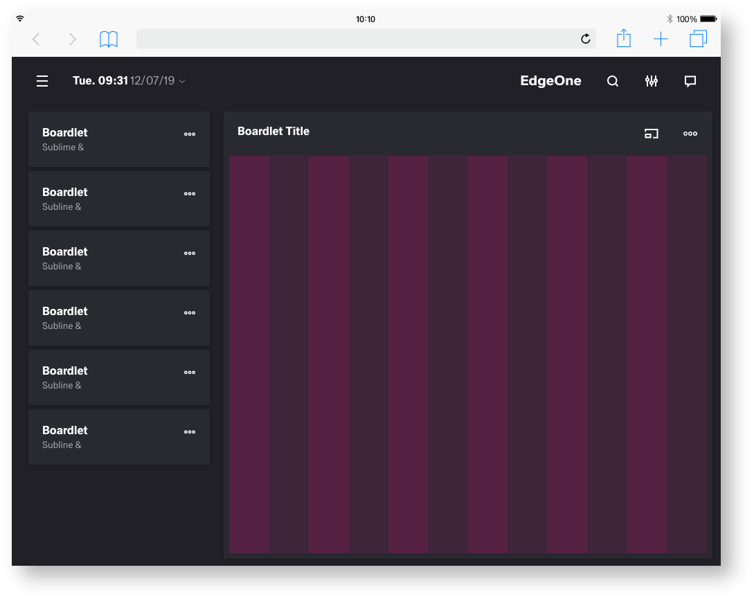
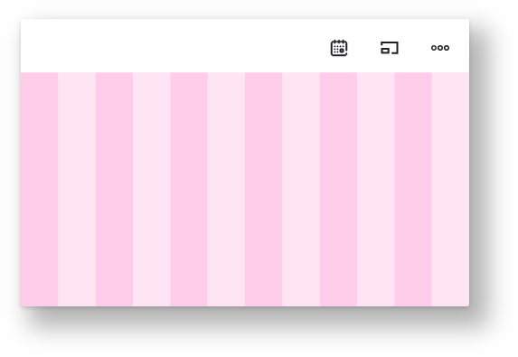
- EdgeOne Dashboard example
- Best Practice Dark and Light Theme - X-Series Dashboard example
- Best Practice Dark and Light Theme - Two different Boardlets-Grids
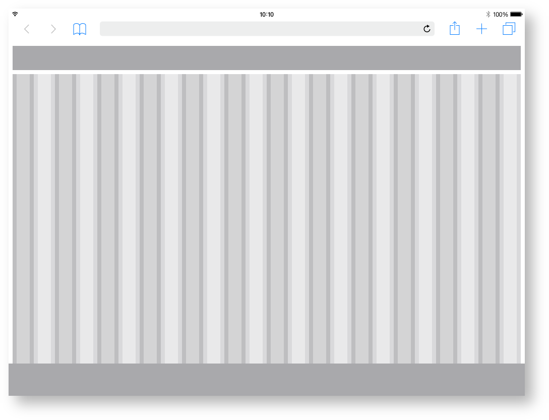
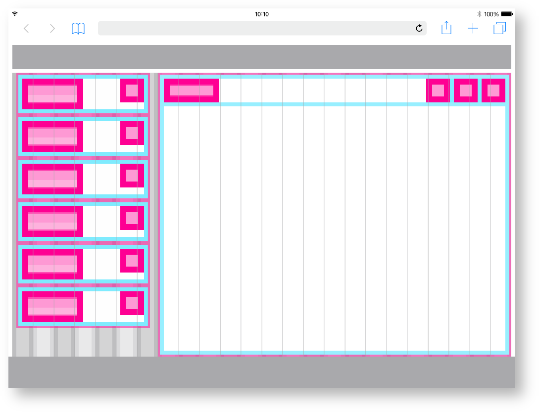
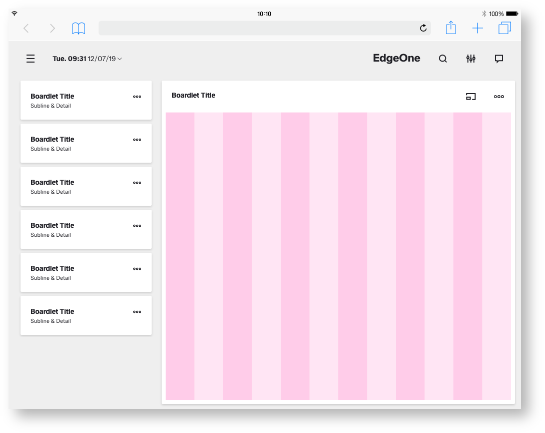
The 24 Columns Grid.
The foundation of the design system is the modified bootstrap frontend grid. this grid has 24 columns within the dashboard and 12 columns within the boardlets. The dashboard is divided into two parts, header and content area. The 24 Columns Grid only applies within the content area.
The grid has no column space, all distances are solved via the margin.
Spacing of the
Tablet landscape.
Here you can find all important values for building the tablet landscape grid. The grid is divided into two main containers. the header area and the content area.
| Base | px | rem |
|---|---|---|
| Breakpoint | 1056 | 66 |
| Width | 1024 | 64 |
| Height |
| 800 |
| 50 |
| Margin |
| 8 | 0 |
| ,5 | ||
| Content Area | ||
|---|---|---|
| Columns |
| 24 | - |
| Column Width |
| 42 |
| 2.625 |
| Gutter |
| 12 | 0. |
| 75 | ||
| Header Area | ||
|---|---|---|
| Header | 48 | 3 |
| Icon max | 48 | 3 |
| Icon min | n.n | n.n |
Space between | 8 | 0.5 |
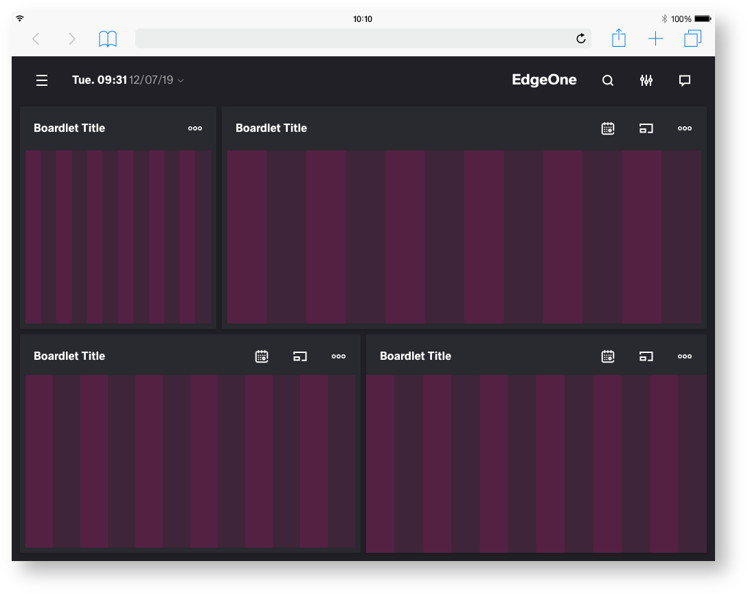
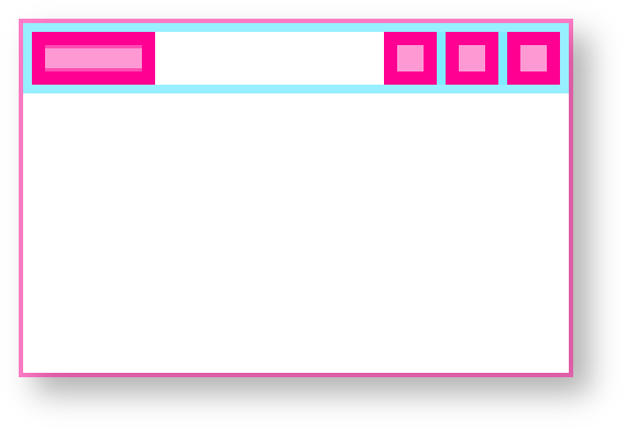
The 24 Columns Gutter.
Gutters may be missing as shown above or present as shown below. For closely related content, you should consider an Gutters free layout. Use the gutter if the content requires more separation.
Example for the use of a gutter.

Best Practice
Dark and Light Theme.

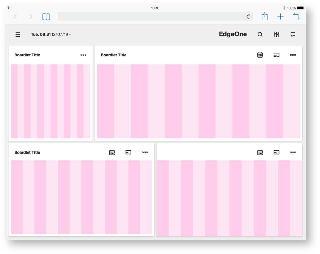
Best Practice
Dark and Light Theme.
| Info | ||
|---|---|---|
|


