Page History
Table of contents
- The 24 Columns Grid
- Spacing and Details - The 24 Columns Gutter
- EdgeOne Dashboard example
- Best Practice Dark and Light Theme - X-Series Dashboard example
- Best Practice Dark and Light Theme - Two different Boardlets-Grids
 web tablet portrait
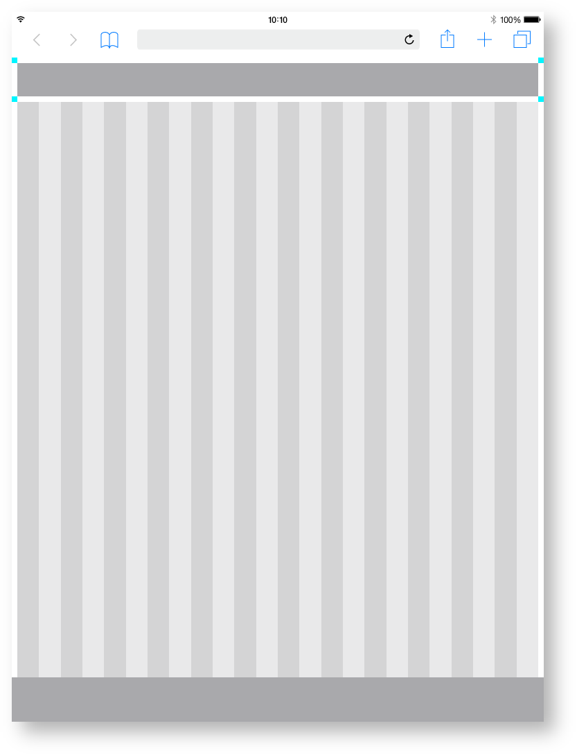
| Base | px | rem |
|---|---|---|
| Breakpoint | 1312 | 82 |
| Width |
| 1280 |
| 80 |
| Height |
| 800 |
| 50 | |
| Margin | 16 |
| 1 | ||
| Content Area | ||
|---|---|---|
| Columns |
| 24 | - |
| Column Width |
| 52 |
| 3. |
| 25 | ||
| Gutter | 16 | 1 |
| Header Area | ||
|---|---|---|
| Header | 24 | 1,500 |
| Icon max |
| 24 |
| 1,500 |
| Icon min |
EdgeOne Boardlet example.
This is how the division of the boardlets within this representation could look like. The Edge One/dSFM layout serves as an example.
Best Practice
Dark Theme.
Best Practice
Light Theme.

| 16 | 1 | |
Space between | 12 | 0.75 |
X-Series Boardlet example.
This is how the division of the boardlets within this representation could look like. The X-Series/Objective layout serves as an example.
| title | This is a work in progress. Not final!!! |
|---|
Dark Theme.
| title | This is a work in progress. Not final!!! |
|---|
Light Theme.
| title | This is a work in progress. Not final!!! |
|---|
