Page History
The Breakpoints.
The grid has 5 basic breakpoints. These breakpoints determine not only the columns, header, margin, gutter and icon size. They also determine the contents of the respective device and how they are displayed. This is necessary because the display of boardlets in high resolutions allows a generous handling of headlines, sublines, content and icons. Within small representations these contents have to be compressed or even displayed in multiple levels. Otherwise the user loses the overview in the fill or content is displayed so small that it is no longer readable. Please take a look at the breakpoint animation.
Extra Small <576px | Small ≥576px | Large ≥960px | Extra large ≥1200px | Extra extra large ≥1800px | Max container width | |
|---|---|---|---|---|---|---|
| Class prefix | .col-sm- | .col-md- | .col-lg- | .col-xl- | .col-xxl- | |
| # of columns | 24 | 24 | 24 | 24 | 24 | |
| Gutter width | n.n | 12 | 12 | 16 | 26 | |
| Nestable | Yes | Yes | Yes | Yes | Yes | |
| Column ordering | Yes | Yes | Yes | Yes | Yes |
The Guidlines.
This list of breakpoints will grow steadily, as the need arises.
Currently, the following breakpoints are necessary from the point of view of the UI/UX Guild.
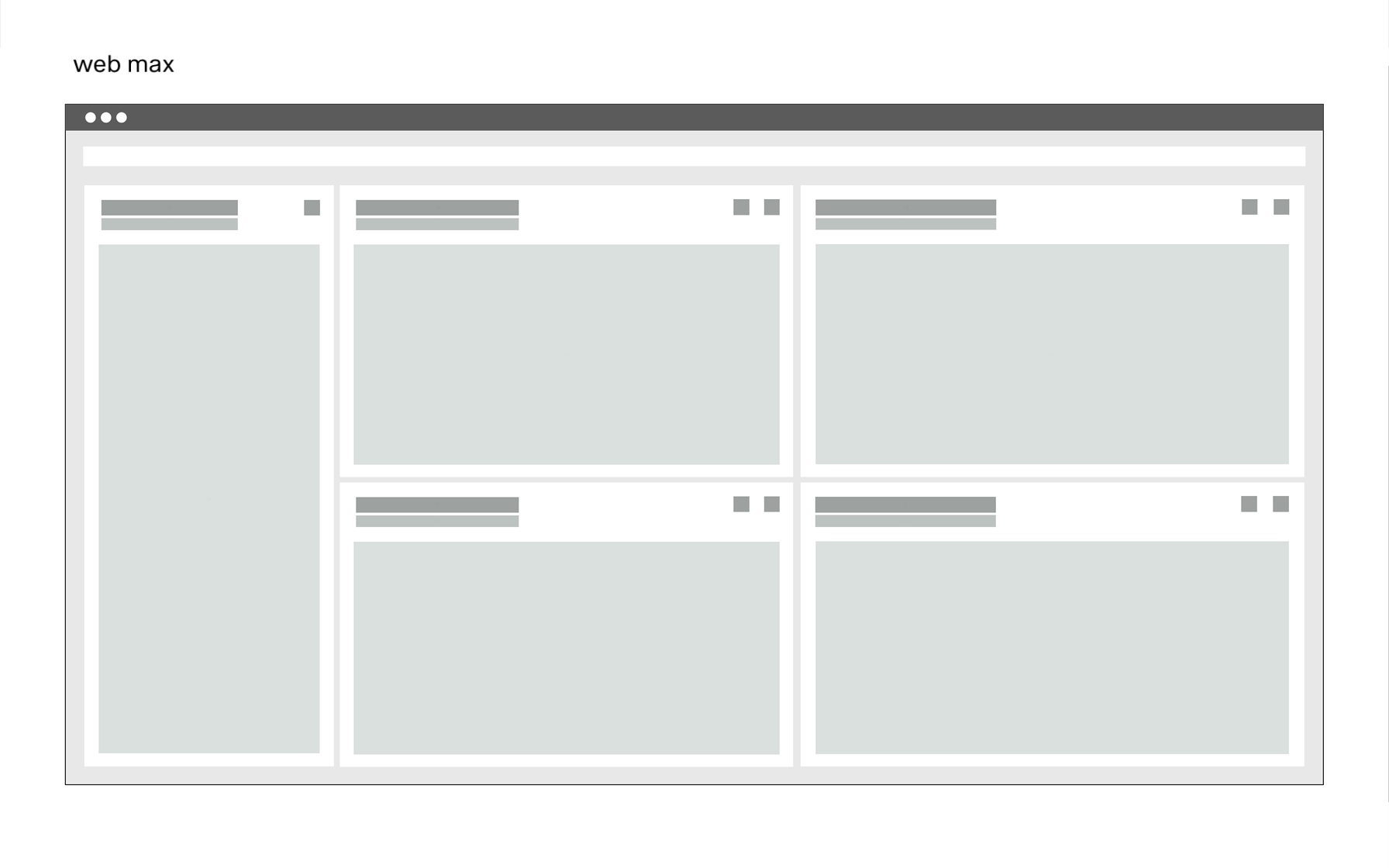
- Web max(1920x1080)
- Web min(1280x800)
- Tablet landscape (1024x768)
- Tablet portrait (768x1024)
- Smartphone portrait (375x667)