Page History
Table of contents
- The 24 Columns Grid
- Spacing and Details - The 24 Columns Gutter
- EdgeOne Dashboard examplex
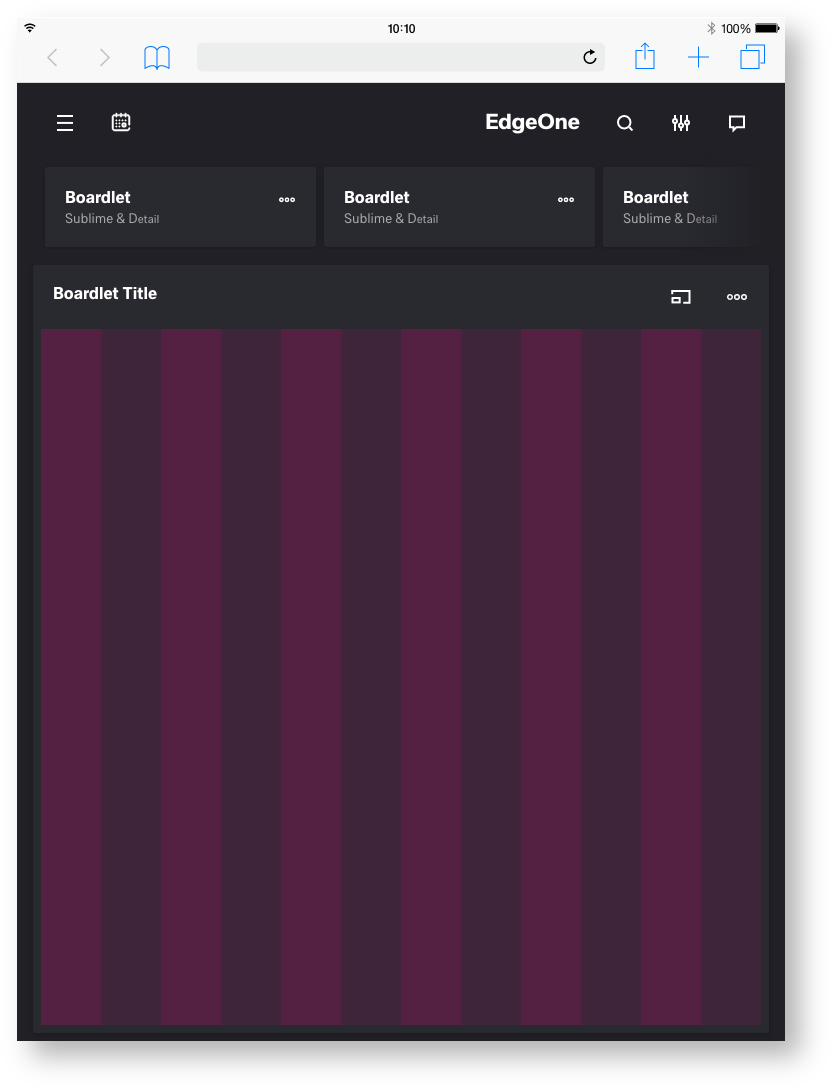
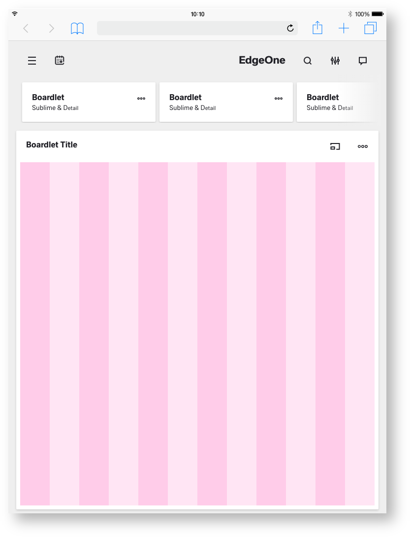
- Best Practice Dark and Light Theme - X-Series Dashboard example
- Best Practice Dark and Light Theme - Two different Boardlets-Grids
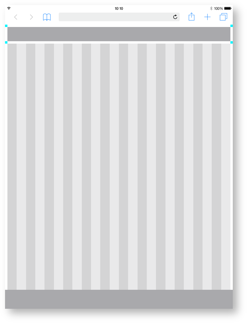
The 24 Columns Grid.
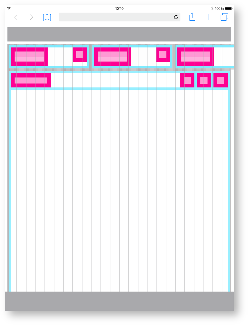
The foundation of the design system is the modified bootstrap frontend grid. this grid has 24 columns within the dashboard and 12 columns within the boardlets. The dashboard is divided into two parts, header and content area. The 24 Columns Grid only applies within the content area. The grid has no column space, all distances are solved via the margin.
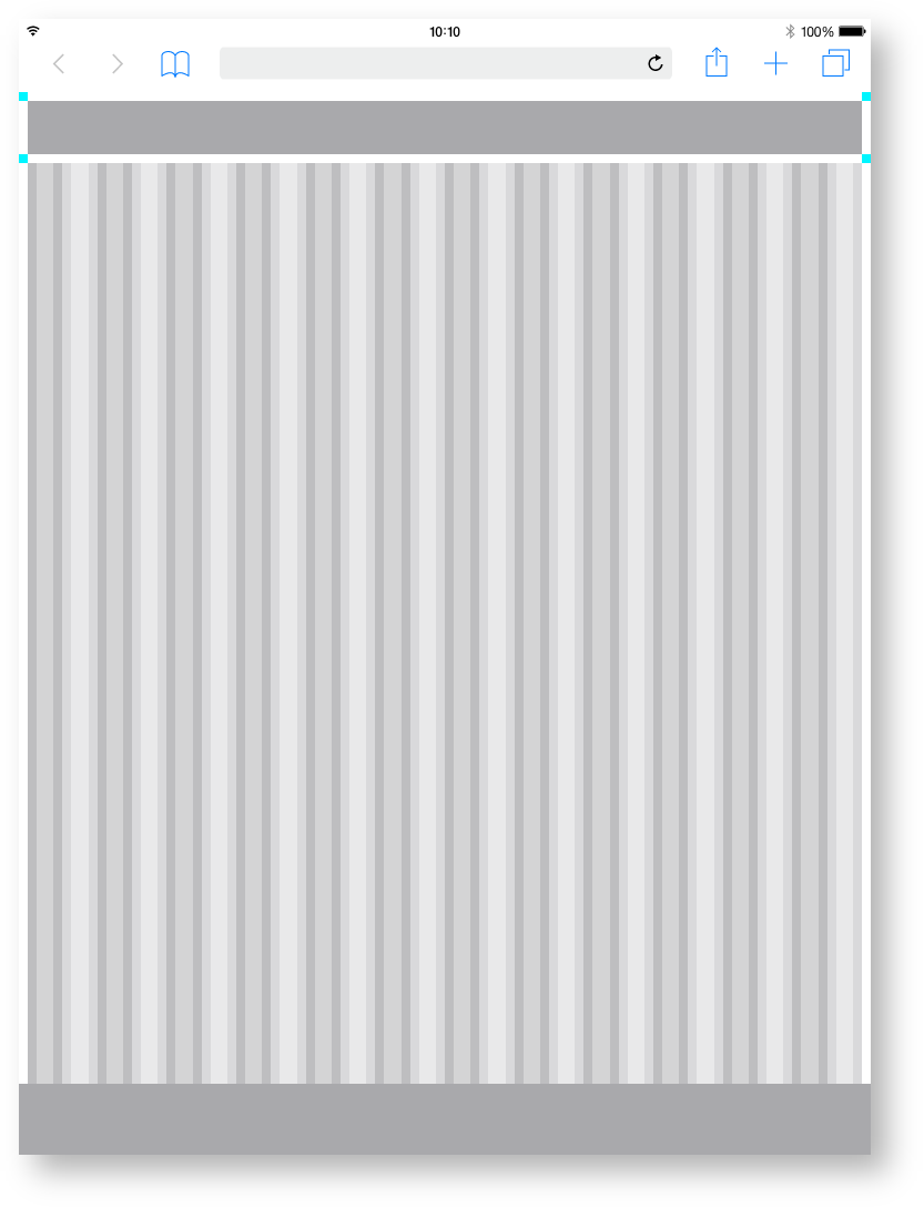
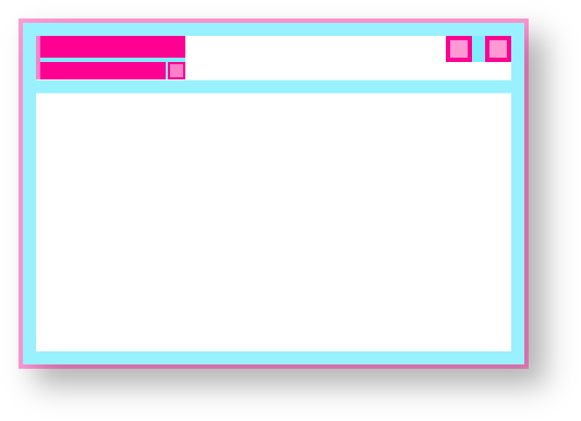
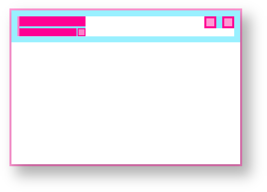
The 24 Columns Gutter.
Gutters may be missing as shown left or present as shown left. For closely related content, you should consider an Gutters free layout. Use the gutter if the content requires more separation.
Spacing of the
Tablet portrait.
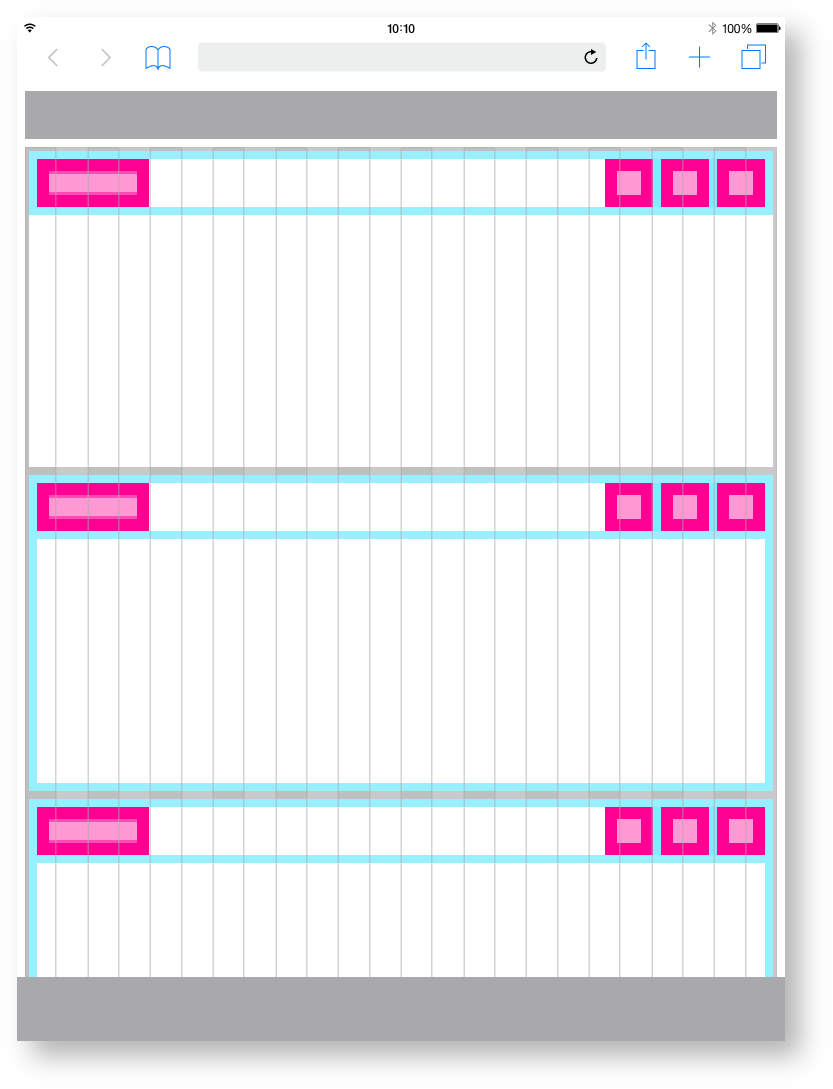
Here you can find all important values for building the Tablet portrait grid. The grid is divided into two main containers. the header area and the content area.
| Base | px | rem |
|---|---|---|
| Breakpoint | ≥576px | n.n |
| Width | 768 | 48 |
| Height | 1024 | 64 |
| Grid & Header Padding | 12 | 0.75 |
| Content Area | ||
| Columns | 24 | - |
| Column Width | 31 | 1.938 |
| Gutter | 12 | 0.75 |
| Header Area | ||
| Header | 48 | 3 |
| Icon max | 48 | 3 |
| Icon min | n.n | n.n | Space between | 8 | 0.5
Zeplin Documentation:
Download Inspire Design KIT:
http://www.ronoemus.com/Brand_x/032020_DESIGN_KIT_INSPIRE_V1.1.zip
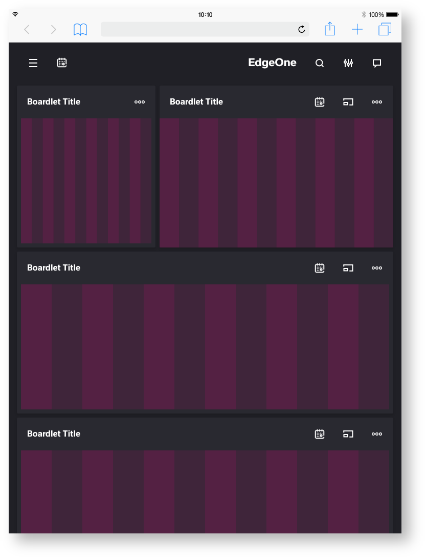
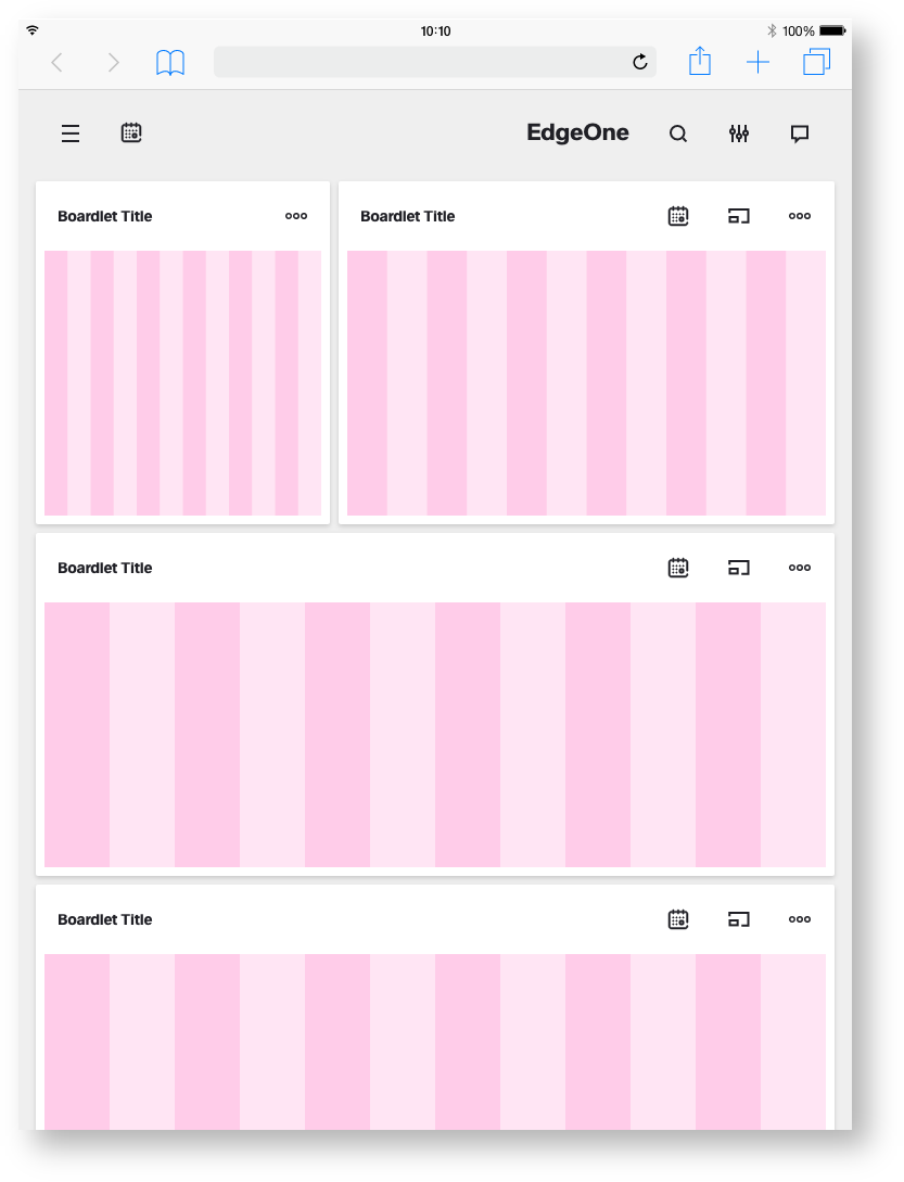
EdgeOne Dashboard example.
In this example, you can see how the 12-column grid behaves within the differently sized boardlets. Here you can also see why the grid does not have a column space. This would mean that the spaces within the boardlets would be different widths. For this reason, distances are determined by margin.
This is how the division of the boardlets within this representation could look like. The Edge One/dSFM layout serves as an example.
X-Series Dashboard example.
In this example, you can see how the 12-column grid behaves within the differently sized boardlets. Here you can also see why the grid does not have a column space. This would mean that the spaces within the boardlets would be different widths. For this reason, distances are determined by margin.
This is how the division of the boardlets within this representation could look like. The X-Series/Objective layout serves as an example.
| Info | ||
|---|---|---|
| ||
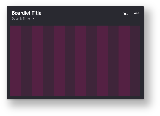
Two different Boardlets Grids.
There are basically two different boardlet grids. One for graphic content and one for regular content. These differ only slightly in padding.
More Details about Boardlets you will find here:
| Children Display | ||||||
|---|---|---|---|---|---|---|
|
Regular content

content

