Page History
Basic
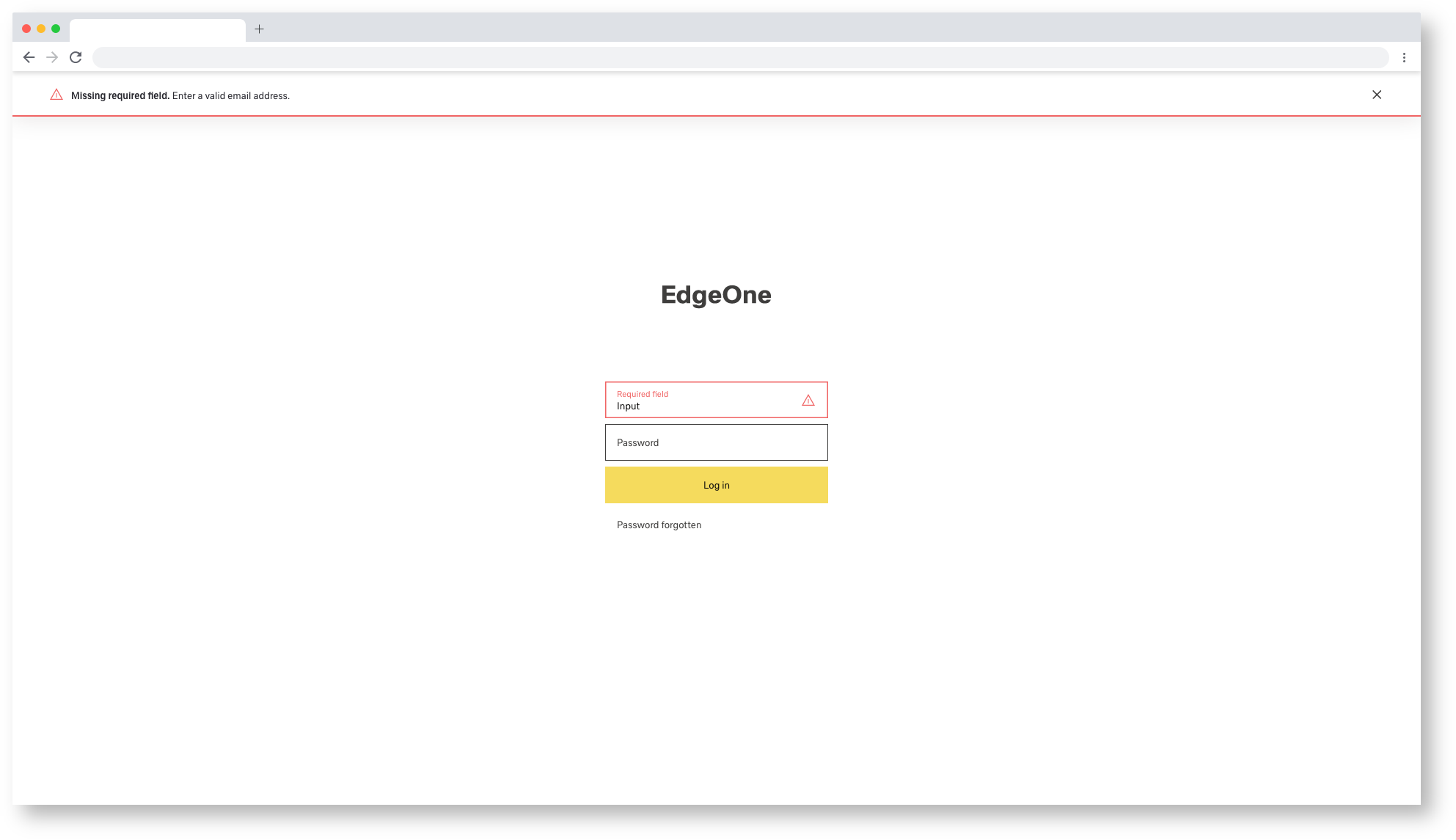
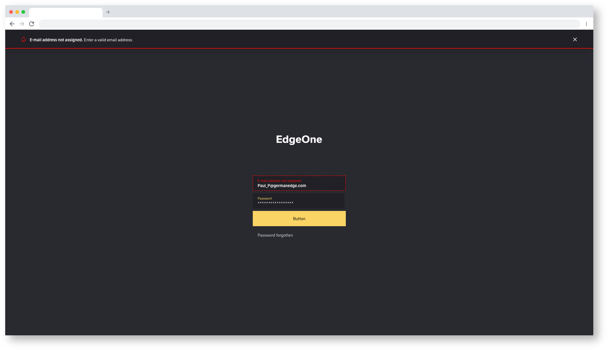
Use notifications to inform users about updates or changes to the system status. Communicating with users and providing immediate feedback is important for building trust. Although notifications are an effective way to communicate with users, they are disruptive and should be used sparingly. There are two standard notifications:
| Table of Contents | ||
|---|---|---|
|
Formatting
The notifications use a fixed width and their height depends on the length of the message. Inline notifications appear below the browser header. A later application of flexible inline notifications is not excluded but currently not planned. Toast notifications appear in the upper right part.
1920/Inline-Notification
1920/Toast-Notification
Overview
System information and notifications offer only limited space for content, so the content must be short and concise. A user should be able to quickly understand the notification, be informed about the situation and know what to do next.
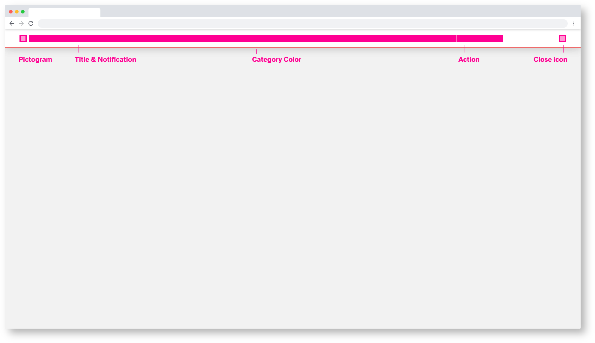
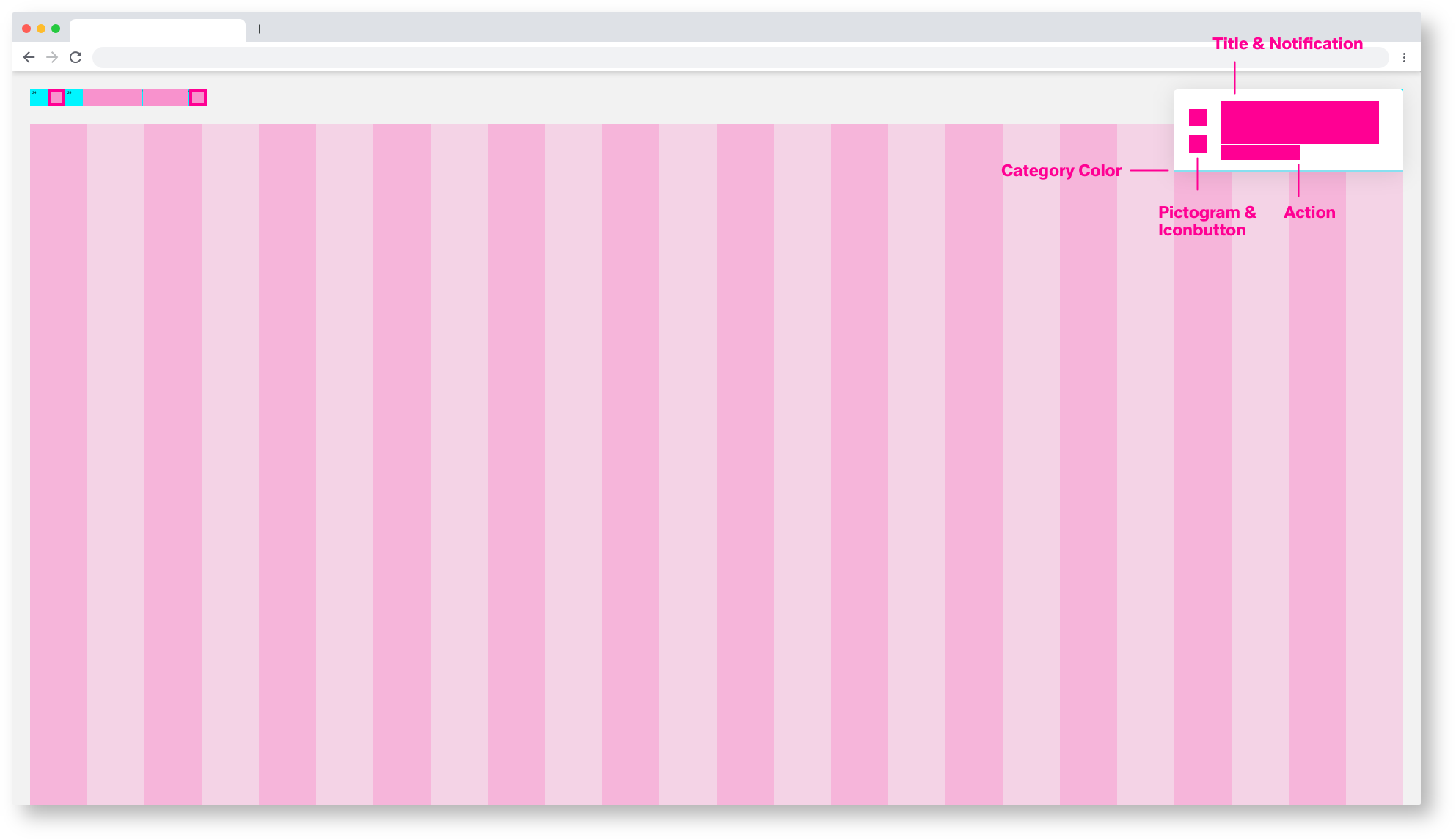
Pictogram
The pictogram should visually support the title and content of the notification. The pictogram replaces the category colour within the barrier-free presentation. For more information, see the section on accessibility.
Category Color
The category colour gives an indication of the type and importance of the notification. Here it is possible to color the pictogram, the action link and the lower category color bar in the respective color.
Action Link
You can insert links within the notification body to direct the user to the next steps. Do not confuse the user with too many possibilities. Two actions, perform action and do not perform action, are sufficient.
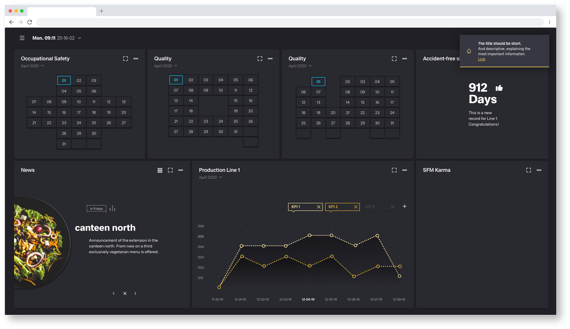
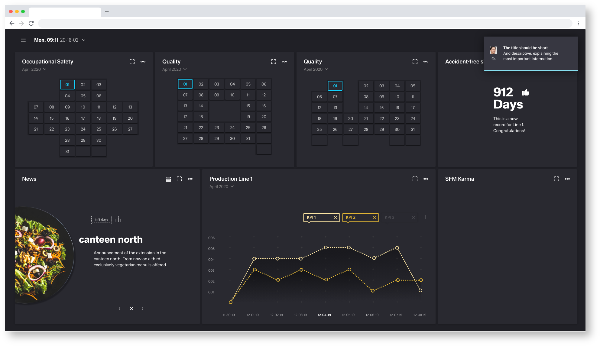
Titel & Notification
The title should be short and descriptive, explaining the most important information. If possible, communicate the main message by the title alone. Limit the content to one or two short sentences. Explain how the problem can be solved by stating any troubleshooting actions or next steps.
If a system information or notification requires a message that is longer than two lines, add a "Show more" link that takes the user to a view of the full notification message.
Inline Notification
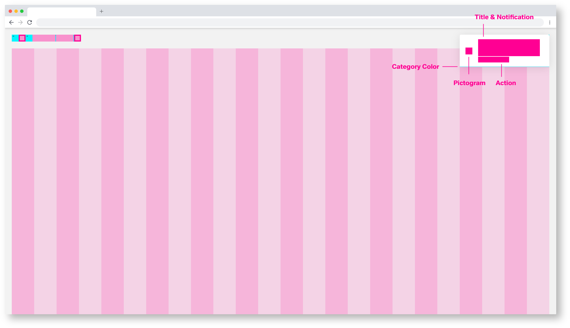
The inline notification is used for error handling. Important alarms, warnings, notes and system infos are displayed here. The inline notification is not automatically hidden and can only be removed by actively closing the user. The pictograms are freely selectable but must clarify the content of the message. The inline notification always consists of the same molecules, but the atoms can vary.
1920/Inline-Notification molecules
1920/Inline-Notification atoms
Inline Notification Theming
All templates and pages exist in two themes, the Astronaut(light) and the Tokyo at Night Theme(dark).
1920/Inline-Notification Astronaut
1920/Inline-Notification Tokyo at Night
Inline Notification Animation

1920/Inline-Notification Astronaut
The inline notification is not automatically hidden and can only be removed by actively closing the user.
But after the user has corrected the error, the Inline Notification is automatically hidden.
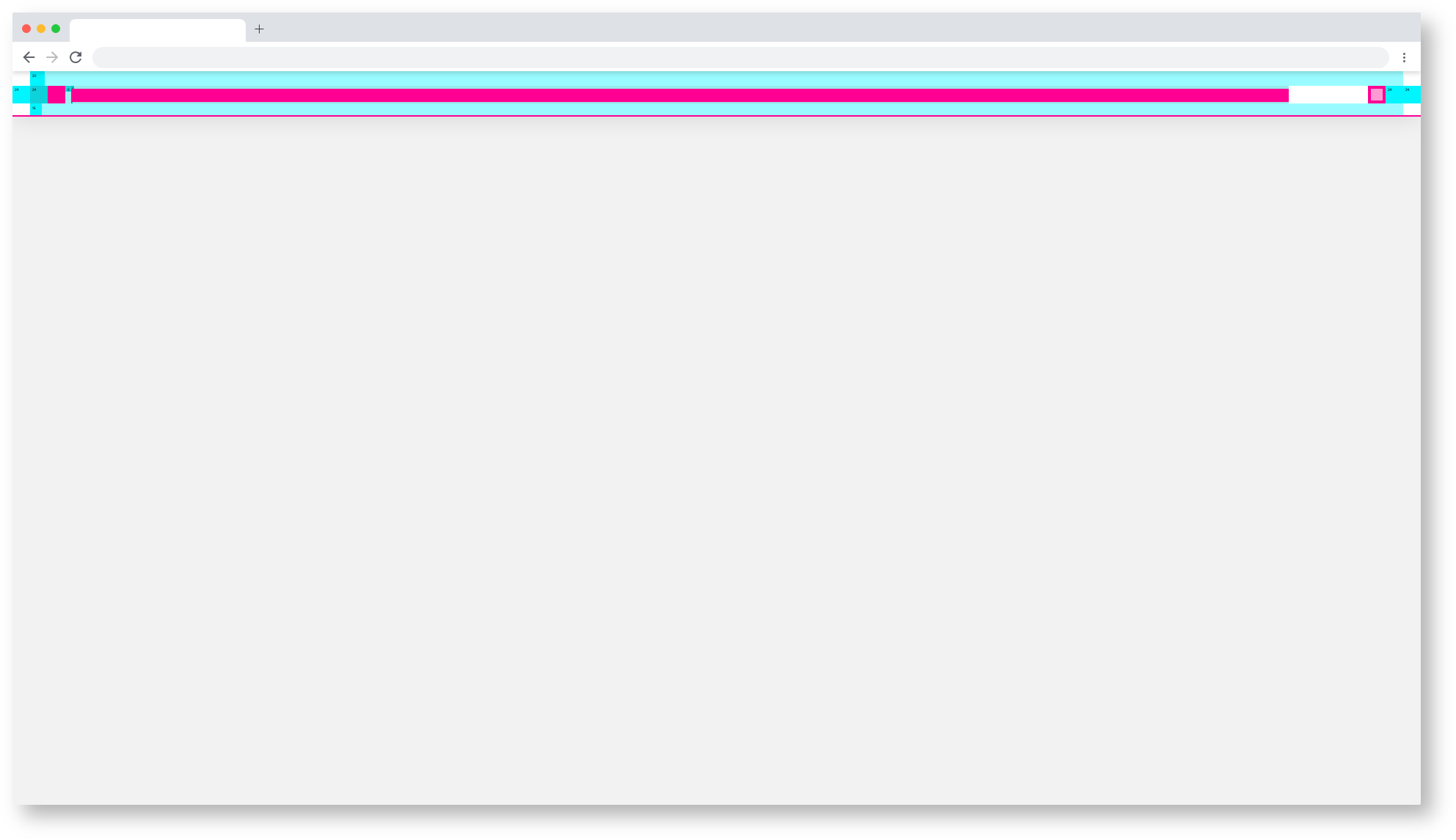
Toast-Notification
Toast notification is used to inform the user about content. updates, emails, chat etc. The Toast Notification fades out automatically after the category color bar has expired. How long is freely selectable. There are currently 2 different Toast Notifications, The Notification and the Message. These differ in the atoms but not in the molecules.
| Info | ||||
|---|---|---|---|---|
| ||||
Astronaut: https://zpl.io/amAP43Q |
1920/Toast-Notification molecules
 1920/Toast-Notification atoms
Toast Notification Theming
All templates and pages exist in two themes, the Astronaut(light) and the Tokyo at Night Theme(dark).

1920/Inline-Notification Astronaut
1920/Inline-Message Astronaut
 1920/Inline-Notification Tokyo at night
1920/Inline-Message Tokyo at night
Toast-Notification Animation
