Page History
The overlay serves as a focus aid for all components that are to be lifted from the dashboard. The overlay also has a column grid, this grid is similar to the Dashbord Column Grid.
Currently the overlay can be used for these applications:
| Table of Contents |
|---|
Basic Overlay
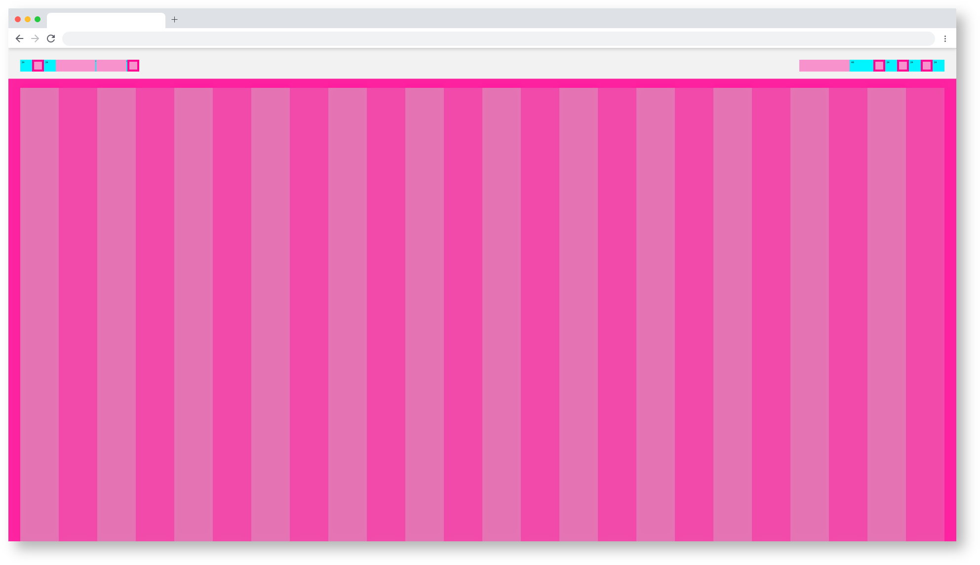
1920 Basic Overlay definition
| Info | ||||
|---|---|---|---|---|
| ||||
here you will find the handover and the Styleguide of this componente: Astronaut: https://zpl.io/b6d0Y8R Tokyo at Night: soon |
1920 Basic Astronaut Overlay
1920 Basic Tokyo Overlay
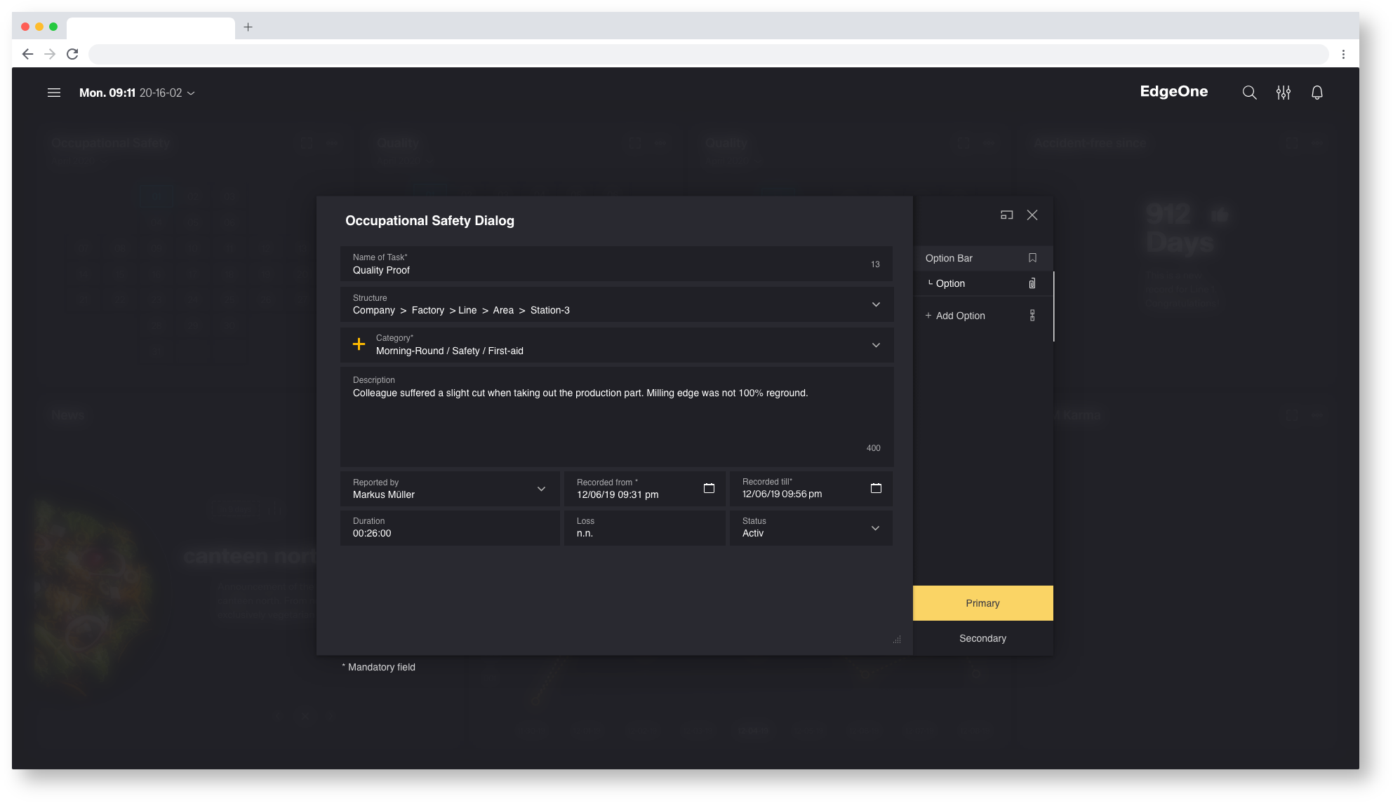
Dialog Overlay
Der Dialog passt sich an den Column-Grid des Overlays an. Welche Dimensionen der Dialog besitzt ist vom unterschiedlichen Inhalt abhängig. Mehr darüber erfahren Sie im Thema Dialog.
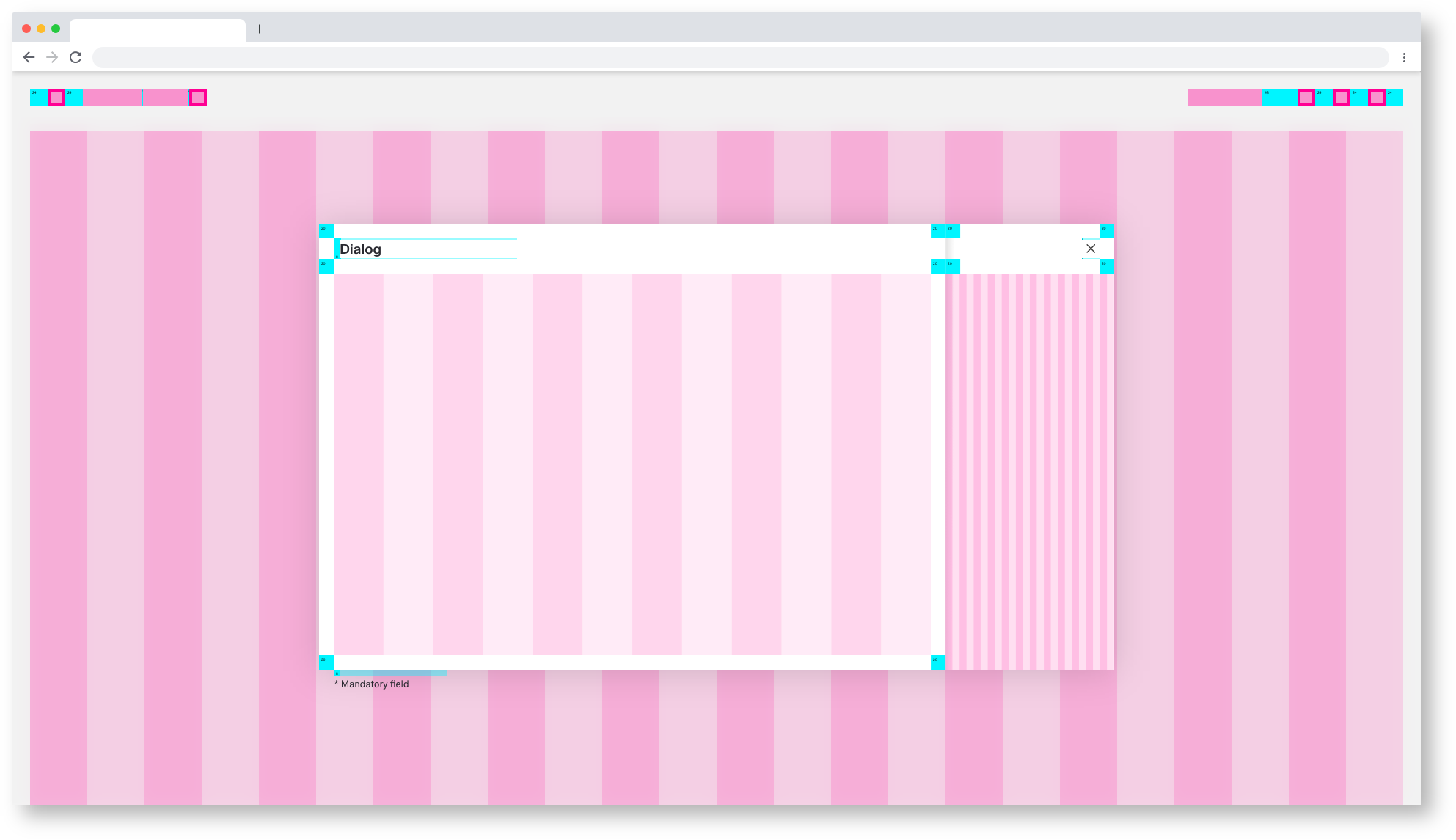
1920 Dialog Overlay definition
| Info | ||||
|---|---|---|---|---|
| ||||
here you will find the handover and the Styleguide of this componente: Astronaut: https://zpl.io/VQX5AvP Tokyo at Night: soon |
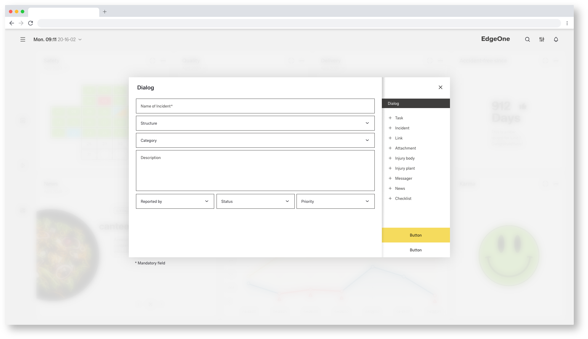
1920 Astronaut Dialog Overlay
1920 Tokyo at Night Dialog Overlay
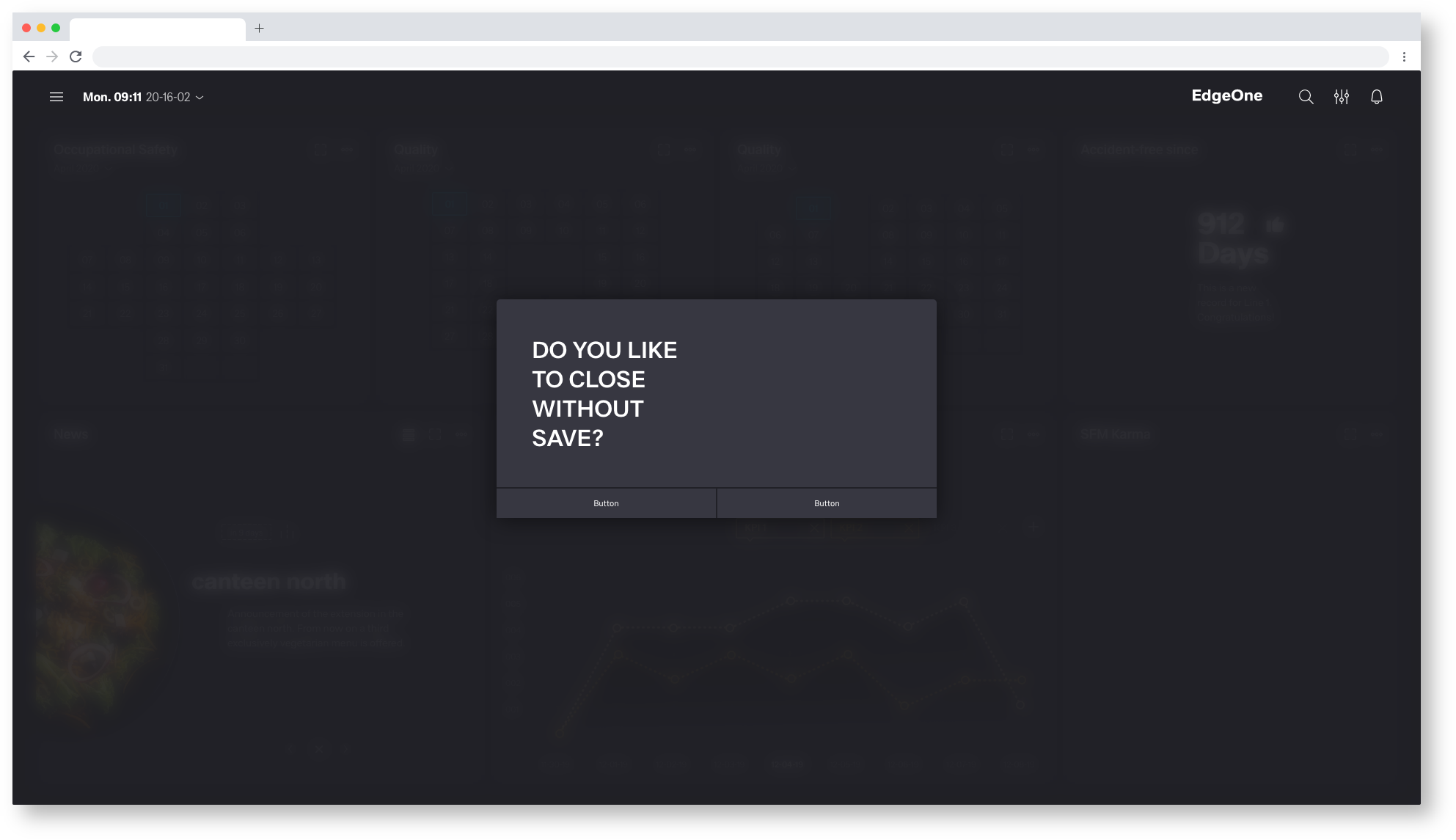
Popup Overlay
Als Popup eignen sich alle möglichen Informations-Module oder Eingabe-Module. Das Modul passt sich an den Column-Grid des Overlays an. Welche Dimensionen das Modul besitzt ist vom unterschiedlichen Inhalt abhängig. Mehr darüber erfahren Sie im Thema Modul.

1920 Popup Overlay definition
| Info | ||||
|---|---|---|---|---|
| ||||
here you will find the handover and the Styleguide of this componente: Astronaut: https://zpl.io/2pGJrvN Tokyo at Night: soon |

1920 Astronaut Popup Overlay
1920 Tokyo at Night Popup Overlay