Maintaining consistent and engaging digital experiences within Germanedge, whether applications or experiences, requires a sensitive use of color. The following color concepts form the basis for our efforts to create a unique user interface design. The color world of our user interface "Inspire" is clean and reduced.
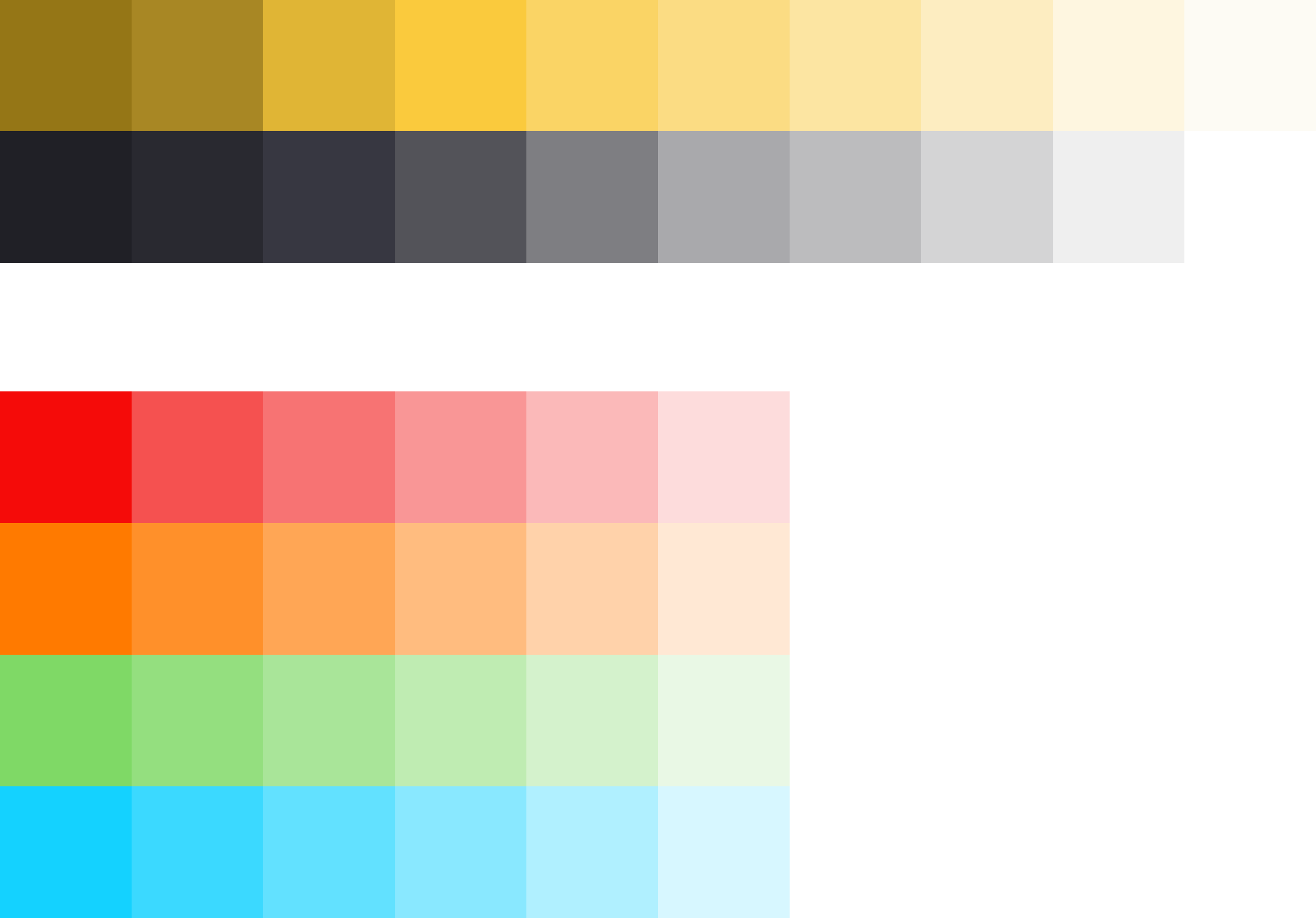
The colour system is based on 2 main colours, the brand colour and the primary colour "Tokyo". The two colours together, because they are complementary to each other, result in a rounded colour picture. In addition, various alarm colours are added, but it should be noted that the alarm colours never resemble the brand- and primary colours.
The color palette of Germanedge is basically divided into two different themes. The "Daylight" and "Nightshift" theme. The color palette of each theme brings a uniform and recognizable consistency to our interface.
The anatomy of the Germanedge colours.
As the basis for both themes, the neutral "Tokyo" colour family dominates, separating the contents with subtle nuances. It is important that the nuances do not run into each other. The yellow brand colour is the primary action colour for all Germanedge products and experiences. Additional colours are used sparingly and purposefully.
UI Tab
title
Usage
The themes.
The themes serve as a framework for colour worlds within Inspire, with each theme based on a specific primary background colour. There are two standard themes. The Daylight theme "Astronaut" and the Nightshift theme"Tokyo at Night".
Nightshift Theme Colors Here you will find all colors that can be used in this theme.
Tokyo Colors
Brand Colors
Alerts Colors
#hex
#hex
Danger
#hex
Warning
#hex
Success
#hex
Note
#hex
Tokyo 100
#202026
Brand 100
#957616
Danger 100
#F50B09
Warning 100
#FF7A00
Success 100
#7FD966
Note 100
#14D2FF
Tokyo 90
#292930
Brand 90
#A88724
Danger 80
#F55150
Warning 80
#FF902A
Success 80
#94DF7F
Note 80
#3BD9FF
Tokyo 80
#373741
Brand 80
#E0B535
Danger 60
#F77373
Warning 60
#FFA655
Success 60
#A9E599
Note 60
#62E1FF
Tokyo 70
#535359
Brand 70
#FACA3D
Danger 40
#F99696
Warning 40
#FFBC7F
Success 40
#BFECB2
Note 40
#89E8FF
Tokyo 60
#7E7E82
Brand 60
#FAD465
Danger 20
#FBB9B9
Warning 20
#FFD2AA
Success 20
#D4F2CC
Note 20
#B0F0FF
Tokyo 50
#A9A9AC
Brand 50
#FBDC83
Danger 00
#FDDCDC
Warning 00
#FFE8D4
Success 00
#E9F8E5
Note 00
#D7F7FF
Tokyo 40
#BCBCBE
Brand 40
#FCE5A2
Tokyo 30
#D4D4D5
Brand 30
#FDEDC1
Tokyo 20
#EFEFEF
Brand 20
#FEF6E0
Tokyo 10
#FFFFFF
Brand 10
#FDFBF4
Daylight Theme Colors Here you will find all colors that can be used in the theme.
Tokyo Colors
Brand Colors
Alerts Colors
#hex
#hex
Danger
#hex
Warning
#hex
Success
#hex
Note
#hex
Astronaut 100
#0F0E0D
Brand 100
#BE9C38
Danger 100
#F06464
Warning 100
#FDB225
Success 100
#9FDB57
Note 100
#87DFF0
Astronaut 90
#272625
Brand 90
#D9B23D
Danger 80
#F17575
Warning 80
#FDBA3D
Success 80
#A9DF69
Note 80
#94E2F1
Astronaut 80
#3F3E3D
Brand 80
#F2D43D
Danger 60
#F38686
Warning 60
#FDC355
Success 60
#B4E37C
Note 60
#A1E6F3
Astronaut 70
#575655
Brand 70
#F5DB5D
Danger 40
#F59797
Warning 40
#FDCB6D
Success 40
#BFE78F
Note 40
#AFE9F5
Astronaut 60
#6F6E6D
Brand 60
#F7E06F
Danger 20
#F6A8A8
Warning 20
#FDD485
Success 20
#C9EBA1
Note 20
#BCEDF6
Astronaut 50
#878686
Brand 50
#F7E692
Astronaut 40
#B7B6B6
Brand 40
#F8EBA7
Astronaut 30
#CFCECE
Brand 30
#F8EFBC
Link
#00AEE2
Astronaut 20
#E7E6E6
Brand 20
#F7F1CF
Astronaut 10
#F2F2F2
Brand 10
#F5F2DE
Highest Contrast
WCAG AA
WEB AIM
UI Tab
title
Code
Code
Preview the link component with the React live demo. For detailed code usage documentation, see the Storybooks for each framework below.


 9.2.15, themed by Refined