Maintaining consistent and engaging digital experiences within Germanedge, whether applications or experiences, requires a sensitive use of color. The following color concepts form the basis for our efforts to create a unique user interface design. The color world of our user interface "Inspire" is clean and reduced.
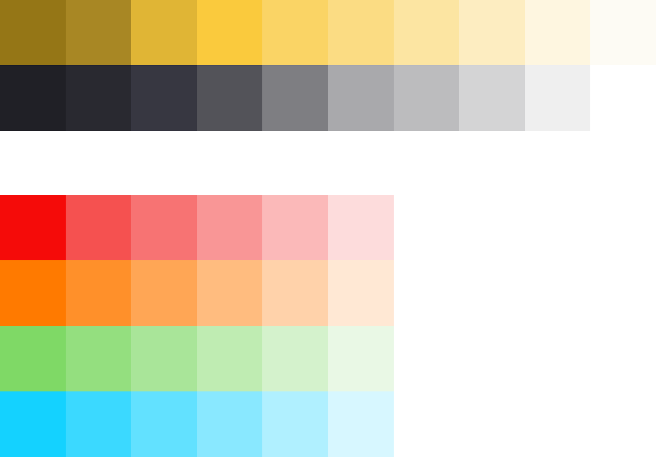
The colour system is based on 2 main colours, the brand colour and the primary colour "Tokyo". The two colours together, because they are complementary to each other, result in a rounded colour picture. In addition, various alarm colours are added, but it should be noted that the alarm colours never resemble the brand- and primary colours.
The color palette of Germanedge is basically divided into two different themes. The "Daylight" and "Nightshift" theme. The color palette of each theme brings a uniform and recognizable consistency to our interface.
The anatomy of the Germanedge colours.
As the basis for both themes, the neutral "Tokyo" colour family dominates, separating the contents with subtle nuances. It is important that the nuances do not run into each other. The yellow brand colour is the primary action colour for all Germanedge products and experiences. Additional colours are used sparingly and purposefully.
The themes.
The themes serve as a framework for colour worlds within Inspire, with each theme based on a specific primary background colour. There are two standard themes. The Daylight theme "Astronaut" and the Nightshift theme"Tokyo at Night".
Highest Contrast
WCAG AA
WEB AIM
UI Tab
title
Usage
Usage of the Astronaut Theme Colors
(tbd)
Usage of Tokyo Theme Colors
(tbd)
#id
Role
Value
?
Default page background
Tokyo 100 #202026
?
Default boardlet background
Tokyo 90 #292930
Tone
Name
Hexadecimal
SCSS variable name
Usage
Highlight palette
Image Removed
Primary Color
#1DC1FD
to be defined
Can be used for links or other elements that we wish to highlight separately.
Image Removed
Brand Color
#FAD465
to be defined
Messages palette
Image Removed
Success Color
#49F45D
to be defined
e.g. Positive confirmation for notifications, entries or actions. Positive feedback for error-free production.
Image Removed
Error Color
#FA3030
to be defined
e.g. negative confirmation for notifications, entries or actions. Negative feedback for dirsturbed production. Used for every kind of error.
Image Removed
Warning Color
#FF9D00
to be defined
Used, for example, for warnings that can occur in production. Unlike the error, the warning is not as critical.
Neutral palette
The various gradations of grey are used to ensure good contrast and legibility. This allows the remaining colours to be optimally displayed.


 9.2.12, themed by Refined