Page History
...
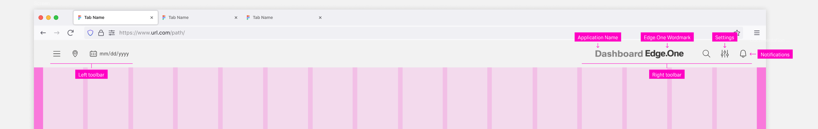
| Primary Actions | Secondary Actions |
|---|---|
| Settings | Search |
| Application Name | Notifications |
| Edge.One Wordmark | Home |
Boardlet toolbar
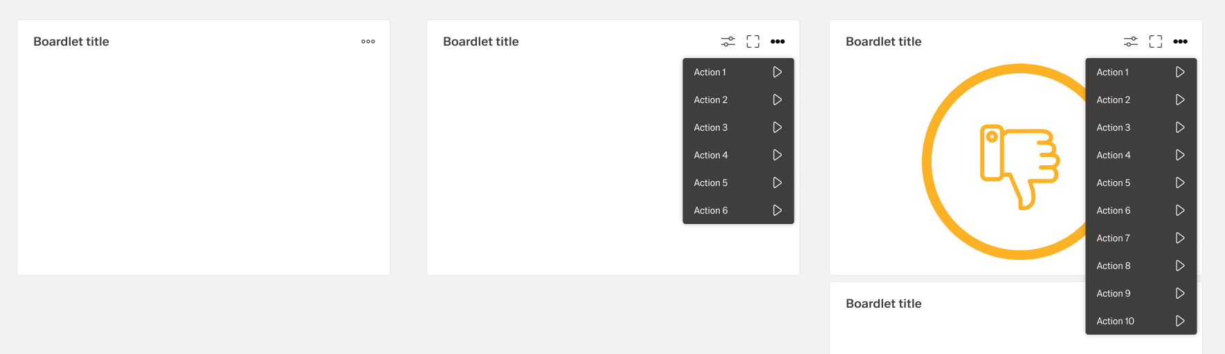
The boardlet toolbar is always on the right side of the boardlet. It controls actions for the boardlet and its content.
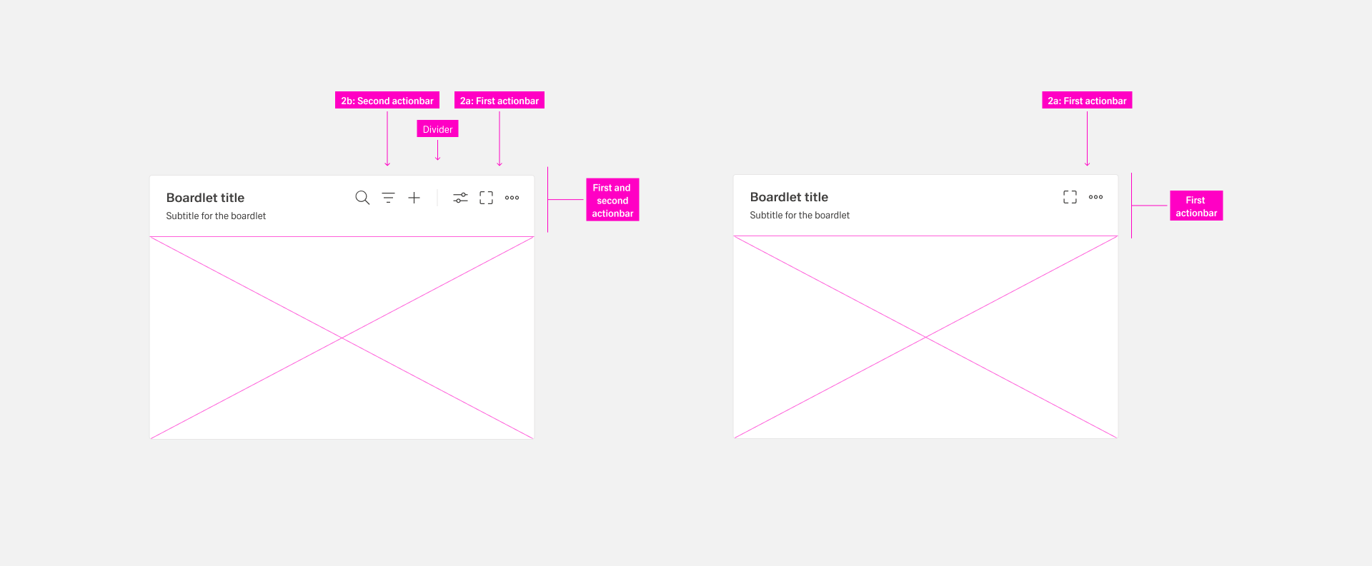
The toolbar can exist in two variations:
...
The actions of the toolbar are divided into primary and secondary. Secondary actions are place inside the overflow menu. The number of secondary actions is not limited. But it is recommended not to place more than 8 actions, because otherwise the overflow menu becomes too long. This can disturb the clarity.
Second Actionbar
The second actionbar is always separated from the first actionbar by a dividing line. The second actionbar contains only actions that can be performed on the content of the boardlet, e.g. filtering and sorting the content, search, adding etc. The second actionbar never be used without the first action bar.
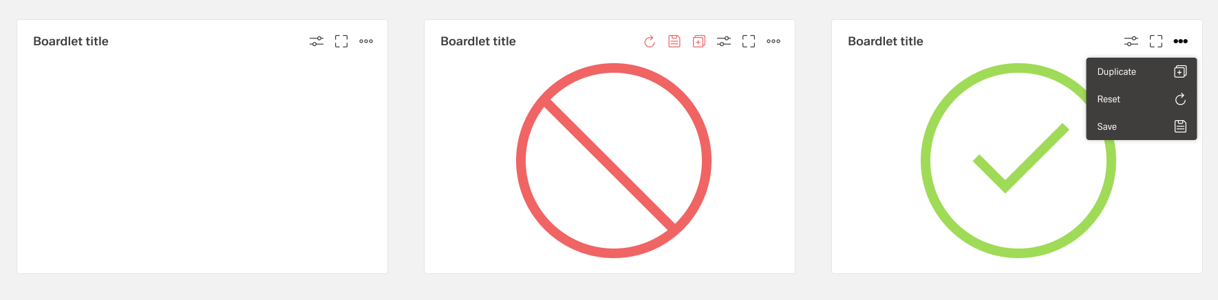
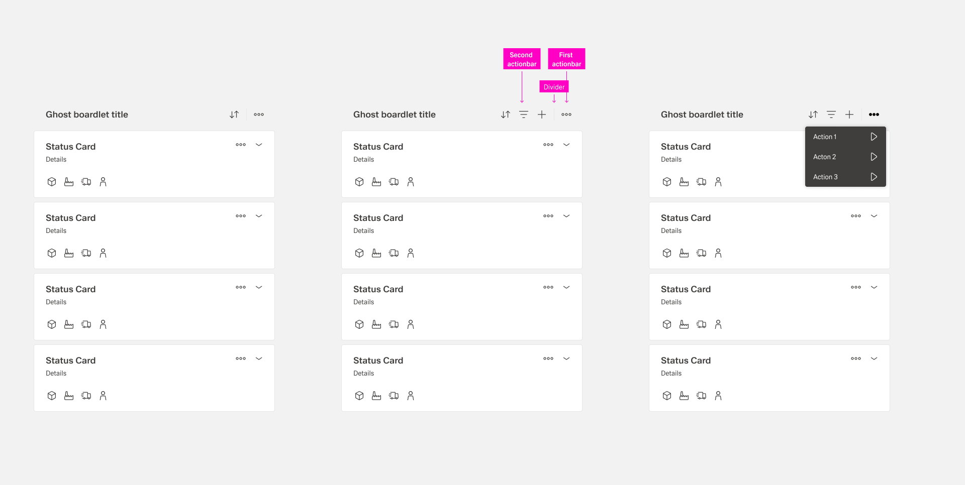
Ghost boardlet toolbar
The ghost boardlet toolbar follows the boardlet rules. Alignment and grouping are the same. The only difference is the first actionbar, which contains only the more action with a dropdown menu.
Card toolbar
The placement and rules of actions inside cards depend on the tye of card:
| Type | Action Placement |
|---|---|
| Interactive Card (Collapsed) | The "More" and "Expand/Collapse" actions are placed in the top right. Further actions might be placed on the bottom left. |
| Interactive Card (Expanded) | Only two actions are allowed: "More" and "Expand/Collapse", placed in the top right corner. |
| Mini Card | Up to six actions icons in two roes of three can be placed at the right side of the card. |
| App Card | Up to three action icons ore one action button can be placed at the top-right side. |
| Conflict Card | The only allowed action is "More", placed in the top-right corner. |
| KPI Card | The only allowed action is "More", placed in the top-right corner. |
| Action Chain Card | The only allowed action is "More", placed in the center-right corner. |
[Image Placeholder: Cards and Action placement]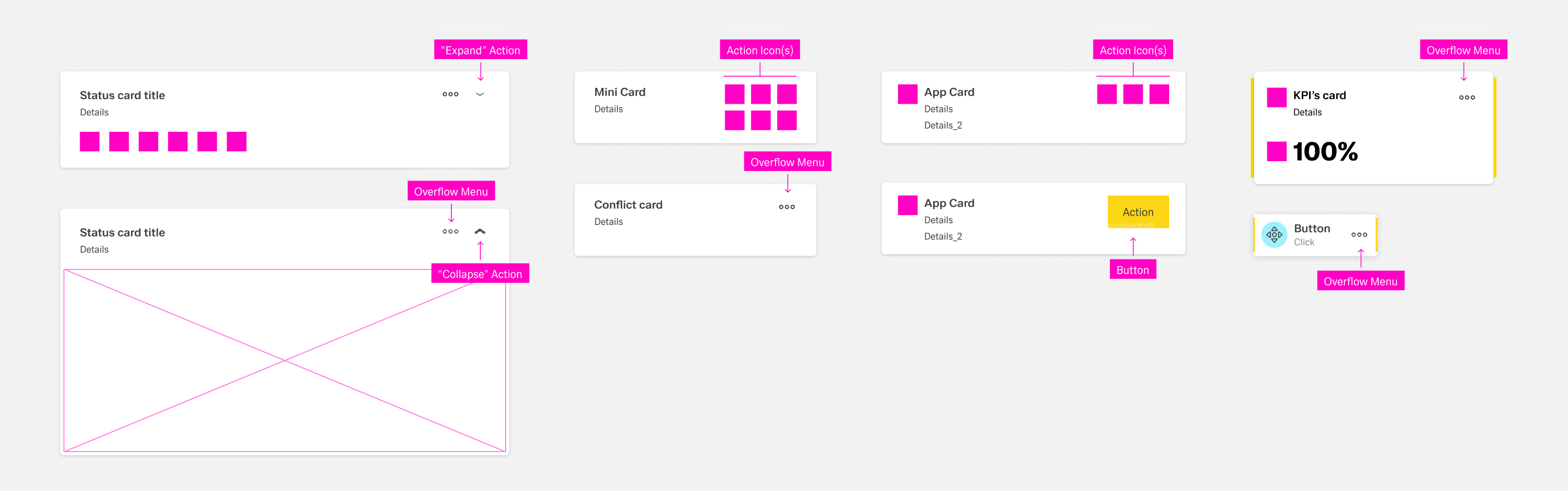
Dialog toolbar
The Dialog Toolbar, as a child of the Boardlet Toolbar, follows its rules. However, the variant "Dialog with Sidebar" is an exception.
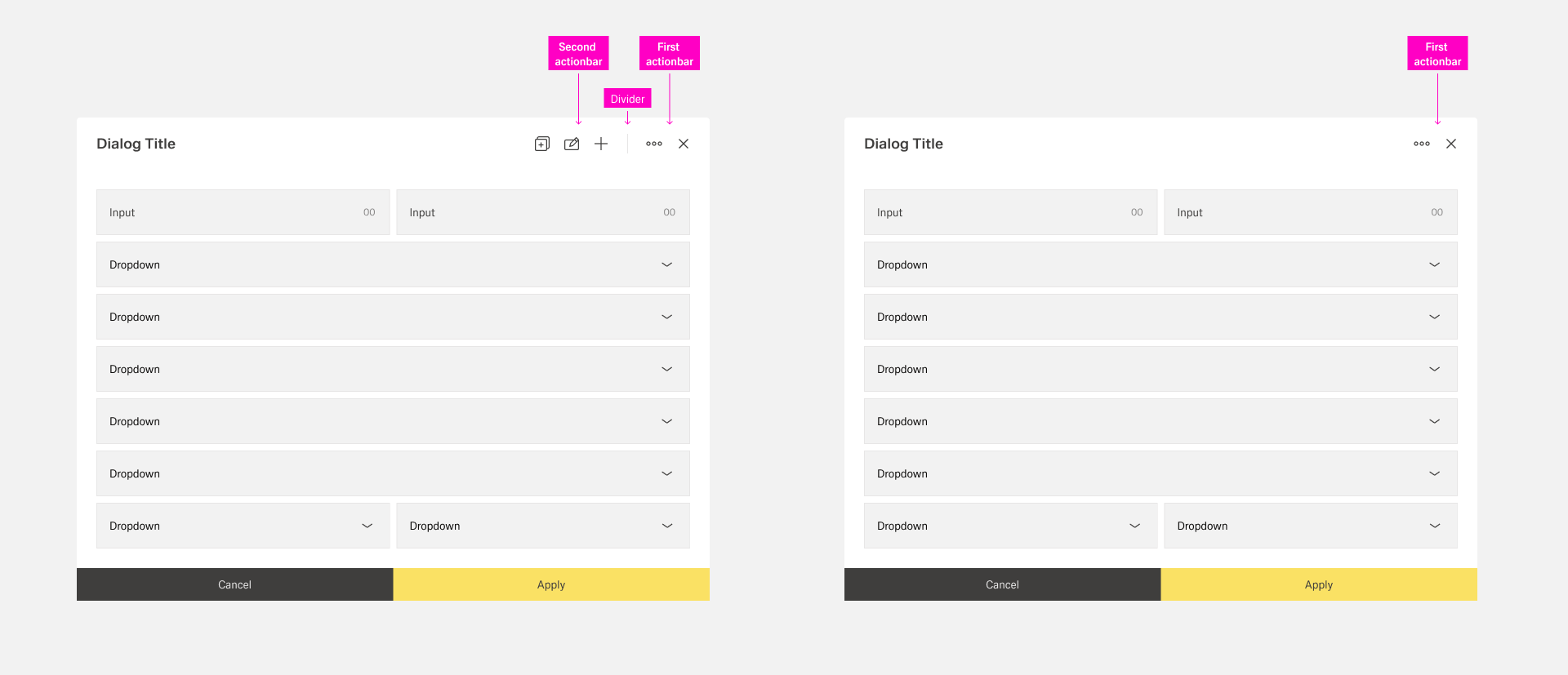
In case a dialog has a sidebar, the first actionbar must be placed in the outer right area of the sidebar. This ensures that the user notices the difference between dialog functions and content functions.
[Image Placeholder: Dialog with and without sidebar]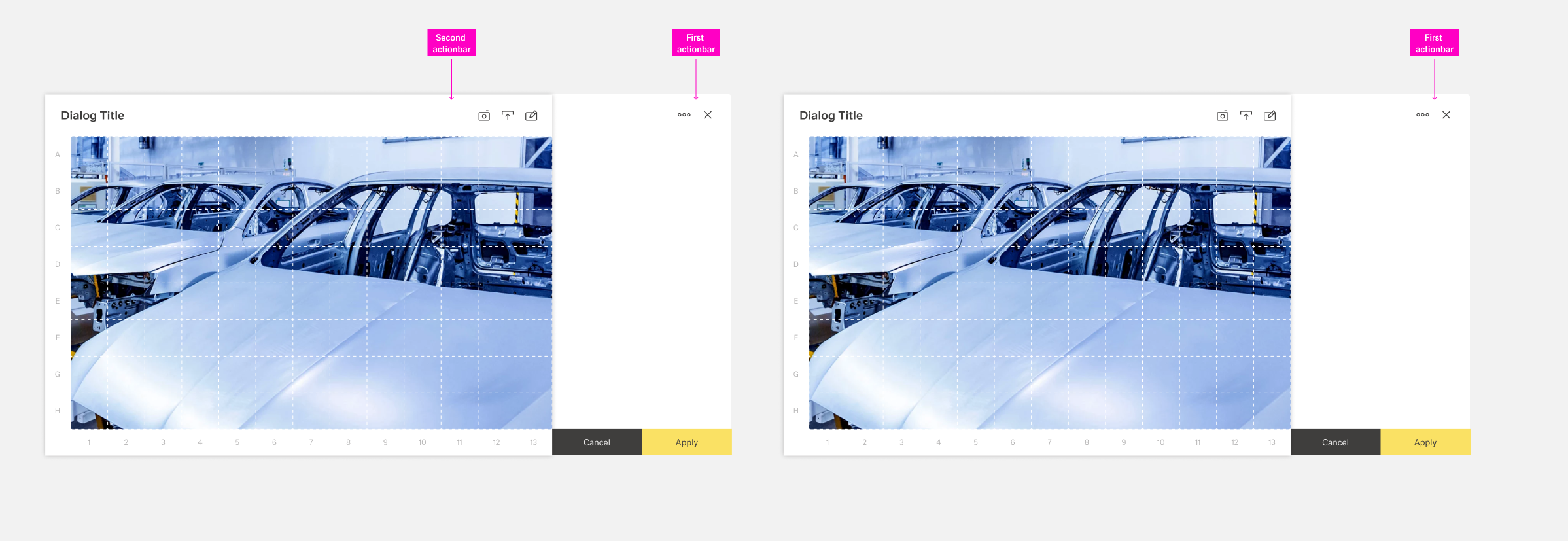
Table row toolbars
...
There are two predefined action: updating and deleting. Additional actions can be placed in the toolbar or a "more" action inside the toolbar. Custom actions inside the toolbar are placed to the right of predefined actions. They have a custom action [icon], a label custom visibility and custom activation.
To enhance clarity, there should never be more than 5 items inside the action toolbar. If more actions are needed, they should be placed inside the [overflow menu] of the more action.
Best Practices
...
Keep the number of visible actions small to preserve clarity. If an organism has a great number of actions, less secondary actions are placed inside an overflow menu with the "more" icon. Avoid more than eight secondary actions in a single overflow to maintain clarity.