Page History
...
Actions: The main actions needed to complete or cancel the dialogue task. Use descriptive words for the actions like Add, Delete, Save and avoid vague words like Done or OK.
A Dialog can vary in the height and width, with the dimensions depending on the context. The width of the modal is based on breakpoints within the window while the content.
Rules on the maximum height of dialogs will follow soon.
Dialog
A dialogue is used when the system requires the user to enter data or perform tasks. The body of the dialogue is variable and can be freely edited. It is only important that the dialogue does not become too long. In such a case, please separate the interaction into partial interactions.
...
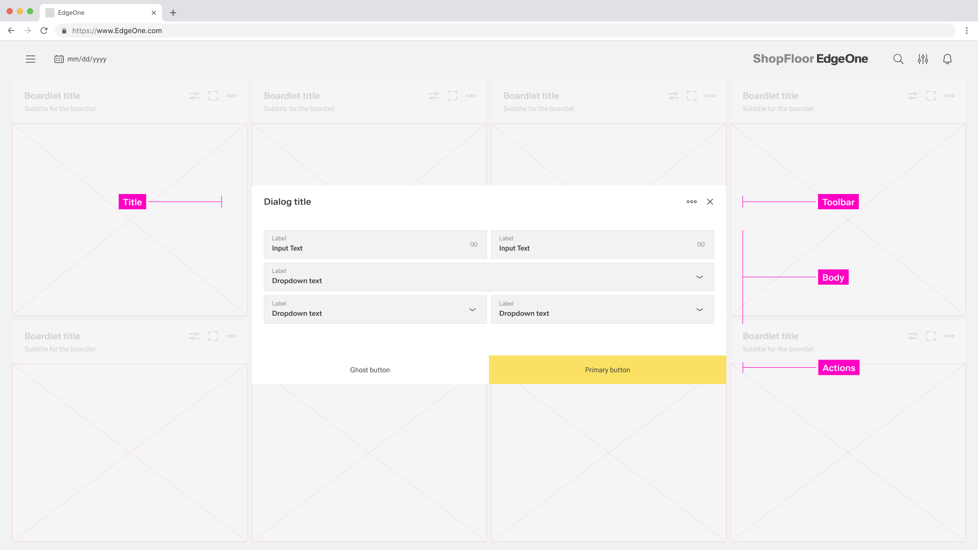
- 01 Dialog Title - The title must be present in each dialog. all assets are set.
- 02 Content Area - Here you can perform all the necessary content. In modal it is not allowed to position actions to another place.
- 03 Action Icons - In the process dialog the action icons are always located in the sidebar
- 04 Process Area - A process can be represented by different assets. these assets are always located in the process area.
- 05 Action Area - Here you can perform all the necessary actions.
Alignment
...
Dismissing non-modal Dialogues
...
- 01 Content Area - Here you can place all your content.
- 02 Action Area - Here you can perform all the necessary actions. In modal it is not allowed to position actions to another place.
Alignment
Dismissing a Modal
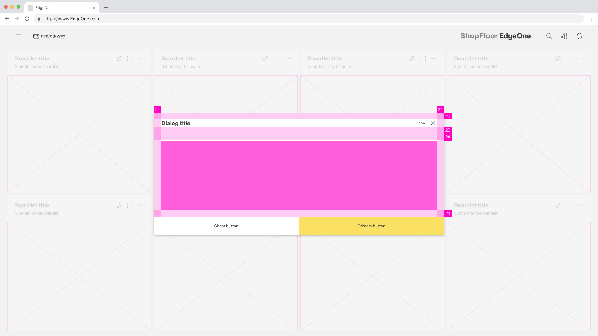
How a modal is dismissed and the effects thereof A Modal can vary in the height and width. The dimensions of the modal depend on the content . The width of the modal is based on the 16 column grid of the dashboard. The height is based on the rows of the grid.
The Modal always has a margin of 8px.

Dismissing a Modal
wip
Best Practices
...
. For more information, read "Use Cases for Modals".
Best Practices
When to use a dialogue
- Use it to focus the user's attention.
- For completing non-simple to complex tasks.
- To collect input from the user.
- To display relevant information.
When not to use a dialogue
- Do not use if the content is unrelated to the current workflow.
- Do not use for displaying complex or large amounts of data.
- Do not display a sub-application or other dashboard in a dialogue box.
- Do not use if the user has not triggered the dialogue.
Button Placement
Look for footerbar actions
When
...
to use what type of Modal
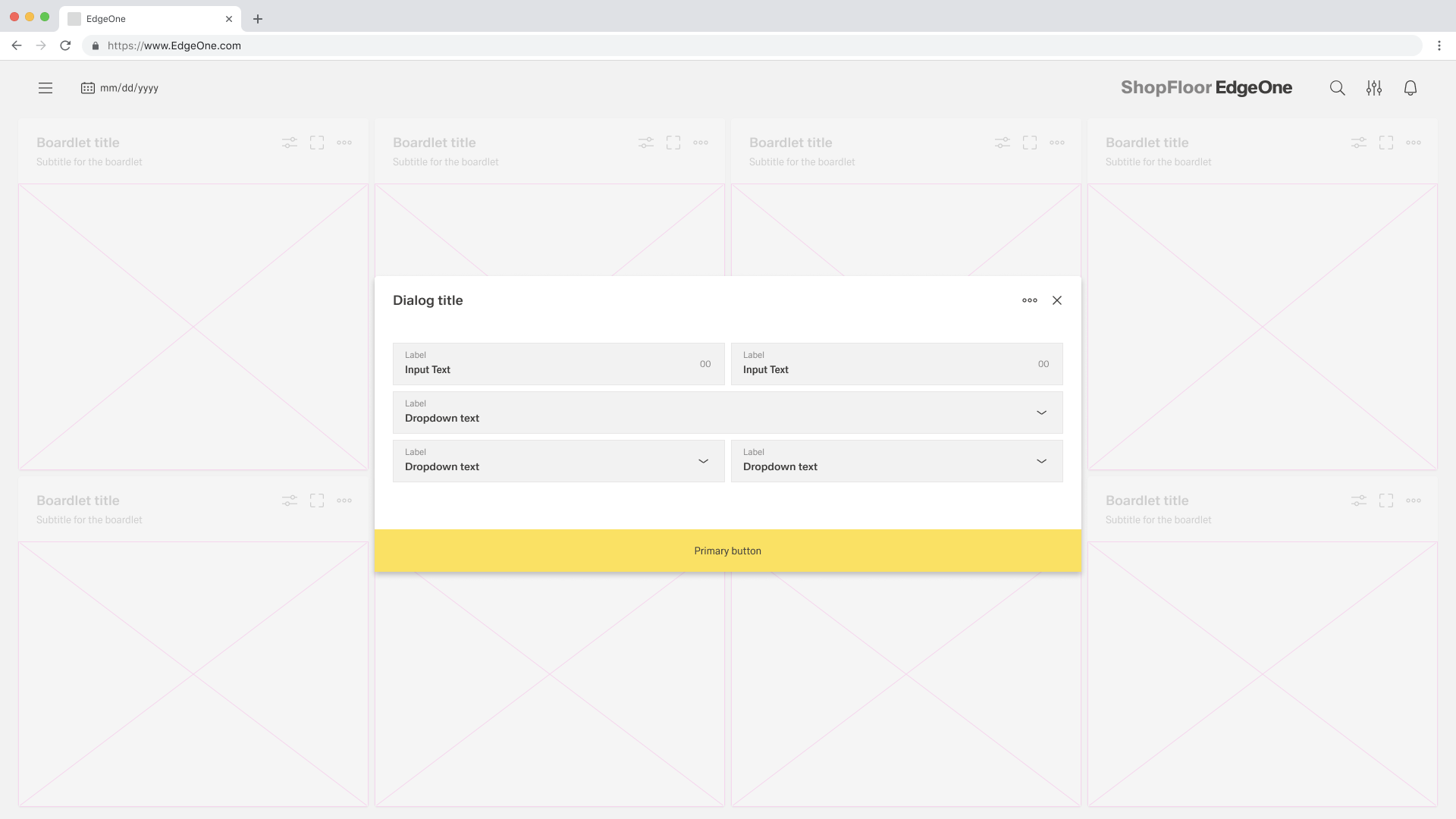
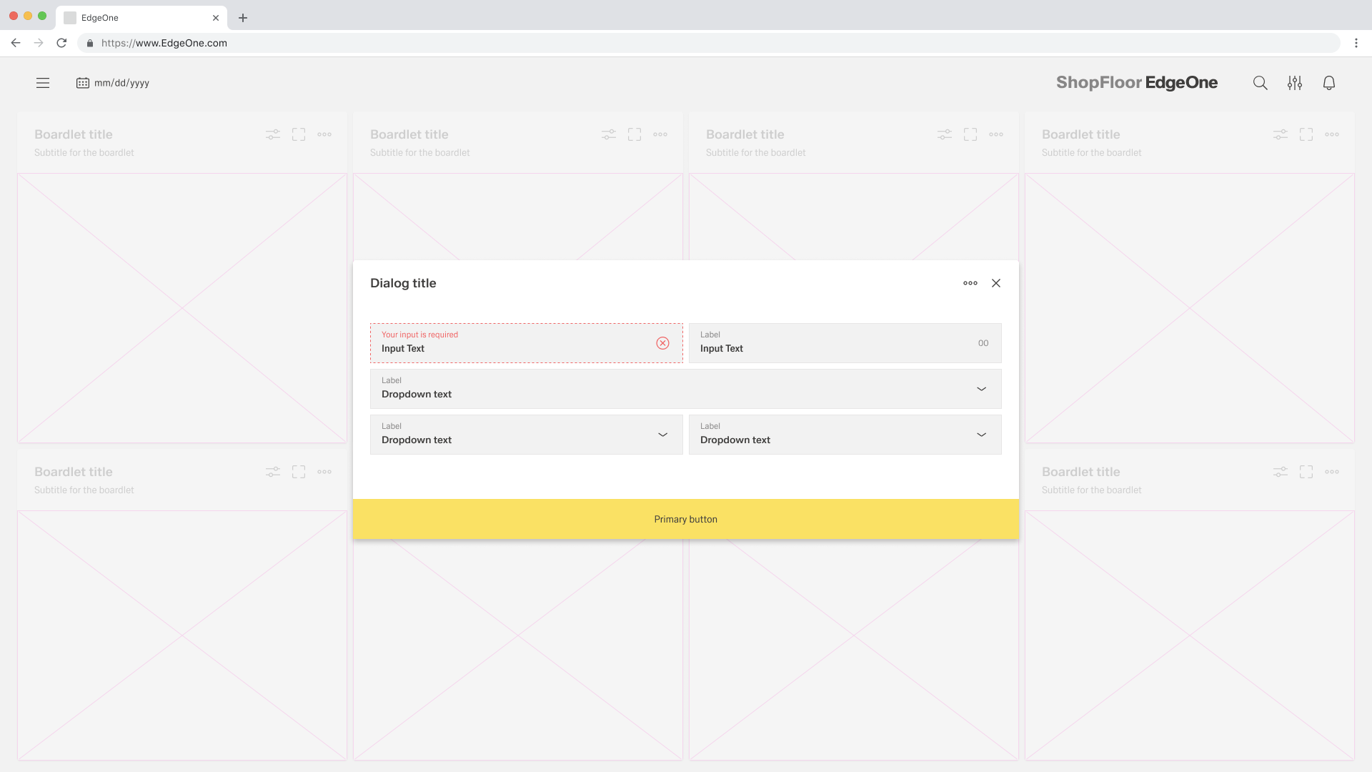
Single buttons are placed across the entire page. The single button format is most commonly used for confirmation dialogues. In most scenarios, a primary button is used when only one button is needed.
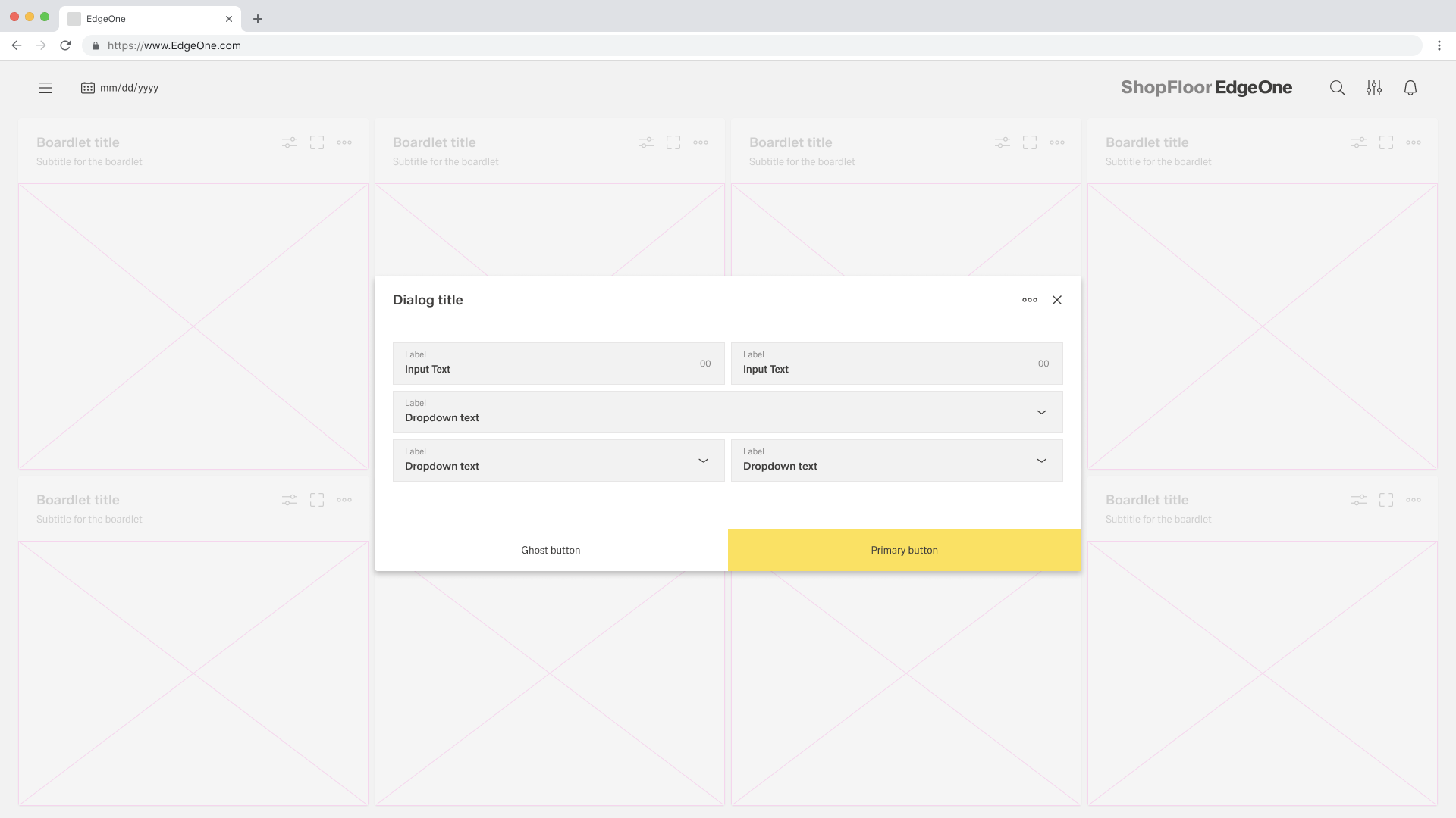
When using two buttons, the secondary or ghost button is on the left and the primary button is placed on the right. Each button spans 50% of the dialog and are full bleed to the edge.
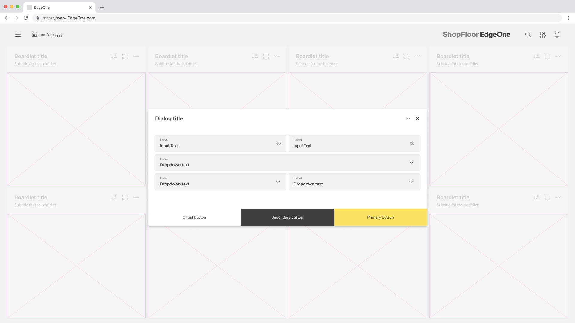
If three buttons are required, each takes up 33.33 % of the dialogue width. Only the rightmost button may be a primary button, the other two are secondary buttons. If all three actions have the same weight, all three should be secondary buttons.
Modals
- Passiv: Presents information the user needs to be aware of concerning their current workflow. Contains no actions for the user to take.
- Active: Requires an action to be taken in order for the modal to be completed and closed. Contains a cancel and primary action button
- Acknowledgement: System requires an acknowledgement of the information from the user. Contains only a single button, commonly "OK".
- Fokus: Focused and action to be taken. Contains a Secondary and Primary action button.
- Progress: Requires several steps to be completed bevor it can be closed. Contains a cancel, previous, and next/completion button.
...
Behaviour
Trigger
Dialogues are triggered by a user's action and not generated by the system. Common components that can trigger a dialogue include buttons, links or icons.
Focus
Once the dialogue box is open, set the initial focus to the first location that allows user input. The focus should then remain in the dialogue until it is closed.
Process
The modal component has a fixed maximum height. If the content of the dialogue is longer than the height of the dialogue, the main part should be divided into so that the user can scroll through the process. For this case, only the process dialogue may be used.
Validation
Validate a user's input before closing the dialogue. If an input is invalid, the dialogue should remain open with the input marked with an error status and an inline error message. The message should inform the user what has happened and give advice on next steps or possible solutions. An effective and immediate error message can help the user understand and resolve the problem.
Button Placement
Look for footerbar actions
When placing buttons, Cancel is always the outmost left button option and the primary action is always the outmost right button. There should only ever be one primary action per dialog. Dialog buttons are always full bleed and attached to the bottom of a dialog.
Single buttons are placed across the entire page. The single button format is most commonly used for confirmation dialogues. In most scenarios, a primary button is used when only one button is needed.
When using two buttons, the secondary or ghost button is on the left and the primary button is placed on the right. Each button spans 50% of the dialog and are full bleed to the edge.
If three buttons are required, each takes up 33.33 % of the dialogue width. Only the rightmost button may be a primary button, the other two are secondary buttons. If all three actions have the same weight, all three should be secondary buttons.
Use Cases for Modals
Passiv
...