Page History
...
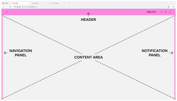
A standard Edge.One Dashboard includes three organisms: Header, Content area, and the Notification Panel and Navigation panelPanel.
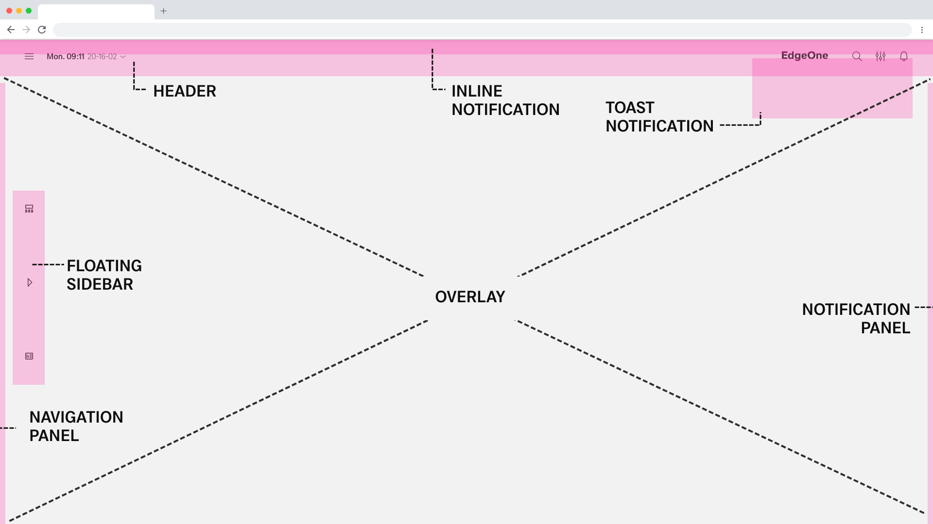
Optional components include Floating Sidebar (depricated), Overlay, Inline Global Notification, Toast Notification (in progress), and the Modal Notification Panel.
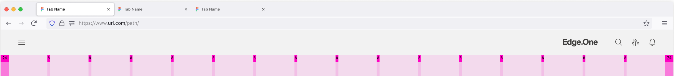
Header
The header Header provides access to global actions and is adapted per device to preserve clarity on smaller screens. The layout is consistent across applications.
Content of the header consists of Global Navigation. It may include the product logo, icons, and menus. In addition, App Developers can activate or deactivate a breadcrumb navigation and date picker within the header. All elements have a fixed distance of 2 rem to each other.
Content Area
All content within the content area must follow either the Landscape Grid or the Portrait Grid.
...
This section will only give a brief overview. For more information on navigation within and between dashboards, please visit Navigation.
Navigation Panel
The navigation panel Navigation Panel sits in the left sidebar and contains navigation components only. These include internal dashboards and approved third-party links. Using fixed navigation molecules keeps the sidebar consistent across applications. The content of the 1st level and 2nd level can vary.
...
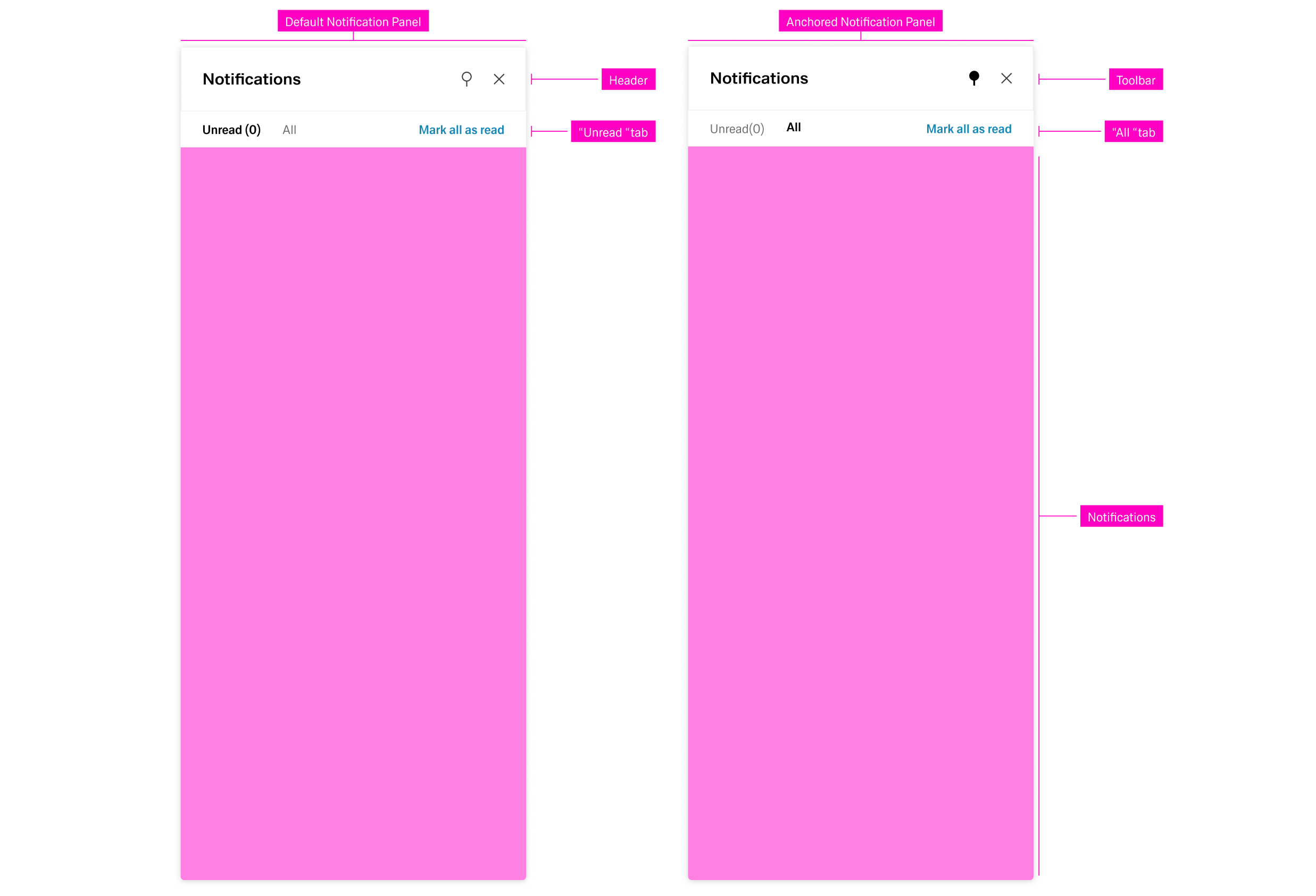
The Notification Panel is located within the right sidebar. It hosts only communication organisms. It can be opended with the "notification" action icon in the header. Similar to the navigation panel, it can be anchored or closed with the respecticve actions on the top-right side.
The notification panel Notification Panel has two tabs: unread and all.
...
Notifications are ordered and grouped by their date of appearance, regardless of the active tab. Selecting a notification opens a detail panel to the left with basic information about the notification.
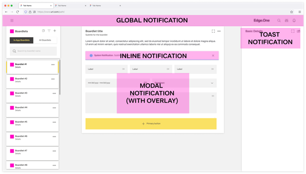
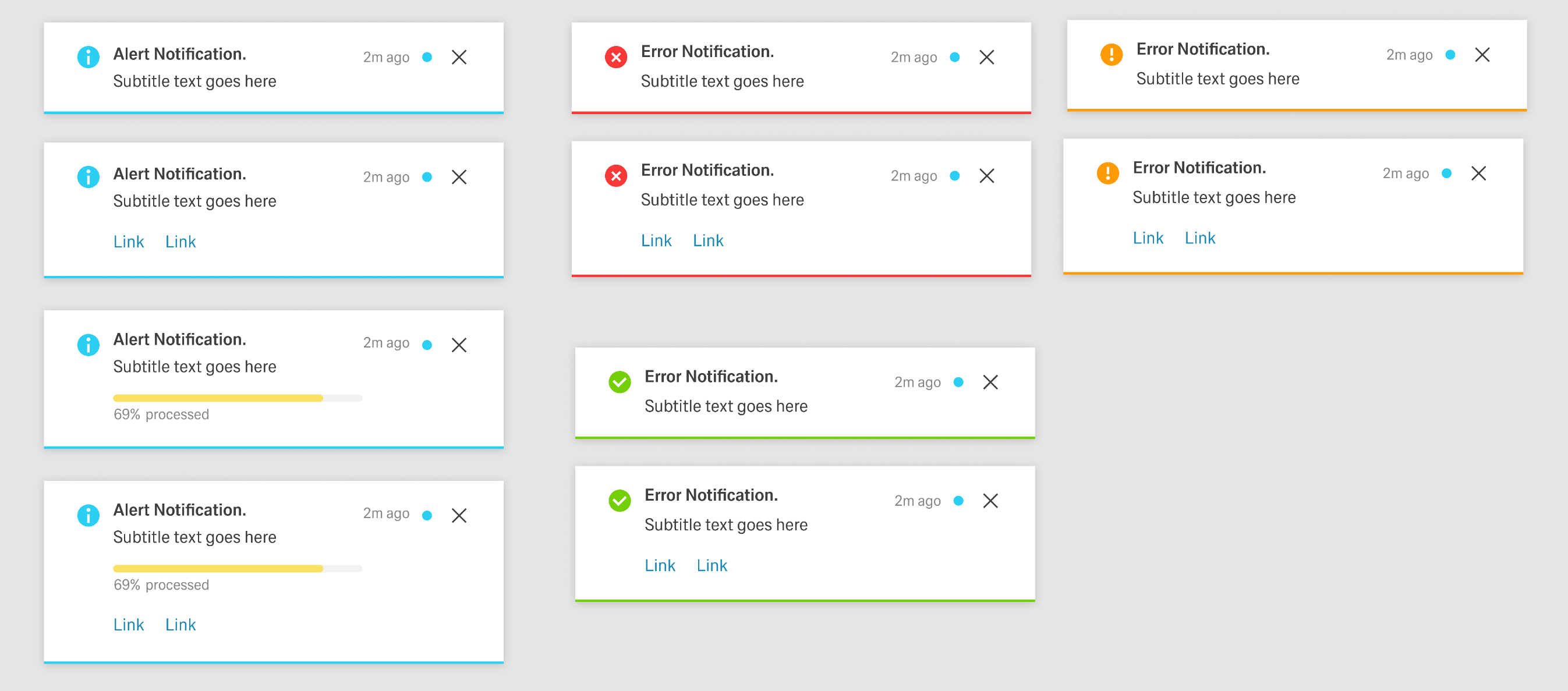
Global Notifications
Global Notifications appear as a bar at the top of the dashboard as a pop-up. They disappear after a set amount of time or if the user clicks the "close" button, if one is present.
Global Notifications give feedback on major user actions, for example saving a change inside a table. They appear at the end of a process and usually have an impact on the system, like changing data. They are always tied to user interaction or the inability for a user to perform an action.
Global Notifications have four states, determined by importance. 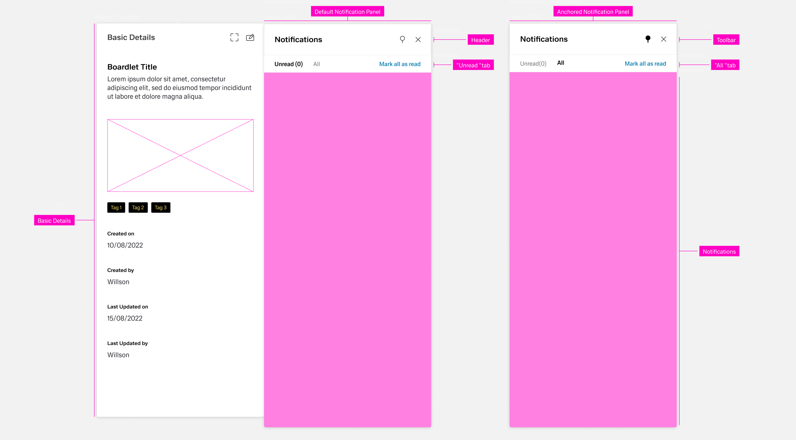 The content can vary by use case.
- Error Notification — Colored blue; signals critical errors.
- Warning Notification — Colored orange; announces problems that may result in errors.
- Success Notification — Colored green; signals a successful process.
- System Notification — Colored blue; reports system information.
Inline Notification
For more information on the component of the same name: Inline Notification
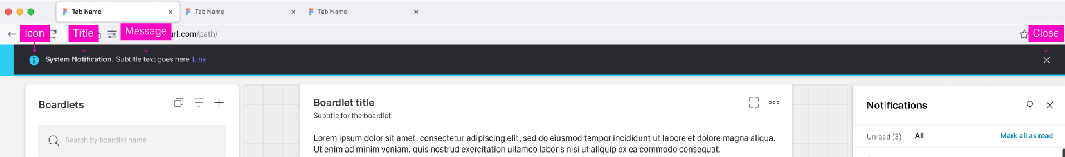
The Inline Notification organism consists of three molecules and one atom: Notification Indicator, Notification, Actionbar, and a Container with shadow. It appears directly below the header and animates downward when it enters. Users dismiss the notification with the close icon.
Like Global Notifications, Inline Notifications have four states, determined by importance. The content can vary by use case.
...
- The notification indicator/icon.
- An outline at the bottom of the container with the state color.
- For Error, Warning, and Success notifications, an additional icon in the header to the left of the Notification icon.
- For Progress notifications, a circular progress indicator in the header to the left of the Notification icon and a progress bar in the container.
A toast notification apperes on the top right corner of a dashboard as an overlay. The dashboard never shows more than one toast navigation at a time. They allways include a notification indicator, a title, a notification, the time of the notification and a close icon. They nay also include links or content actions.
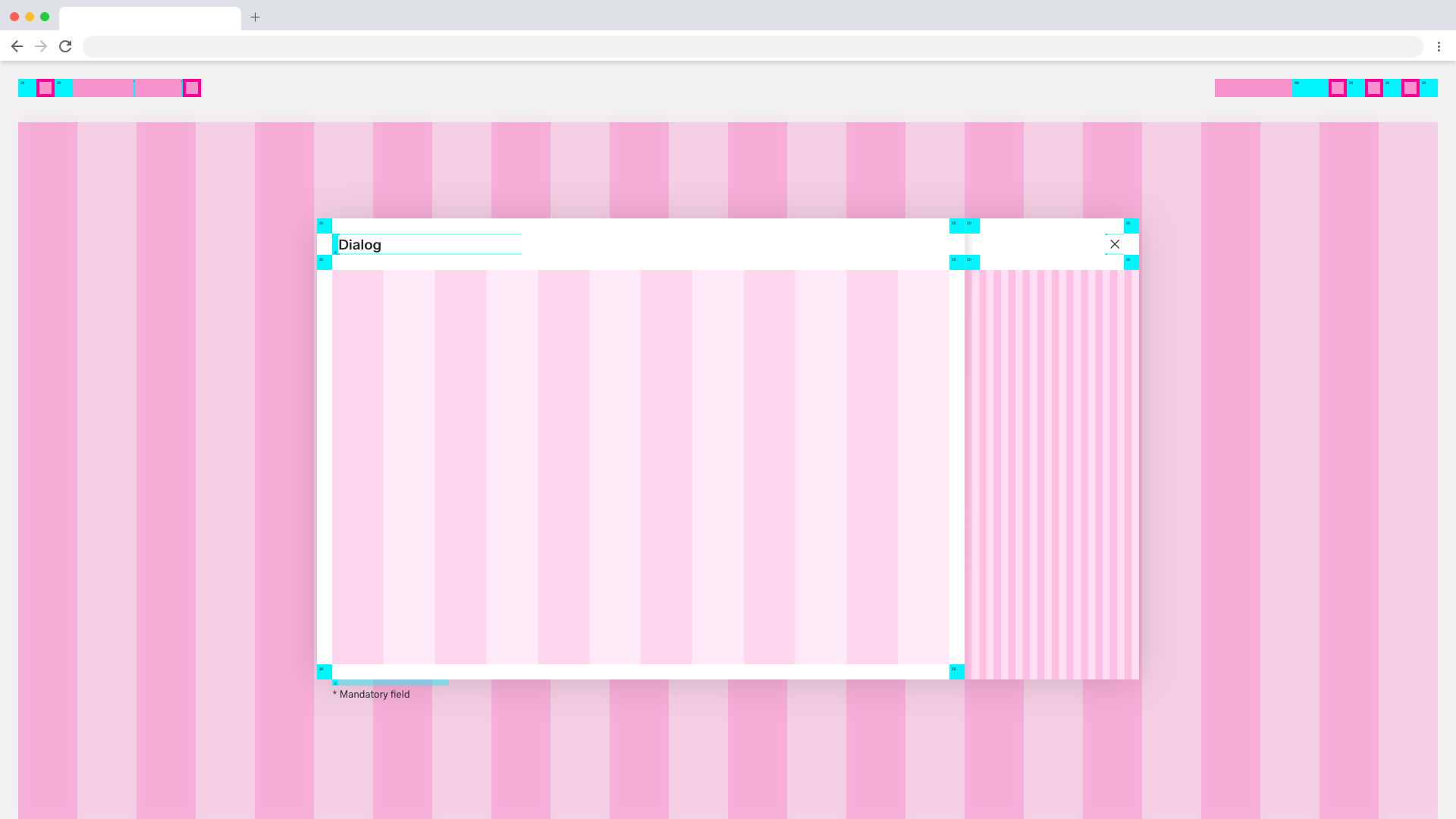
Overlay
Use an overlay to focus attention when displaying dialogs or modals. The overlay follows the dashboard’s 16-column grid. Dialog and popup sizes depend on content; see Dialog for size guidance.

Currently the overlay can be used for these applications:
Dialog Overlay
Modal Notifications
Modal Notifications are a special type of Dialog, the Passive Modal.
Dialog
Dialogs are placed on to of an Overlay to focus the users attention. The width of the Dialog is based on breakpoints inside the window, while the height is adaptive to the content of the Dialog. It is important that the Dialog does not become too long. In such a case, separate the interaction into partial interactions with the help of a sidebar.
Basic and Progress Dialog
A Dialog is used when the system requires the user to enter data or perform tasks. The body of the dialogue is variable and can be freely editedThe Dialog follows the column-grid of the Overlay. The size and dimensions of the Dialog depend on the size of the content. More on this topic in the Dialog pattern.

...
Modal
...
The Popup Modal is best suited for entry or information modules. These modules adapt to the column grid of the Overlay. The dimensions of the Popup Modl depend on the content. More on this topic in the Dialog pattern.


Best Practices
...
When designing a dashboard, use one of the documented dashboard patternsfloorplans. If none fits, contact UX to propose a new patternfloorplan. It will be reviewed and if appropriate, added to the list of patterns floorplans below.
Use the same patterns for similar processes within an application. It ensures a cohesive user experience and predictability for the User.
...