Page History
...
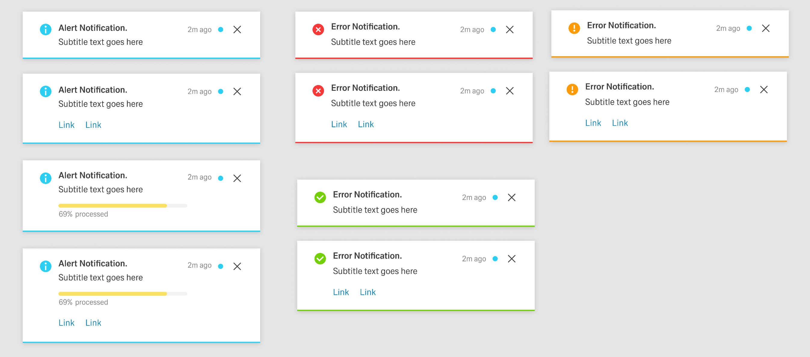
- The notification indicator/icon.
- An outline at the bottom of the container with the state color.
- For Error, Warning, and Success notifications, an additional icon in the header to the left of the Notification icon.
- For Progress notifications, a circular progress indicator in the header to the left of the Notification icon and a progress bar in the container.
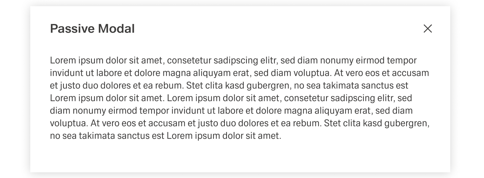
Modal Notifications
The Modal Notifications are a special type of Dialog, the Passive Modal.Notification is a varriation of the Dialog and appears as a centered passive modal above a dimmed background. It contains a critical message and can only be closed with the close action in the header toolba. It blocks interaction with the dashboard until it is closed.
Dialog
Dialogs are placed on to of an Overlay to focus the users attention. The width of the Dialog is based on breakpoints inside the window, while the height is adaptive to the content of the Dialog. It is important that the Dialog does not become too long. In such a case, separate the interaction into partial interactions with the help of a sidebar.
...