Page History
...
- Provide meaningful, unique titles for each section so context is clear even when collapsed (
elements.title). Use plain-language; avoid icon-only labels (elements.title). - Expose a stable handle for automated accessibility checks (
dataTestId). - Avoid color-only meaning; place essential cues in text (
elements.title,elements.content). - Keep expansion order predictable by establishing item order during initialization (
ON_INIT,elements).
Datasource Requirements
Accordions can be automaically created with the help of a template. This template uses the data source from the accordion in conjunction with placeholders.
Guide
Firstly, choose a datasource in the accordion in the Datasource tab. The datasource should be an array of objects with any number of elements. The keys of the value pairs inside the objects will later be used to create placeholders for the data inside the template.
Example data:
...
[
  {
    "name": "German (Germany)",
    "code": "de-DE"
  },
  {
    "name": "French (France)",
    "code": "fr-FR"
  },
  {
    "name": "English (United States)",
    "code": "en-US"
  },
  {
    "name": "Dutch (Netherlands)",
    "code": "nl-NL"
  },
  {
    "name": "Spanish (Spain)",
    "code": "es-ES"
  },
  {
    "name": "Chinese (China)",
    "code": "zh-CN"
  },
  {
    "name": "Polish (Poland)",
    "code": "pl-PL"
  }
]
Next, activate "useTemplate" in the Visual Properties tab of the accordion. This activates two new components in the tree view on the left: "Accordion Template Header" and "Accordion Template Content" Any formatting of the to be created accordion items will happen here.
In order to display the data as a text, select a text component like the title or label and put it into the Accordion Template Header or Content. Set the displayed text to {{$.insert key here}}. This key is dependant on the data source. One text component can have multiple placeholders and additional text can be set next to the placeholder if required.
Example placeholders 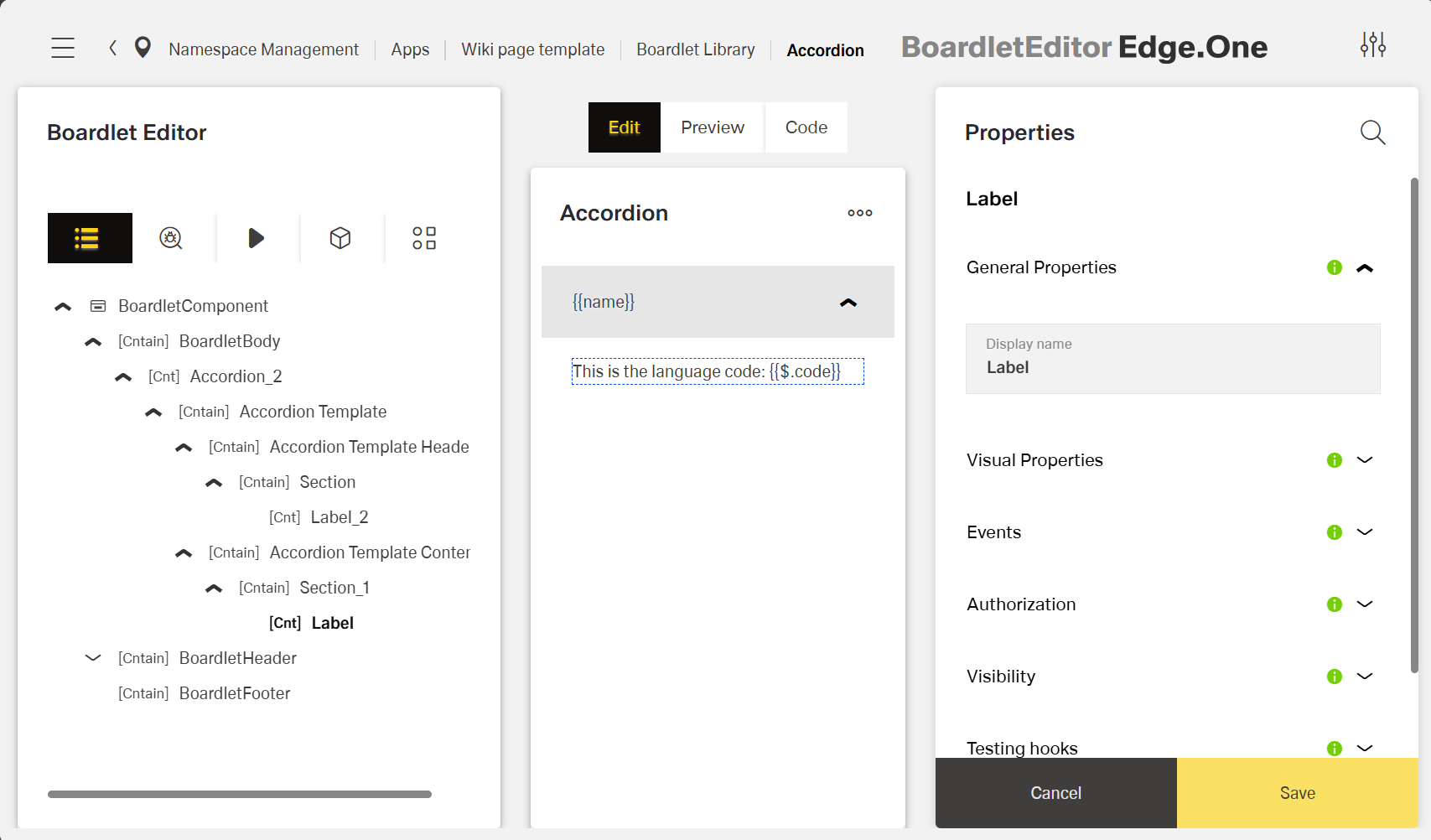
To see the rendered data, switch to the Preview tab inside the boardlet editor.
Specs - Accordion Template (Header/Content)
General Properties
- displayName — Sets the display name of the component shown in the structure panel. For example, "Product FAQ" allows for easy identification of the accordion's purpose in the component structure.
...