Page History
...
Introduction
The Home Dashboard of the for the Namespace management is the first page users see when navigating to the Namespace Management. It provides an overview of the namespace, including the apps, services users and current version. The Additionally, the page additionally allows navigation to settings regarding the entire name space namespace and the Application Library. The Home Dashborad has the following sections:
...
- Gaining essential insights on the status of the namespace.
- Navigating to the Application Library or an application directly.
- Changing settings of the entire namespace.
Navigation Boardlet
This boardlet contains a list with links to all namespace-wide settings, the Application Library and all menus, permissions and policies.
Namespace
Apps
This link connects to the Application Library.
Menus
Every menu inside every application of this namespace is listed here.
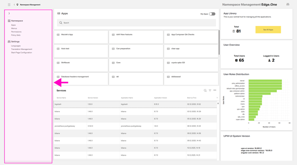
The page allows the creation of Users can create a new menu item items as described inside the Menu Settings. They It also can import supports importing or export exporting the menu through toolbar actions of the menu list. Exporting a menu opens a [dialog]. Confirming the export creates a custom JSON-file that can be used inside other namespaces. [IMAGE]
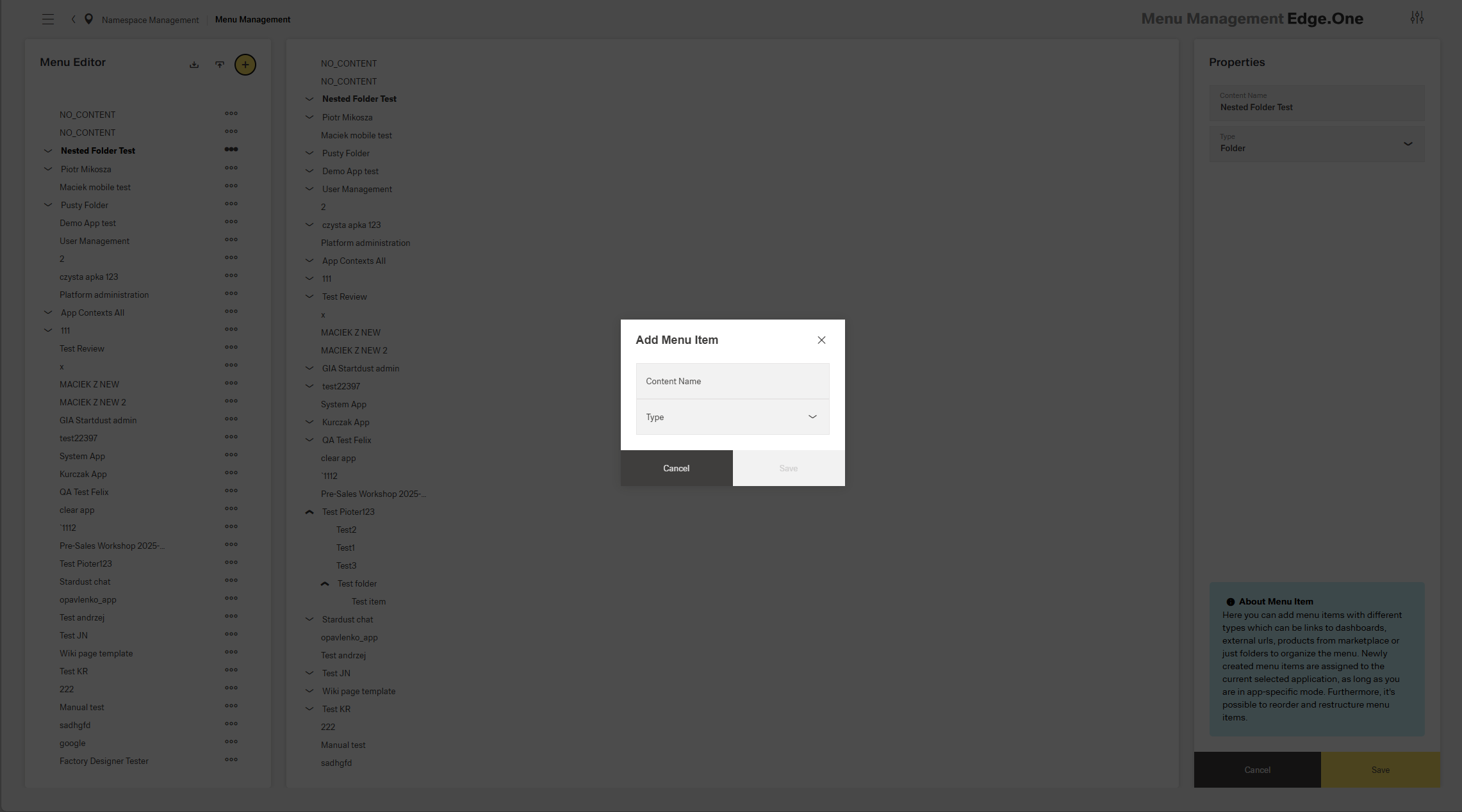
Importing a menu also opens a dialog. Inside this dialog, users can select The dialog contains a selection of a conflict strategy, choose the choice whether the old menu remains after importing, and select he selection a file. This file is ideally created through the export of another menu.
[IMAGE]
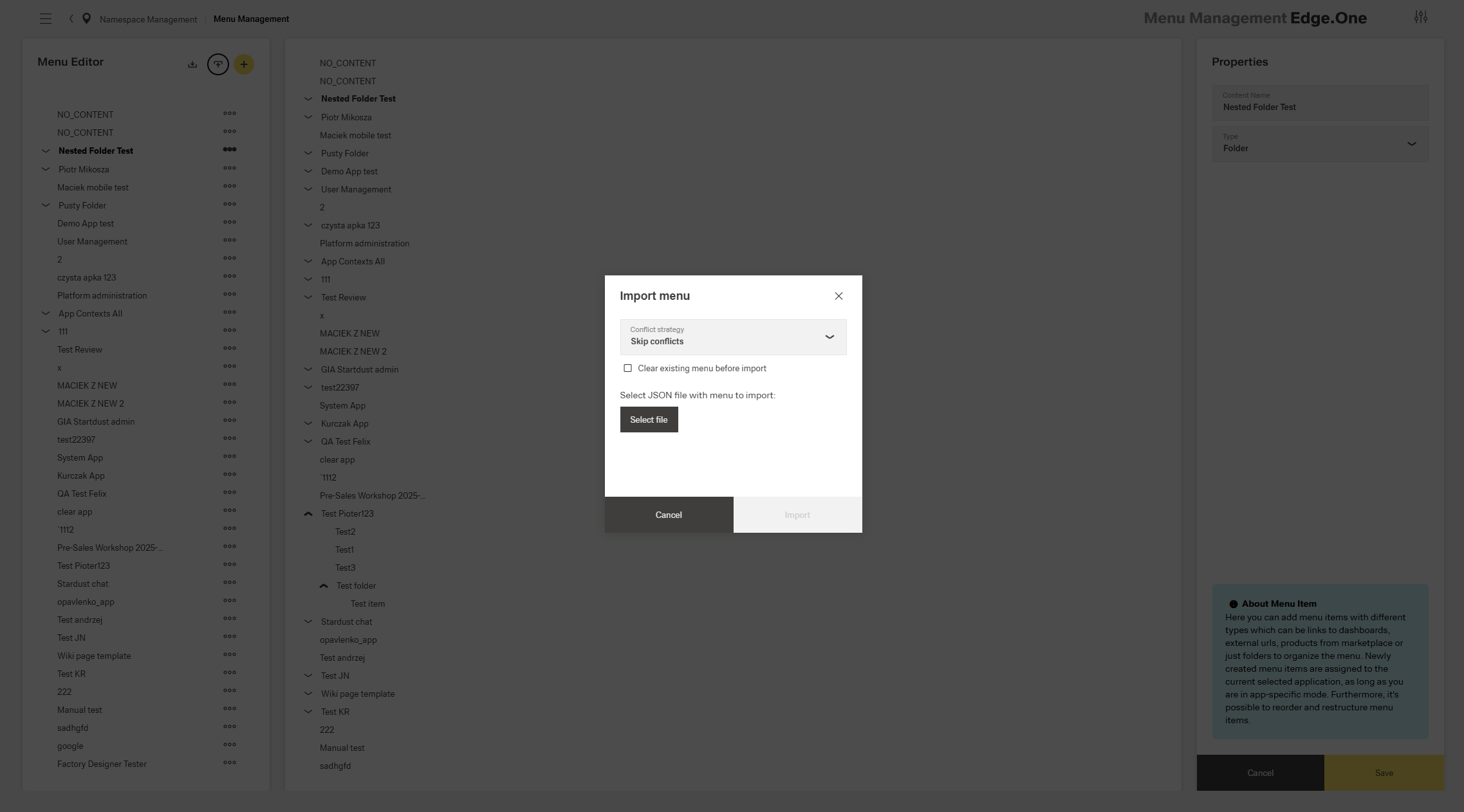
Clicking By clicking on a menu item , users can edit allows editing of the specific menu item inside the right boardlet like in the Menu settings. They can also delete that It also enables deletion of the item with an action inside the overflow menu in the left boardlet.
[IMAGE]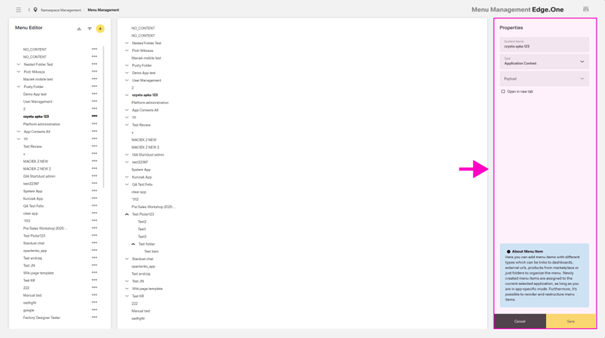
When selecting an entire menu of an app, the overflow menu also allows users to clone cloning the menu to another app or create a menu item inside the selected menu.
[IMAGE]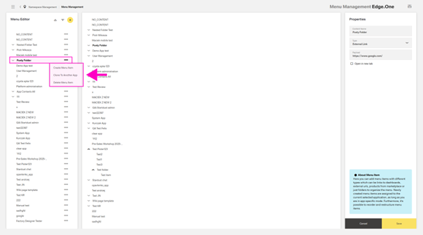
Permissions
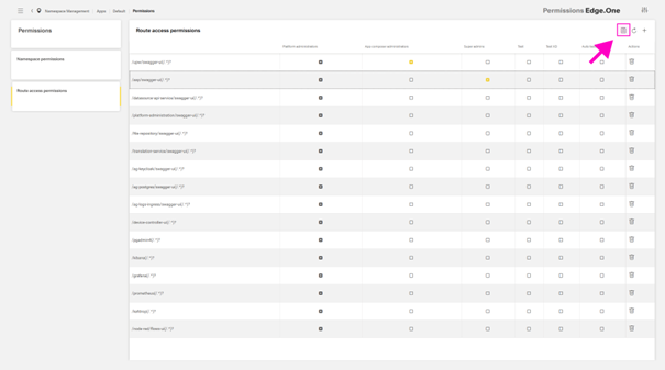
This section allows reviewing, changing and adding namespace and route access permissions. The two types of permissions are separated into two tables with navigation between the two being the card collection on the left.
[IMAGE]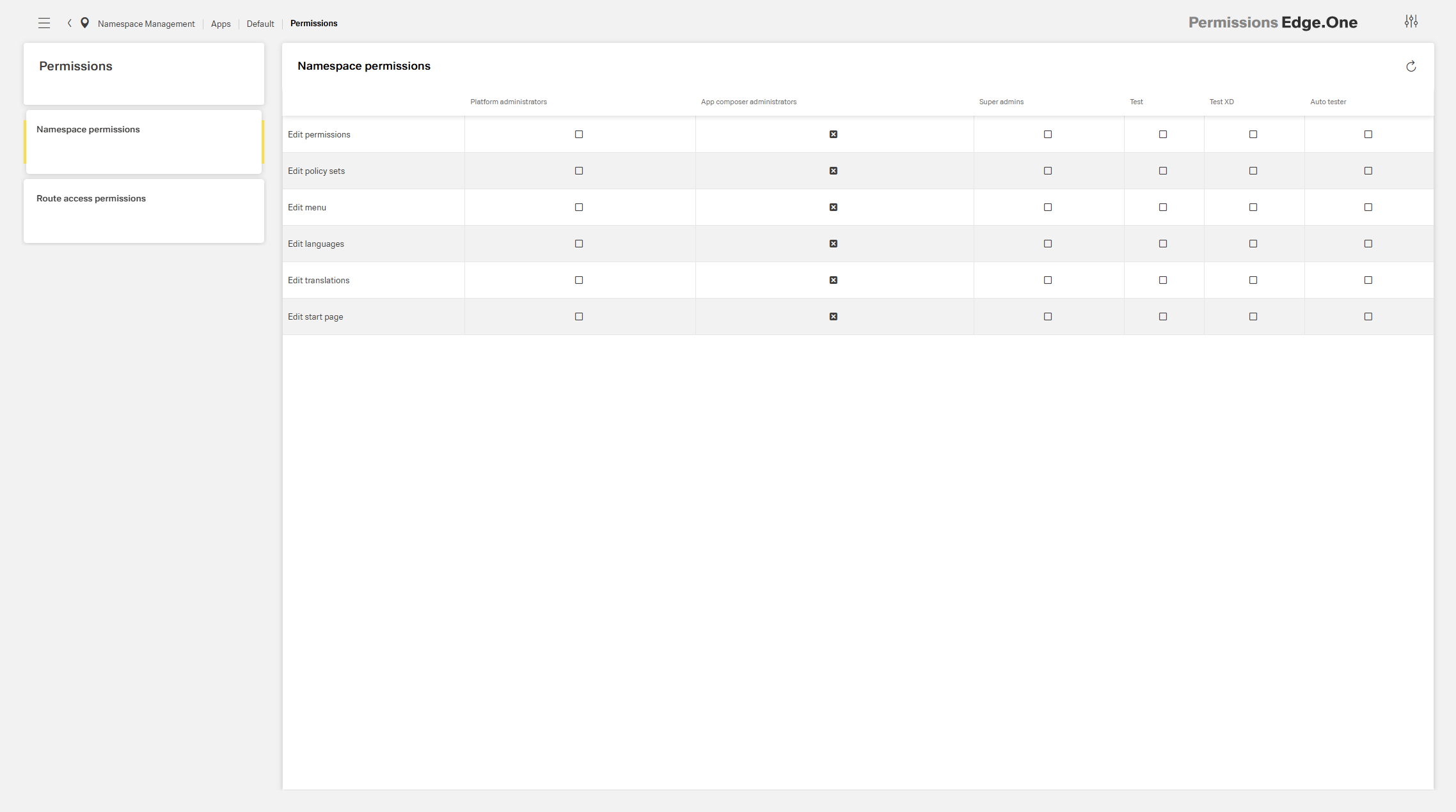
Inside the table, users one can select who has what permission through the checkboxes inside every table cell. Route access permissions also allow adding a route through an action inside the table header. All changes to permissions need to be saved through a save action inside the table header toolbar. This action only appears if a change has occurred.
Policy Sets
This page allows users to set creation of namespace-wide roles for policies. These roles are listed in the card collection on the left side and have a name, a description, and a policy set model. This model equates an attribute – either a User Role or HTTP decision – to an attribute value – for example platform admin or users – through an operator – either equals or not-equals. A role can have multiple conditions and user groups assigned to it.
[IMAGE]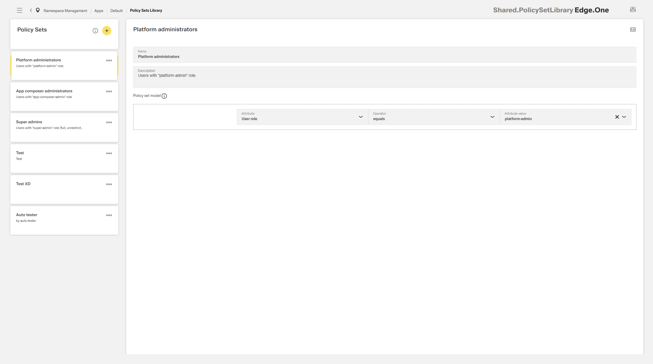
Users One can add a new role through the action inside the card collection header. They can also edit or delete Editing or deleting a role can be achieved through the overflow/”more” menu inside the cards.
[IMAGE]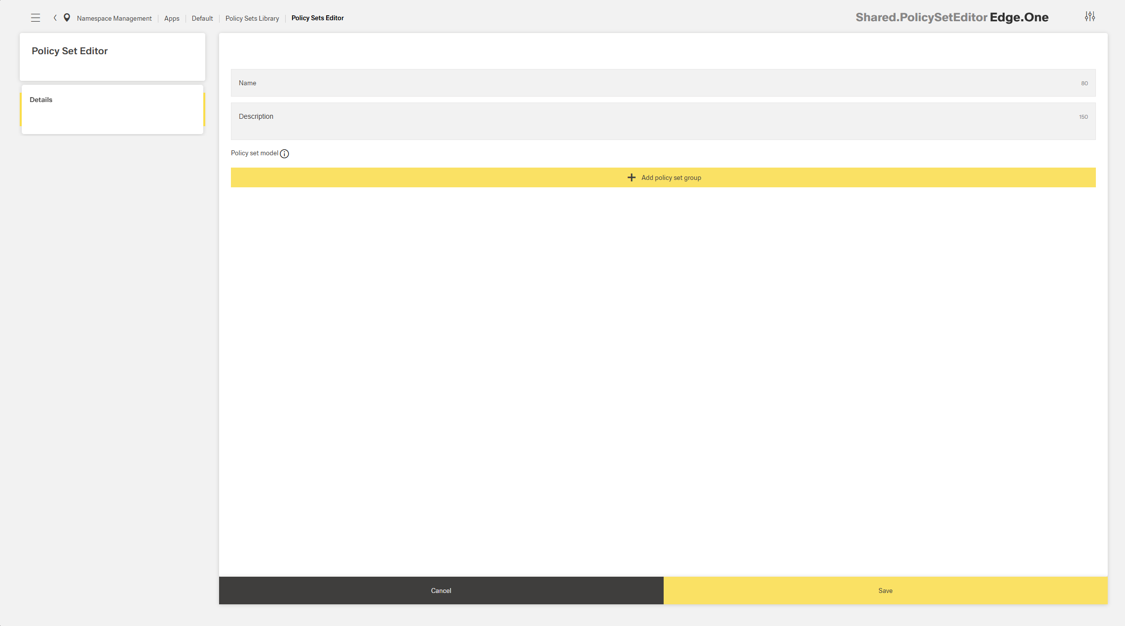
Settings
Languages
...
This page allows editing the automatic translations inside the namespace. Users can select Selection of a translation happens through the list on the left, ether by navigating the tree view or by searching the name of the translation. This opens the different translations inside the boardlet on the right.
Every change needs to be saved through the save button in the footer.
[IMAGE]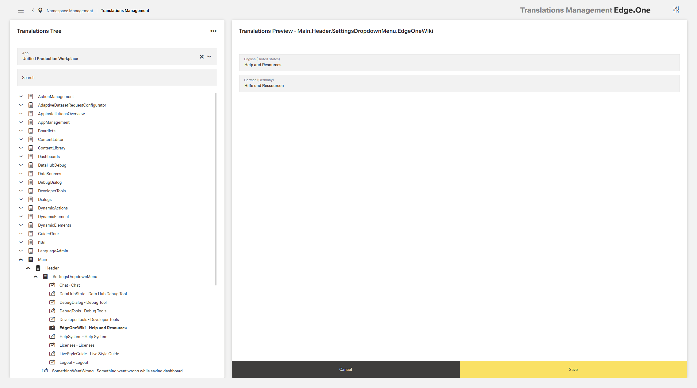
Start Page Configuration
The Start Page Configurations enables assigning user-specific landing pages, also called welcome or starting pages, inside the namespace. Every namespace has a default landing page. This page can be configured in the first section of this dashboard. First, select an application inside the namespace in the left selection input, then a dashboard inside the application on the right one.
[IMAGE]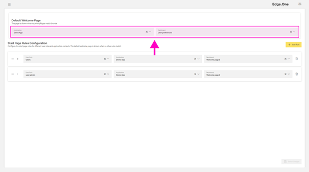
In addition to the default settings, this page allows assigning user-specific landing pages. This manifests in a prioritized list of rules. Each rule consists of a user group, an application, and a dashboard inside that application.
[IMAGE]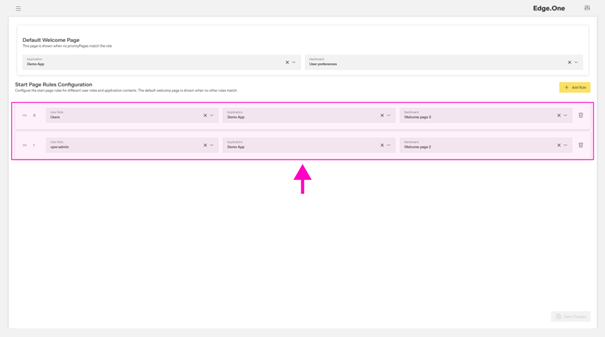
If a user is part of multiple user groups, the rule with the highest priority will apply. If a user is not part of a group with a designated starting page, they will see the default page. Every change needs to be saved through the save button in the footer.
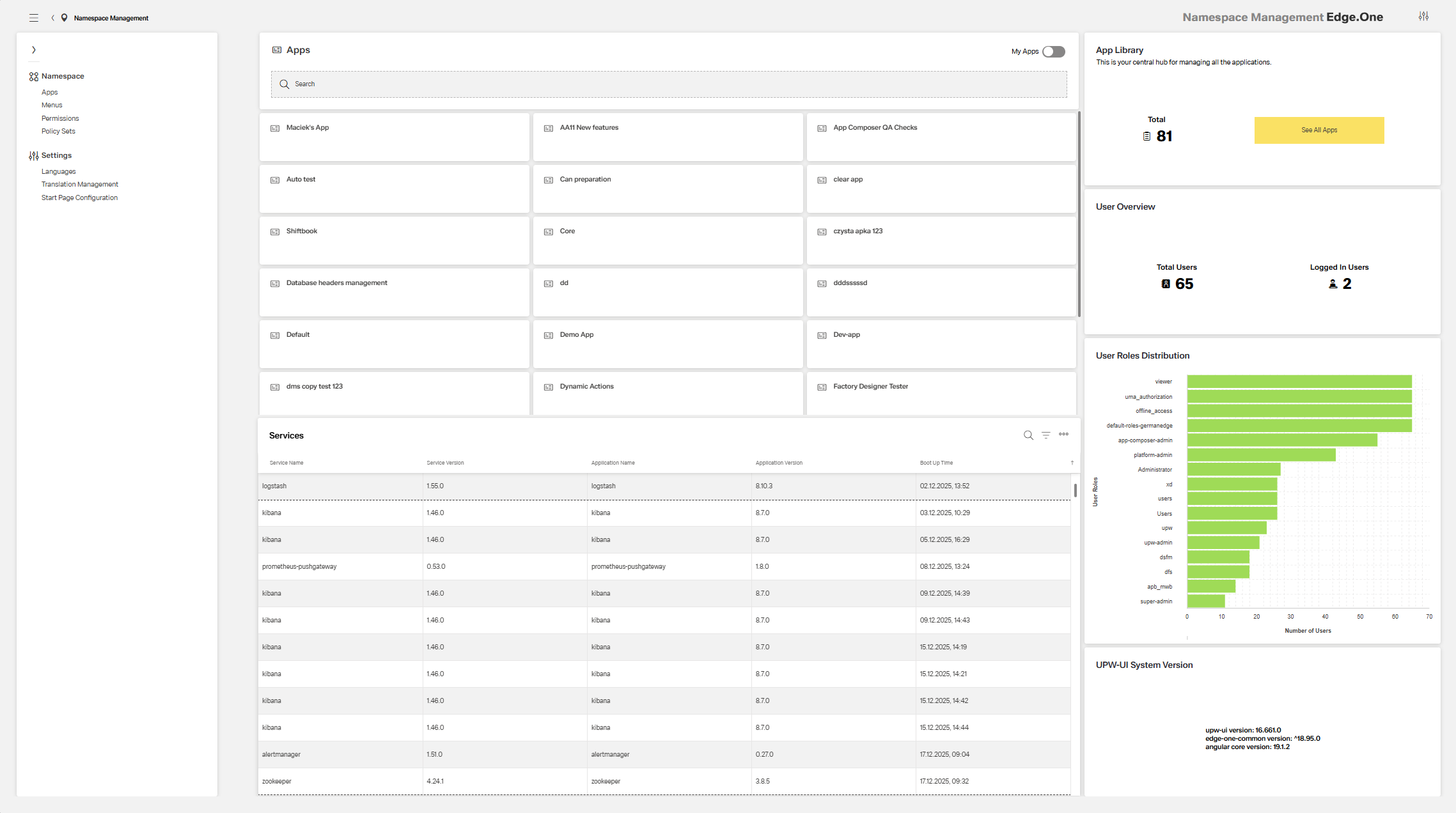
App Collection
The App Collection is a Card Collection listing every application within the namespace. Specific apps can be found with the help of the search bar at the top. In addition, a toggle switch at the top right allows filtering to only see the self-created apps. Clicking on a card allows instant navigation to the associated app.
[IMAGE]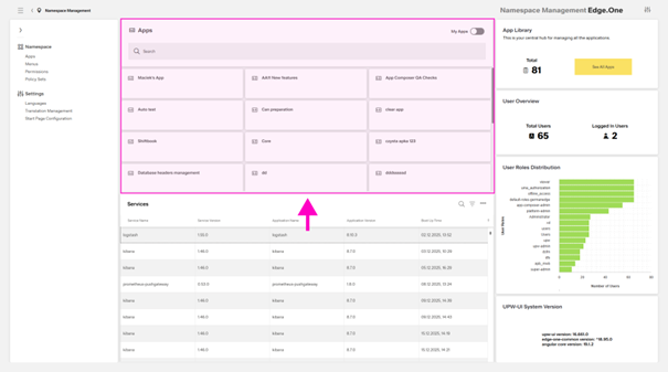
Services Table
The Services table lists all services connected to the namespace, their current version and their original boot up time. If the service is connected to an application, the table displays the application’s name and current version.
[IMAGE]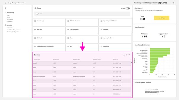
The table allows searching, searching by column and export to an excel file.
...
The Welcome Page has four Infographics containing information on applications, users, user roles and the system version. • App Library - This infographic shows the total number of apps inside the namespace and contains a primary button to the Application Library. • User Overview - This boardlet shows the total number of users and number of currently logged in users. • User Roles Distribution - This chart shows the total number of users in each role. Users can have multiple roles at once, counting as 1 in each role. • UPW-UI System Version - The current uwp-ui, edge-one-common and angular core version are displayed here.
[IMAGE]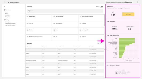