Page History
...
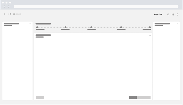
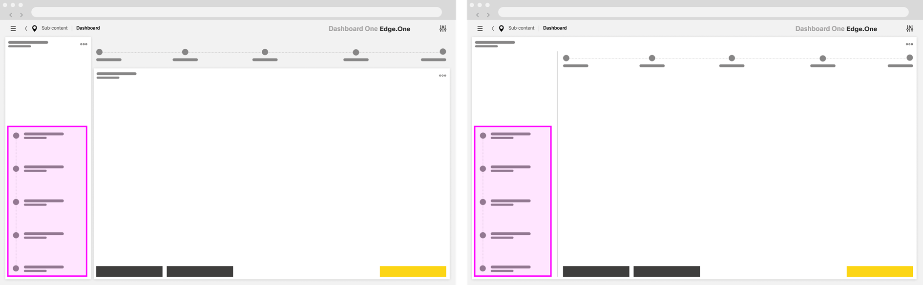
Its core structure consists of a Progress Indicator and a Main Content area. Depending on the needs of the workflow, the layout may also include a separate [Button Boardlet], an optional Sidebar, split main content, or nested progress bars within a step. These elements should stay aligned with the dashboard grid and support the primary flow without changing the overall structure of the Wizard.
Progress Indicator
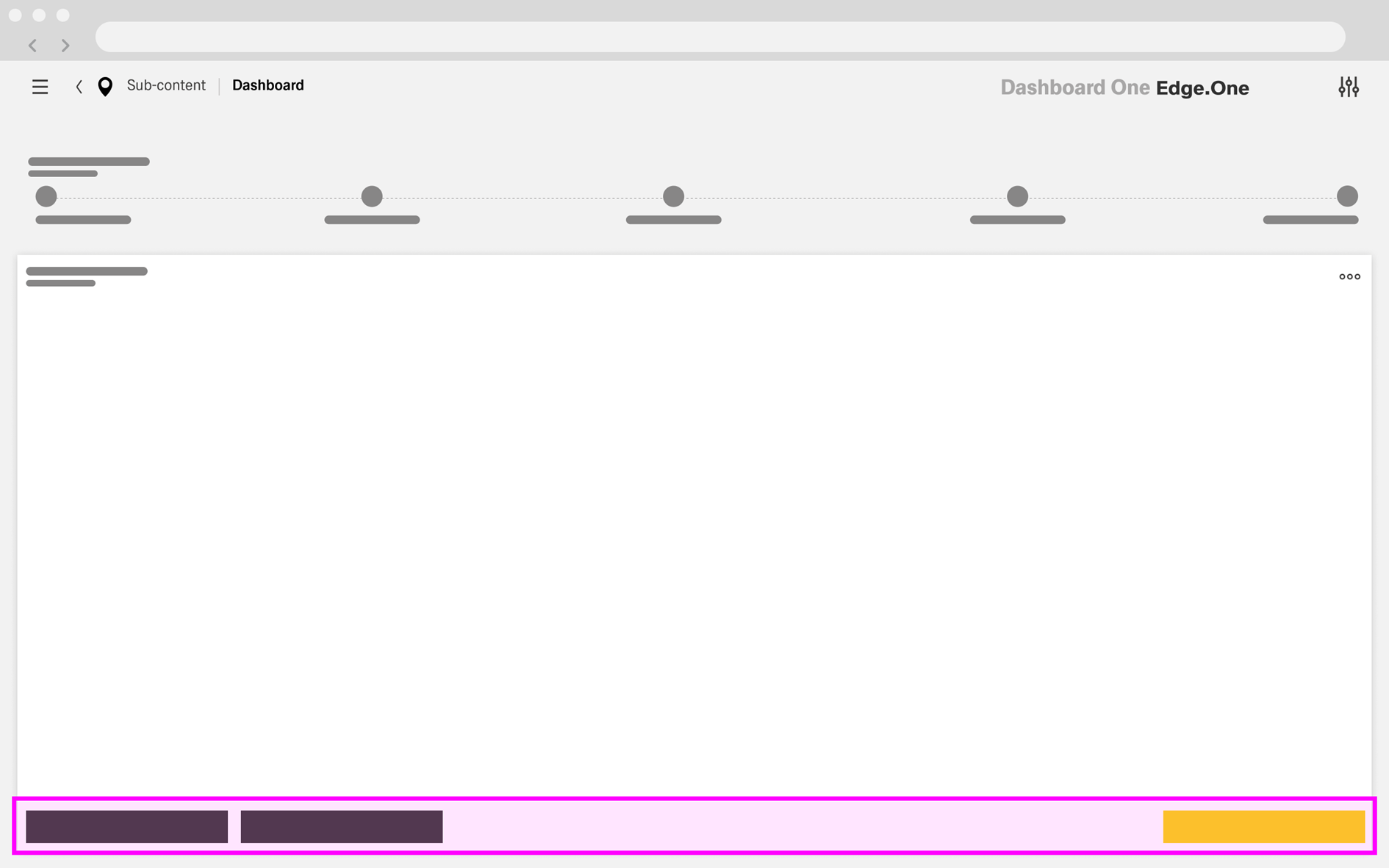
The Progress Indicator sits at the very top of the main content area and spans its full available width. In the standard layout, it extends across the full width of the dashboard. When sidebars are present, it remains aligned with the main content area and next to the sidebar.
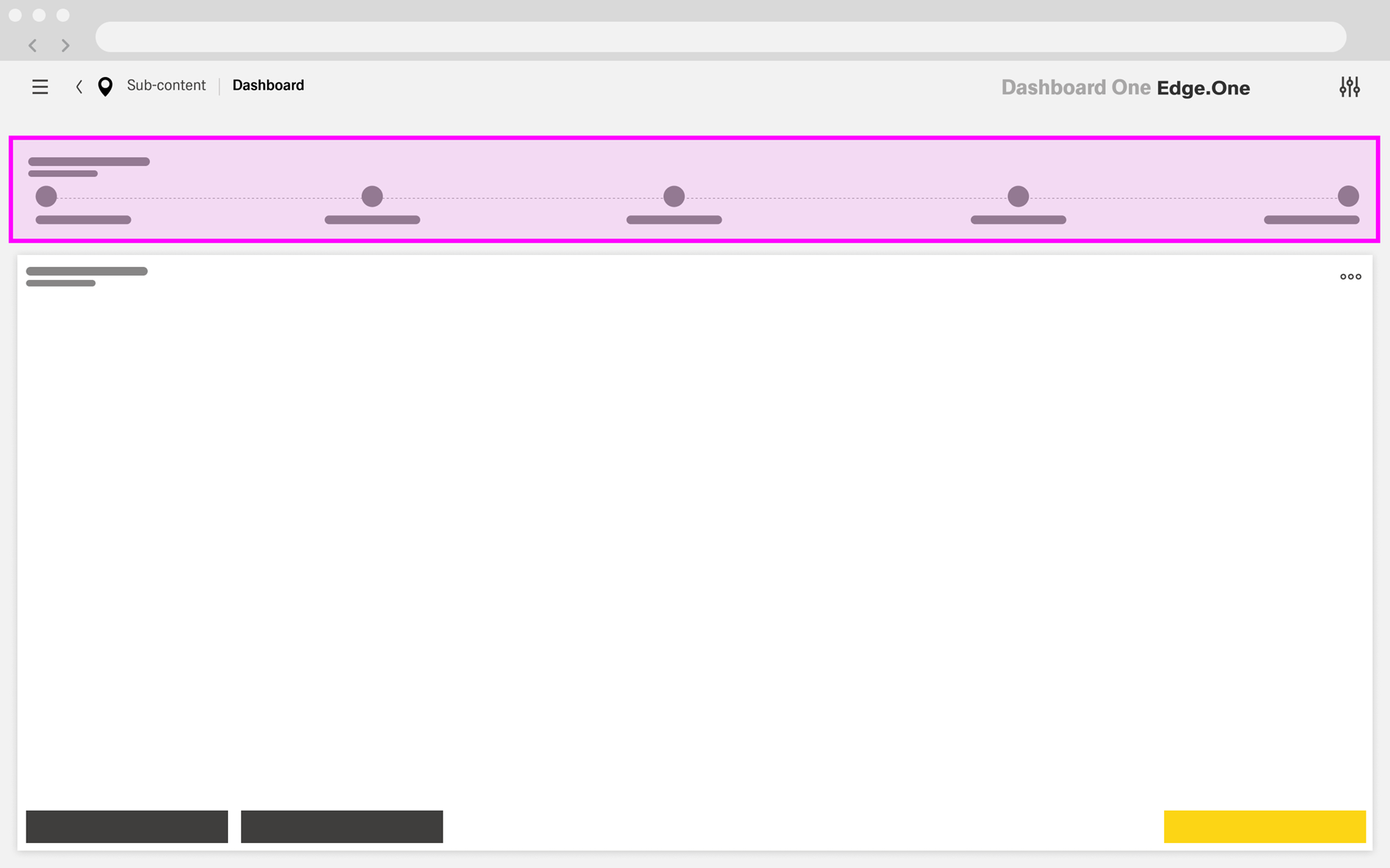
It is displayed as a ghost boardlet without a header or footer and uses the [Progress States] component. The stages remain consistent throughout the process and should not change between steps, except for completion marks that reflect progress.
Each stage should have has a descriptive title so users can clearly understand their current position in the process and the sequence of steps.
...
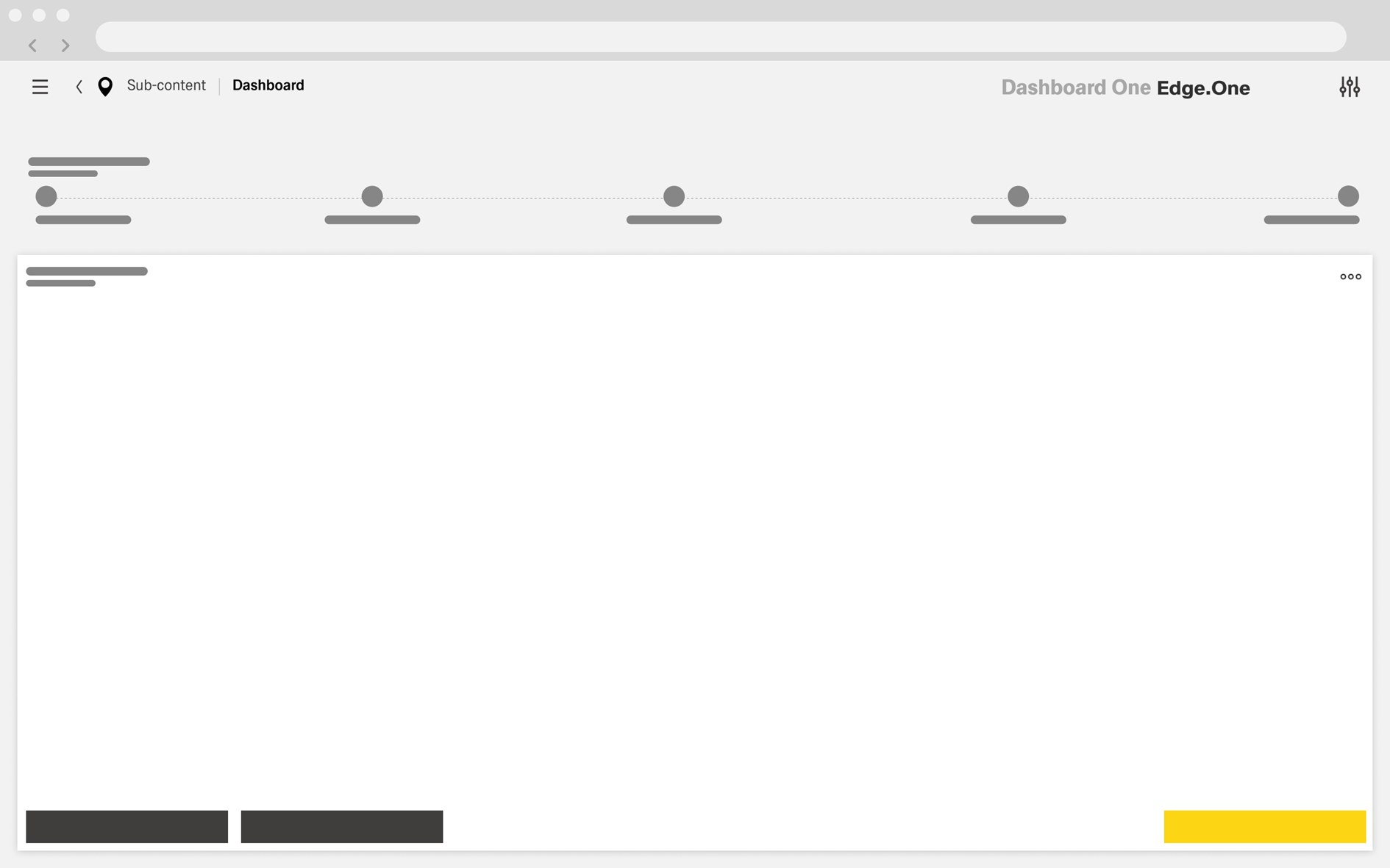
The Main Content is displayed in a default boardlet positioned directly below the Progress Indicator and extending to the bottom of the dashboard. Its overall size should remain consistent across steps to create a stable layout throughout the process.
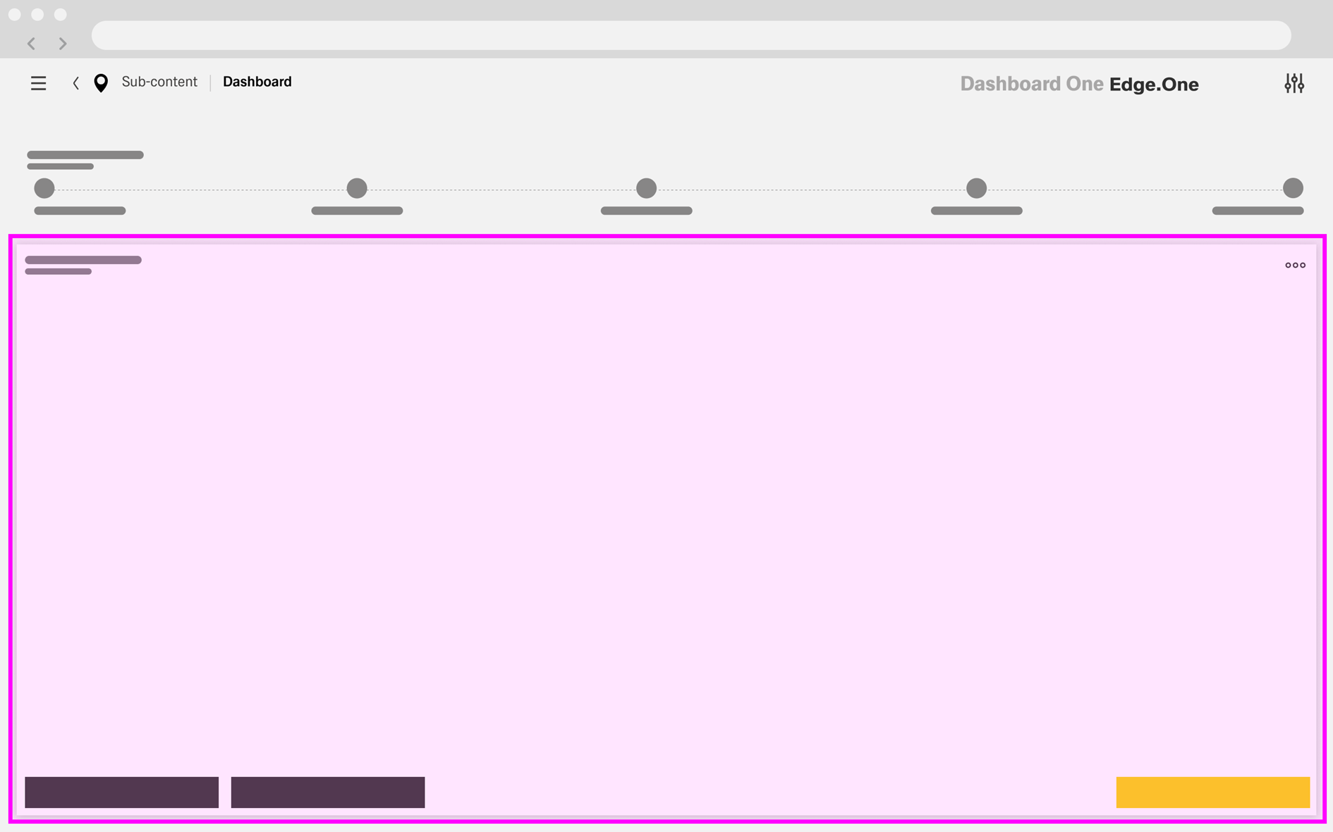
This area contains the content required for the current step, such as forms, details, instructions, scanning components, input fields, or confirmation modules.
When no separate [Button Boardlet]() is used, the Main Content boardlet includes the step actions at the bottom. It should provide at least two buttons: a primary action on the right to advance to the next step, and a secondary action on the left to return to the previous step. A cancel action may also be included on the left when needed. The placement and behavior of these actions should remain consistent throughout the process.
Split Main Content
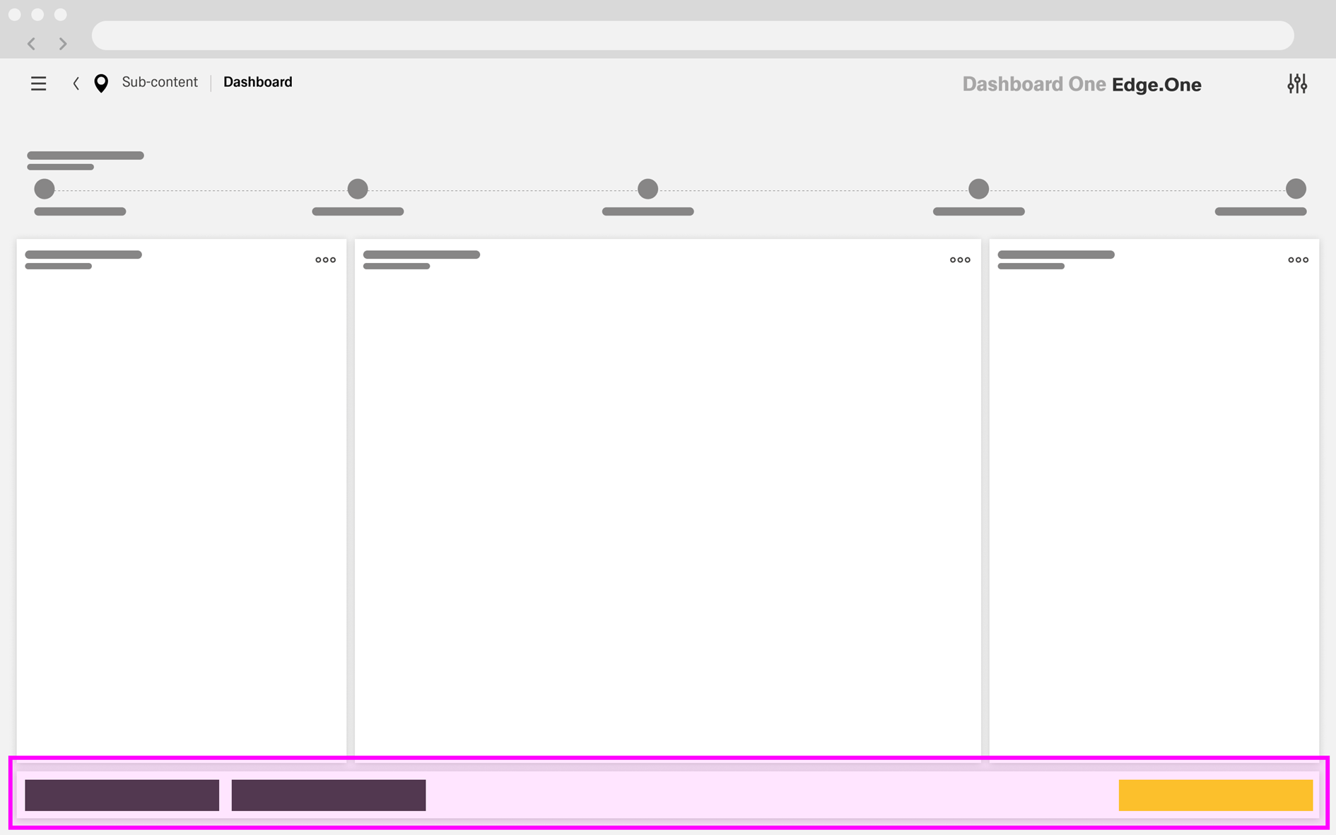
In some steps, the Main Content may be divided into multiple sections, such as a [table] paired with an [expanded search boardlet](). This split layout does not need to appear on every step. However, the combined area of all sections should remain comparable to the Main Content area used in steps without a split layout.
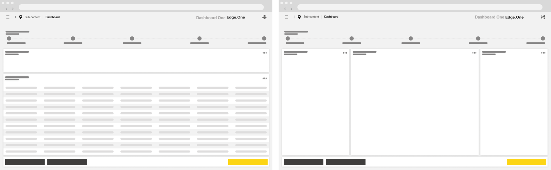
A split layout should use no more than three content sections. Sections may be arranged vertically or horizontally, but both orientations should not be combined within the same step unless there is a clear need.
When the Main Content is split, step actions should be placed in a separate [Button Boardlet]() for next, back, and optional cancel actions.
...
The optional Button Boardlet is used when step actions are separated from the Main Content, typically in split layouts. It is displayed as a default boardlet without a title or footer and is only one row high.
The primary next action is placed on the right. Back actions appear on the left, with an optional cancel action when needed. The placement of these actions should remain consistent with the rest of the Wizard.
For more details, see [button boardlet]().
Optional Sidebar
An optional Sidebar may appear on the right side of the Wizard and typically spans from the top to the bottom of the dashboard. It usually occupies two to three columns, reducing the horizontal space available to the Progress Indicator and Main Content.
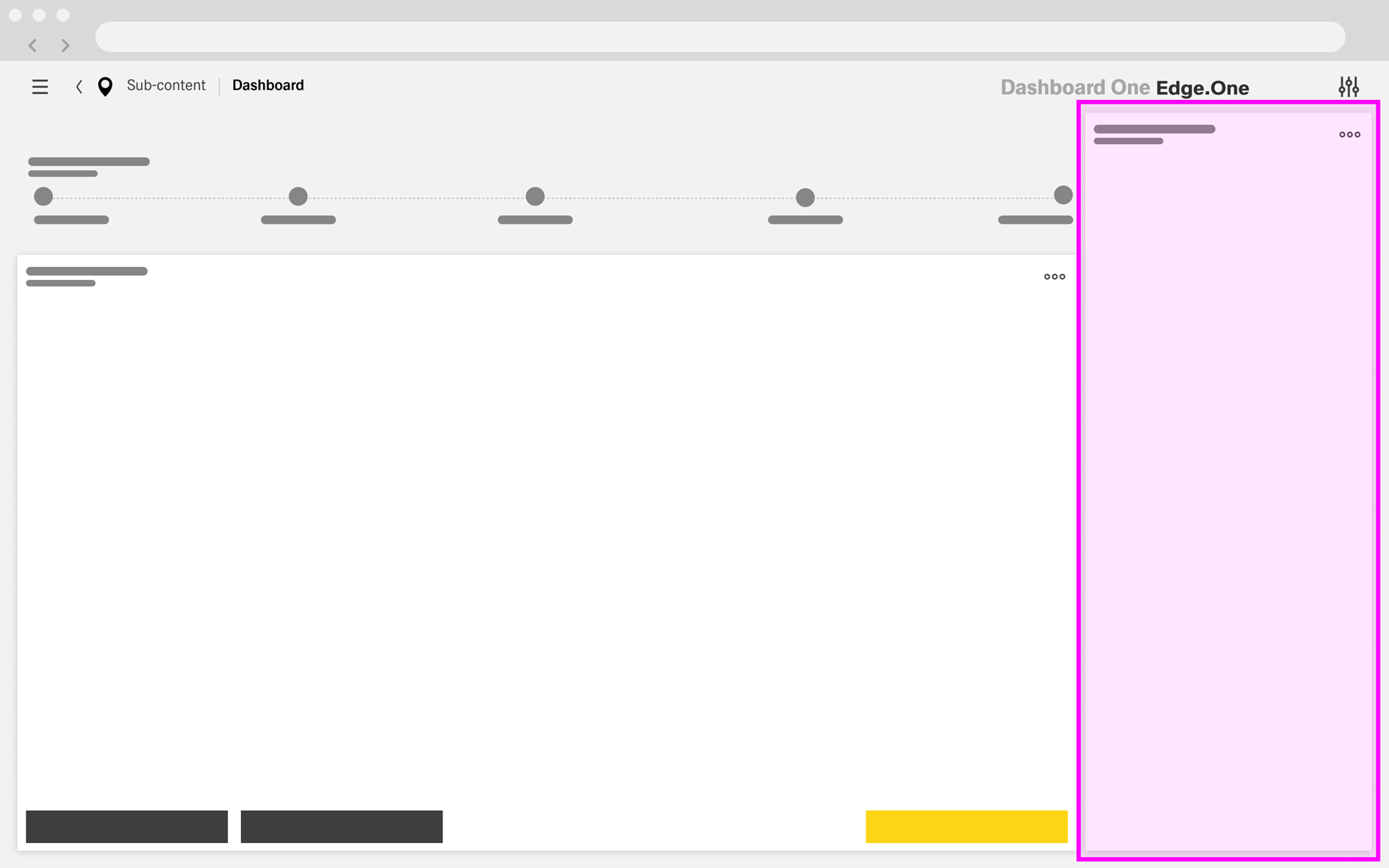
The Sidebar does not need to be a direct part of the process. It can provide supplementary information, contextual details, or navigation actions related to the process or its subject. When needed, it may be divided into multiple boardlets.
...
Nested Progress Bars are used when a step within the Wizard contains its own sub-process. In this case, the secondary progress indicator appears within the Main Content boardlet and is can be separated from the rest of the content by a [Vertical Divider]().
The nested progress area is positioned on the left side of the Main Content. It includes its own progress indicator and can extend vertically across the full height of the boardlet, continuing alongside both the content area and the actions at the bottom. In some cases, the secondary progress indicator may appear below essential information related to the subject of that sub-process.
This pattern does not need to appear in every step of the main process. Where it is used, the secondary steps are typically more detailed than the steps shown in the main Progress Indicator. Triggering the next-step action advances the secondary progress for as long as the nested process is active.
Completion of the nested process usually triggers a simple [Modal Notification] indicating whether the process was successful.
...
- The Wizard opens with the current step highlighted in the [ Progress Indicator].
- The user reviews or completes the content for the current step.
- The primary action remains unavailable until the current step meets its required conditions.
- Once the step is valid, the user selects the primary action to continue.
- The Wizard advances to the next step.
- The [ Progress Indicator ] updates to show the previous step as completed and the next step as active.
- This sequence repeats until the final step is reached.
...
- The user selects Back to return to the previous step.
- If step selection is enabled, the user may also return by selecting an earlier step in the [ Progress Indicator].
- The Wizard reopens the selected earlier step.
- The [ Progress Indicator ] updates to show that step as active.
- The user reviews or changes earlier input before moving forward again.
...
Keep step actions in a consistent location. Actions may appear in the Main Content or in a separate [Button Boardlet](), but their placement should remain consistent throughout the Wizard whenever possible.
...