Page History
Existing Empty States Messages
When to use
Empty states happen for a variety of reasons, and can require different treatments.
Strive for a balance between the situation and the content you’re providing. More content doesn’t necessarily mean it’s a better solution as there is a cognitive cost for having more content on the page. This is especially true when users first engage with your product, so save the more involved educational moments for primary features and more complex situations.
The following table suggests different approaches for empty states to match the needs of the user in different situations.
Basic empty states
| Type | Use cases | Goal of the empty state | When to use |
|---|---|---|---|
| No data empty states | First time use, no data yet | User understands what will be available on the page when data has been added or is available. They understand how to add data themselves. | For simpler situations, or for secondary features where bite-sized pieces of information are preferable. |
| User action empty states | Provides feedback based on some user action. For example:
| User understands how to adjust search terms or filters to continue their search. User understands that they’ve successfully completed a process. | User understands that they’ve successfully completed a process. When you need to provide feedback to the user based on an interaction. |
| Error management empty states |
| User understands the problem and if there are corrective actions available, knows what action to take or has options to correct the issue. | When something is amiss or some level of intervention or troubleshooting is required, a higher level of detail and specificity will better support the user. |
Where to use
Empty states always appear in the otherwise empty space, in the context of the data that’s missing. They can occur anywhere your app can display data, including but not limited to dashboards, data tables, tiles, full pages, and side panels.
The approach and layout you choose will depend on the situation, and what is the most appropriate based on the page layout and context.
Types of empty states
No data empty states
These are the most recognizable first use empty states, explaining what will be in the space once it is populated with data, and providing guidance for the next step the user can take to populate the space.
Ron Oemus please add an example screen here. Please use this as an example: https://www.carbondesignsystem.com/patterns/empty-states-pattern/#no-data-empty-states
Do:
- Use basic empty states for simpler situations, or secondary features, where bite-sized pieces of information are preferable.
- Be specific about what will be available in the space when data is there.
- Keep words to a minimum so they are fast to read and act upon.
- If there is an actionable next step, include a direct link in your message copy or a primary action button to make that action fast. Alternatively, guide them to what they need to click.
Don’t:
- Don’t cover multiple options in one empty state. If there are multiple things a user can do, pick the most important and keep the focus on that action.
- Don’t use product-specific terms that the user may not yet understand.
- Don’t include content that is about other areas of the app. Be contextual.
- As a general rule, don’t lead the user into a dead end. If there are useful next steps, include them.
Error management empty states
Empty states can also occur when there is data but it cannot be surfaced for some reason. A higher level of specificity is helpful here, with the aim that the user will be able to address the issue comfortably themselves.
Provide guidance about why there is no data, and either what the user can do to address the lack of data, or the circumstances under which the data would appear. And use plain language. Following this fulfills Jakob Nielsen’s ninth usability heuristic: Help users recognize, diagnose, and recover from errors.
Error messages should be expressed in plain language (no codes), precisely indicate the problem, and constructively suggest a solution.
- 10 Usability Heuristics for User Interface Design, Jakob Nielsen
Here are some error management situations that may be addressed with the basic empty state solution.
| Error type | Explain why there is no data | Explain what the user can do |
|---|---|---|
| Permissions issue | The user does not have permission to view the data. | Suggest steps or process to request access. |
| Systems issue | Problems with a related system are preventing the data from being supplied. | Explain steps the user can take to learn what has happened. For example, viewing an activity log. |
| Configuration required | Further configuration may be needed to access the data. | Provide an explanation and the first step for the user to take for the required configuration. |
| Action not supported | For example, the user attempts to upload an unsupported file type. | Explain what file types are supported. |
Do:
- Consult with your team to explore what information is available.
- If there are corrective actions, give the user an actionable next step. Include a direct link in your message copy or a primary action button to make the next action fast. Alternatively, guide them to the element they need to click.
- Use direct, plain language to describe the situation.
- Be respectful of the user and don’t joke or use flippant language.
- Any images used should reflect the situation and be sensitive to what could be a serious situation.
Don’t:
- Don’t include content that is about other areas of the app. Be contextual.
- Don’t lead the user into a dead end. Always aim to provide a path to a solution.
- If there are multiple things for the user to try, be sure to include a hierarchy so that it’s clear which option would be the primary action.
Error management empty states
User understands the problem and if there are corrective actions available,
knows what action to take or has options to correct the issue.
Astronaut Theme
The Empty States of the Astronaut theme use the Astronaut/nasa language. Optionally, the Astronaut animation and individual graphic elements can be used to visually support the concept.
Empty State - Full Screen
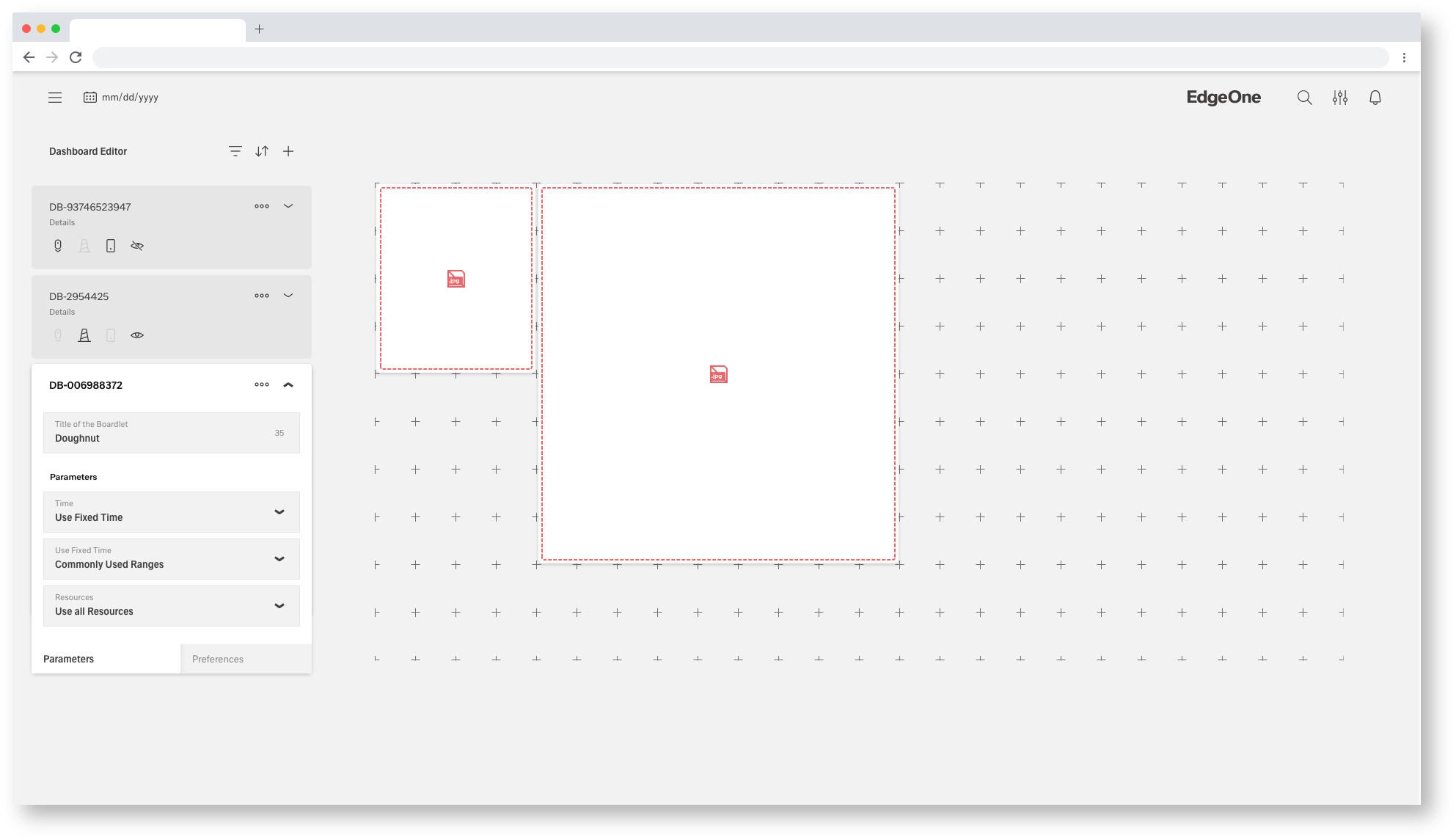
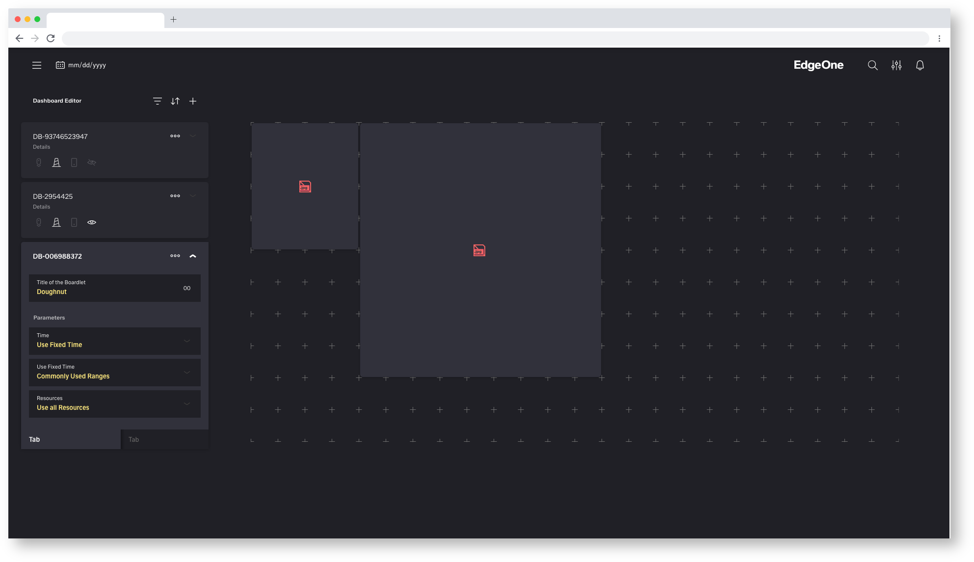
Empty State - Rectangle/Widescreen Boardlet
Empty State - Skyscraper/Mini Boardlet
Tokyo Theme
The Empty States of the Astronaut theme use the Astronaut/nasa language. Optionally, the Astronaut animation and individual graphic elements can be used to visually support the concept.

Empty State - Full Screen
Empty State - Rectangle/Widescreen Boardlet
Empty State - Skyscraper/Mini Boardlet
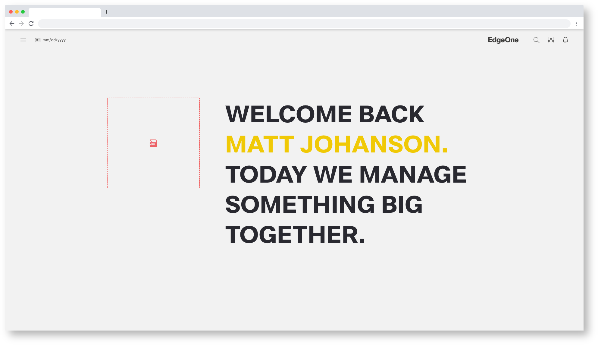
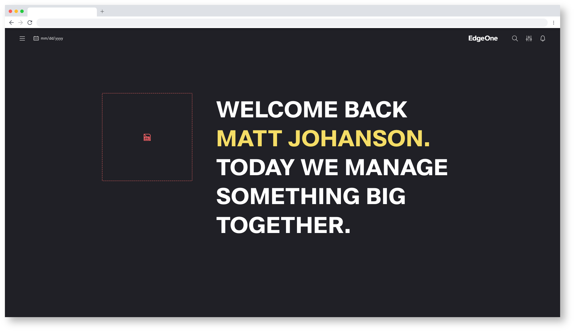
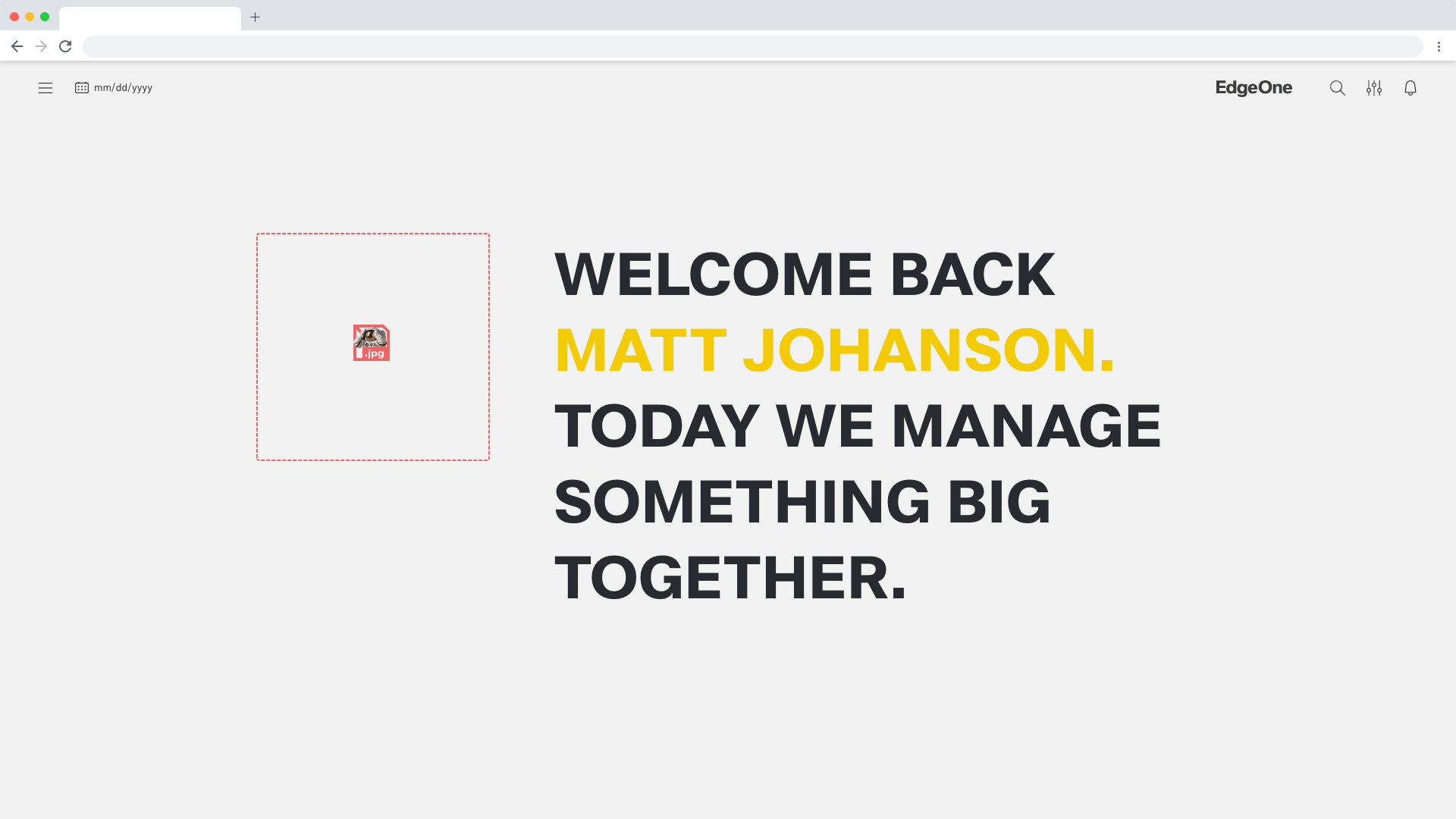
No Image empty states
The user understands the problem and knows that images could not be loaded.
Astronaut Theme
Empty State - Missing Image
Empty State - Missing Image
Empty State - Missing Icon
Tokyo Theme
Empty State - Missing Image
Empty State - Missing Image

Empty State - Missing Icon
Missing Image alternate
Empty State - Missing Image
Empty State - Missing Image
Alignment
For larger spaces, you have some flexibility in how you design the larger empty areas. Follow these guidelines, look at the examples, and use your discretion to decide what works best for each situation. Additionally, you can choose between additional graphic elements to emphasize the vcisual concept.
Empty state elements should be left-aligned as a block. Depending on the image you’re using, there are different arrangements available. Blank status elements should be left-aligned as a block. Different arrangements are possible, depending on the image you are using.
Anatomy

- Image (optional): A non-interactive or interactive image
- Headline: Short headline pointing out an error. Headline can optionally support the visual concept.
- Body: Explain clearly the next action to populate the space. You may also explain why the space is empty and include the benefit of taking this step. There are three options for explaining the primary action:
- Action Bar: The primary/secondary call to action referenced in the body copy above.
- Background(optional): Visual support to better perceive the erroneous blank boardlet. visual support for communication idea. looks better