Page History
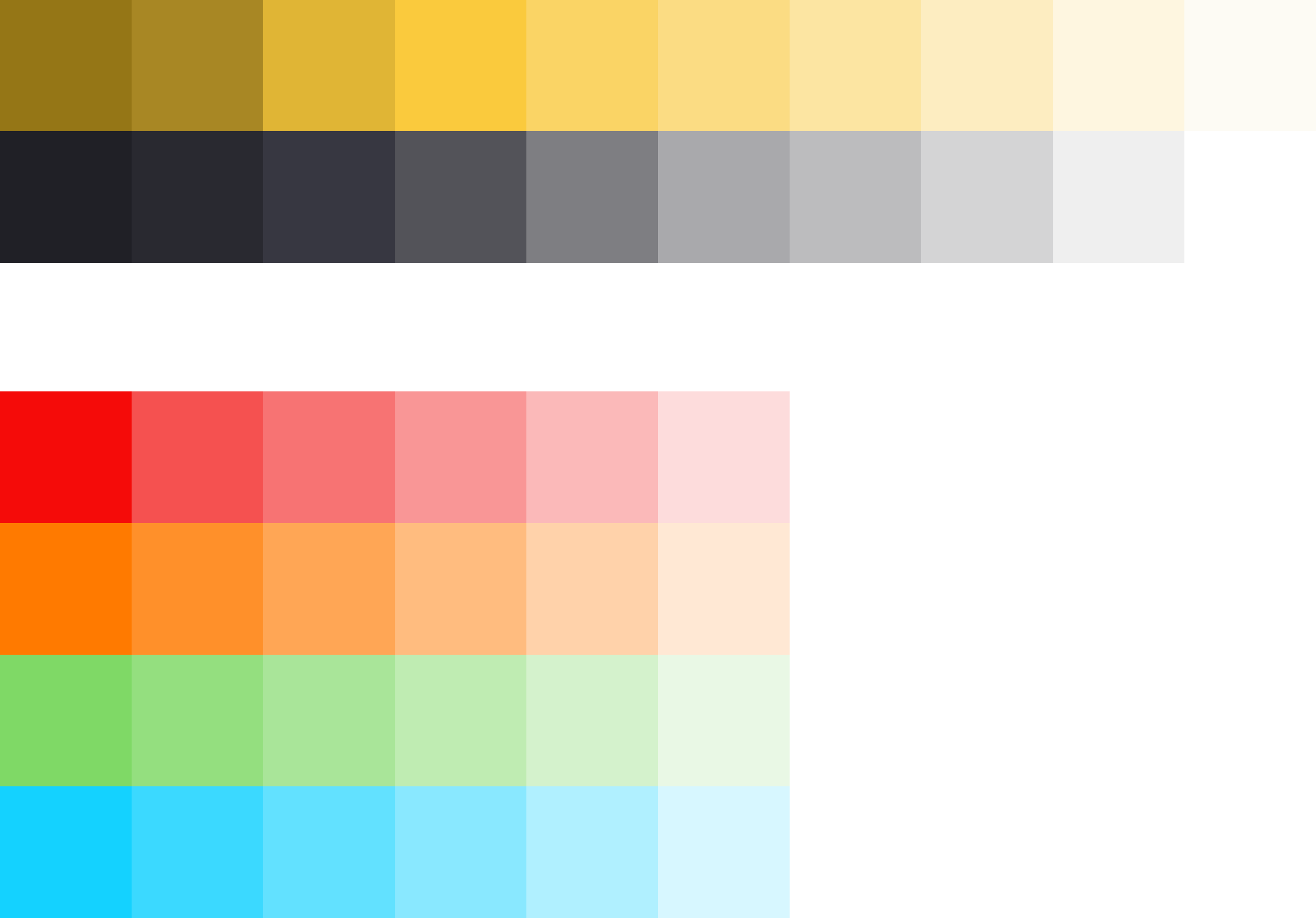
The color concept.
Maintaining consistent and engaging digital experiences within Germanedge, whether applications or experiences, requires a sensitive use of color. The following color concepts form the basis for our efforts to create a unique user interface design. The color world of our user interface "Inspire" is clean and reduced.
The colour system is based on 2 main colours, the brand colour and the primary colour "Tokyo". The two colours together, because they are complementary to each other, result in a rounded colour picture. In addition, various alarm colours are added, but it should be noted that the alarm colours never resemble the brand- and primary colours.
The color palette of Germanedge is basically divided into two different themes. The "Daylight" and "Nightshift" theme. The color palette of each theme brings a uniform and recognizable consistency to our interface.
The anatomy of the Germanedge colours.
As the basis for both themes, the neutral "Tokyo" colour family dominates, separating the contents with subtle nuances.
It is important that the nuances do not run into each other. The yellow brand colour is the primary action colour for all Germanedge products and experiences. Additional colours are used sparingly and purposefully.
The themes.
The themes serve as a framework for colour worlds within Inspire, with each theme based on a specific primary background colour. There are two standard themes. The Daylight theme "Astronaut" and the Nightshift theme"Tokyo at Night".
Code
...
| title | Usage |
|---|
Lorem ipsum
Lorem ipsum
...
Action Link
...

...
Link with Icon
...

...

- Icon Button/ Icon
- Link Text
- Icon
Content
We recommend links be three words or fewer. Because links take users to a new location, it is important that their labels accurately reflect the content users will find at the link destination. Use meaningful labels for links and avoid terms like “click here” or the web address itself.
Links need to be clear enough to be understood by the user, but should not be so long that the text wraps unless used inline.
Behaviors
Interactions
Mouse
Users can open a link by clicking anywhere along the link text or on the associated icon.
Keyboard
Users can open a link by pressing Enter while the link has focus. For additional keyboard interactions, see the Accessibility tab.
Screen readers
VoiceOver: Users can open a link by pressing Control-Option-Space or Enter.
JAWS: Users can open a link by pressing Enter.
NVDA: Users can open a link by pressing Enter.
Link types
Standalone link
Standalone links are used on their own directly following content. They should not be used within sentences or paragraphs. Standalone links are the default link style for Carbon and only have an underline in the hover state.
The standalone link component can be paired with an icon. Use 16px icons and place them to the right of the link. Icons should always be the same color as the link text.
!!!insert picture here
Inline link
Inline links are used in sentences or paragraphs of text. The inline link behaves the same as the standalone link but it is styled with an underline. This helps differentiate them from the text they are placed next to and makes it clear users can interact with them.
Inline links should not be used on their own and should not be paired with icons.
Modifiers
Visited style
By default, the link component does not use a visited style. Visited links indicate that a user has already opened the link so they can be a helpful indicator during task completion. Visited styles should be used sparingly because they often clutter the the page and add further visual noise as users are trying to navigate a product. They can be used if it is important that a user knows they have already clicked on a link.
Links that trigger actions
Some links trigger actions to aid task completion in addition to navigation. These links should still serve a navigation purpose. A common example is linking phone numbers so clicking the website automatically opens and calls the phone number when clicked. The label and any accompanying icons should make it clear what action will be triggered and where the user will be directed.
Related
...
| title | Style |
|---|
Style
Color
!!! define color here
pawel tomkowski makes it sense to put the style information from live style guide here?
...
Interactive States
...
!!! add picture here
Typography
Links should not exceed three words.
...
Structure
Recommended
Links can be grouped horizontally or vertically and must be underlined. The following specs are not built into the Link component but are recommended by design as the proper distance between grouped Links.
...
| title | Code |
|---|
Code
Preview the link component with the React live demo. For detailed code usage documentation, see the Storybooks for each framework below.
!!! create live demo here.
pawel tomkowski makes it sense to put the code from live style guide here as an iframe?
Test
...
| title | Accessibility |
|---|
Accessibility
!!!this section needs to rework
How it works
The link Carbon component is primarily a native HTML hyperlink navigational element. The Enter key activates the link and causes the user agent to move focus to the link destination. When you use the disabled link component the ARIA state is set to aria-disabled="true", which changes the appearance and the tabindex="-1" which removes the link for the tab order. When the link becomes active the ARIA state changes to aria-disabled="false" and the link is present in the tab order.
Accessibility considerations
This component has been validated to meet the WCAG 2.0 AA and Section 508 accessibility guidelines, however changes made by the content owner can affect accessibility compliance. Be sure to review and follow the guidance in this section when updating or adding new content to this component.
- Link text is the visible label for the native HTML link and is used to provide the purpose of the link which is clear and easy to understand for all users.
- The alt attribute for the img element is used to describe the purpose of a graphical link with an image inside the link.
- The title attribute can be used to supplement the link text with any additional useful description.
...