Page History
(this page was created automatically. In case of formatting issues, please visit the official Wiki Page)
Toolbar Actions
...
Overview
Toolbar actions are a key part of action placement. They control functions of the content and of the container. Actions in toolbars are represented by action icons. When there are too many actions, they are grouped into an overflow menu.
Toolbars appear across multiple organisms. They exist in the header, in boardlets, in ghost boardlets, in cards, in dialogs, and in table rows. Each placement follows specific rules that fit its use case.
Anatomy
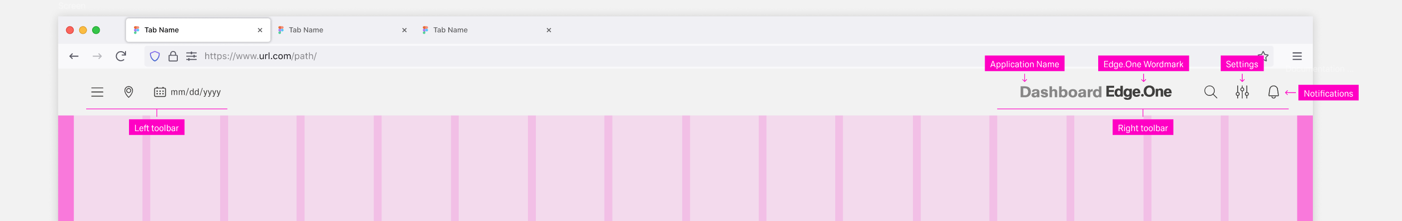
Header Toolbar
The header toolbar contains actions that affect all applications the entire application or the entire user environment. Primary There is a distinction between primary and secondary actions are distinguished. Primary actions are always be available, while secondary actions might not be present in some dashboards.
Navigation items like the burger menu or breadcrumbs are placed on the left. Form more can be found in [Navigation]. If the inline datepicker in the header is active, it is also placed in the left toolbar at the armost farmost right position.
Possible actions for the right sidebar action toolbar include:
| Primary Actions | Secondary Actions |
|---|---|
| Settings | Search |
| Application Name | Notifications |
| Edge.One Wordmark | Home |
Boardlet
...
Toolbar
The boardlet toolbar is always on the right side of the boardlet. It controls actions for the boardlet and its content.
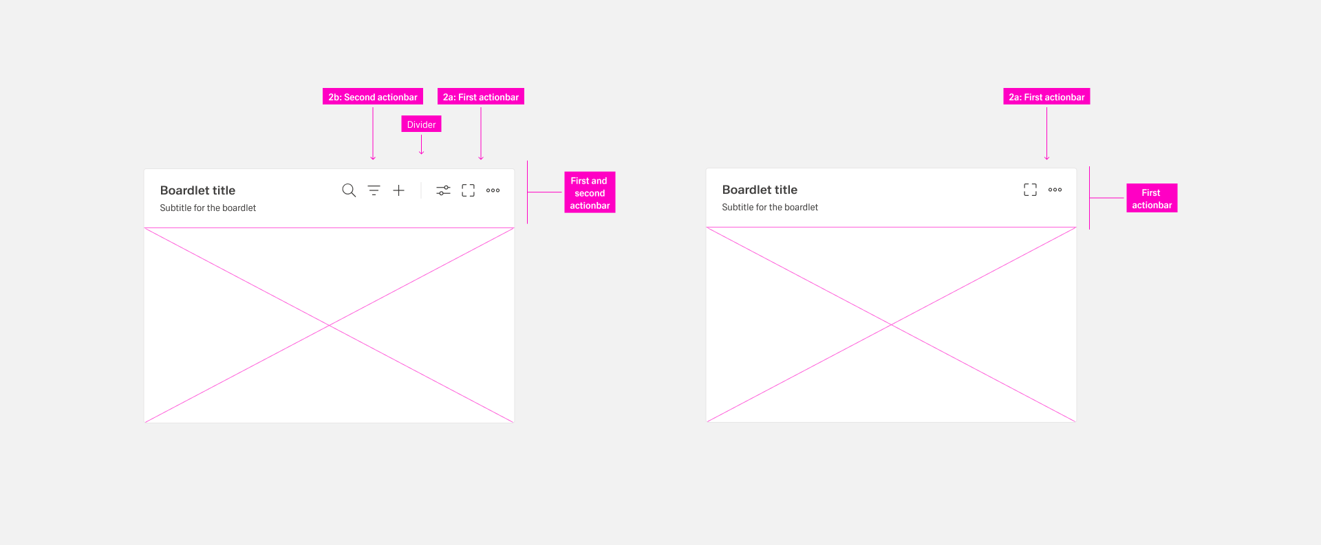
The toolbar can exist in two variations:
- The first actionbar containing actions that affect to the boardlet
- The second actionbar containing actions that affect to the content
First Actionbar
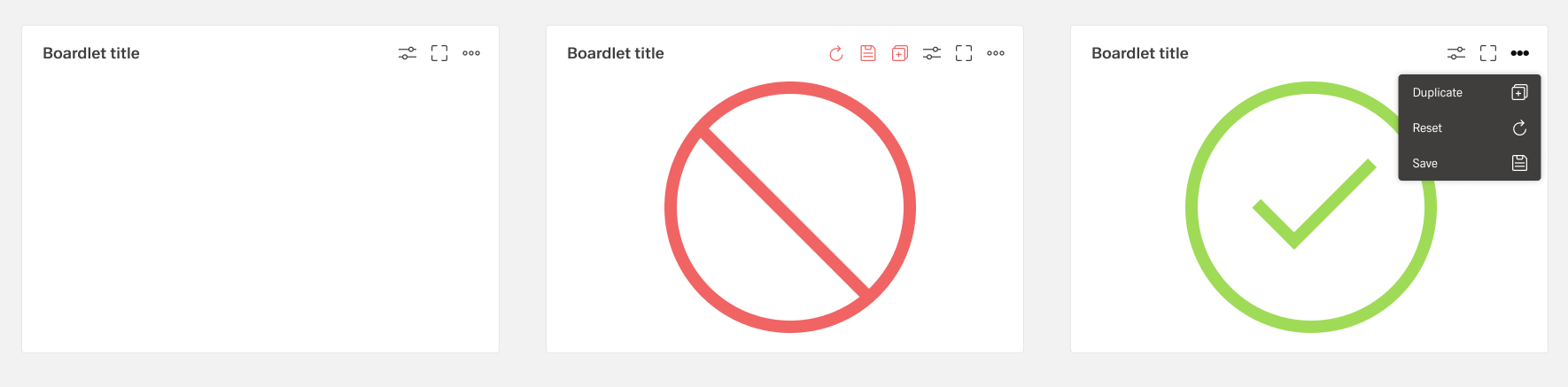
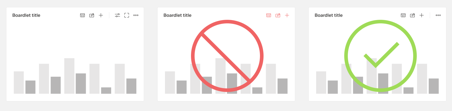
Never place more than three actions per toolbarfirst actionbar. If it is necessary to place more than three actions in the boardlet, they are grouped and can be found under the "more" icon. Grouping This is always done with the help of an overflow menu.
The actions of the toolbar are divided into primary and secondary. Secondary actions are place inside the "More" actions in the form of an Overflow Menuoverflow menu. The number of secondary actions is not limited. But it is recommended not to place more than 8 actions, because otherwise the overflow menu becomes too long. this This can disturb the clarity.
Second Actionbar
The second actionbar is always separated from the first actionbar by a dividing line. The second actionbar contains only actions that can be performed on the content of the boardlet, e.g. filtering and sorting the content, search, adding etc. The second actionbar never be used without the first action bar.
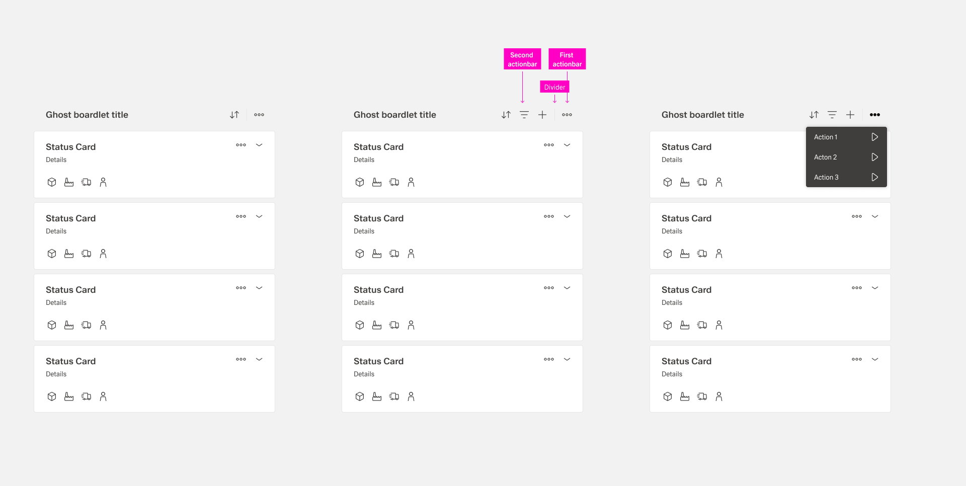
Ghost
...
Boardlet Toolbar
The ghost boardlet toolbar follows the boardlet rules. Alignment and grouping are the same. The only difference is the first actionbar, which contains only a single More iconthe more action with a dropdown menu.
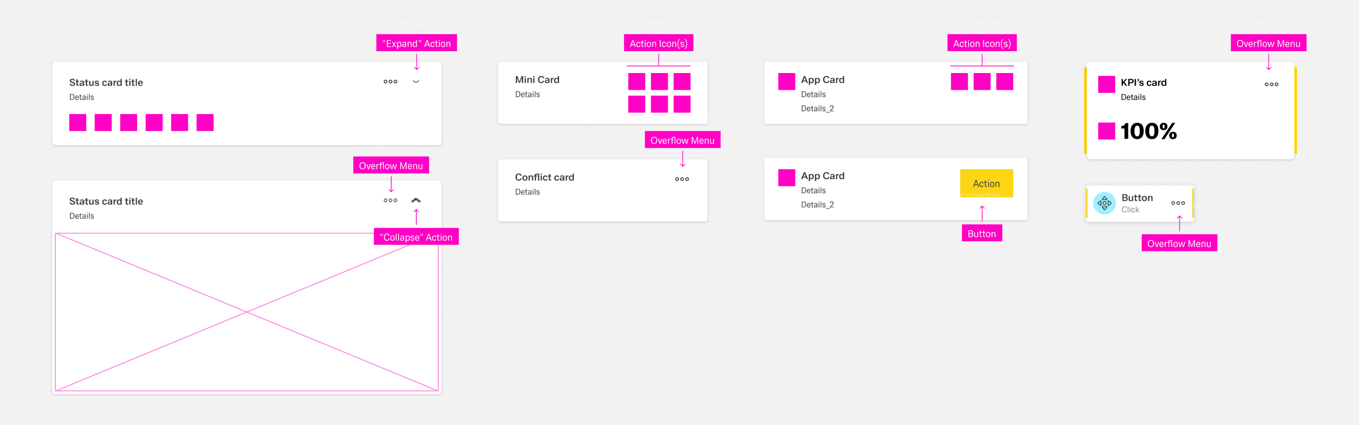
Card
...
Toolbar
The placement and rules of actions inside cards depend on the tye of card:
| Type | Action Placement |
|---|---|
| Interactive Card (Collapsed) | The "More" and "Expand/Collapse" actions are placed in the top right. Further actions might be placed on the bottom left. |
| Interactive Card (Expanded) | Only two actions are allowed: "More" and "Expand/Collapse", placed in the top right corner. |
| Mini Card | Up to six actions icons in two roes of three can be placed at the right side of the card. |
| App Card | Up to three action icons ore one action button can be placed at the top-right side. |
| Conflict Card | The only allowed action is "More", placed in the top-right corner. |
| KPI Card | The only allowed action is "More", placed in the top-right corner. |
| Action Chain Card | The only allowed action is "More", placed in the center-right corner. |
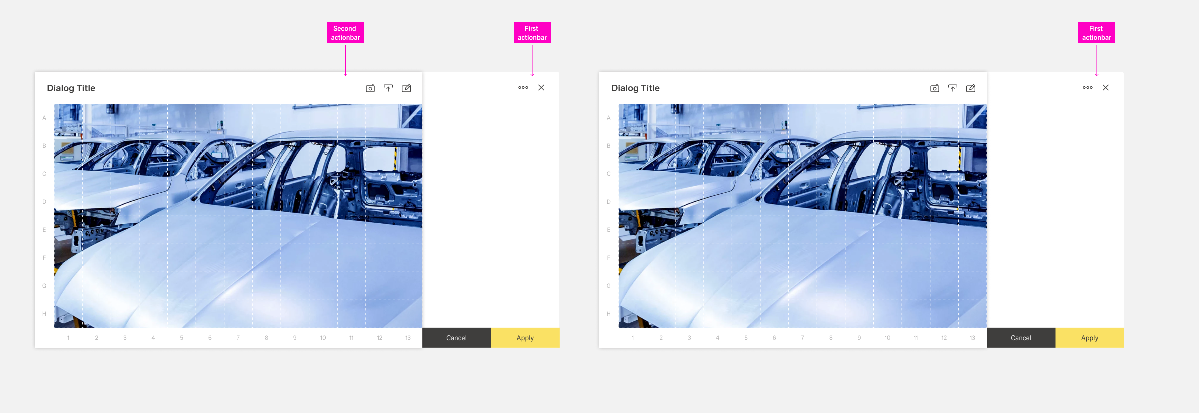
Dialog
...
Toolbar
The Dialog Toolbar, as a child of the Boardlet Toolbar, follows its rules. However, the variant "Dialog with Sidebar" is an exception.
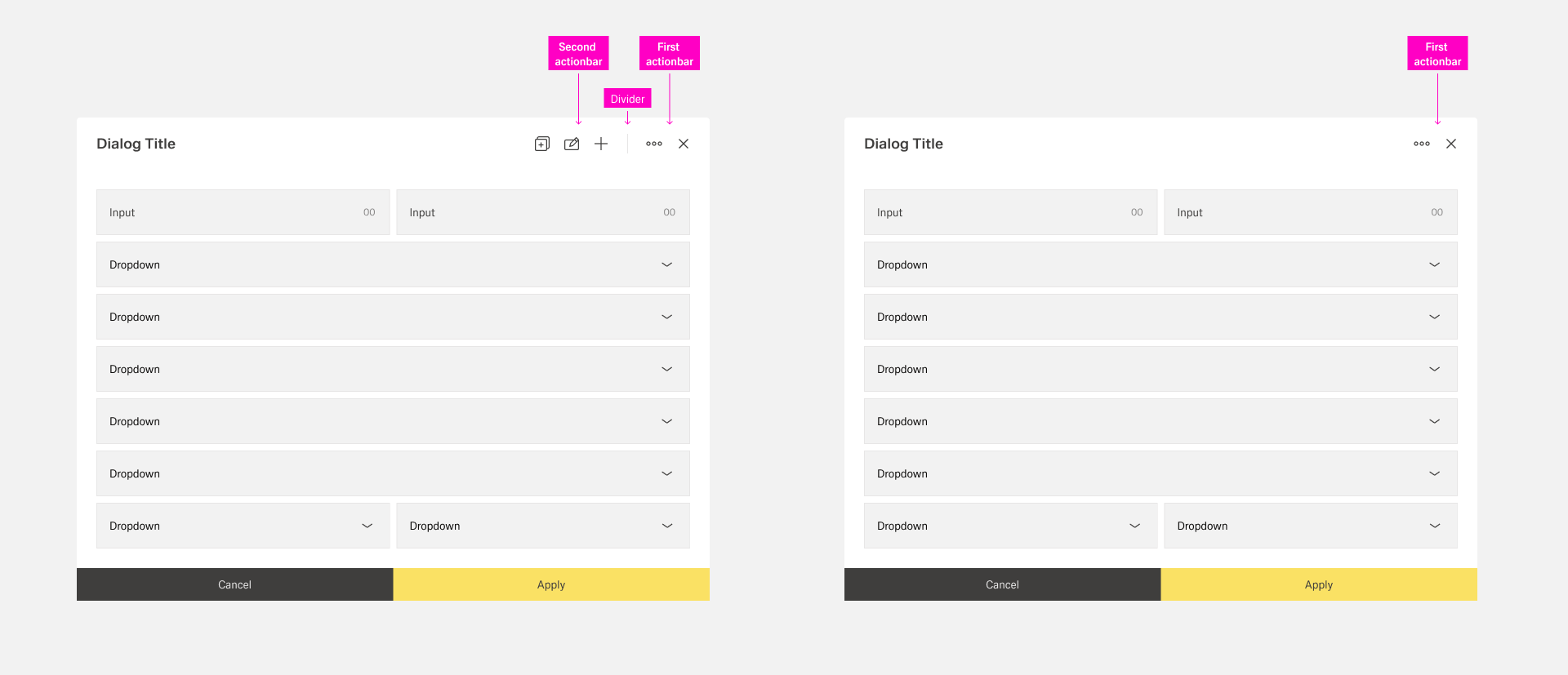
In case a dialog toolbar follows the boardlet rules. It inherits alignment, grouping, and capacity guidance.
If the dialog has a sidebar, place the first actionbar on must be placed in the outer right area of the sidebar. This makes ensures that the user notices the difference between dialog functions and content functions clear.
Use a visible divider when two actionbars are present. Keep actions right-aligned.
Table row toolbars
.
Best Practices
Placement and Alignment
Toolbars are generally aligned at the right with the most important actions being placed at the faremost right. If an organism has an overflow menu, it is placed at the farmost right.
Every toolbar action, beside the application ame and Edge.One wordmark in the header toolbar, is represented by an action icon. All actions have a title that is shown in a tooltip when users hover the icon.
Using an Overflow Menu
Keep the number of visible actions small to preserve clarity. If an organism has a great number of actions, less secondary actions are placed inside an overflow menu with the "more" icon. Avoid more than eight secondary actions in a single overflow to maintain clarity.
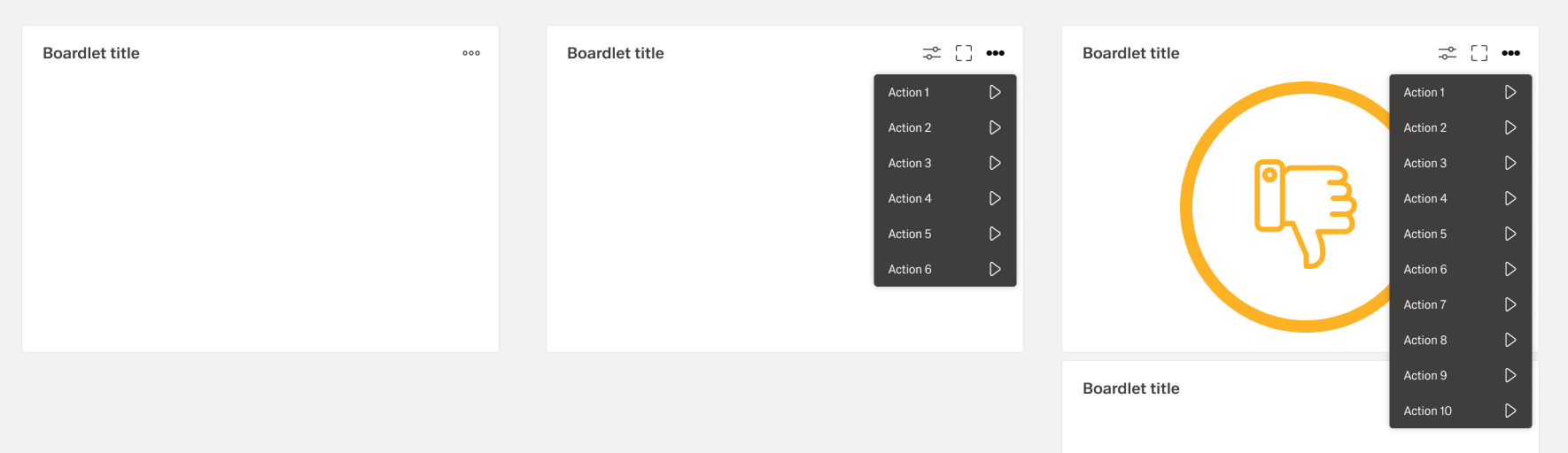 Table row toolbars are used in rows of tables. They always control functions of the entire row.
Represent actions with icons. Group additional actions under More when space is limited.
Keep actions right-aligned within the row. Ensure the toolbar reflects row-level scope only.