Page History
...
The boardlet toolbar is always positioned at the top-right of the boardlet header. It controls actions for the boardlet and its content.
[IMAGE]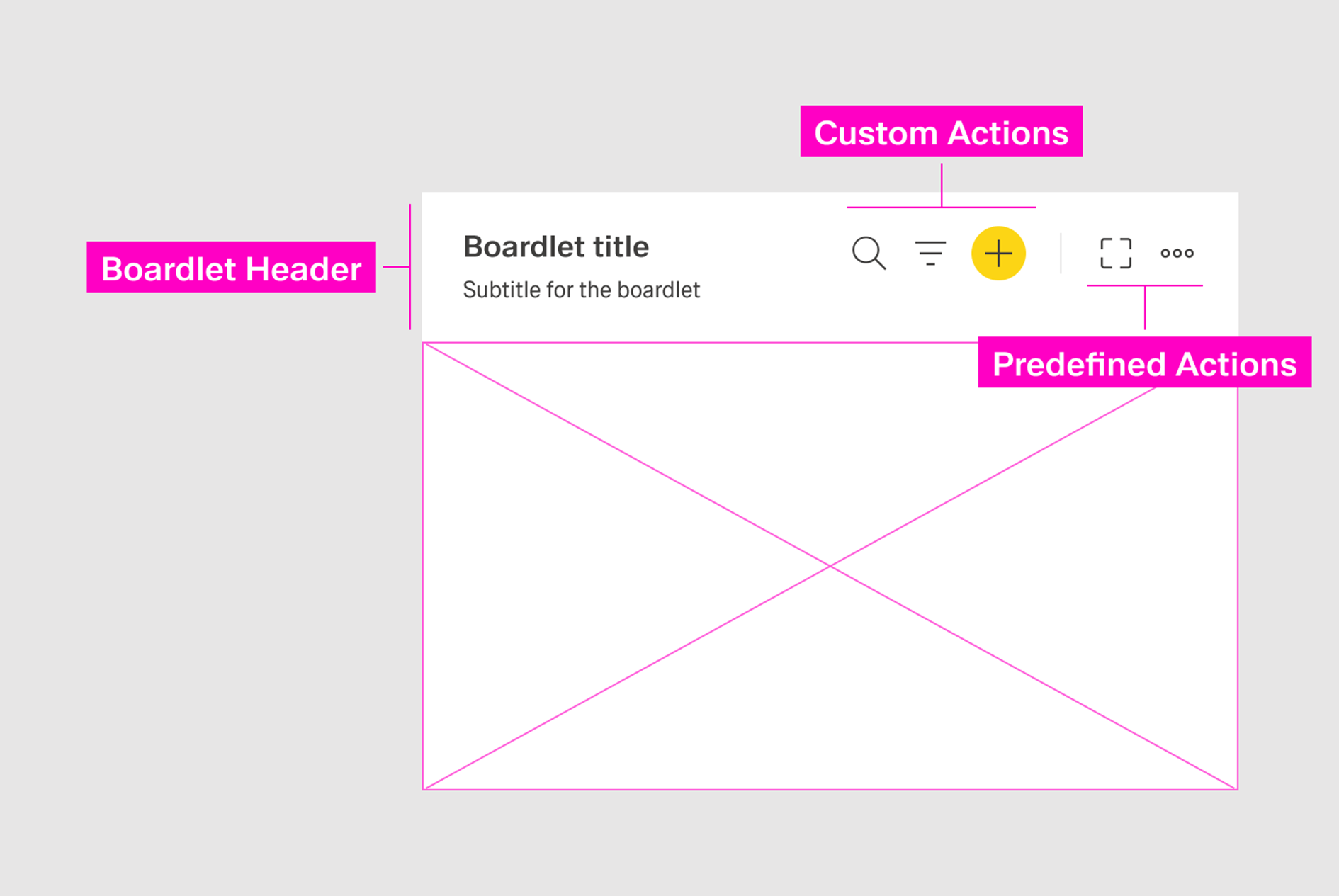
The toolbar has two parts:
...
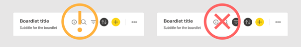
A dividing line separates predefined actions from custom actions. [IMAGE]

Custom Actions
...
- Primary icon-only button.
- Secondary icon-only button.
- Action icon.
The action icon is the default state. The state can be changed manually to a primary or secondary icon-only button if the action hierarchy of the page requires it.
Icon-only buttons should be placed on the far-right side of the custom action area.
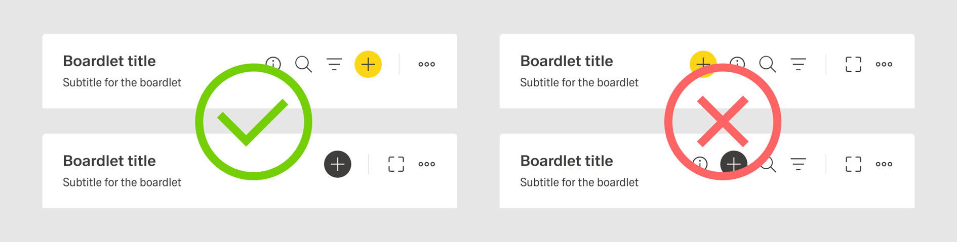
Primary actions should appear to the right of secondary actions. A If possible, a single toolbar should avoid multiple buttons.
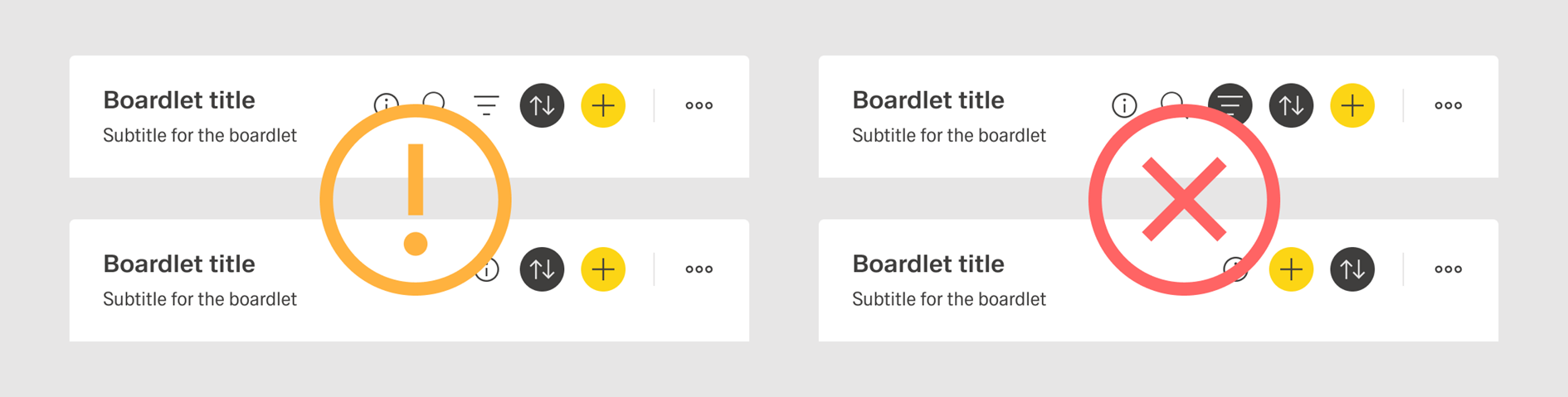
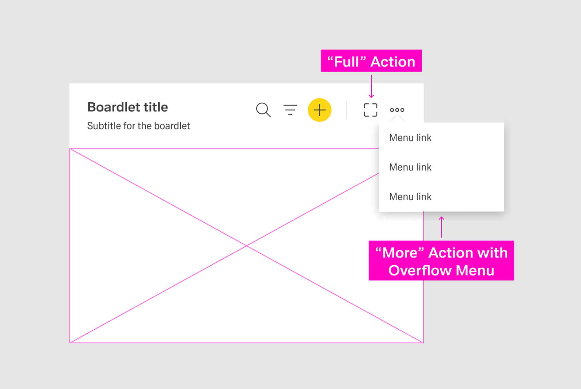
A toolbar should include a maximum of three action icons and a maximum total of four actions. Additional actions should be placed inside the More action.
[IMAGE]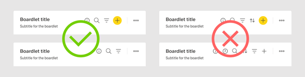
Ghost Boardlet Toolbar
...
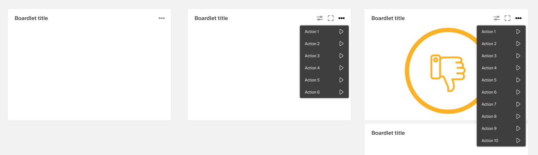
If an organism includes many actions, less important actions should be placed in an overflow menu using the More icon. Avoid more than eight actions in a single overflow menu to maintain clarity.
Extension of Action Hierarchy
Primary Actions
A page should not include more than one primary action. If the primary action is placed in a toolbar, no other button on the dashboard should be primary. If another button on the dashboard is already primary, no action in the toolbar should be primary.
The primary action of a page should drive the user forward in the current user flow. For more information, consult action placement.
Secondary Actions
Reserve secondary actions for secondary user flows on the current dashboard. If unsure, set the action to tertiary rather than secondary.
A toolbar can include only one secondary icon-only button.
...
Ghost Actions
Reduce visible actions to the most important to avoid overwhelming the user with choices. Less important or less common actions should be placed inside the More action.
...