Page History
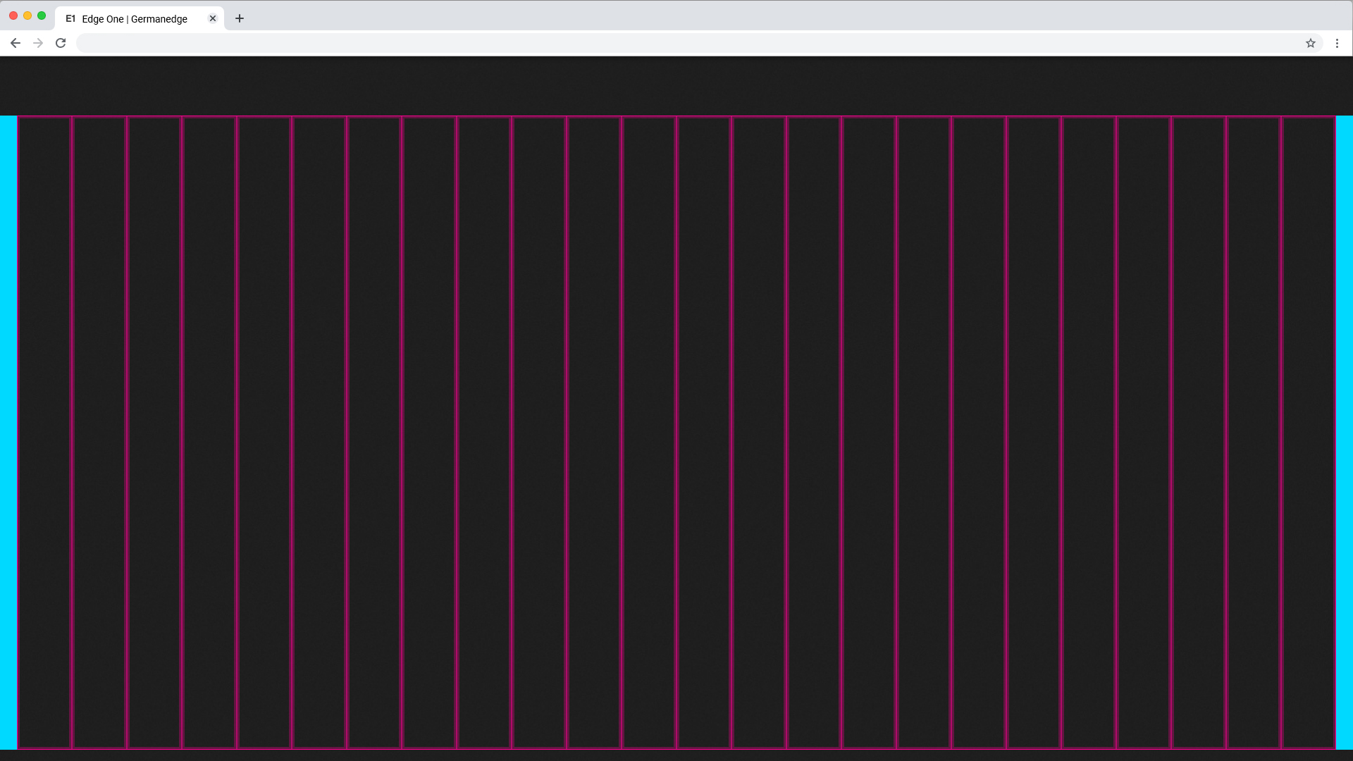
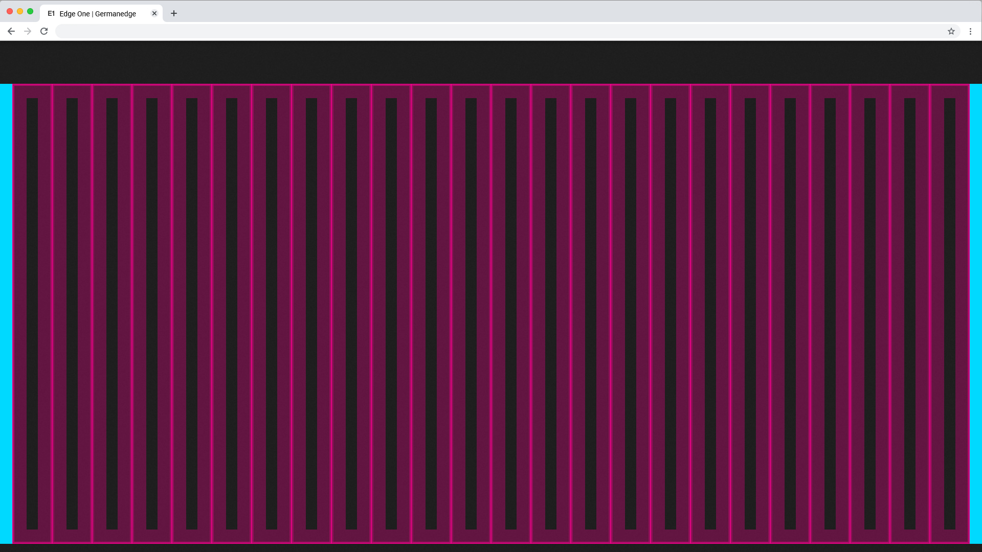
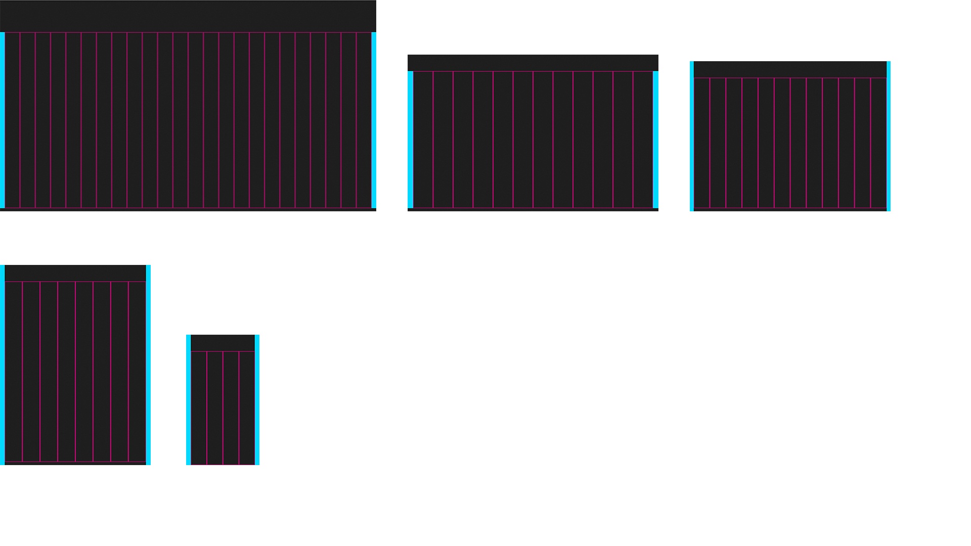
24 Columns Grid
The 24 Columns Grid ist the Base of all. Columns result in key lines. Within the lines all components find their place. all columns have a padding.
The Breakpoints.
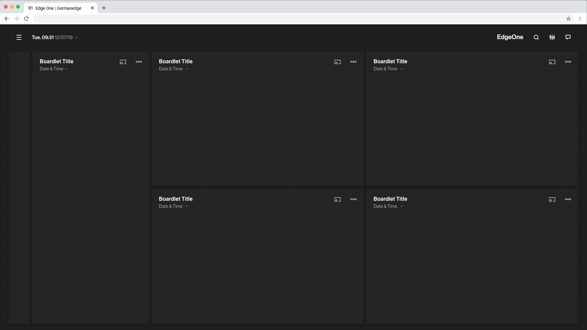
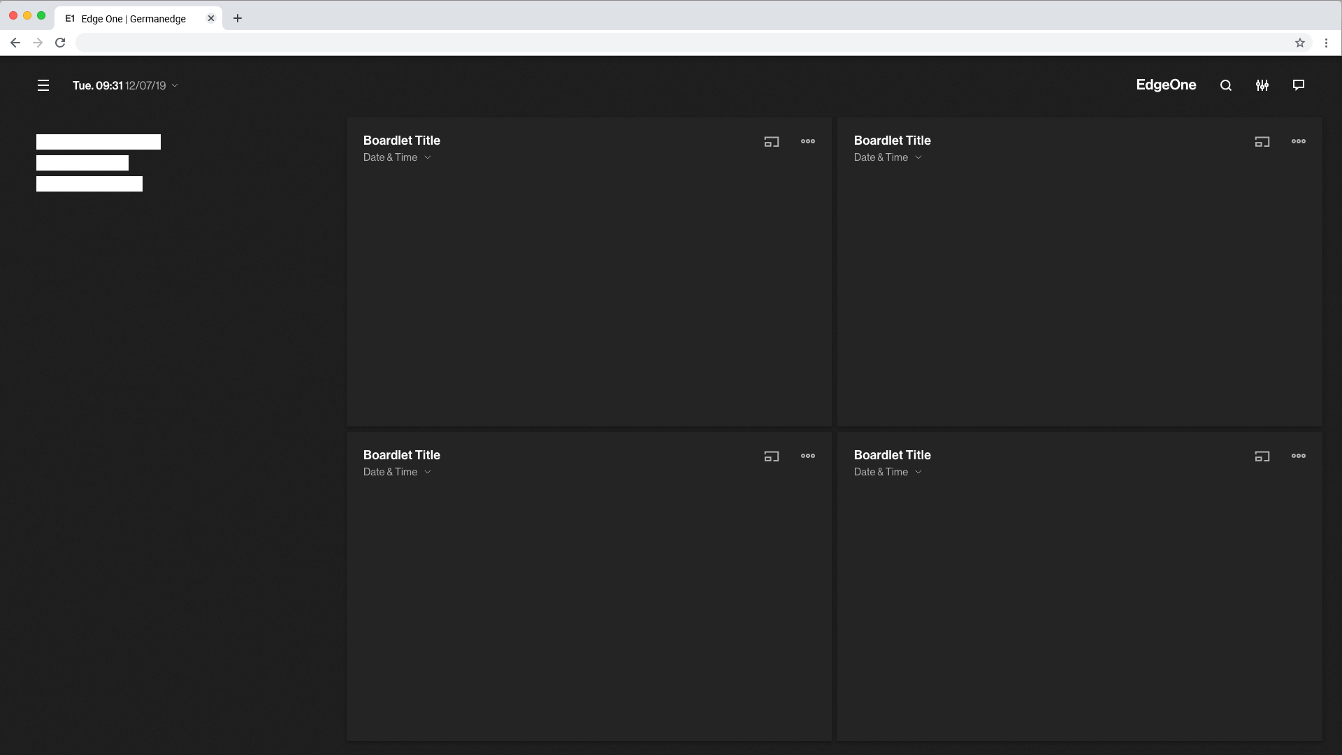
The grid has 5 basic breakpoints. These breakpoints determine not only the columns, header, margin, gutter and icon size. They also determine the contents of the respective device and how they are displayed. This is necessary because the display of boardlets in high resolutions allows a generous handling of headlines, sublines, content and icons. Within small representations these contents have to be compressed or even displayed in multiple levels. Otherwise the user loses the overview in the fill or content is displayed so small that it is no longer readable. Please take a look at the breakpoint animation.
Extra Small <576px | Small ≥576px | Large ≥960px | Extra large ≥1200px | Extra extra large ≥1800px | Kiosk (work in progress) ≥3500px | |
|---|---|---|---|---|---|---|
| Class prefix | .col-sm- | .col-md- | .col-lg- | .col-xl- | .col-xxl- | |
| # of columns | 24 | 24 | 24 | 24 | 24 | |
| Gutter width | n.n | 12 | 12 | 16 | 26 | |
| Nestable | Yes | Yes | Yes | Yes | Yes | |
| Column ordering | Yes | Yes | Yes | Yes | Yes |
The Guidlines.
This list of breakpoints will grow steadily, as the need arises.
Currently, the following breakpoints are necessary from the point of view of the UI/UX Guild.

Columns and Gutter Padding
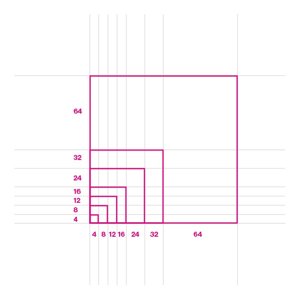
The padding within the columns is one Mini Unit (4x4px) or one Middle Unit (24x24px). This can be determined by the designer depending on the content.
It is recommended to use 1 mini unit for boardlets and 1 middle unit for content that is free standing.
Columns Patting with Mini Units
Gutter Patting with Middle Units
Use this set of standard breakpoints to maintain layout integrity across screen sizes. For best results, test designs and code at each of these standard breakpoints.