Page History
...
Actions trigger functions, such as saving or deleting a business object. They can also trigger navigation to another dashboard, where the action can be executed, described in detail, or checked further. Actions are displayed in the form of action icons or buttons.
Actions that refer to a content are displayed at the top of the boardlet, next to the title that identifies the object. Actions that relate to the task workflow are located at the bottom right and can be performed after working through the content.
To make actions easier to organise and find, they are usually placed in toolbars. Depending on the content that is affected by the action, different toolbars are available. Within the tool barstoolbars, some actions are usually more important than others. Refer to the arrangements in the below examples for better understanding.
Actions are always distinguished from pure navigation. Navigation functions are always on the left, such as Home or Breadcrumbs, while actions in toolbars are aligned on the right.
...
Toolbar actions
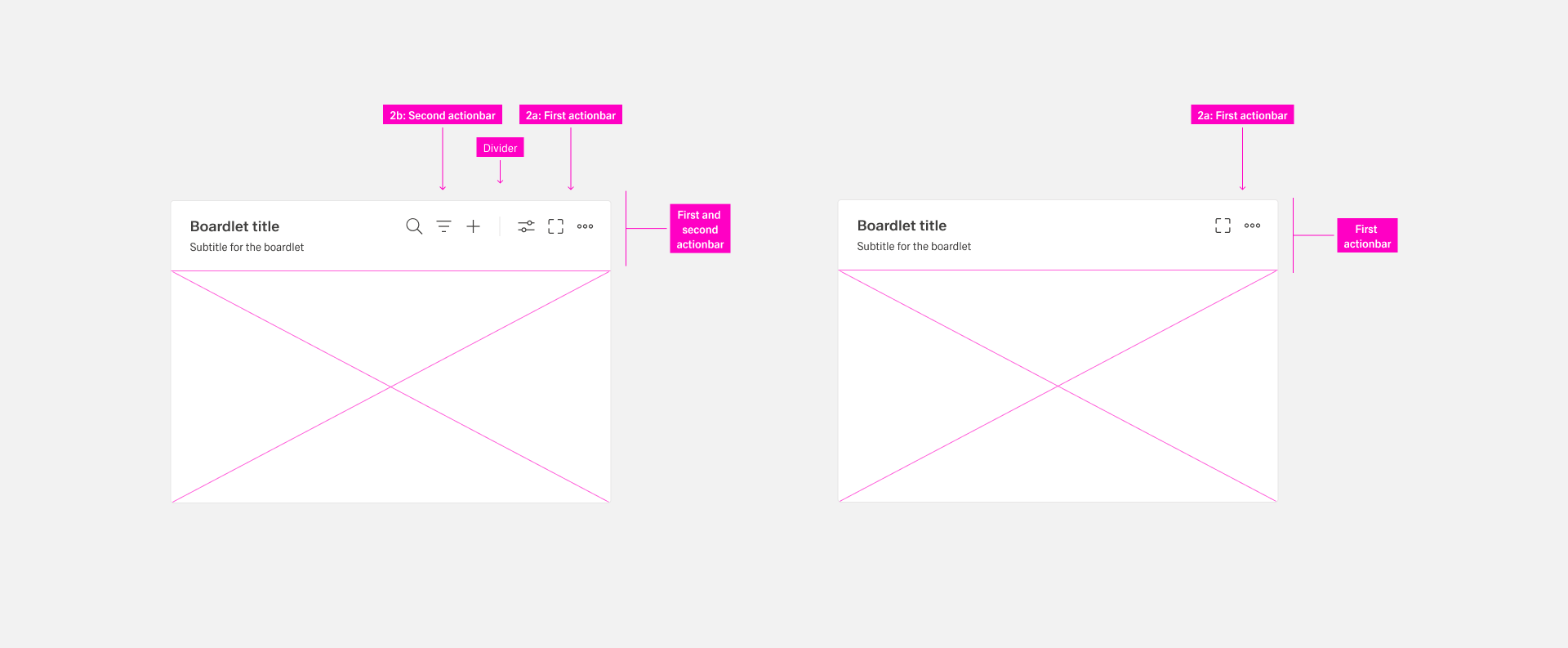
Toolbar actions are an important part of action placement. They control functions of the content as well as the container. Toolbar actions They are represented by action icons. If more than the allowed number is needed, group them in an overflow “More” menuwith the “more” icon. The allowed number is depending dependent on the context.
Toolbars appear in different organisms and follow placement-specific rules. Use the following placements and constraints.
| Name | Use Case |
|---|---|
| Header toolbar | Actions that affects all applications and the entire user environment. It sits in the header area. |
| Boardlet toolbar | Actions controling a single boardlet and its content. It is always on the top- right side of the boardlet. |
| Ghost boardlet toolbar | It follows the boardlet toolbar rules with one exeption: The first actionbar has only one “More” icon. |
| Card toolbar | Card-secific specific actions like “Expand/Collapse” if the card supports expand. All other actions are gouped under a “More” icon. |
| Dialog toolbar | It contains actions related to the Dialog dialog and follows boardlet behavior. |
| Table row toolbars | Actions that pertain to a single row of a table. They always control functions of the entire row. |
For more information, please go to [Toolbar Actions].
Footerbar actions
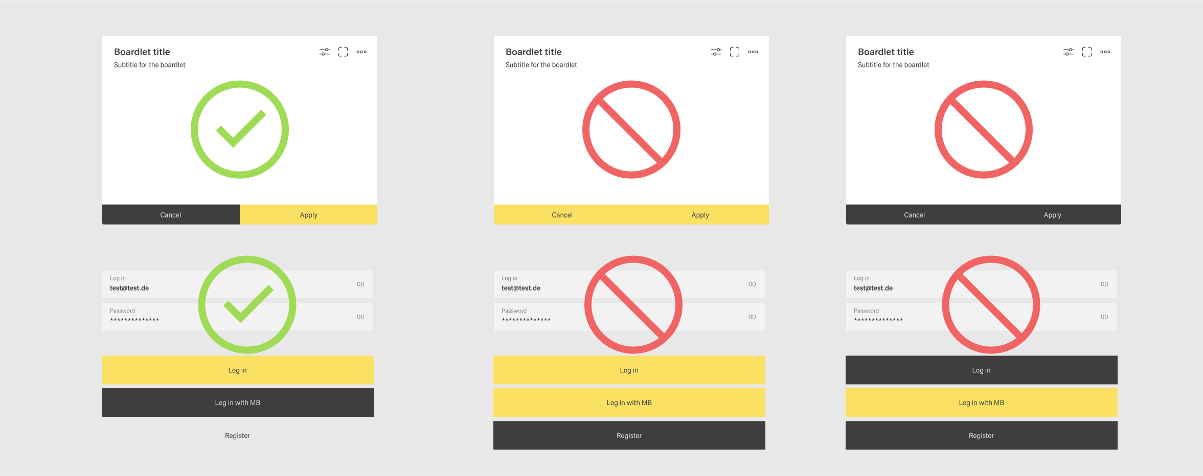
The footerbar controls the workflow of the organism they is placed in, usually a boardlet. Actions related to the workflow are always at the bottom of the organism.
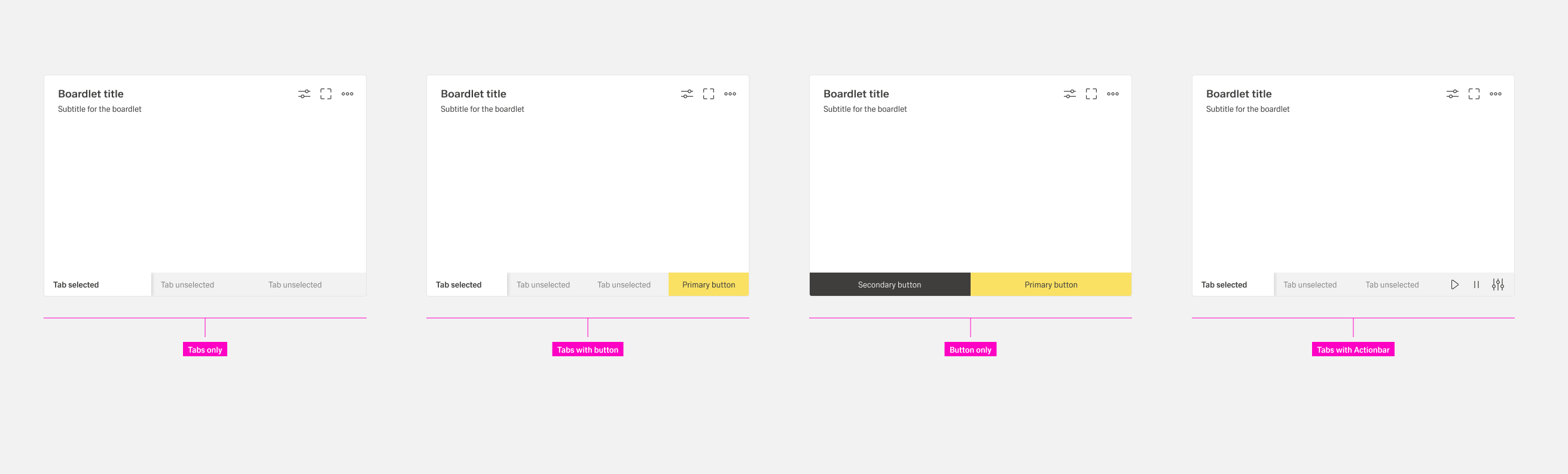
The footerbar has a fixed height and must never be multiline. Use only the allowed combinations.:
- Tabs only. Tabs are arranged side by side. There is no default number of tabs. Exeptions: Vertical tabs are placed below each other.
- Tabs with buttons. Use this when the boardlet has multilayer content and a content action. If an action exists only in one tab, show it disabled in all other tabs to avoid visual jumping. The number of possible actions is limited to a maximum of two buttons.
- Buttons only. Use this when an action is required in the boardlet. The number of possible actions is limited to a maximum of two buttons.
- Tabs with actionbar. Use this as a secondary display option. It can be used in kiosk mode to control tab rotation and timing.
For more information, please go to [Footerbar Actions].
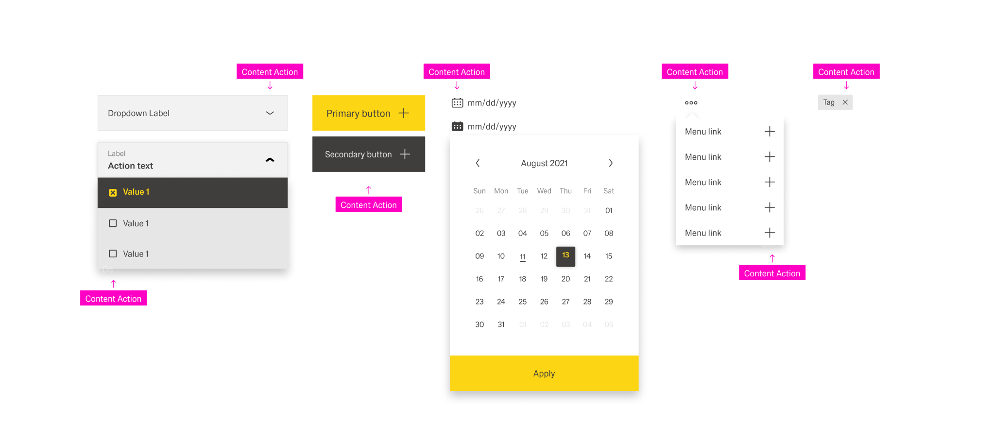
Content actions
Content actions are placed directly in freely selectable content. They can appear in the content area of a boardlet, dialog, modal, or free-standing content.
...
- Inline actions. The action molecule or organism is not enclosed by a body. The action is always on the left inside the molecule or organism.
- Actions. These actions also have no enclosing body. The action is always on the left inside the molecule or organism.
- Table Actions. They are placed inside an action column inside a table. Each row has the same actions. Actions effect the entire row.
For more information, please go to [Content Actions].
Best practices
Place and
...
alignment
Place actions as close as possible to the content they affect. For example, if an action only effects one items inside a boardlet, consider putting it into a content action rather than a toolbar action.
...
Follow this order in the Header toolbar. : Place business actions first and then content management actions. Place layout management actions next and then generic actions. It is recommended to place the action most important for your business context on the very left within its group.
...
Do not place more than three actions per boardlet toolbar. Group additional actions under the More action. List grouped actions in an overflow menu. A boardlet has actions, it must always include the More action. The second actionbar must not exist without the first.
Hierachy of
...
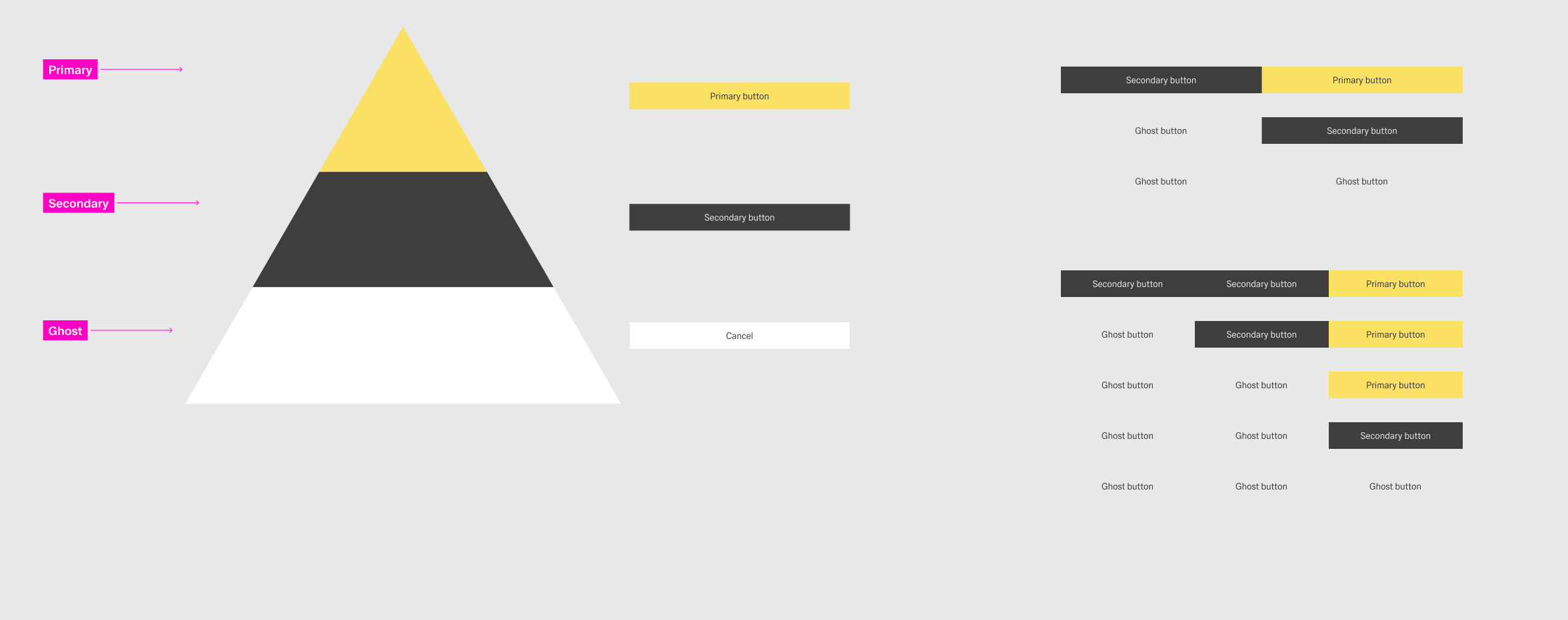
Action Buttons
The buttons follow a hierarchical order. It is important that you create a visual hierarchy between the buttons in your user interface. The hirachie moves linearly from right to left.
Types
There are three types of buttons:
| Type | Definition | Examples | Styling |
|---|---|---|---|
 | |||
 | |||
 |
There is only one primary button per group of buttons. There can be multiple secondary and ghost buttons. An actions should retain its type of button throughout the application.
Layout
Depending on the context, a group of buttons can have two layouts: horizontal and vertical. Avoid conbining the two within one dashboard. The order for buttons is as follows:
- Horizontal - From left to right, place ghost buttons first, than secondary buttons and last if existing a primary button.
- Verical - From top to bottom, place the primary button first, than secondary buttons and ghost buttons at the bottom.
Avoid placing more than three buttons in a button group for visual clarity.