Page History
Spacing is an important, and often underestimated, part of the visual design within Inspire. The Spacing serves to make all distances within the modules look the same. The different spacings allow for flexible arrangement within the system.
The Spacing are divided into two spacing usecases and other spacing.
1. The "Spacing" can be used horizontally and vertically. It refers to padding, margin , but also to distances and space between the elements.
2. The "Layout Spacing" can also be used horizontally and vertically. It is used as a design element to create hierarchies with spacing, to create focus and to give the overall design a sense of calm. Within the "spacing scale".White Scale" no data may be visualized.
Spacing and White Spacing
Our spacing rules are based on those of Bootstrap 4, but for more flexibility, clarity and clean code we have modified them. To make a clear separation between spacing and white spacing, we also added a separate rule for white spacing.
Spacing utilities without a breakpoint abbreviation (e.g. mx-1) will apply to all breakpoints. When you supply a breakpoint abbreviation to the spacing utility, that spacing will be applied from that breakpoint upward, e.g.: "mt-md-3" will apply a margin top of 0.5 rem (in our table 3 equals 0.5 rem) starting from the breakpoint "sm" towards "xxl"
Padding & margin spacing
Spacing Scale
| title | Importent |
|---|
.
| Where property is one of: | |
|---|---|
| m - | for classes that set margin |
| p - | for classes that set padding |
| Where sides is one of: | |
| t - | for classes that set margin-top or padding-top |
| b - | for classes that set margin-bottom or padding-bottom |
| l - | for classes that set margin-left or padding-left |
| r - | for classes that set margin-right or padding-right |
| x - | for classes that set both *-left and *-right |
| y - | for classes that set both *-top and *-bottom |
| blank - | for classes that set a margin or padding on all 4 sides of the element |
| Spacing | rem | px |
|---|---|---|
$spacer * 0 | 0 | 0 |
$spacer * 1 | 0.125 | 2 |
$spacer * 2 | 0.25 | 4 |
$spacer * 3 | 0. |
$spacer * 4| 5 | 8 |
$spacer * |
4 | 0.75 | 12 |
$spacer * |
5 | 1 | 16 |
$spacer * |
6 | 1. |
| 25 |
| 20 |
$spacer * |
7 | 1.5 | 24 |
$spacer * 8 | 2 | 32 |
| Layout Spacing | rem | px |
|---|---|---|
$ws * 1 | 3 | 48 |
$ws * 2 | 4 | 64 |
$ws * 3 | 5 | 80 |
$ws * 4 | 6 | 96 |
$ws * 5 | 7 | 112 |
$ws * 6 | 8 | 128 |
Spacing and Layout Spacing Example
9$spacer * 10$spacer * 11$spacer * 12$spacer * 13Padding & margin best practice
Here are some representative examples of these classes:

<div class="dialog-container p-7">...</div>
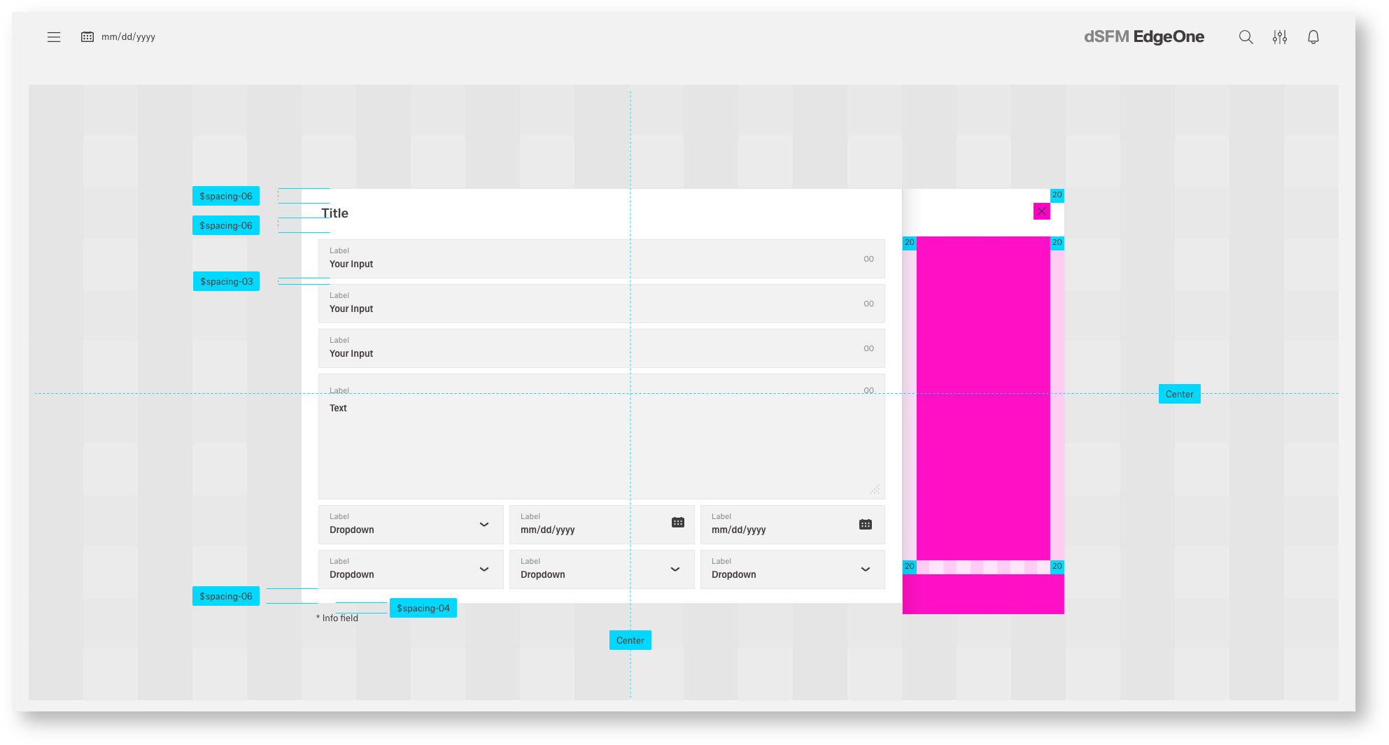
Spacing of a Dialog inside a Dashboard
Spacing of a DSFM cockpit
Center Spacing
Additionally, Inspire also includes an center class for centering fixed-width block level content—that is, content that has display: block and a width set by setting the horizontal margins to auto.

The headline atom is vertically aligned in the molecule
The dialog is vertically and horizontally aligned in the dashboard
Gutter
With this command all elements will aligned to the Gutter. This command is used exclusively for free-standing atoms, such as overlines and headlines, contentswitch or icons, but also molecules that consist of two or more atoms. Boardlets or Cards must never be aligned to the Gutter.
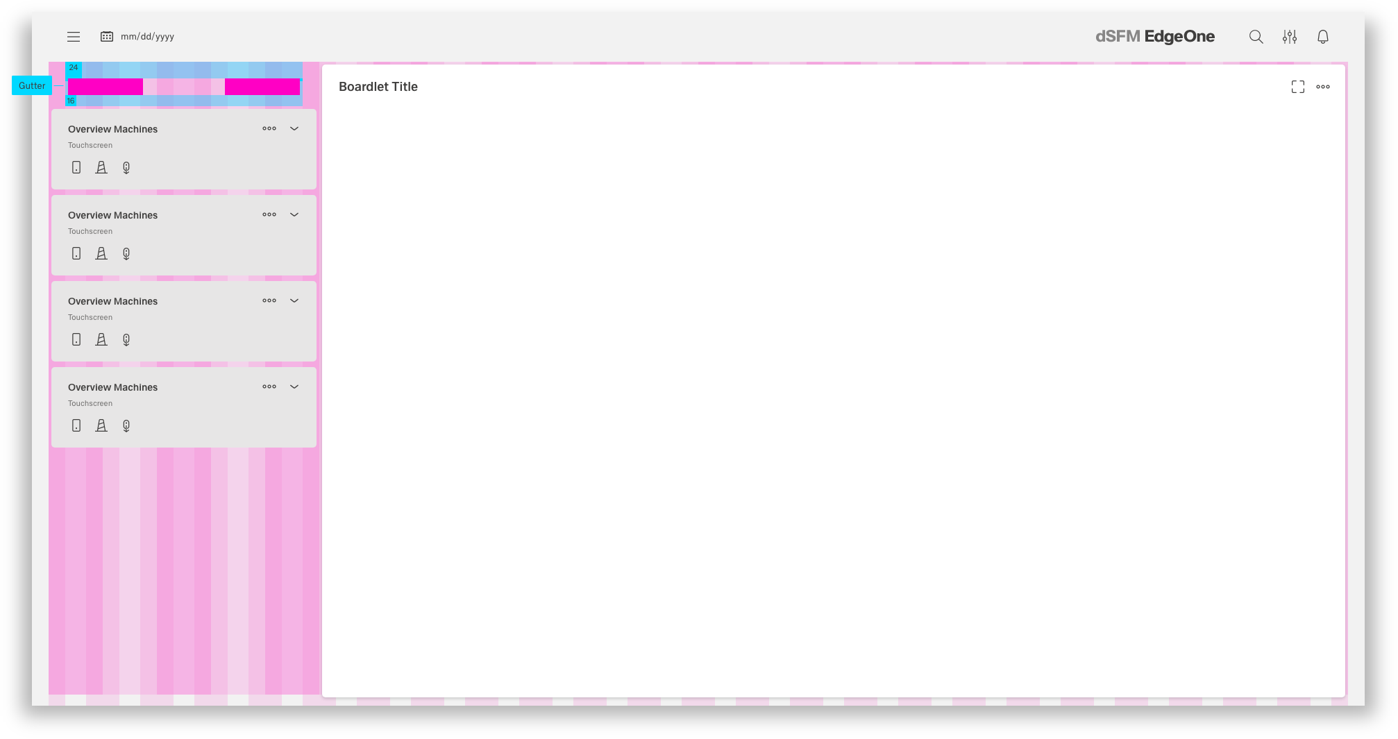
The Cardheader Molecule is aligned to the gutter.
Creating relationships (Copycat from IBM - Texter needed)
Elements in a design that are near each other are seen as being meaningfully related. As more space is added between elements, their perceived relationship weakens.
Patterns created through spacing can also create relationships. Elements arranged in the same spacing pattern are seen as related pieces that have equal weight.
Space can also be used to denote groups of associated information. This creates content sections on a page without having to use lines or other graphical elements as a divider.
Designing with space (Copycat from IBM - Texter needed)
Every part of a UI should be intentional including the empty space between elements. The amount of space between items creates relationships and hierarchy.
Using White Spacing with the grid (Copycat from IBM - Texter needed)
The Inspire grid is the encouraged way to horizontally space UI elements. The White Spacing is most commonly used for vertical spacing, but it can also be applied for horizontal spacing when appropriate, especially in the case of fixed spacing.
Other Spacing
There are a few other methods that can be used for spacing elements. Each has its own unique use case. Here are some representative examples of these classes.