Page History
...
Optional components include Floating Sidebar (depricateddeprecated), Overlay, Global Notification, Toast Notification (in progress), and Modal Notification.
...
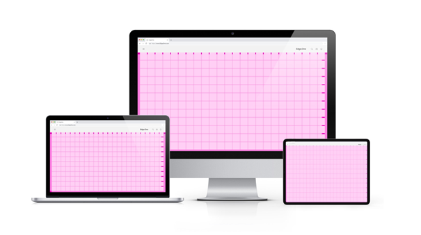
Within the grid, the content is not positioned freely. Start content blocks, for example, boardlets, at the top-left and place them along the grid. Grid cells should generally all be filled within a finished dashboard. Nested content, for example content nested in boardlets, may scroll within their own area.
Breakpoints
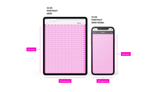
The grid defines six breakpoints that control columns, header layout, margins, gutters, and icon sizes. On smaller viewports, compress or stack headings and labels to preserve readability. Use this set of standard breakpoints to maintain layout integrity across screen sizes.
| Name | BrakpointBreakpoint | Width/Height | ColunmsColumns/Rows | Padding | Header size |
|---|---|---|---|---|---|
| Kiosk | ≥ 2000px | 4096/variable | 16/9 | 16/16/72/16 | 72px |
| Web_max | ≥ 1800px | 1920/variable | 16/9 | 16/16/72/16 | 72px |
| Web_min | ≥ 1200px | 1280/variable | 16/9 | 16/16/72/16 | 72px |
| Tablet_landscape | ≥ 960px | 1024/variable | 16/9 | 16/16/72/16 | 72px |
| Tablet_portrait | ≥ 576px | 768/variable | 9/16 | 16/16/72/16 | 72px |
| MobilMobile | < 576px | 375/variable | 9/16 | 8/8/64/8 | 64px |
...
- x: Clicking the close x icon in the upper left will close the Sidebar.
- Esc: Press ESC on the keyboard
- Click: Click into the non-sidebar content
There are is only one possible way to exit the anchored left Sidebar.
...
[!WARNING] This component of teh the pattern is likely depricateddeprecated. Please do not include it in the designs.
...
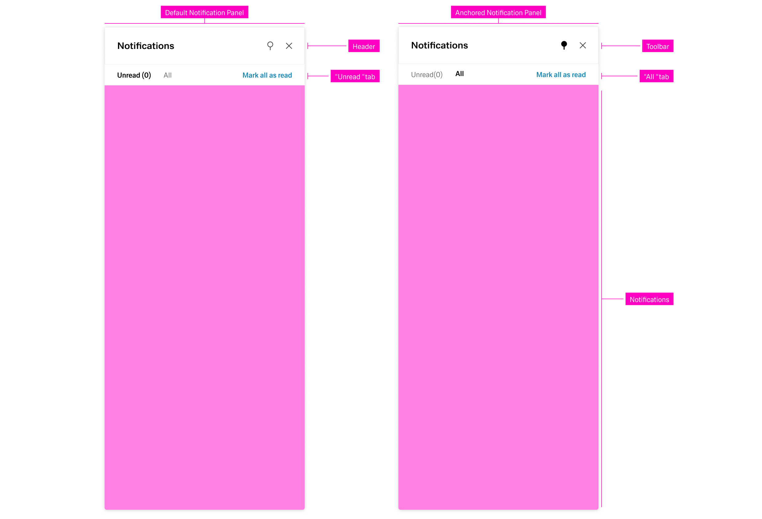
The Notification Panel is located within the right sidebar. It hosts only communication organisms. It can be opended opened with the "notification" action icon in the header. Similar to the navigation panel, it can be anchored or closed with the respecticve respective actions on the top-right side.
...
- Unread - This tab displays all notification the user has not interacted with. This is the default tab.
- All - This tab shows all information the user has recieved received so far.
Notifications are ordered and grouped by their date of appearance, regardless of the active tab. Selecting a notification opens a detail panel to the left with basic information about the notification.
Global Notifications
...
The Modal Notification is a varriation variation of the Dialog and appears as a centered passive modal above a dimmed background. It contains a critical message and can only be closed with the close action in the header toolbatoolbar. It blocks interaction with the dashboard until it is closed.
...
Dialog
Dialogs are placed on to top of an Overlay to focus the users user’s attention. The width of the Dialog is based on breakpoints inside the window, while the height is adaptive to the content of the Dialog. It is important that the Dialog does not become too long. In such a case, separate the interaction into partial interactions with the help of a sidebar.
...
The Modal is best suited for information modules. The dimensions of the Modl Modal depend on the content. More on this topic in the Dialog pattern.
...
Place primary navigation in the left sidebar. Navigation within a task, for example "next" within a multi-step process, can be placed within the content area in the form of actions.
...
Keep the dashboard titles consiseconcise.
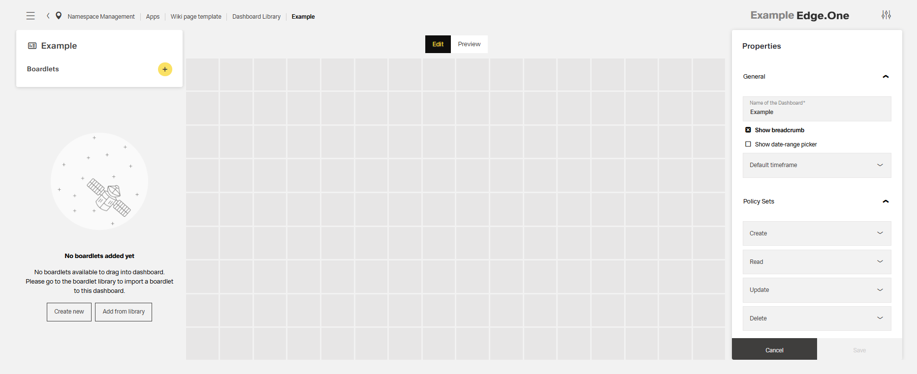
Dashboard Patterns Library
Dashboard patterns inside Inspire are strategically crafted interfaces that cater to various user needs and interactions. From the central hub of the Home Dashboard to the detailed exploration in Application Overview, each pattern serves a unique purpose, providing users with intuitive navigation, comprehensive insights, and customisation customization capabilities.
These patterns collectively form a harmonious ecosystem, ensuring consistency, accessibility, and flexibility throughout the design system.
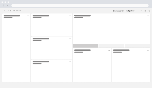
Home Dashboard
It acts as the epicentre of your application development experience, providing an instant snapshot of essential metrics and insights. Users gain immediate visibility into the performance and status of existing applications, streamlining decision-making and project management.
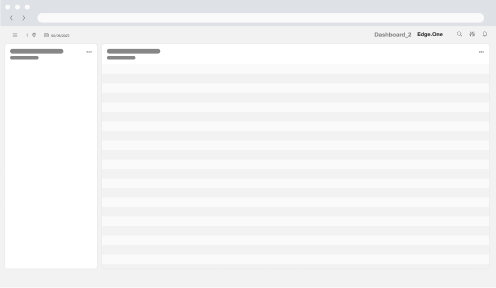
Application Library
The library rovides a clear overview of all active items in the application. A table lists each item, and a left-hand panel surfaces key metrics. Users can monitor status, edit items, or open a detailed view.
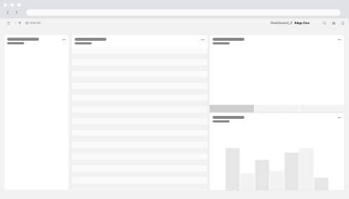
Application Overview
It opens from the Library to focus on a single item. A right-hand details panel shows detailed information on the item. Users can review changes, adjust settings, or navigate to deeper views.
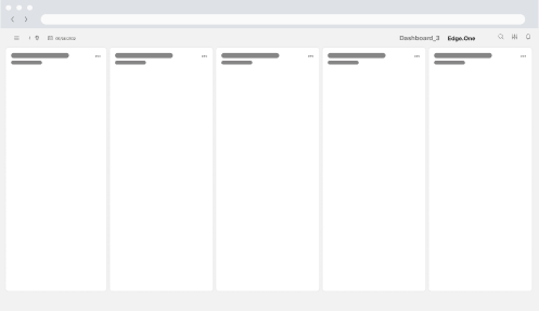
Task Management Dashboard - Kanban View
This dashboard functions as an overview of tasks with key metrics within the application. Tasks are grouped by applycation relevant attributed for clarity. The progress of each task is clearly displayed. Users gain an insight on the status of tasks, potential problems and the overall status of teh process.
Content Editor
Two toolbars frame the content preview and provide editing controls. Users can edit the content here, then use the top toggle to switch between editing and previewing the result.