Page History
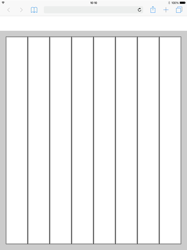
24 Columns Grid
The 24 Columns Grid ist the Base of all. Columns result in key lines. Within the lines all components find their place. all columns have a padding. The margin of the Content box varies within the different displays. An overview can be found below..

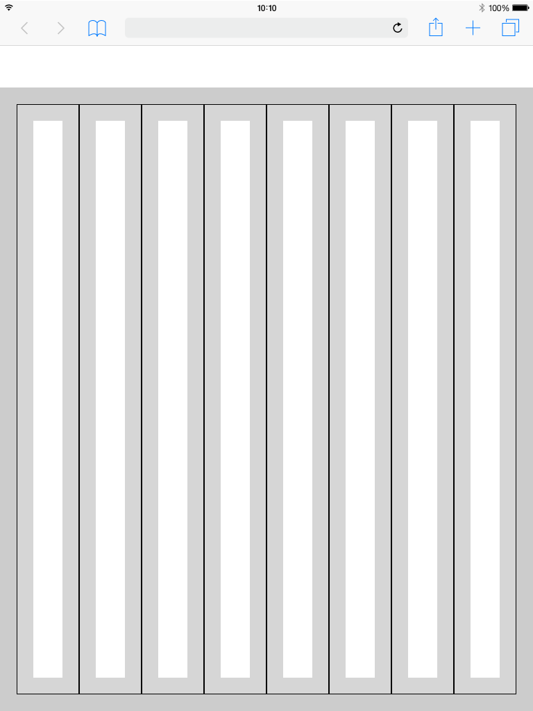
Columns and Gutter Padding
Basically there are two ways to display content inside the dashboard. On a boardlet or as freestanding content. Columns and Gutter define how you handle these two possibilities.
The padding within the columns is always the same. We only differentiate here in 0,5 rem(0,25 rem each side) inside the columns and 1,5 rem inside the gutter.
Columns Patting
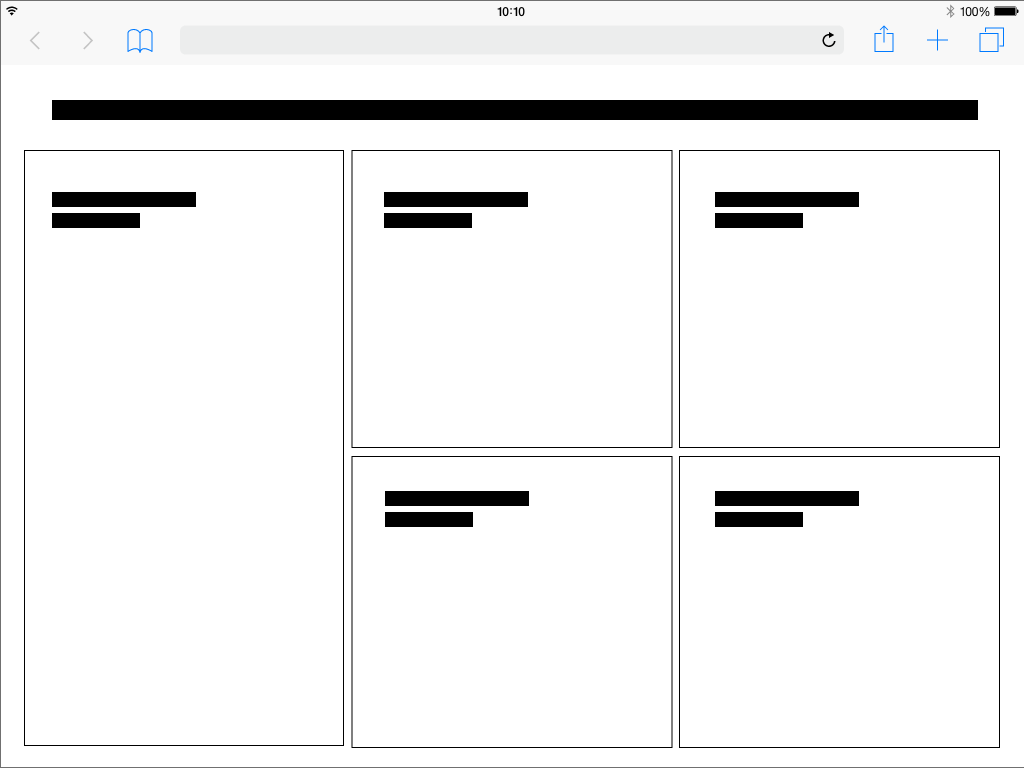
Best Practice
Dark Theme
Best Practice
Light Theme

Use this set of standard breakpoints to maintain layout integrity across screen sizes. For best results, test designs and code at each of these standard breakpoints.
The Breakpoints.
The grid has 5 basic breakpoints. These breakpoints determine not only the columns, header, margin, gutter and icon size. They also determine the contents of the respective device and how they are displayed. This is necessary because the display of boardlets in high resolutions allows a generous handling of headlines, sublines, content and icons. Within small representations these contents have to be compressed or even displayed in multiple levels. Otherwise the user loses the overview in the fill or content is displayed so small that it is no longer readable. Please take a look at the breakpoint animation.
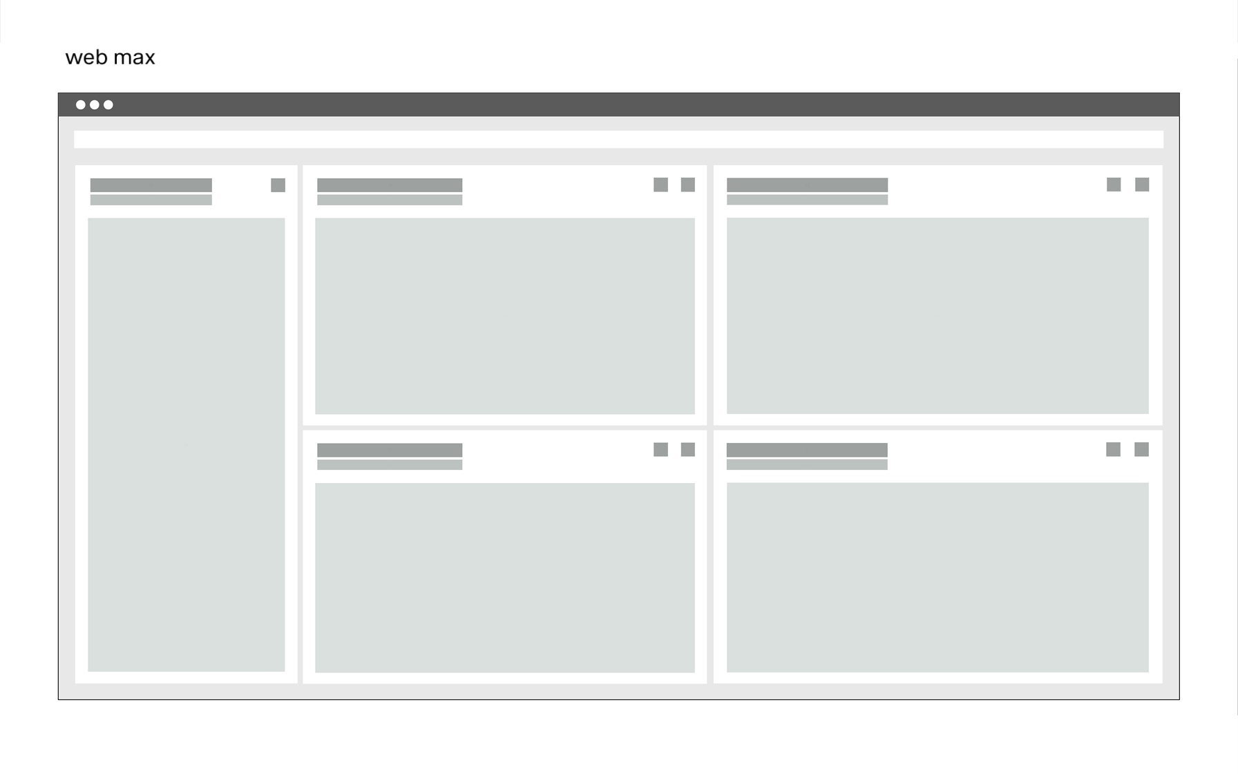
Extra Small <576px | Small ≥576px | Large ≥960px | Extra large ≥1200px | Extra extra large ≥1800px | Kiosk (work in progress) ≥3500px | |
|---|---|---|---|---|---|---|
| Class prefix | .col-sm- | .col-md- | .col-lg- | .col-xl- | .col-xxl- | |
| # of columns | 24 | 24 | 24 | 24 | 24 | |
| Gutter width | n.n | 12 | 12 | 16 | 26 | |
| Nestable | Yes | Yes | Yes | Yes | Yes | |
| Column ordering | Yes | Yes | Yes | Yes | Yes |
The Guidlines.
This list of breakpoints will grow steadily, as the need arises.
Currently, the following breakpoints are necessary from the point of view of the UI/UX Guild.
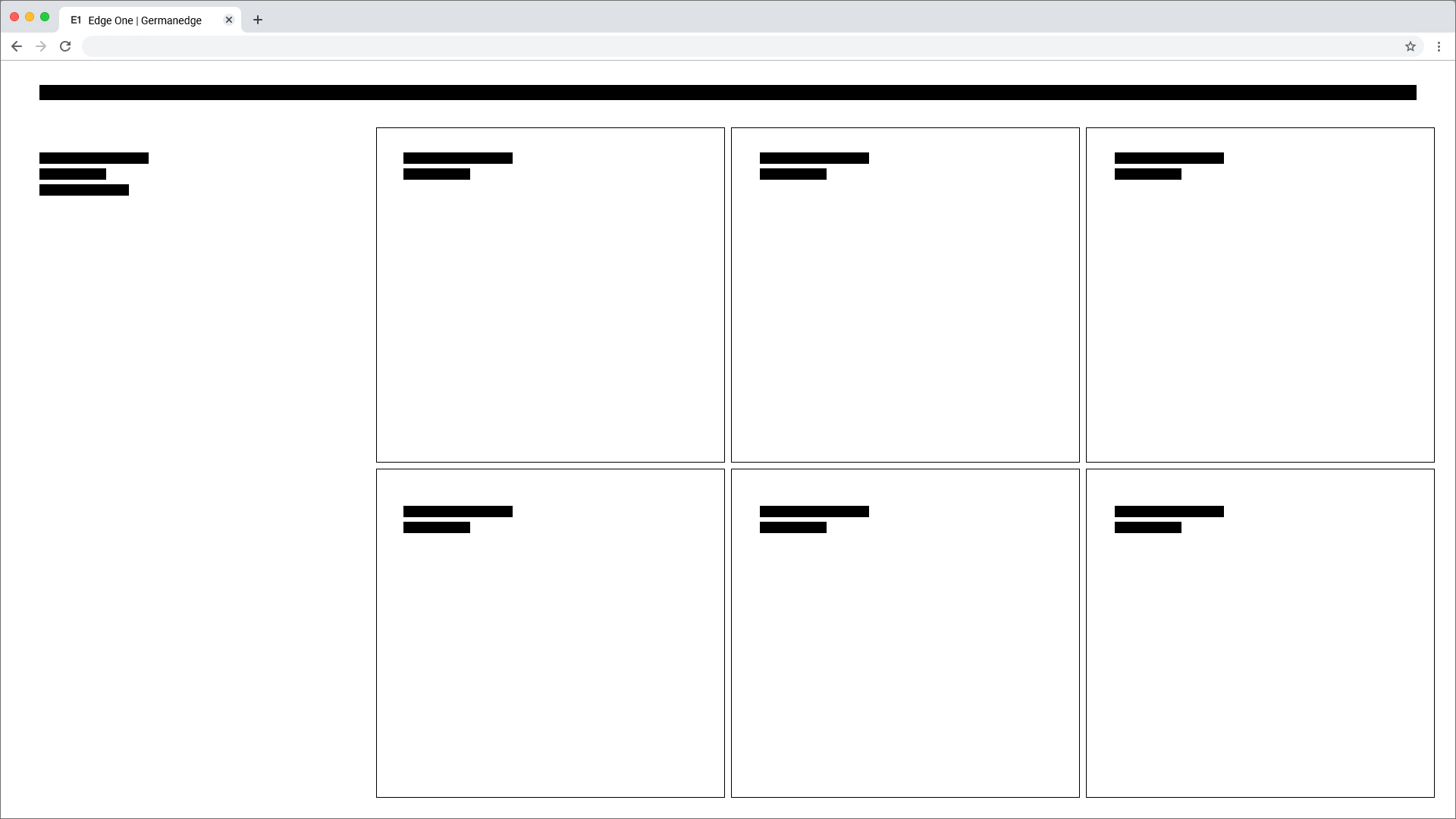
Grid examples
Desktop_Max

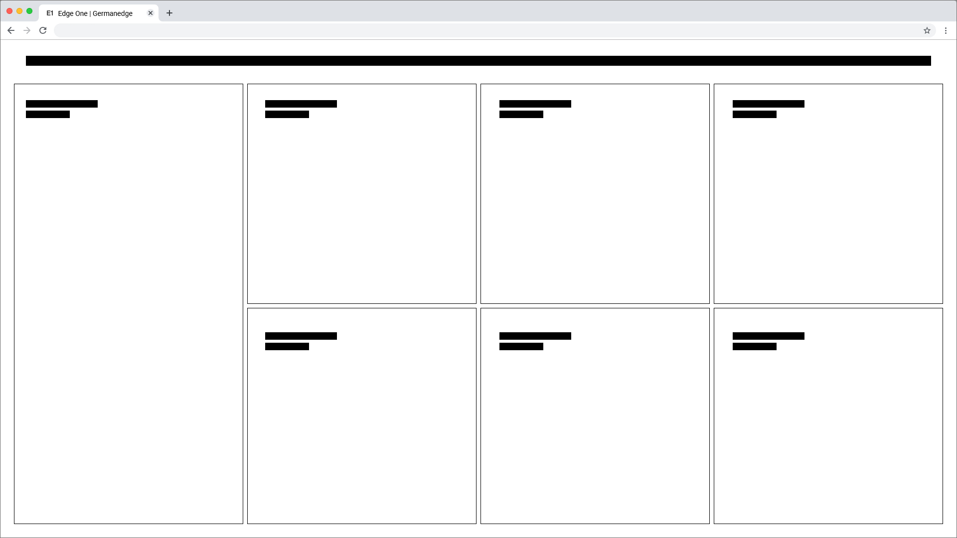
Grid examples
Desktop_Min


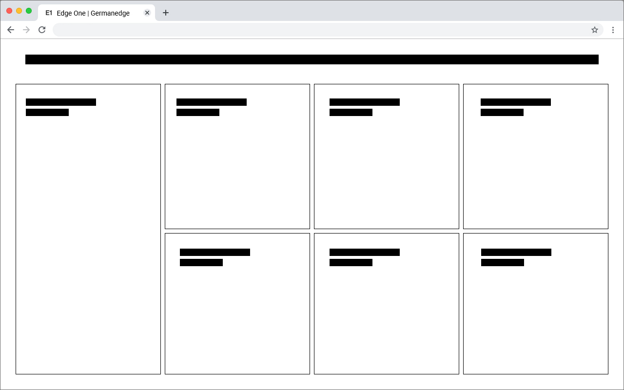
Grid examples
Tablet_Landscape


Grid examples
Tablet_Upright

Grid examples
Mobile


Header
The header is the heart of the software. All buttons with global functions can be found here.The appearance and the contents vary within the different devices. This is necessary because for example
mobile less details are necessary or the details have to be displayed in multiple levels. This also applies to the header.
More Details about the Header you will find here