Versions Compared

Key

  • This line was added.
  • This line was removed.
  • Formatting was changed.

The

basic unit

Grid.

The basis for all designs within the Design System is the grid. This grid ensures that the ratios of

the design system is rem. The smallest unit within the system is 0.25 rem. Variants of 0,25 rem form the dimensions of columns, rows and boxes as well as their edges and fillings. The 0,25 rem adapts to your content while maintaining a constant visual rhythm.

24 Columns Grid

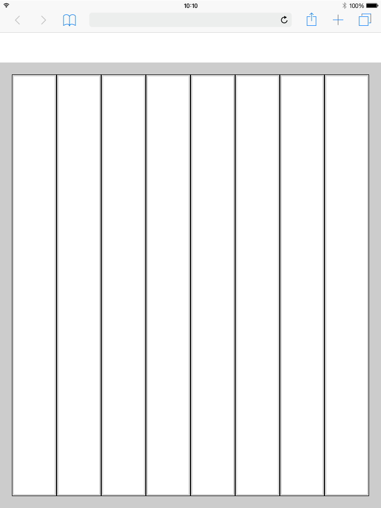
The 24 Columns Grid ist the Base of all. Columns result in key lines. Within the lines all components find their place. all columns have a padding. The margin of the Content box varies within the different displays. An overview can be found below..

Image Removed

Columns and Gutter Padding

Basically there are two ways to display content inside the dashboard. On a boardlet or as freestanding content. Columns and Gutter define how you handle these two possibilities.

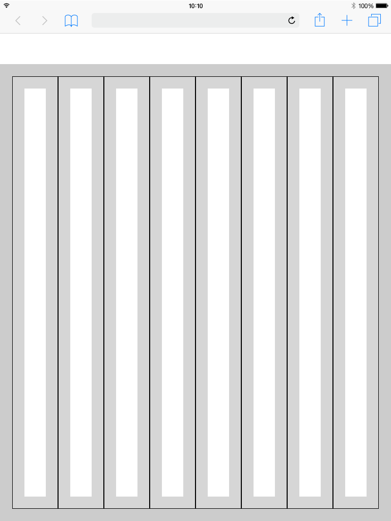
The padding within the columns is always the same. We only differentiate here in 0,5 rem(0,25 rem each side) inside the columns and 1,5 rem inside the gutter.

Columns Patting 

Gutter Patting 

Image Removed

Image Removed

Best Practice
Dark Theme

Image Removed

Breakpoints

Use this set of standard breakpoints to maintain layout integrity across screen sizes. For best results, test designs and code at each of these standard breakpoints.

the elements within the different devices are always the same. For this reason our DS is designed in the unit "rem". The foundation of the design system is the modified bootstrap frontend grid. The basic Interface is divided into two main parts, header and content area. The 24 Columns Grid only applies within the content area. 

All contents such as boardlets, fluid navigation, cards and so on have a nested grid with 12 columns(only the overall / dashboard grid has 24 columns). This allows us to arrange various elements within the above examples correctly and ensure that they have the same proportions on the different boardlet sizes. Distances are determined by the margin.


The Breakpoints.

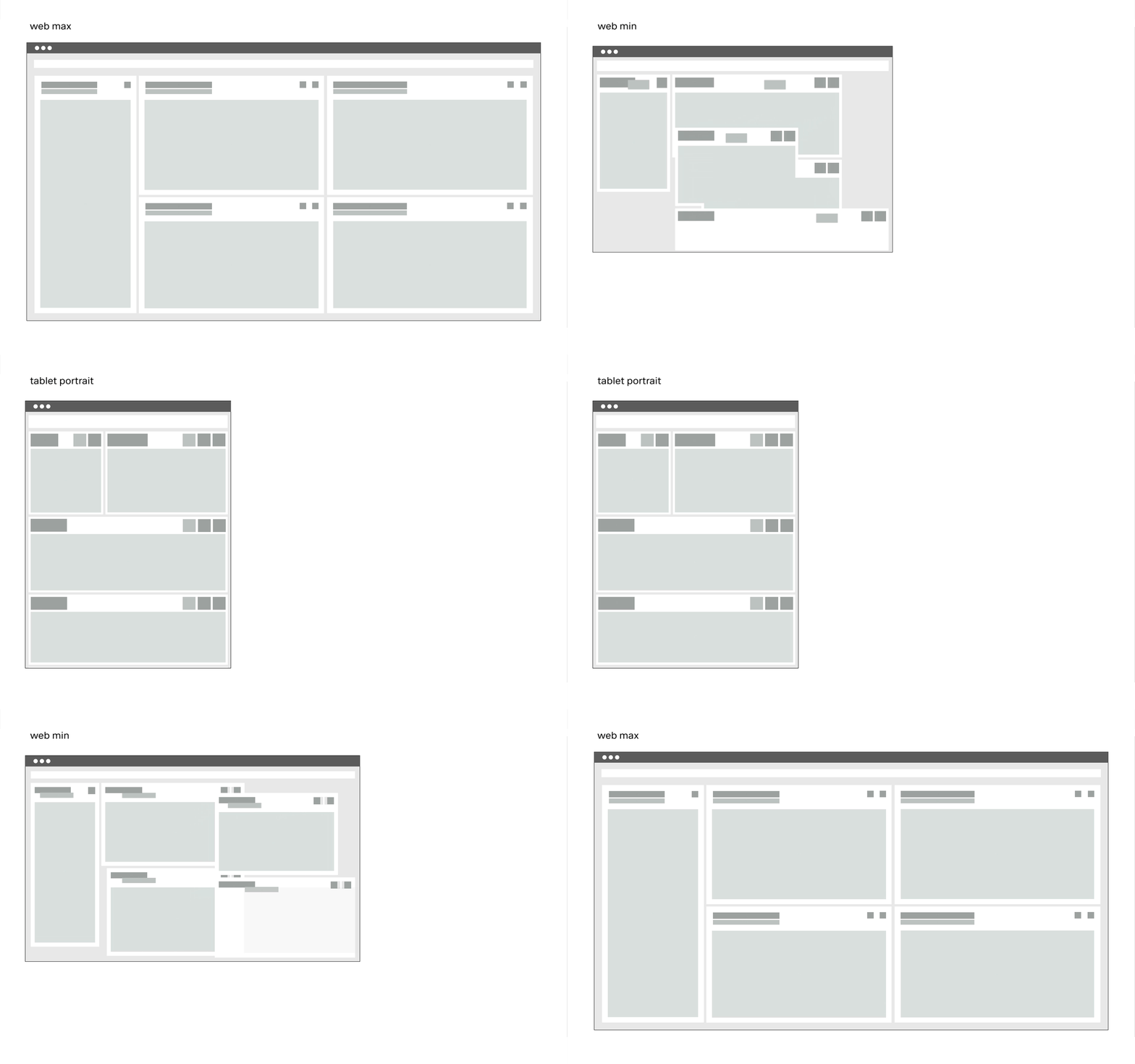
The grid has 5 basic breakpoints. These breakpoints determine not only the columns, header, margin, gutter and icon size. They also determine the contents of the respective device and how they are displayed. This is necessary because the display of boardlets in high resolutions allows a generous handling of headlines, sublines, content and icons. Within small representations these contents have to be compressed or even displayed in multiple levels. Otherwise the user loses the overview in the fill or content is displayed so small that it is no longer readable. Please take a look at the breakpoint animation.


Image Added


Extra Small

<576px

Small

≥576px

Large

≥960px

Extra large 

≥1200px

Extra extra large

≥1800px

Kiosk (work in progress)

≥3500px

Class prefix.col-sm-.col-md-.col-lg-.col-xl-.col-xxl-
# of columns2424242424
Gutter widthn.n12121626
NestableYesYesYesYesYes
Column orderingYesYesYesYesYes


The Guidlines.

This list of breakpoints will grow steadily, as the need arises.
Currently, the following breakpoints are necessary from the point of view of the UI/UX Guild.

Breakpointssize (px)columns size (%)padding (rem)margin (unit)gutter (unit)Small328425%0,25 rem1,5 rem1,5 remTablet upright720812.5%0,25 rem1,5 rem1,5 remTablet landscape984128.33%0,25 rem1,25 rem1,5 remWeb 12801224128.33%0,25 rem1,75 rem1,5 remWeb 19201873244,16%0,25 rem1,5 rem1,5 rem

Grid examples
Desktop_Max

Image Removed

Image Removed

Grid examples
Desktop_Min

Image Removed

Image Removed

Grid examples
Tablet_Landscape

Image Removed

Image Removed

Grid examples
Tablet_Upright

Image Removed

Image Removed

Grid examples
Mobile

Image Removed

Image Removed

Header

The header is the heart of the software. All buttons with global functions can be found here.
The appearance and the contents vary within the different devices. This is necessary because for example
mobile less details are necessary or the details have to be displayed in multiple levels. This also applies to the header.

More Details about the Header you will find here

Header

Image Removed