Page History
Table of contents
- The
- 24 Columns Grid
- Spacing and Details - The 24 Columns Gutter
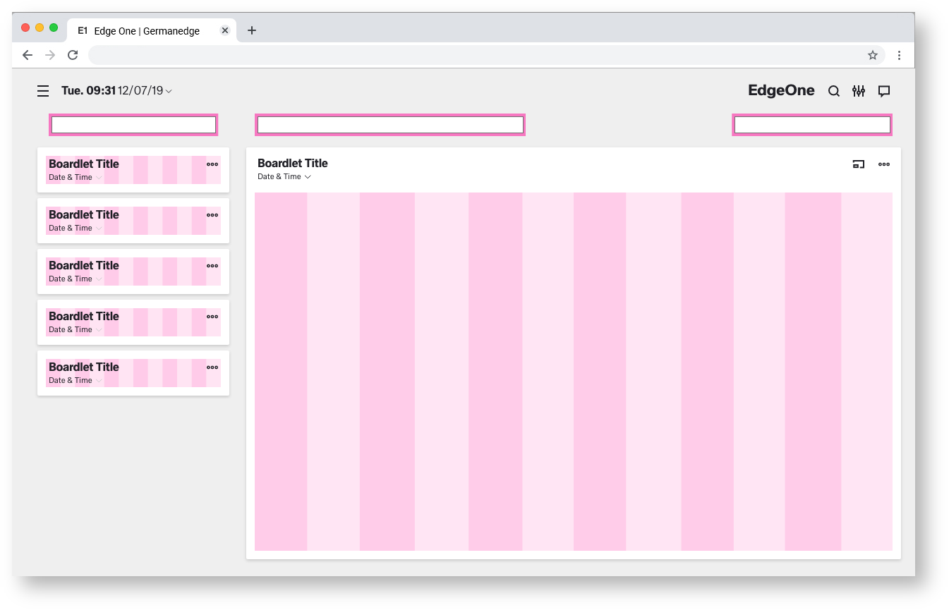
- EdgeOne Dashboard example
- Best Practice Dark and Light Theme - X-Series Dashboard example
- Best Practice Dark and Light Theme - Two different Boardlets-Grids

Spacing of the
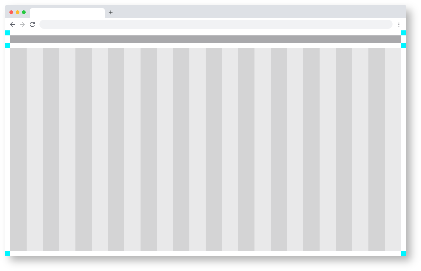
web Web min.
Here you can find all important values for building the web min grid. The grid is divided into two main containers. the header area and the content area.
| Base | px | rem |
|---|---|---|
| Breakpoint | ≥1200px | n.n |
| Width |
| 1280 |
| 80 |
| Height |
| 800 |
| 50 | ||
| Content Area | ||
|---|---|---|
| Columns | 24 | - |
| Column Width |
| 52 | 3.25 | |
| Gutter | 16 | 1 |
| Margin | 16 | 1 |
| Header Area |
|---|
| Header | 24 | 1,500 |
| Icon max | 24 | 1,500 |
Zeplin Documentation:
Download Inspire Design KIT:
http://www.ronoemus.com/Brand_x/032020_DESIGN_KIT_INSPIRE_V1.1.zip
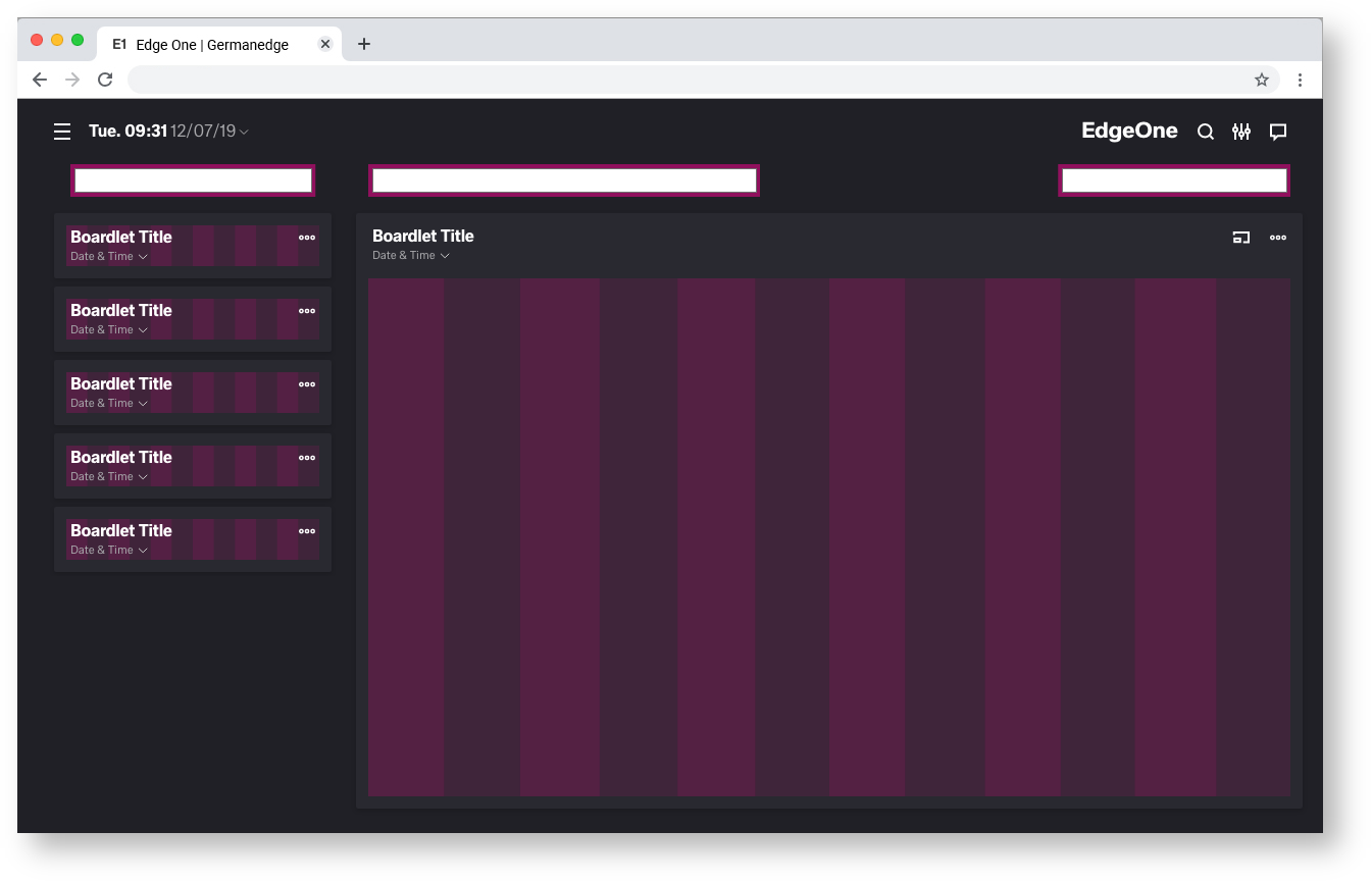
The 24 Columns Gutter.
Gutters may be missing as shown above or present as shown below. For closely related content, you should consider an Gutters free layout. Use the gutter if the content requires more separation.
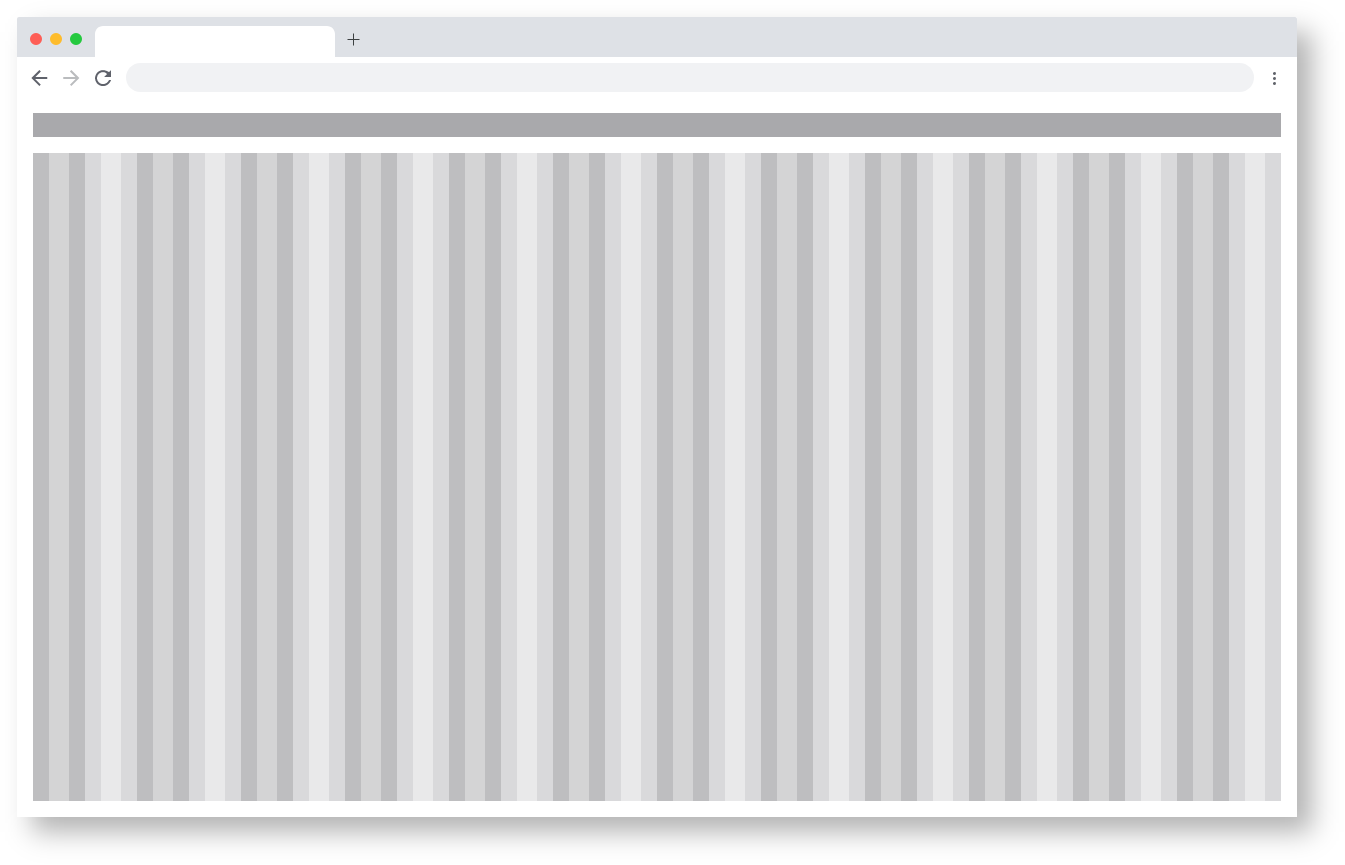
Example for the use of a gutter.
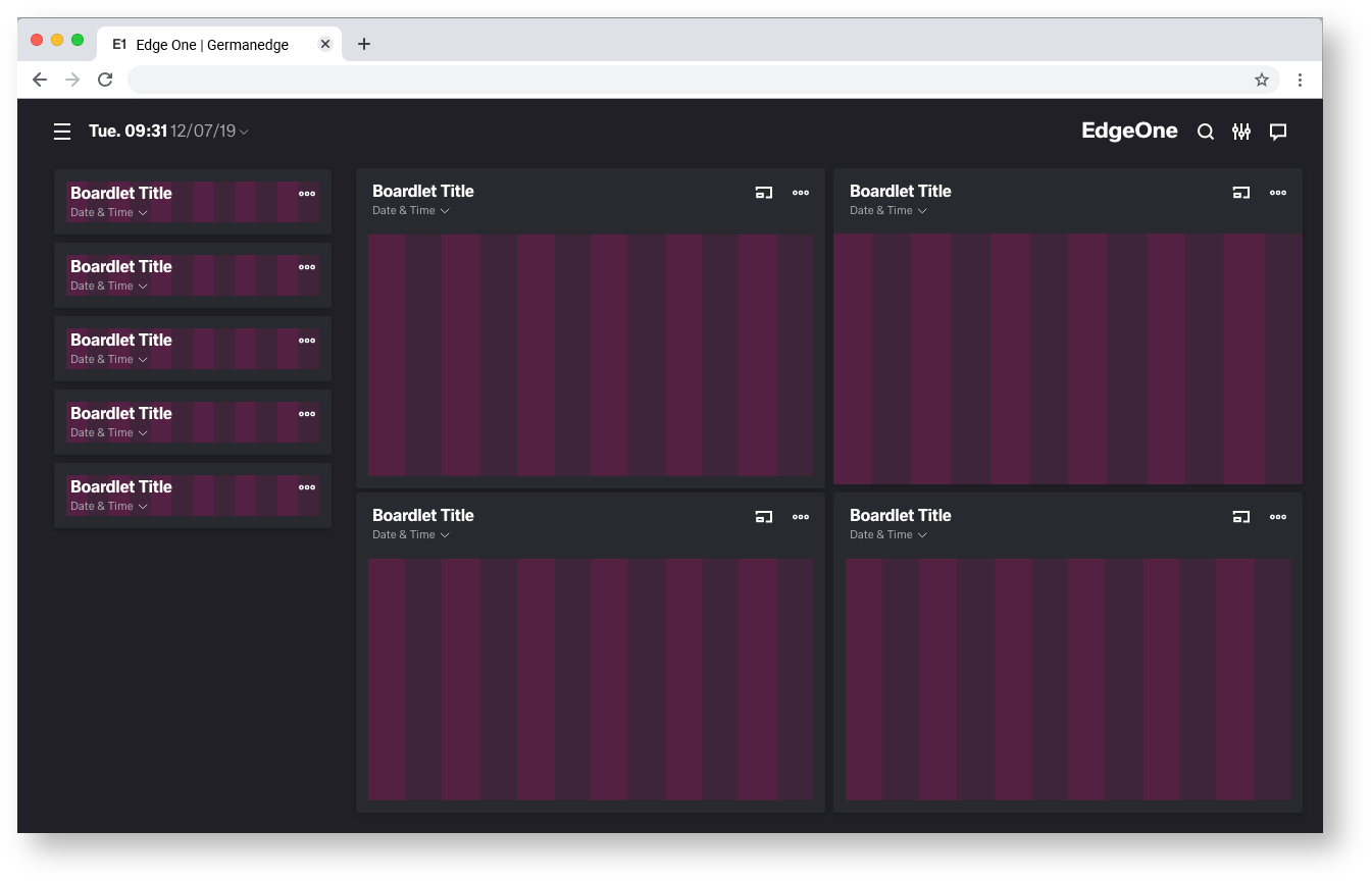
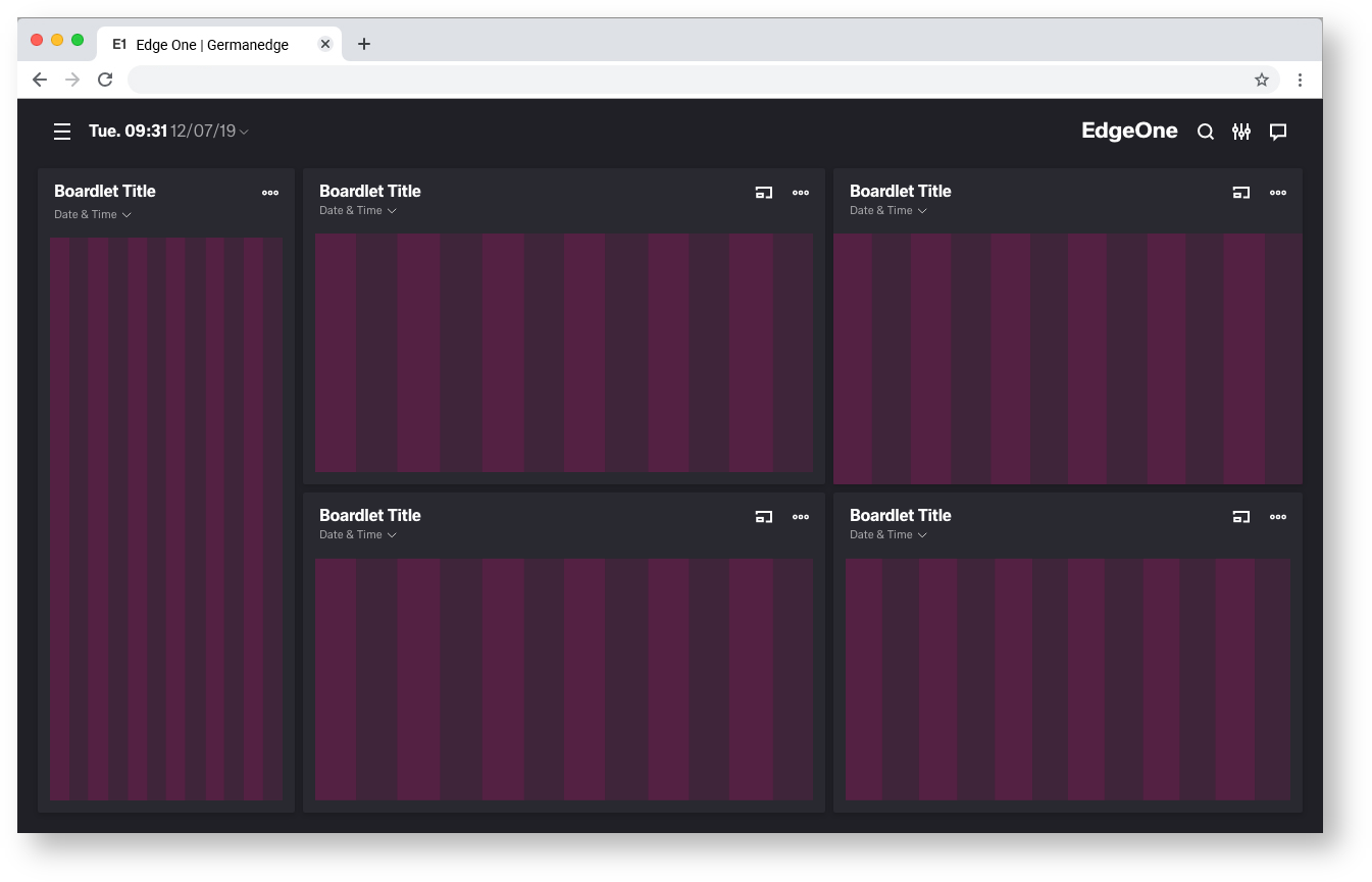
Best Practice
Dark and Light Theme.


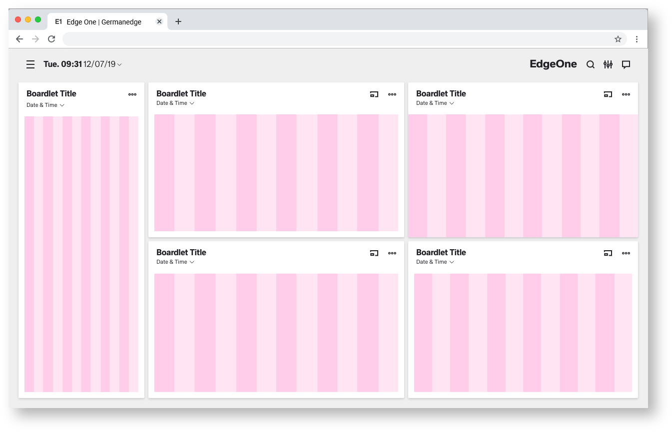
Best Practice
Dark and Light Theme.
| Info | ||
|---|---|---|
| ||
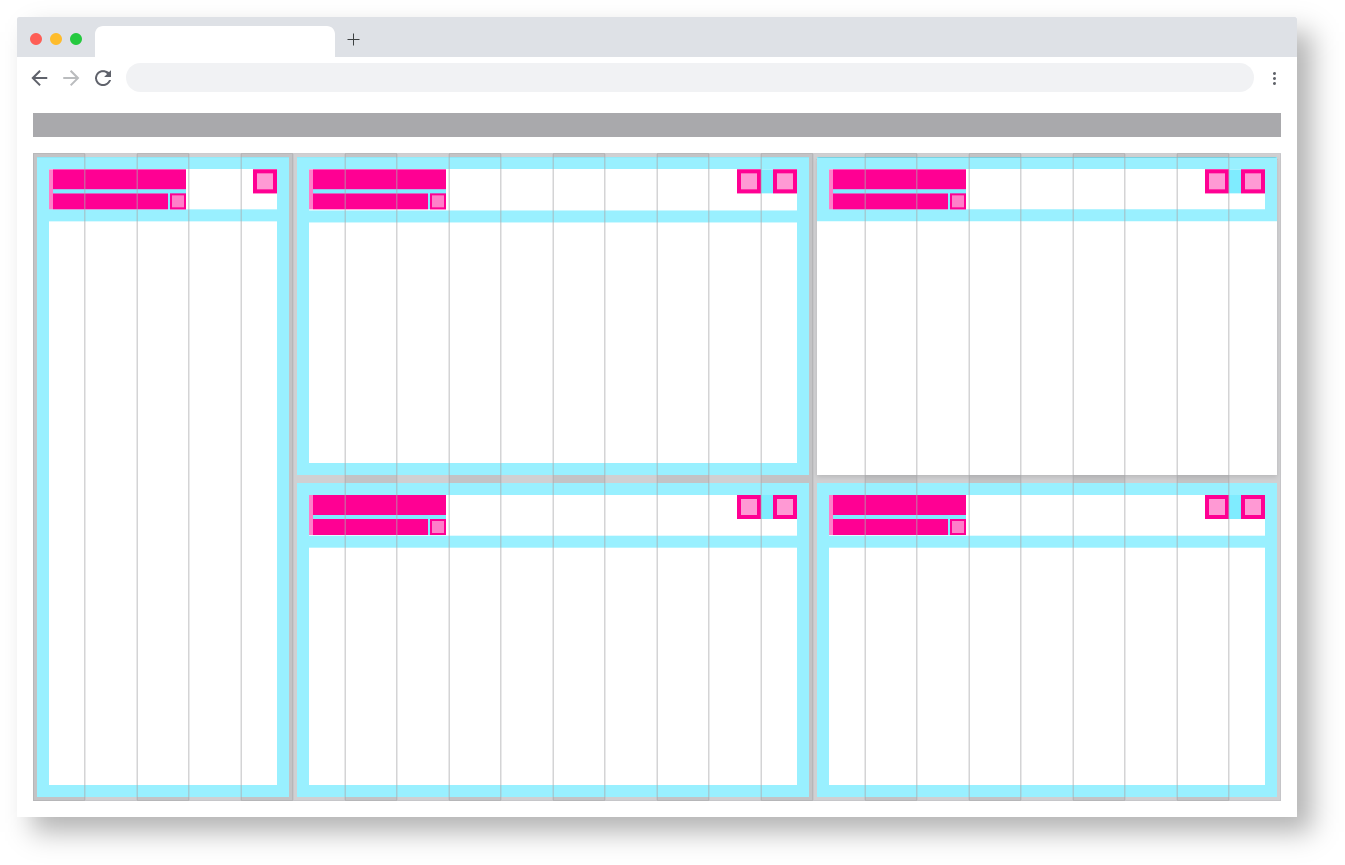
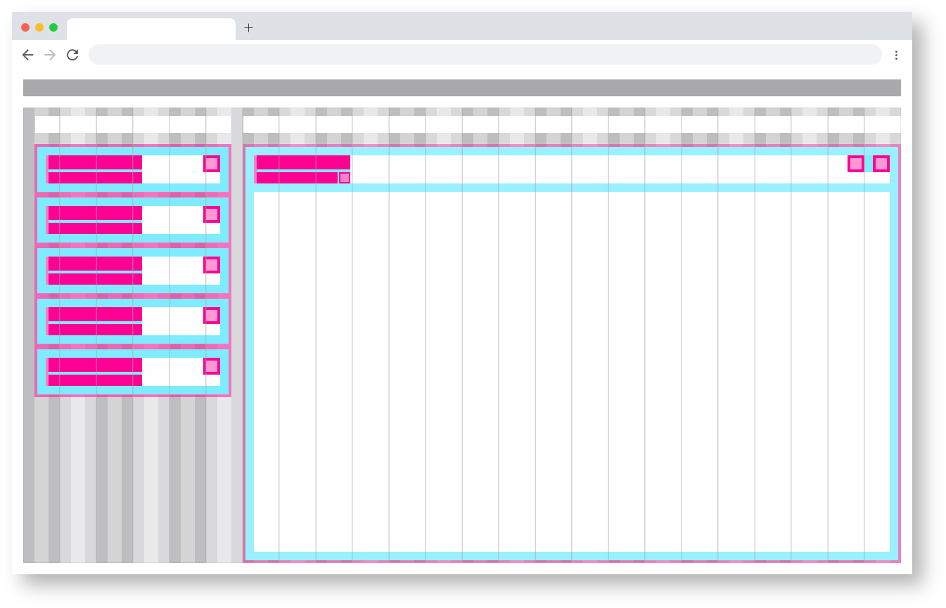
Two different Boardlets Grids.
There are basically two different boardlet grids. One for graphic content and one for regular content. These differ only slightly in padding.

More Details about Boardlets you will find here:
| Children Display | ||||||
|---|---|---|---|---|---|---|
|
Regular content