Page History
Zeplin Styleguide
| Card | Zeplin Documentation | Layout example | |
|---|---|---|---|
| 1 | ID3 Boardlet | coming soon | |
| 2 | ID3 Tabs | https://zpl.io/V17rG3k |
Jira
| Jira | ||||||
|---|---|---|---|---|---|---|
|

The boardlet is the heart of the interface. On the boardlet all the different information is aggregated and displayed. Currently the boardlet is available in 2 states, with and without Tabs. In the next subpoints you will find all information about the boardlets.
| Table of Contents |
|---|

The boardlet is the heart of the interface. on the boardlet all the different information is aggregated and displayed. Currently the boardlet is available in 4 states:
1. default boardlet
2. default boardlet with tabs
3. graphic boardlet
4. graphic boardlet with tabs
The Basics.
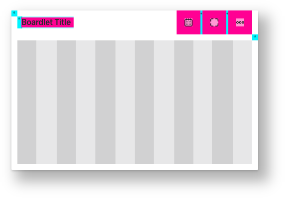
A boardlet always consists of a title, the toolbar and a content area. In mobile breakpoints the boardlets transform into multilevel cards. These cards serve as a summary or status of the data in the boardlet. The cards can be opened and thus all data from the boardlet can be made visible in compressed form.


safe space between Title and Toolbar
The Title.
The title always consists of the name of the boardlet and the time setting.
The time setting is placed within the breakpoints Kiosk to Web min as a dropdown below the title. Within the mobile display, the dropdown becomes an icon with the same functions. This is necessary because the mobile display has a different input behaviour. If we leave it at a dropdown the header would need too much space.

The Tabs.
The Toolbar.
Inside the toolbar the user finds all the icons needed to operate the content. If there is not enough space for all icons, related functions have to be grouped. (Group icon with dropdown)
The Content Area.
The content area always has a 12 column grid. Graphics, charts, special graphics, tables and lists are placed in this area.