Page History
...
Actions trigger functions, such as saving or deleting a business object. They can also trigger navigation to another [dashboard], where the action can be executed, described in detail, or checked further. Actions are displayed in the form of action icons or buttons.Actions that refer to a content are displayed at the top of the organism, next to the title that identifies the object. Actions that relate to the task workflow are located at the bottom right and can be performed after working through the content.
To make actions easier to organise and find, they are usually placed in toolbars. Depending on the content that is affected by the action, different toolbars are available. Within the toolbars, some actions are usually more important than others. Refer to the arrangements in the below examples for better understanding.
...
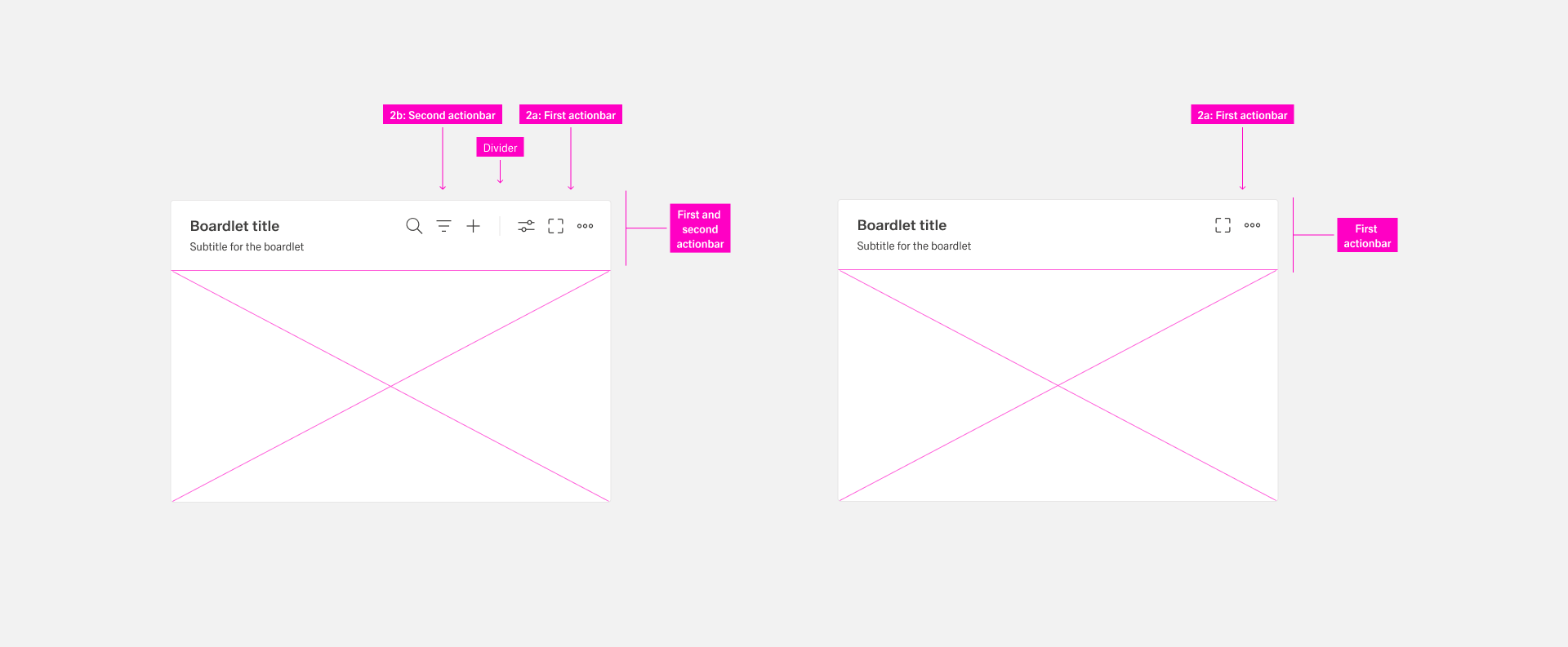
Toolbar actions control functions of the content as well as the container. They are represented by action icons or icon-only buttons. If more than the allowed number is needed, group them they are grouped in an overflow menu with the “more” icon. The allowed number is dependent on the context.
...
| Name | Use Case |
|---|---|
| Header toolbar | Actions that affects all applications and the entire user environment. It sits in the header area. |
| Boardlet toolbar | Actions controling a single boardlet and its content. It is always on the top-right side of the boardlet. |
| Ghost boardlet toolbar | It follows the boardlet toolbar rules with one exeption: The first actionbar has only one “More” icon. |
| Card toolbar | Card-specific actions like “Expand/Collapse” if the card supports expand. All other actions are gouped under a “More” icon. |
| Dialog toolbar | It contains actions related to the dialog and follows boardlet behavior. |
| Table row toolbars | Actions that pertain to a single row of a table. They always control functions of the entire row. |
For more information, please go to Toolbar Actions.
...
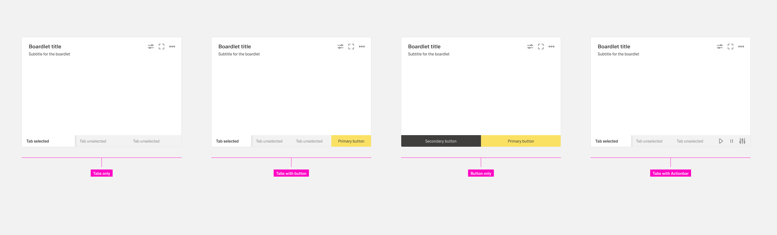
The footerbar has a fixed height and must never be multiline. Use only the allowed combinations.:
- Tabs only. Tabs are arranged side by side. There is no default number of tabs. Exeptions: Vertical tabs are placed below each other.
- Tabs with buttons. Use this when the boardlet has multilayer content and a content action. If an action exists only in one tab, show it disabled in all other tabs to avoid visual jumping. The number of possible actions is limited to a maximum of two buttons.
- Buttons only. Use this when an action is required in the boardlet. The number of possible actions is limited to a maximum of two buttons.
- Tabs with actionbar. Use this as a secondary display option. It can be used in kiosk mode to control tab rotation and timing.
For more information, please go to Footerbar Actions.
...
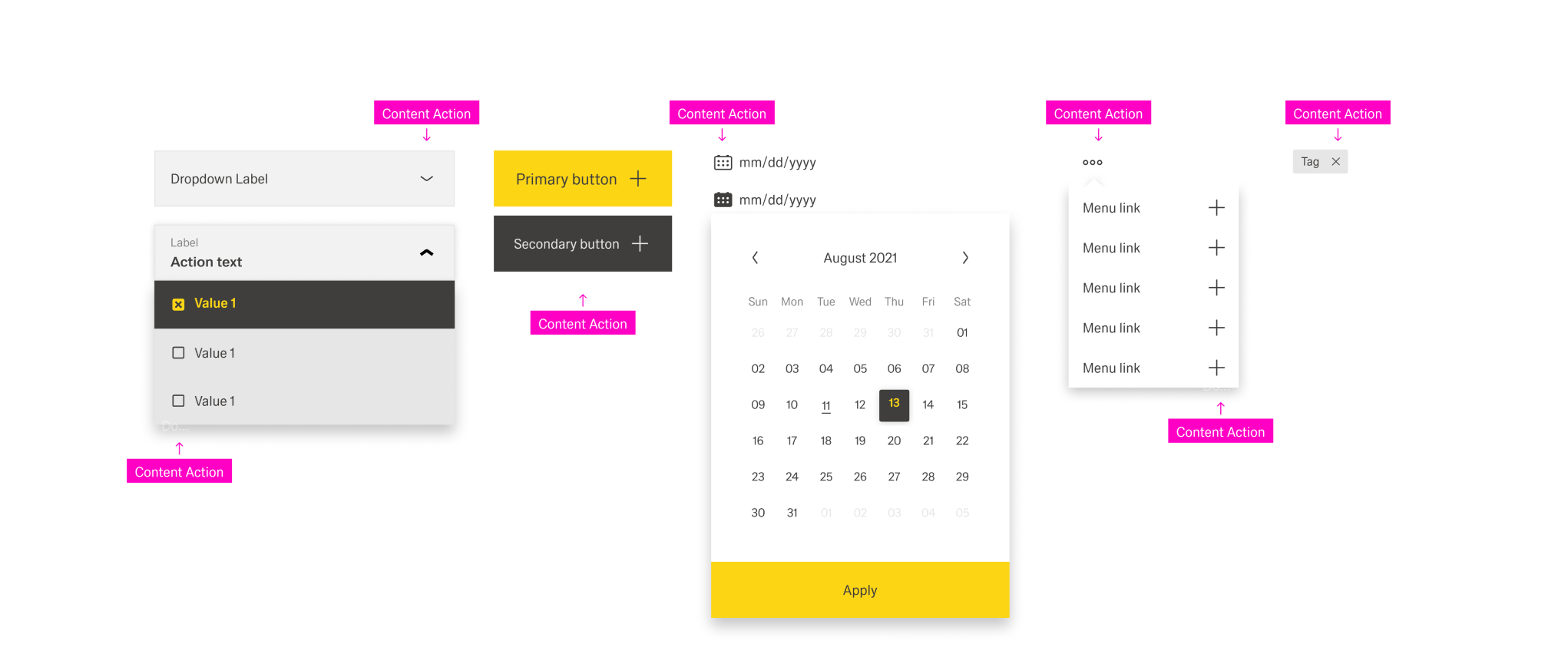
- Inline actions. The action molecule or organism is not enclosed by a body. The action is always on the left inside the molecule or organism.
- Actions. These actions also have no enclosing body. The action is always on the left inside the molecule or organism.
- Table Actions. They are placed inside an action column inside a table. Each row has the same actions. Actions effect the entire row.
For more information, please go to Content Actions.
...
Follow this order in the Header toolbar. : Place business actions first and then content management actions. Place layout management actions next and then generic actions. It is recommended to place the action most important for your business context on the very left within its group.
...
Toolbar capacity and grouping
Do not place more than four actions and never more than three icon actions per boardlet toolbar . Group additional actions under the More action. List grouped actions in an overflow menu. A boardlet has actions, it must always include the More action. The second actionbar must not exist without the first.
Hierachy of
...
Actions
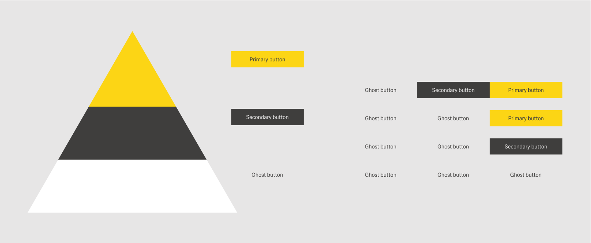
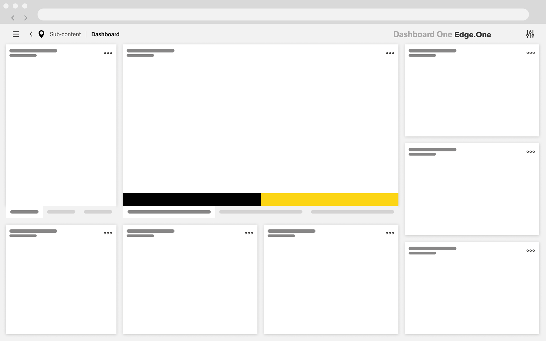
The buttons inside Inspire follow a hierarchical order. It is important that you to create a visual hierarchy between the buttons in your the user interface . The hirachie moves linearly from right to left.to guide the user’s attention towards the desired user flow.
Foundations
In the western world, users tend to engage with a content from left to right, top to bottom. Keep this in mind while arranging actions. For example, a finishing action like “Save” should be placed towards the right and bottom of the page if possible. This ensures that the user completes the process of the dashboard bevor naturally ending up at the final action.
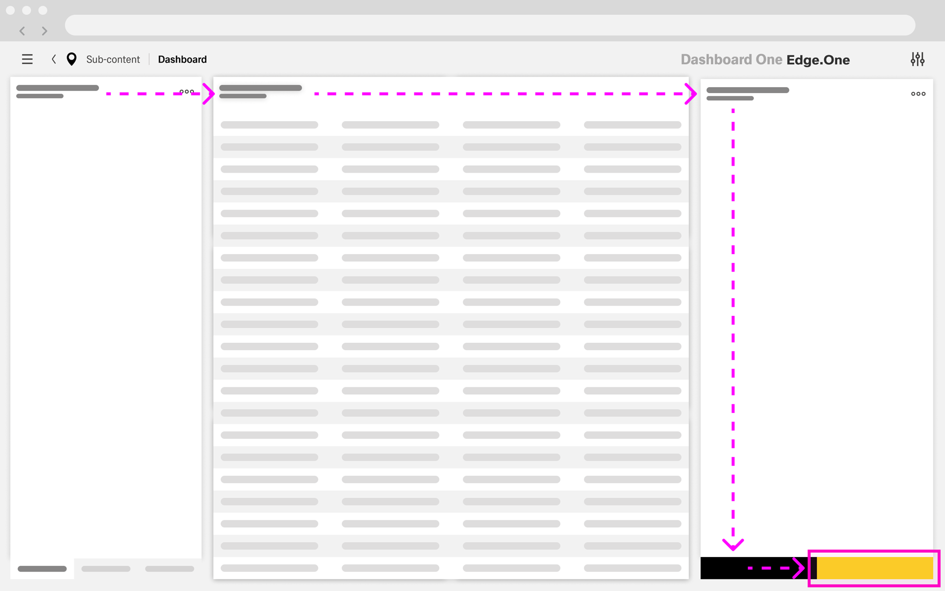
This reading flow can intentionally change with the help of visual emphasis. One of the most effective ways to do that is color. Attention tends to gravitate towards bright colors and high contrast. In Inspire, this could be the bright yellow of a primary action or the contrast-heavy black of a secondary action. This effect diminishes exponentially the more color is used within a dashboard. It therefore should be used in regulation.
Implementation in Practice
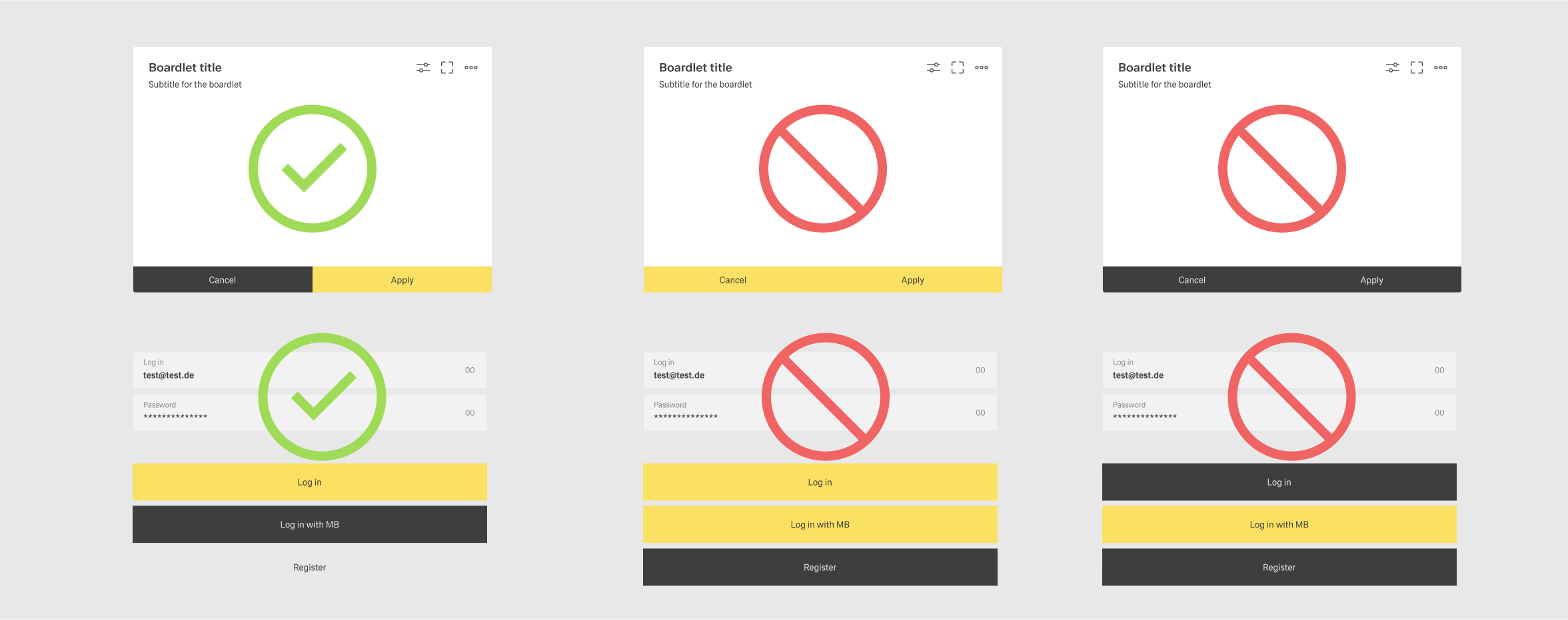
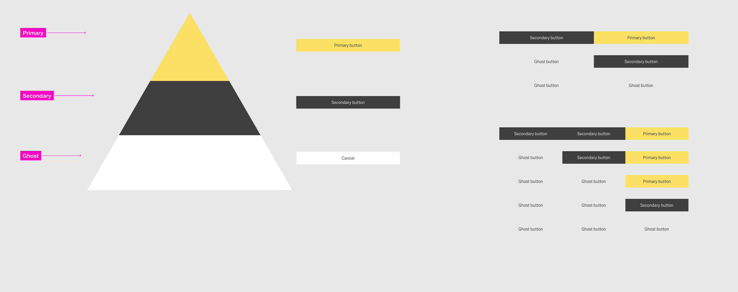
Inspire Design has three types of buttons:
| Type | Definition | Examples | Styling |
|---|---|---|---|
 | |||
 | |||
 |
Primary
...
Action
A dashboard can only ever have one primary action but also might have no primary action at all. The primary action should guide the user forward in the primary user flow. This flow is the main task the user is trying to achieve within a combination of dashboards. This could be among others:
- Creating a new element within the system.
- Completing a multi-step process across multiple dashboards.
- Navigating to the main workplace a user might use.
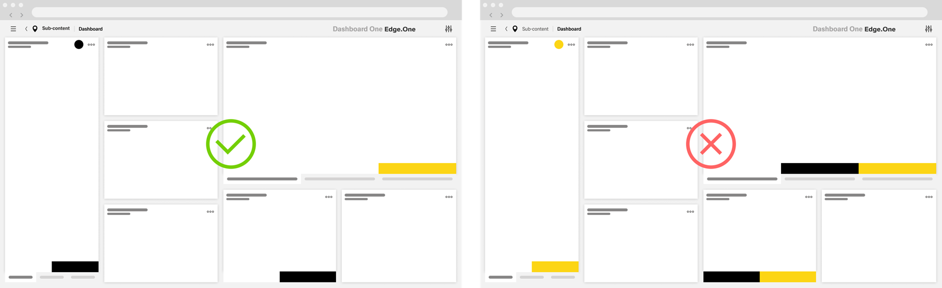
Secondary Action
A dashboard can have multiple secondary actions. These actions highlight secondary user flows within the dashboard. These flows are optional additions to the primary user flow or entire user flows of their own. This could be among others:
- Changing data inside a table.
- Adding a new element in a selection list.
- Canceling a process.
Secondary actions should be used in moderation as to not overload the user with choices. Limit the amount of secondary action to a maximum of three per dashboard if possible.
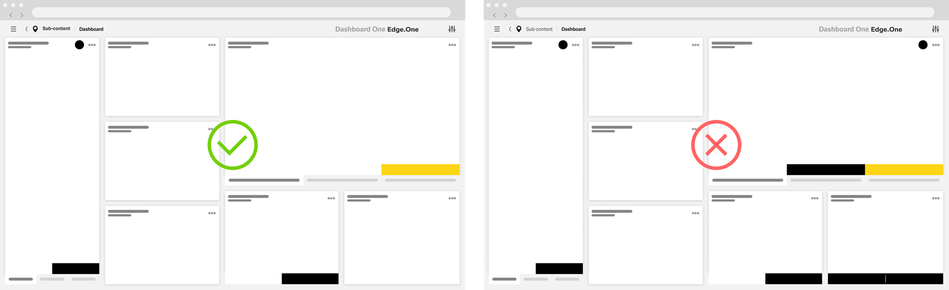
Ghost Action
The total number of ghost actions on a dashboard is not limited. There are limits to the total of ghost actions in certain action groups:
- The number of default - ghost - custom toolbar actions should never exceed three.
- There should never be more than three footerbar actions inside a dashboard, including ghost actions.
- Table row actions should be limited to a total of three, including the "More" action.
- Some component-specific toolbars have their own limit to the total number of actions.
I a dashboard has a great number of ghost actions, especially in toolbars, consider placing the less important ones inside the "More" action to reduce visual complexity.
Button group
Buttons are considered in a group if they are placed next to one another within a boardlet. These buttons don't have spacing between them. One prominent example for this occurs with footerbar actions. Avoid placing more than three buttons in a button group for visual clarity.
A group of buttons can have two layouts: horizontal and vertical. Avoid mixing layouts within a dashboard. The order for buttons is as follows:
- Horizontal - From left to right, place ghost buttons first, then secondary buttons and last if there exists a primary button.
- Vertical - From top to bottom, place the primary button first, then secondary buttons and ghost buttons at the bottom.
Creating a User Flow
The goal of primary and secondary actions is to create a user flow through multiple dashboards of a application. The user is guided through this flow by the primary action of the dashboard. Secondary actions show options to modify the indended flow like canceling, resetting, or going back.
The user flow guides the user through the fundamental tasks related to a goal they want to achieve within the group of dashboard. This goal often mirrors a use case from the requirements for the application. Examples for these tasks are:
- Creating a new object within the system.
- Viewing a specific set of information.
- Going throu a standard process like taking samples.
Creation Guide
This is a step-by-step guide for the selection of primary and secondary actions:
- Define the user goal for the application. What would the user primarily want to achieve within this application? Look at the requirements for information.
- Define the purpose of this dashboard. What action on this dashboard does the user need to take to achieve his primary goal? If multiple actions are may bee needed for this process, choose the final action on this dashboard.
- Define the visualization for the primary action. What boardlet contains the primary action? Select the type of action – toolbar, footerbar, content action – for the primary action.
- Select secondary actions for the dashboard. What actions fundamentally support or change the user flow? A dashboard should avoid having more than three secondary actions.
- Validate the result. Is the user flow clear to the users? Test or discuss the design with users and developers.
Example User Flow - Viewing Data
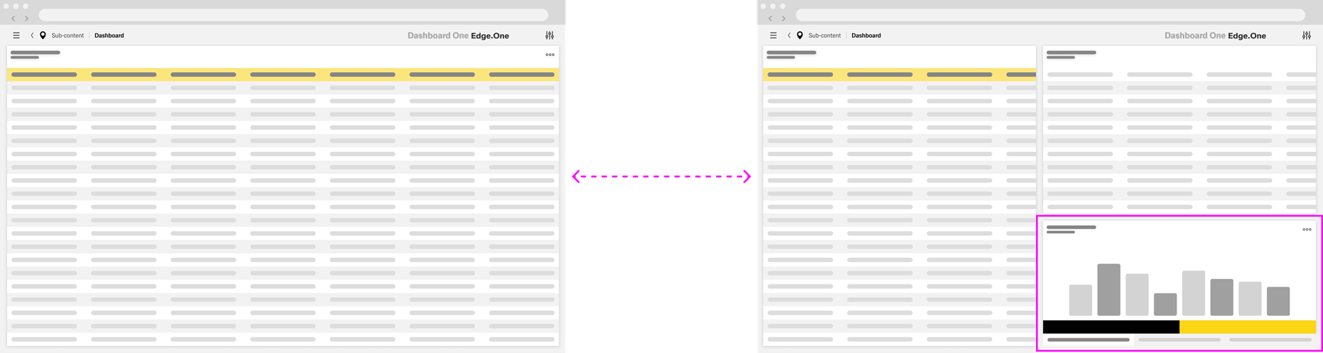
This example application overlooks a large storehouse with many different containers. These containers are constantly filled with some kind of building materials. The amount of this material is constantly changing as it gets used and refilled. The application tracs, among other things, these containers and the material they contain. The user wants to look at the fluctuation of material within a container and be able to edit it.
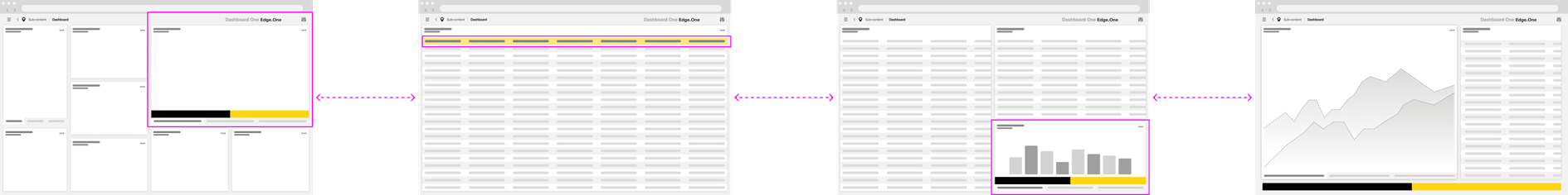
The first dashboard shows the home screen of the storage terminal. The main task for this terminal would be to survey the containers and material. Thereby the primary action leads to a list of containers.
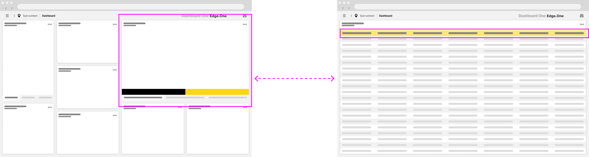
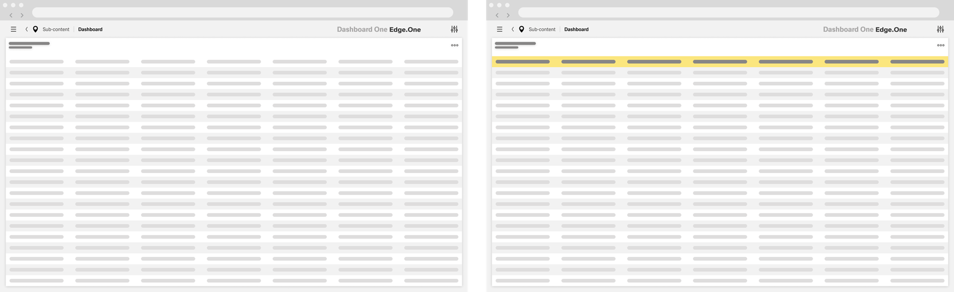
The second dashboard shows the complete list of containers. Certain containers might dynamically be highlighted with the primary color based on criteria like faulty data. Otherwise, this dashboard would not have a primary button, since the next step is the selection of more details. This action applies to every table row thereby can't be a primary action.
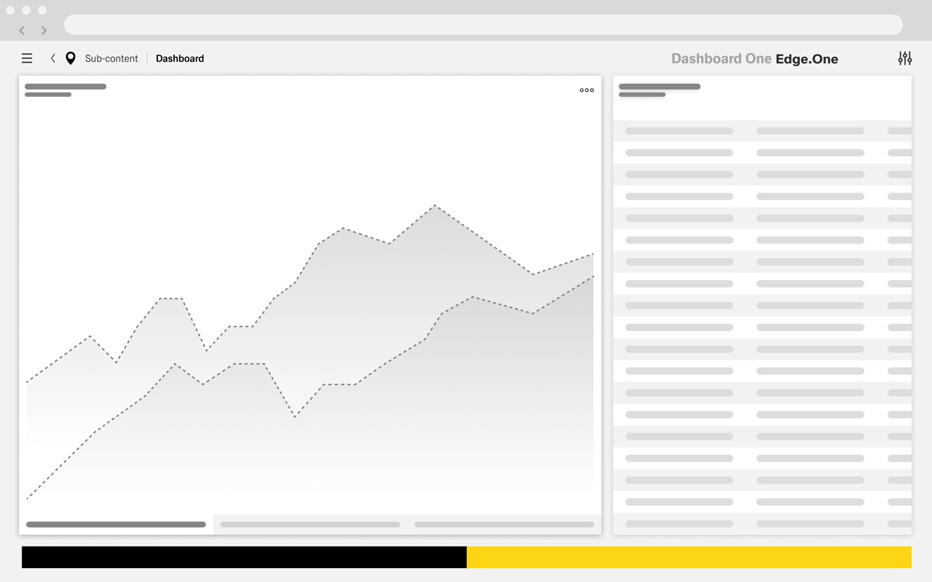
Clicking on a table item shows additional information on the selected container. The bottom of the sidebar contains the data for this container and a chart, with two buttons at the bottom: “Close” and “Edit”. The main task for this dashboard is to navigate to the detail screen in order to edit, making “Edit” the primary action.
The fourth dashboard is a detailed view of the data for the container.
The user can freely edit the data here. The primary action is “Save”, since the system needs a conformation of the changes made by the user.