Page History
...
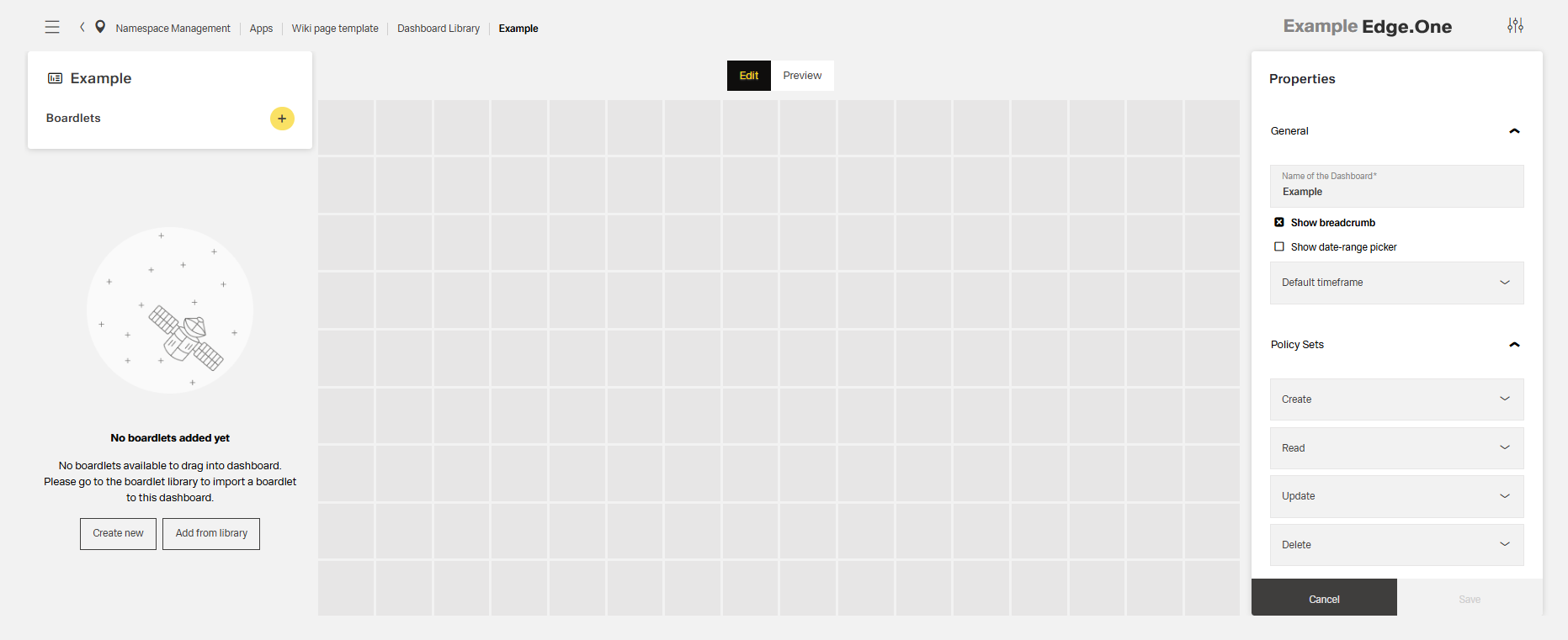
Within the grid, the content is not positioned freely. Start content blocks, for example, boardlets, at the top-left and place them along the grid. Grid cells should generally all be filled within a finished dashboard. Nested content, for example content nested in boardlets, may scroll within their own area.
Breakpoints
The grid defines six breakpoints that control columns, header layout, margins, gutters, and icon sizes. On smaller viewports, compress or stack headings and labels to preserve readability. Use this set of standard breakpoints to maintain layout integrity across screen sizes.
| Name | Breakpoint | Width/Height | Columns/Rows | Padding | Header size |
|---|---|---|---|---|---|
| Kiosk | ≥ 2000px | 4096/variable | 16/9 | 16/16/72/16 | 72px |
| Web_max | ≥ 1800px | 1920/variable | 16/9 | 16/16/72/16 | 72px |
| Web_min | ≥ 1200px | 1280/variable | 16/9 | 16/16/72/16 | 72px |
| Tablet_landscape | ≥ 960px | 1024/variable | 16/9 | 16/16/72/16 | 72px |
| Tablet_portrait | ≥ 576px | 768/variable | 9/16 | 16/16/72/16 | 72px |
| MobilMobile | < 576px | 375/variable | 9/16 | 8/8/64/8 | 64px |
...
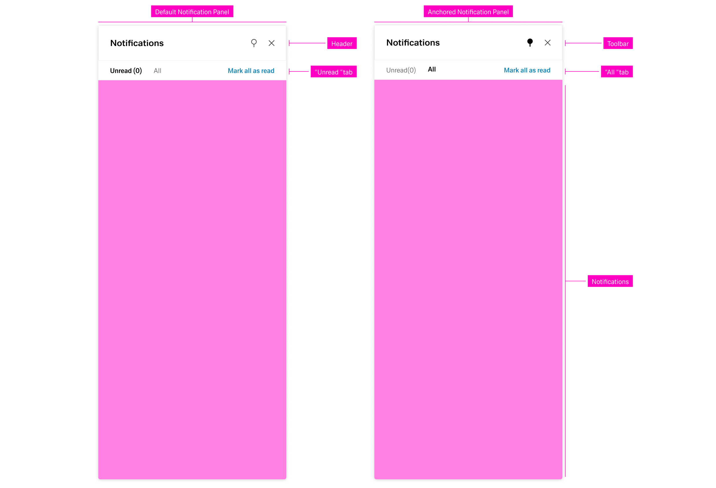
Notifications are ordered and grouped by their date of appearance, regardless of the active tab. Selecting a notification opens a detail panel to the left with basic information about the notification.
Global Notifications
...
The Modal is best suited for information modules. The dimensions of the Modl Modal depend on the content. More on this topic in the Dialog pattern.
...