Page History
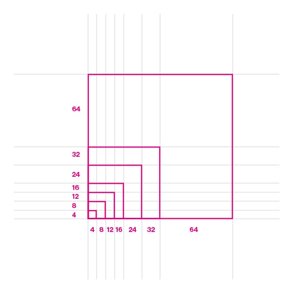
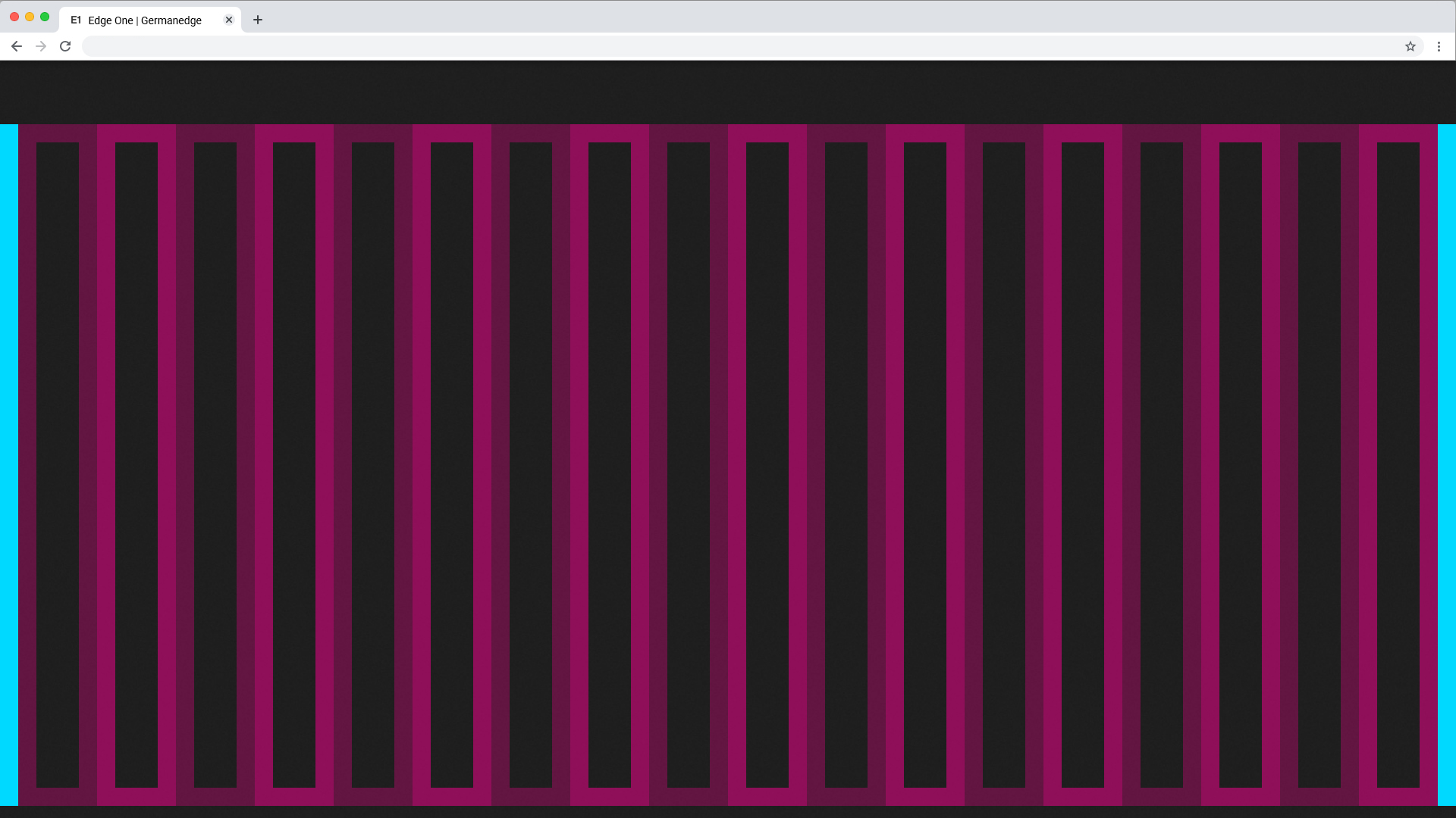
Unit basic unit for the grid is the 4-pixel square mini unit. Variants of mini units form the dimensions of columns, rows and boxes as well as their edges and fillings. The mini-unit adapts to your content while maintaining a constant visual rhythm.
Extra Small <576px | Small ≥576px | Large ≥960px | Extra large ≥1200px | Extra extra large ≥1800px | Kiosk (work in progress) ≥3500px | |
|---|---|---|---|---|---|---|
| Class prefix | .col-sm- | .col-md- | .col-lg- | .col-xl- | .col-xxl- | |
| # of columns | 24 | 24 | 24 | 24 | 24 | |
| Gutter width | n.n | 12 | 12 | 16 | 26 | |
| Nestable | Yes | Yes | Yes | Yes | Yes | |
| Column ordering | Yes | Yes | Yes | Yes | Yes |
The Guidlines.
This list of breakpoints will grow steadily, as the need arises.
Currently, the following breakpoints are necessary from the point of view of the UI/UX Guild.
Columns and Rows
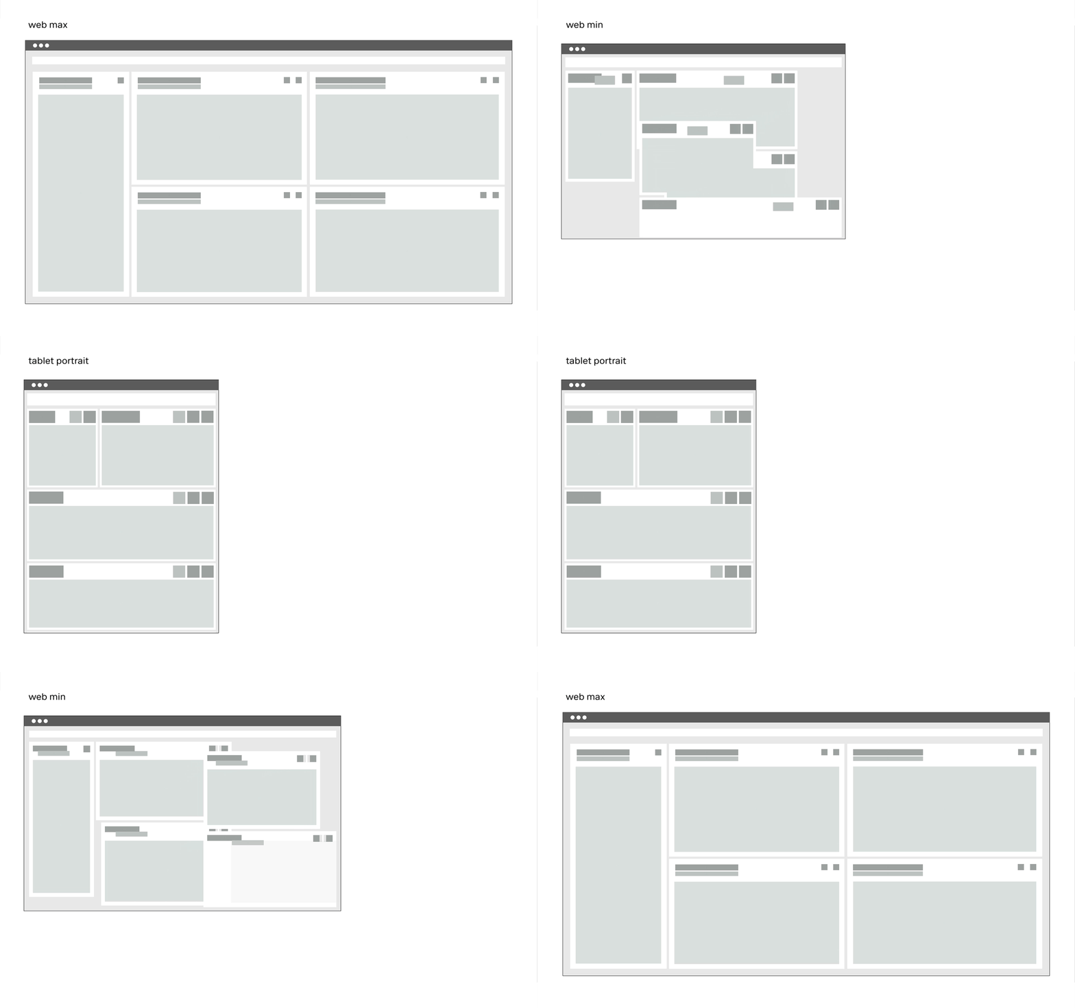
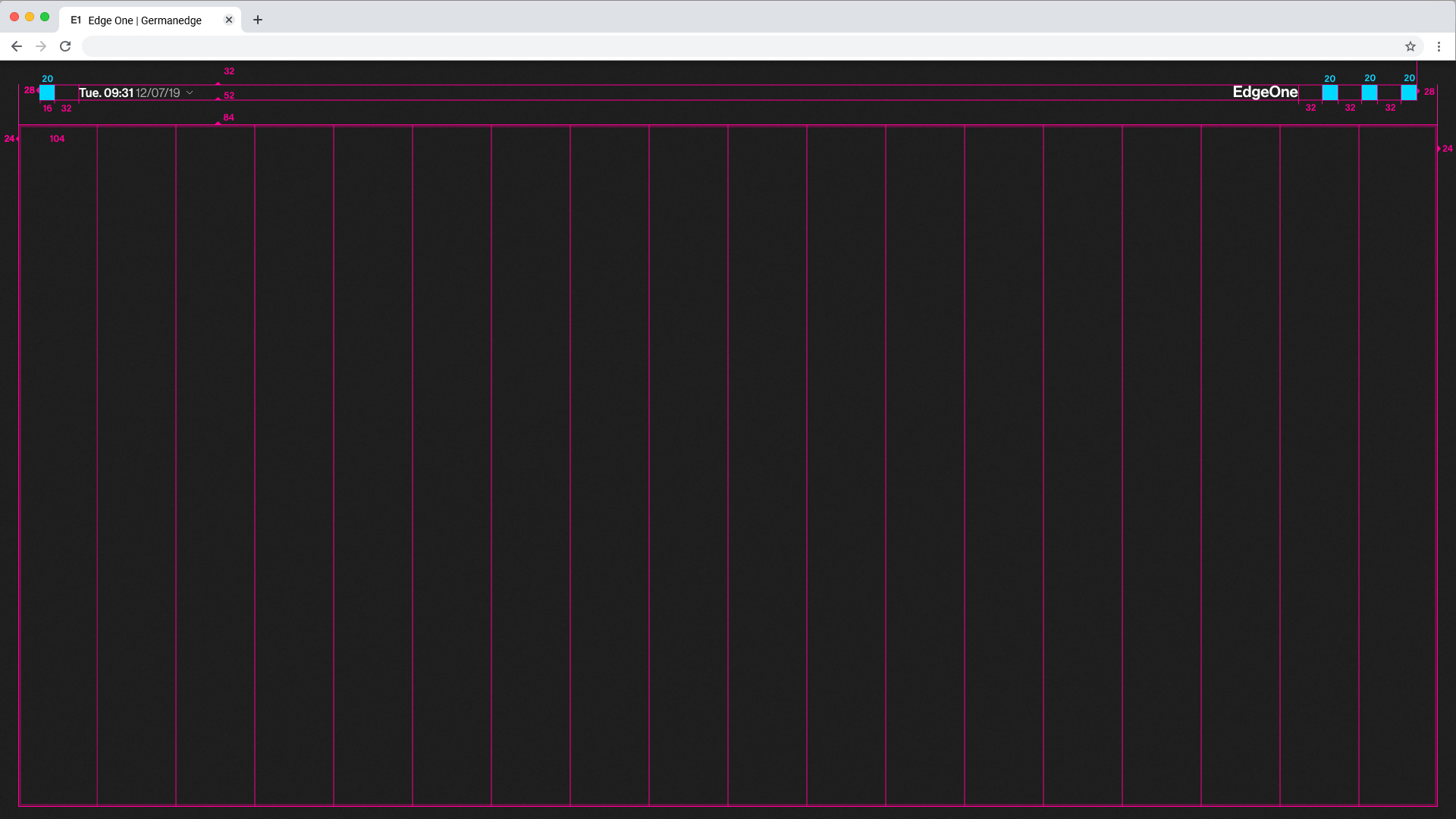
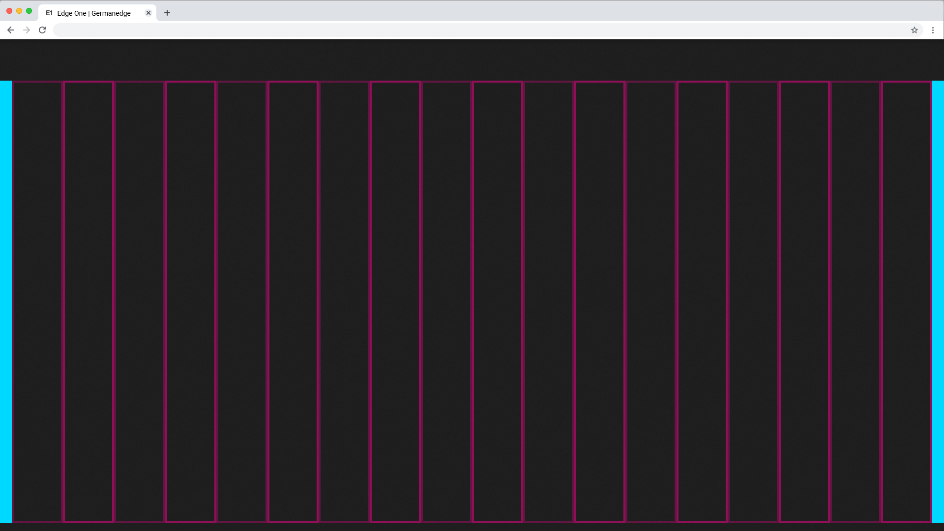
Columns result in key lines. Within the lines all components find their place. all columns have a padding.
Padding
The padding within the columns is one Mini Unit (4x4px) or one Medium Unit (24x24px).

