Page History
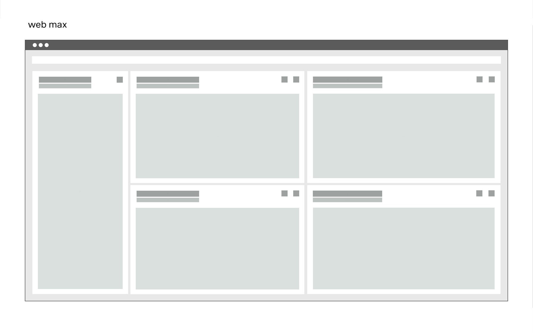
one this distances .Breakpoint px rem Columns Web max 1584 99 24 Web min 1312 82 24 Tablet Landscape 1056 66 24 Tablet Portraid 672 42 24
Mobile 320 20 24Details and the grid for these breakpoints can be found on this page.
The Breakpoint animation.
in this animation we show, using the dsfm interface, how the different contents behave within the breakpionts.
Extra Small <576px | Small ≥576px | Large ≥960px | Extra large ≥1200px | Extra extra large ≥1800px | Kiosk (work in progress) ≥3500px | |
|---|---|---|---|---|---|---|
| Class prefix | .col-sm- | .col-md- | .col-lg- | .col-xl- | .col-xxl- | |
| # of columns | 24 | 24 | 24 | 24 | 24 | |
| Gutter width | n.n | 12 | 12 | 16 | 26 | |
| Nestable | Yes | Yes | Yes | Yes | Yes | |
| Column ordering | Yes | Yes | Yes | Yes | Yes |
The Guidlines.
This list of breakpoints will grow steadily, as the need arises.
Currently, the following breakpoints are necessary from the point of view of the UI/UX Guild.