Page History
...
...
...
...
...
...
...
...
...
...
EdgeOne X-series applications are also linked in the home dashboard. They open per default in a new web browser tab.
- Ron Oemus insert a screen which looks like this.
...
...
...
...

Dashboard Header Anatomy

01 – Hamburger menu The hamburger icon is used to open application navigation such as the left panel.
02 – Position action bar This action bar is intended for datepicker and breadcrump only.
Content of this action bar depends on the content.
03 – Dashboard title The header name should be the name of the parent domain and be as brief as possible
while giving the user a sense of place.
04 – Product logo For Edge.One products, the header name is always preceded by “Edge.One”
05 – Header action bar These utilities are reserved for universal, system-level functions such as profile, search, notifications, and similar functions. Not every product on a system is required to show the same utilities, but it is recommended for a better cross-product user experience.
Dashboard Header Alignment

Dashboard Header Action bar
Die Action bar besteht innerhalb der globalen Navigation immer aus den gleichen Actions.

01 – Global Search Die meisten Suchvorgänge beginnen mit einer breiten Suche, deren Umfang sich mit Hilfe von Filtern einschränkt lässt.
02 – Profile and System Settings Die Einstellungenpunkte sind in einer Overflow Liste aufgeführt. Die Inhalte können sich von User zu User unterscheiden
03 – Notifications currently not possible to describe exactly
Navigation Panel Anatomy
The navigation panel must always be placed on the left side of the dashboard and always consists of the same primary asset sets (1,2,3,6). The number of dashboard groups may vary. The dashboard groups may consist of simple sub menus and sub menu groups. Sub menu groups are always recognizable by the Expand/Collapse icon.

01 – Close Icon for the closeing of the navigation panel.
02 – Resize icon Icon for the individual sliding of the navigation panel.
03 – Dashboard group Group of sub-menus form a dashboard group.
04 – Dashboard group overline Each dashboard group must always be titled by an overline.
05 – Sub-menu Basic link element for the menu.
06 – Tool group tools groups contain sub-menus that link to different tools or services. the number of tools links may vary from user to user.
Navigation Panel Alignment

Responsive behavior
The header always remains the same in its position and function. In all horizontal representations of the header, the position and number of contents are always the same. In all vertical representations of the header, the header's position remains the same, but content may be moved from the global navigation to the local navigation.

Local Navigation
Local navigation does not need to be everywhere in the Edge.One UI. Simple applications do not require local navigation. As soon as a dashboard requires e.g. nodes, dependencies, favorites or subdashboards, this must be placed in the local navigation. The local navigation always controls only the current dashboard and can vary from dashboard to dashboard.
The dashboard navigation boardlet has two display options, Collapsed and Extended. This is necessary to keep the focus on the content of the dashboard. Shape and presentation within a breakpoint are always the same and must not be changed.
| Element | Usage |
|---|---|
| Collapsed Dashboard
Navigation Boardlet | The Collapsed Dashboard Navigation Boardlet is the compressed representation of the local navigation. All navigation contents are displayed to the user via action icons with the corresponding overflow menu. |
| Extended Dashboard
Navigation Boardlet | The Extended Dashboard Navigation Boardlet is the detailed representation of the local navigation. The user is presented with all navigation content via four different navigation assets. A link list, node list, map list or conflict list. The number and arrangement of the assets can be freely varied. |
Collapsed Dashboard Navigation Boardlet
The Collapsed Dashboard Navigation Boardlet always has the same proportions and is located on the left side of the dashboard. The content can vary from dashboard to dashboard and is represented by an action icon. The action icon opens an overflow menu where all thematic actions are listed. In case the customer wants to place his logo inside Edge.One this is only possible in the navigation boardlet.

Collapsed Navigation Boardlet - Anatomy

01 – Extender The Action Icon for extend Aand collapse the navigation boardlet.
02 – Divider A divider helps the user to differentiate between several action icons that have a different content and function.
03 – Content Actions These actions are variable and can be selected by the user/creator.
04 – Client Logo In case the customer wants his own logo, it will be placed only here.
Only signets or rectangular logos are allowed
05 – Overflow Action Link The number of links and the content of the link are variable.
06 – Overflow Menu The overflow menu contains all thematic actions. It opens only to the right.
Collapsed Navigation Boardlet - Alignment

Extended Dashboard Navigation Boardlet
The Extended Dashboard Navigation Boardlet always has the same proportions and is located on the left side of the dashboard. The content can vary from dashboard to dashboard and is represented by a Navigation Asset. Currently there are four different navigation assets. A link list, node list, map list or conflict list. The number and arrangement of the assets can be varied freely. However, we recommend not to use more than three navigation assets in combination, otherwise space problems may occur.
In case the customer wants to place his logo inside Edge.One this is only possible in the navigation boardlet.

Collapsed and Extended Navigation Boardlet
Navigation Assets

01 – Navigation Boardlet with only one Navigation Asset As an example, here you can see a card-list.
02 – Navigation Boardlet with two Navigation Assets As an example you can see here a combination
of card-list with a link-list.
03 – Navigation Boardlet with two Navigation Assets As an example you can see here a combination
of conflict-list with a link-list.
04 – Navigation Boardlet with two Navigation Assets As an example you can see here a combination
of node-list with a link-list
05 – Navigation Boardlet with three Navigation Assets As an example you can see here a combination
of card-List with a link-list and a onflict-list.
| Navigation Asset | Usage |
|---|---|
| Link List | A link-list always consists of a scrollable collection of links. The user can use this list to move faster in the content or to display favorite data with one click. |
| Node List | A node-list always consists of a scrollable collection of notes. The user can move back and forth through this list within the different nodes |
| Card List | A card-list always consists of a scrollable collection of minicards. The minicards can give the user detailed information about the underlying content. The user can move within the contents or data of the dashboard with the use of this list. You can find detailed information about the cards here. |
| Conflicts List | A conflict-list always consists of a scrollable collection of conflict-cards. The number of conflicts can be vary. The user can use this list as an overview and to filter conflicts in their dashboard. |
Extended Dashboard Navigation Boardlet - Anatomy

01 – Extender The Action Icon for extend and collapse the navigation boardlet.
02 – Divider A divider helps the user to differentiate between several action icons that have a different content and function.
03 – Link List Assets.
04 – Node-List Assets.
05 – Card-List.
06 – Client Logo In case the customer wants his own logo, it will be placed only here. Only signets or rectangular logos are allowed
A – Navigation Asset.
B – Content of a navigation asset The content can vary, see overview navigation asset.
C – Overline of a navigation asset Overlines can be used with or without an action bar.
Extended Dashboard Navigation Boardlet - Alignment

Collapsed Navigation Boardlet Anatomy

01 – Extender The Action Icon for extend and collapse the navigation boardlet.
02 – Divider A divider helps the user to differentiate between several action icons that have a different content and function.
03 – Content Actions These actions are variable and can be selected by the user/creator.
04 – Client Logo In case the customer wants his own logo, it will be placed only here.
Only signets or rectangular logos are allowed
05 – Overflow Action Link The number of links and the content of the link are variable.
06 – Overflow Menu The overflow menu contains all thematic actions. It opens only to the right.
Collapsed Navigation Boardlet Alignment

Breadcrump
Breadcrumbs show users their current location relative to the information architecture and enable them to quickly move up to a parent level or previous step. The breadcrump is always located in the left part of the header, it can be expanded or collapsed as needed. this is important so that the header is always clear for the user and the breakcrump does not play a primary role in all applications.
When to use
Breadcrumbs are effective in products and experiences that have a large amount of content organized in a hierarchy of more than two levels. They take up little space but still provide context for the user’s place in the navigation hierarchy.
When to use
Breadcrumbs are always treated as secondary and should never entirely replace the primary navigation. They shouldn’t be used for products that have single level navigation because they create unnecessary clutter.
Anatomy
Breadcrumbs are placed in the upper left area of the page. They are located inside the header. The breadcrumb must always be placed in the header as a primary element of the global navigation. Once the user leaves the homeboard, the breadcrump must have a back arrow. With this arrow the user can navigate back step by step.

01 – Go back icon With the action icon the user can navigate back step by step.
02 – Breadcrump icon With this icon the user can expand and collapse the breadcrump.
03 – Breadcrump link Directs users to the parent-level page.
04 – Separator Clearly distinguishes between each page.
Behavior
All pages in the breadcrumb component should be interactive and link to the corresponding pages. The go-back icon can only go back one step in the page structure at a time.
Mouse
Users can trigger an element by clicking on a breadcrumb page link. The separators between page links are not interactive.
Keyboard
Users can navigate between breadcrumb links by pressing Tab and Shift-Tab. Users can trigger a breadcrumb link by pressing Enter while the link has focus.
Breadcrumb
By default, the Inspire breadcrumb must not be placed expanded in the header. It must always be expanded by the user as needed. This is important so that the header retains its tidy and clear design. In case of complex navigation or linking, the breadcrumb must also be expanded by default.

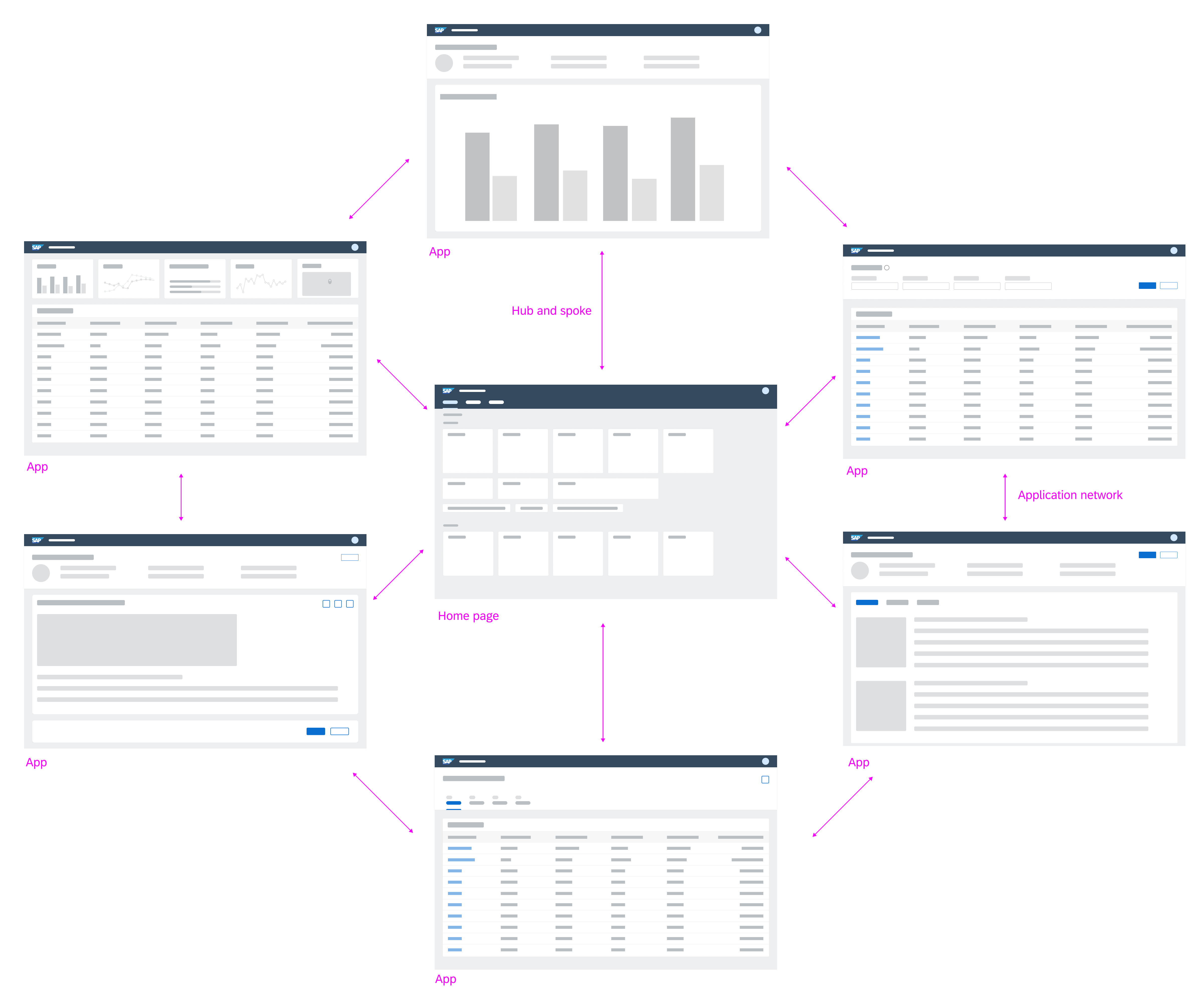
Navigation Between Apps
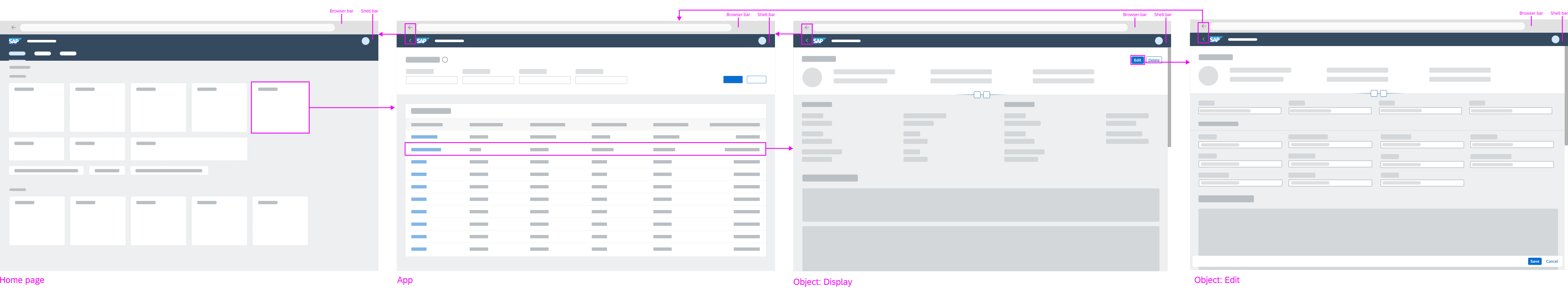
The cards (insert link) on the home dashboard represent navigation anchors to the individual apps/ dashboards. By selecting a card, the user navigates to the corresponding app/ dashboard. It is also possible to integrate legacy UI technology through these cards. EdgeOne X-Series technologies open in a new tab or window (for supported desktop operating systems only).
- Ron Oemus insert a screen which looks like this.
...
Version 1:

Version 2:

Version 3:

The home dashboard features cards as navigation anchors to the individual apps
Individual apps can be connected to build up navigation flows. There are different ways to build a connection:
- Navigation via links (to open other objects or lists)
- Navigation via line items in a list or table (to display more details about the item in the list/table)
- Navigation via other UI elements
- Actions on buttons (to trigger transactional tasks)
By transferring context between apps, one modular app can build on the input of the previous app(s). This way, individual apps can be reused in different contexts. More complex functionality can be combined using individual modules or apps. After each navigation step, the user can always navigate back using the browser’s back button or the back arrow icon in the header bar (insert link).
- Ron Oemus insert a screen which looks like this.
...
Version 1:

Version 2:

Version 3:

Forward navigation flow
Back and Home
The ID2 header is always located at the top of each app. It displays the logo, which triggers navigation to the home dashboard, and back button, which triggers navigation to the previously visited page. An exception is made when a deep link to an application is called and there are no EdgeOne Inspire entries in the browser history. No back button should be displayed.
- Ron Oemus insert a screen which looks like this. (ID2 Header)

Navigation Within Apps
Forward Navigation
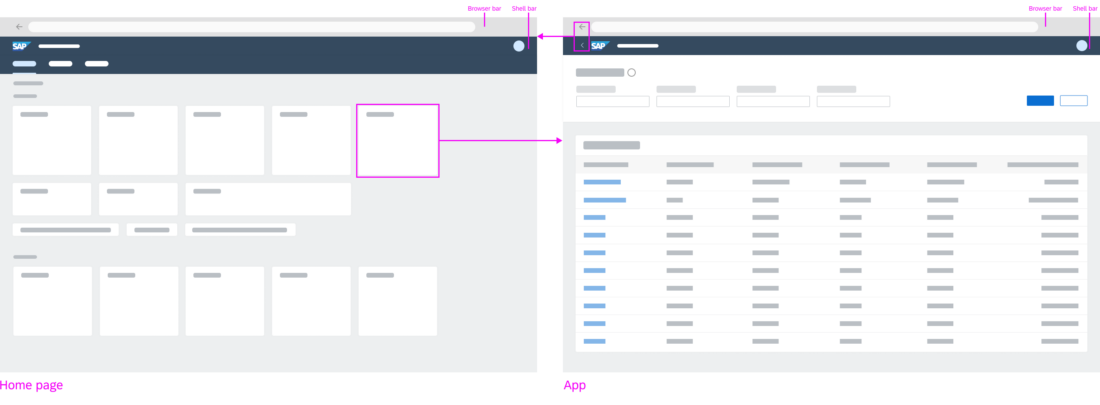
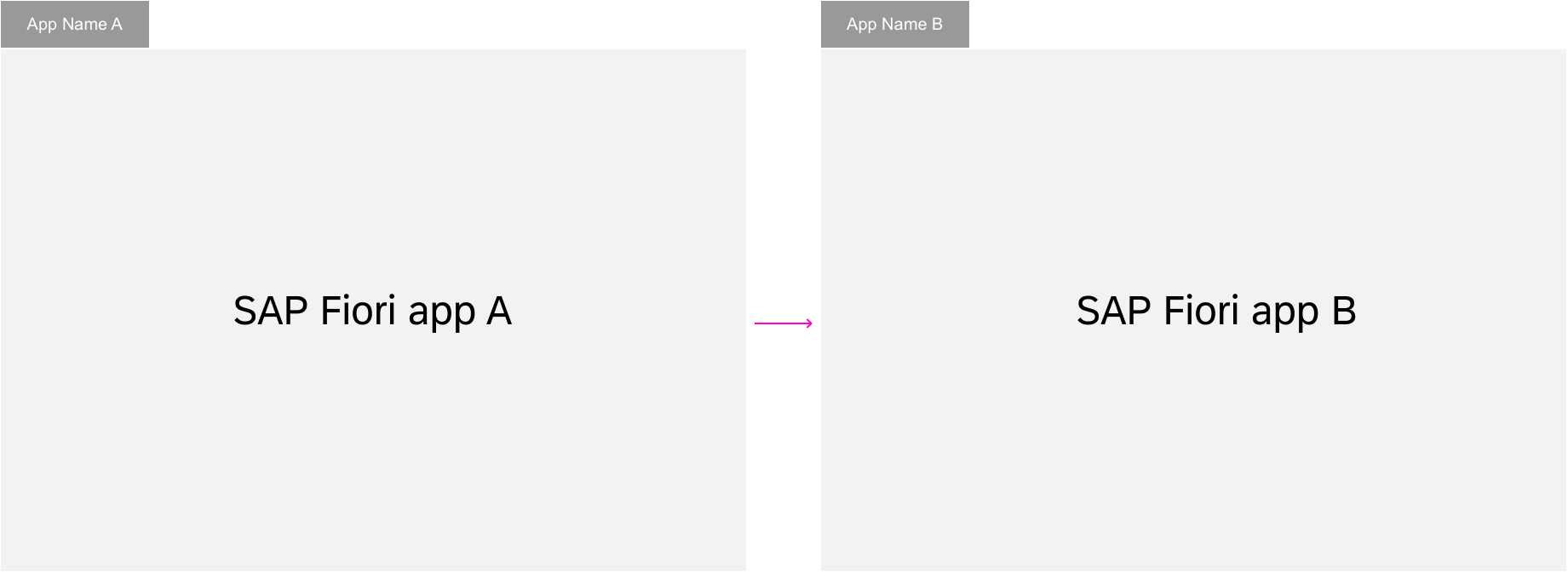
Forward navigation to other dashboards of the app or other apps is triggered by links, line items, buttons, or other UI elements. No distinction is made between navigation targets located within the same app or those located in other apps.
Clicking a link can either trigger direct navigation, or open a popover. With the popover, further navigation targets can be reached. This behavior should be consistent within an app. For example, links in a table should consistently either open a popover or navigate to another dashboard.
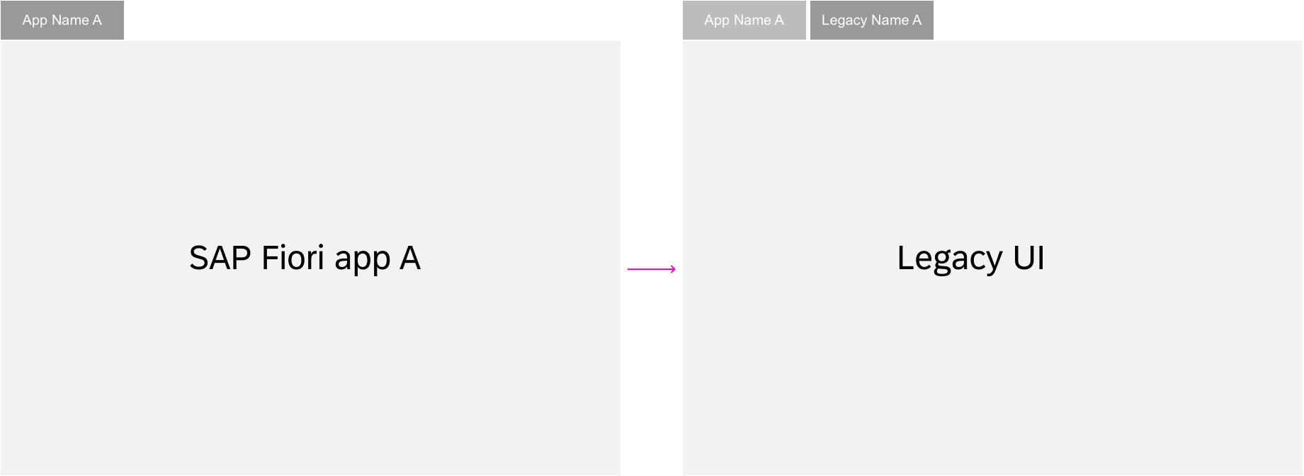
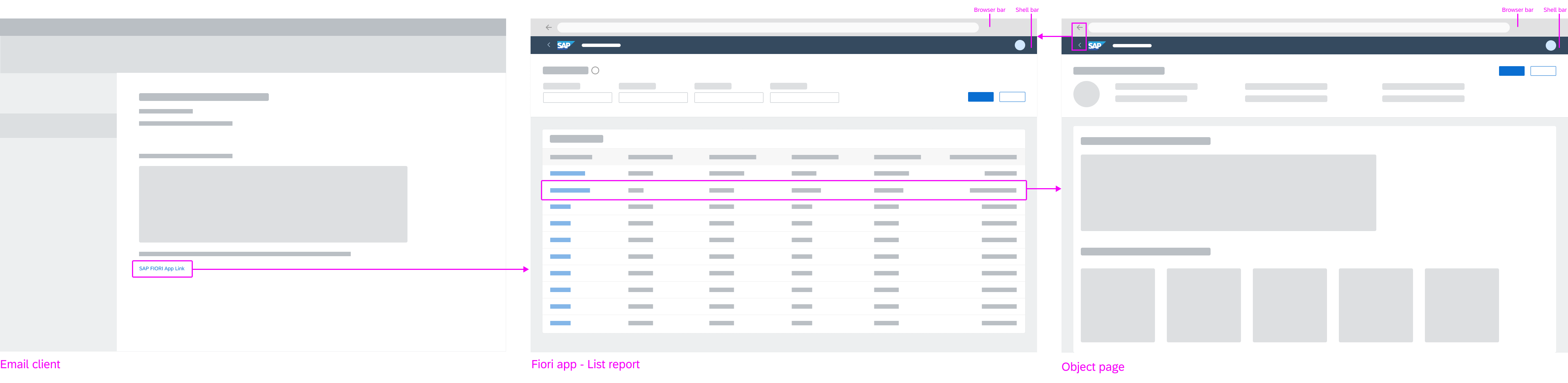
Example: Navigation from legacy to EdgeOne Inspire
EdgeOne X-Series apps are always opened in a new tab/window from the EdgeOne Inspire home dashboard. The same applies to any URL that opens a X-Series app.
- Ron Oemus insert a screen which looks like this.
- Rename SAP Fiori → EdgeOne Inspire
- Rename Legacy UI → X-Series app
...
In-place navigation
Pop-out navigation
Back Navigation
The user can always navigate back to the previous dashboard with the back button in the upper left corner of the ID2 Header. In addition, the browser’s back arrow icon (<) offers the same function. The browser history can be used to go back to previous steps. All dashboards can be bookmarked and the URL can be forwarded to give other users access to the same page.
Exceptions
Switching between display and edit mode is not a navigation step and therefore does not result in a new URL. An exception is made for the draft. Here, a unique number is added to the URL to distinguish drafts from active documents.
More information:
- Behavior in edit scenarios: (add link)
- Deep linking and bookmarking: (add link)
- Ron Oemus insert a screen which looks like this.
Navigation for full screen apps
Edit and Display
Switching from display mode to edit mode is not a navigation step and the URL itself should therefore not change, except for the GUID which is added to the URL. Hence, no new entry is made in the browser history.
Bookmarking draft version
After switching to edit mode, a GUID is added to the URL to identify the current draft version. The user may bookmark the current changes as a draft version. If the user switches back to display mode via Save, the object will be shown with the saved changes. If the user switches back to display mode via Cancel, the object will be shown without the changes.
Navigating to draft version
When the user navigates to a bookmarked draft version, a dialog pops up prompting the user to decide whether the application should continue in edit mode with changes of the draft version, or whether the active version should be shown in display mode.
- If no draft version exists, the active version is shown in display mode.
- If the user rejects the edit mode, the draft version is deleted and the active version is shown in display mode.
- If the bookmarked draft version does not contain any changes, no dialog (popup) is shown. The active version is shown in edit mode.
Exceptions
- If another user is locking the object, the active version is shown with the status Locked by… in display mode.
- If another user’s lock on an object has expired, the active version is shown with status Unsaved Changes in display mode.
Entries in Browser History
The state of an app is reflected in its URL. This allows the user to bookmark or send a link to the app in this specific state. But when does a new URL need to be created?
In general, there are three cases:
- Always create a new entry in the browser history when the user opens a new app. When the user navigates to a different dashboard within the same app, create a new entry to allow back navigation to the previous dashboard. In these cases, users can return to the previous dashboard using the back button or the browser’s back arrow icon.
- Replace the URL in the browser history if only parts of the dashboard are changed. This is important to avoid unnecessarily long back chains when navigating back in the browser history. You will need to replace the URL when the user navigates through a list of items using the up/down arrows, or applies a filter to a list.
- Keep the same URL if you don’t need to mark a new state for the app. This could be the case after choosing a selection. The URL also stays the same when switching between display and edit modes (see exception below).
Exception
There is an exception when working on a draft version. In this case, the URL stays unchanged and a GUID is added to identify the draft version.
(Link to the draft handling article)
Deep Links
A dashboard of an application that is not its home dashboard can be bookmarked or shared as a deep link. Ideally, the full UI state of the dashboard is retrieved. Technically, this includes every part that is represented in the URL.
For example, a master-detail app gets a new URL when another entry is selected in the master list and shown in the details area. This state with the new item can be used as a deep link.
If a deep link to an application is called and there are no EdgeOne Inspire entries in the browser history, do not display a back button.
Apps with draft handling functionality allow deep linking to a dashboard in edit mode. Apps without draft handling allow deep linking only to the display mode of an object. In the latter case, the deep link always navigates to the display mode. For more information about deep linking and bookmarking for drafts, see (link to draft handling).
Calling a Deep Link
Navigation to a deep link ideally restores every detail of the dashboard. Technically, this includes all parts reflected in the URL. The use case and feasibility determine which changes are reflected in the URL, but the rules mentioned in this section must be fulfilled. If a deep link leads the user to an object that no longer exists or can’t be accessed, an empty dashboard is shown. If a user calls a deep link that has been forwarded by another user, the results displayed may vary due depending on authorization levels.
- Ron Oemus insert a screen which looks like this.
Ressources
...