Page History
1.Basic
2.
InstanzenInstance
To make all icons of the different product providers fit together and easier to combine with each other, we divide the icon itself into 2 sections. For all icons the basic rule appliesDamit alle Icons der verschiedenen Produktgeber zusammenpassen und einfacher miteinander kombinierbar sind teilen wir das Icons selbst in 2 Sektionen auf. Für alle Icons gilt die Grundregel:
Large
Size: 24px x 24px
Color: same like Typeface
Small
Size: 16px x 16px
Color: same like Typeface
(not part of the MVP)
X-Large
Size: 48px x 48px
Color: same like Typeface
(not part of the MVP)
Sektion 1
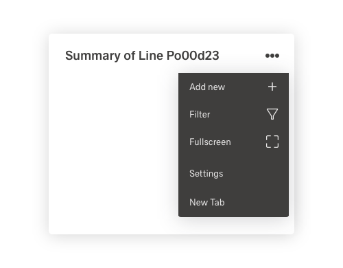
Das Symbol. Dieses kann Funktionen (Action-Icons) wie Sortieren, Filtern, Hinzufügen usw. aber auch Merkmale (Indikator-Icon) wie Maschinen, Qualität, Aktionen usw Icon (Kategorie) symbolisierenThe icon. This can symbolize functions (action icons) like sorting, filtering, adding etc. but also features (indicator icons) like machines, quality, actions etc. Icon (category).
Sektion 2
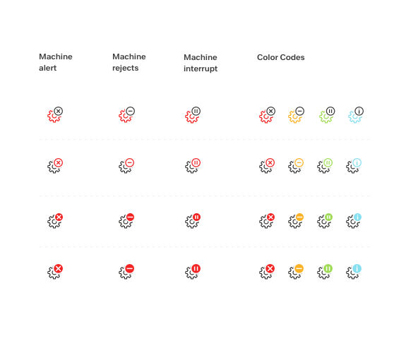
Die Extension. Diese funktioniert nur im Zusammenspiel mit dem Indikator-Icon und zeigt verschiedene Zustände des Indikator icon an. Wie z.B. Maschine defekt, nicht verfügbar, pausiert usw. Die Extension kann nie alleine eingesetzt werden. Die Extensions dürfen farblich unterschiedlich ein aber nicht in Ihrer Größe variieren.The Extension. This works only in conjunction with the indicator icon and shows different states of the indicator icon. Such as machine defective, unavailable, paused etc. The extension can never be used alone. The extensions may vary in color but not in size.
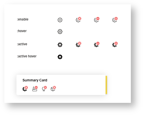
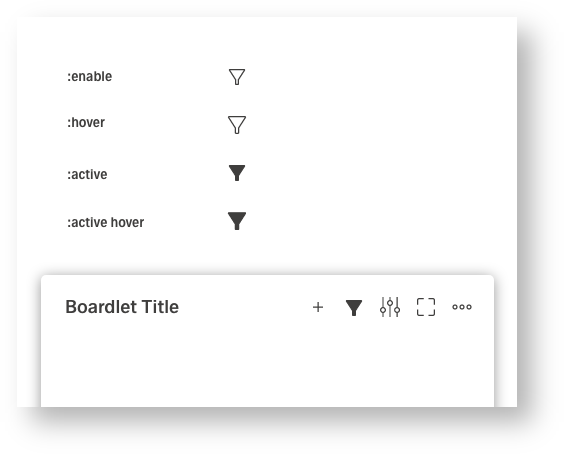
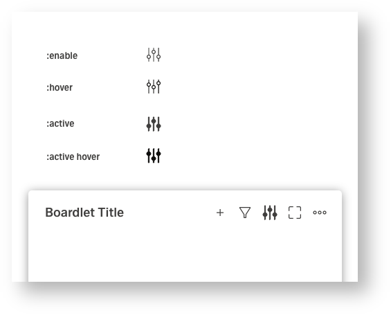
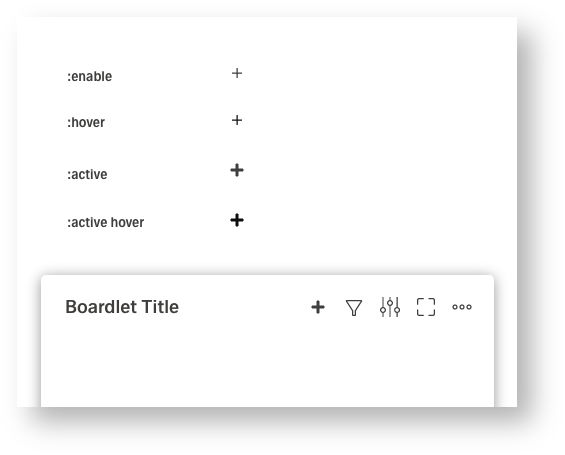
For each icon there are only 5 instances. All other states must be solved via the extension.
:enable is the default display. :hover differs by a slight color nuance and a minimal animation. :active must be clearly distinguished from :enable or :hover by a higher contrast. :active hover differs from the :active by a color nuance, as in :enable. :disable is always displayed without extension, three color nuances below or above the BGFür jedes Icon gibt es ausschließlich nur 5 Instanzen. Alle anderen Zustände müssen über die Extension gelöst werden.
:enable ist die Standart Darstellung. :hover unterscheidet sich durch eine leichte Farbnuance und eine minimale animation. :active muss durch einen höhere Kontrast klar von den :enable oder hover unterscheiden. :active hover unterscheidet sich wie im :enable durch eine Farbnuance zum :active. :disable wird immer ohne Extension, drei Farbnuance unter oder über dem BG angezeigt.
:enable
:hover
:active
:active hover
:disable
Indicator Icon with Extensions

Action Icon (shape) without Extensions
Action Icon (line&shape) without Extensions

Action Icon (line) without Extensions

3.Clickdummy
In the clickdummy only the different instances like :enable, :hover and :active are tested. There may be variations within the UI kit.
| Info | ||
|---|---|---|
| ||
https://xd.adobe.com/view/8ec97a3b-1e42-4c2a-b0f9-2f18d8e0ebcc-db9a/ |
| Multimedia | ||||
|---|---|---|---|---|
|
4.Animationen
Animations are always minimal and can include a shift of min 1px to max 2px, a rotation, a zooming of the symbol. But it is also allowed to animate single paths of the symbol as mentioned. The extension must never be part of the animation. Only action icons, as an indicator of an action, have an animation. Indicator icons animations are "not part of the MVP" and are
and will be drawn after the MVP.Die Div-Box des Icon hat eine feste Größe bestehend aus
Animationen sind immer minimal und können ein Verschieben von min 1px bis max 2px, ein Rotieren, ein Zoomen des des Symbols beinhalten. Es ist aber auch Erlaubt einzelne Pfade des Symbols wie genannt zu animieren. Die Extension wird darf nie Teil der Animation sein.
Action Icon (line) Hover
Action Icon (shape) Hover
Indicator Icon (shape) Hover
4.Gruppierungen
Im Falle einer Gruppierung von Icons sind aktuell zwei Versionen möglich.
| title | Icon Grouping Test A |
|---|
| title | Icon Grouping Test B |
|---|
In case the action bar cannot be displayed completely, (a) all icons or (b) groups of function-related icons must be combined. Here it must be decided whether a or b is pursued.
Icon grouping in more icon
Icon grouping in more and grouping Icon
5. Extensions
Extensions are currently only possible in these 4 layout versions. Here we have to decide which version we will pursue further.
More Details about Extensions here:
Structure of Icons
6
5.Beispiele aus anderen UI Kits
Google Material: https://material.io/resources/icons/?style=outline
Carbon design System: https://www.carbondesignsystem.com/guidelines/icons/usage
Apple Icons: https://developer.apple.com/design/human-interface-guidelines/ios/icons-and-images/system-icons/
Sap: https://sapui5.hana.ondemand.com/sdk/test-resources/sap/m/demokit/iconExplorer/webapp/index.html#/overview/SAP-icons