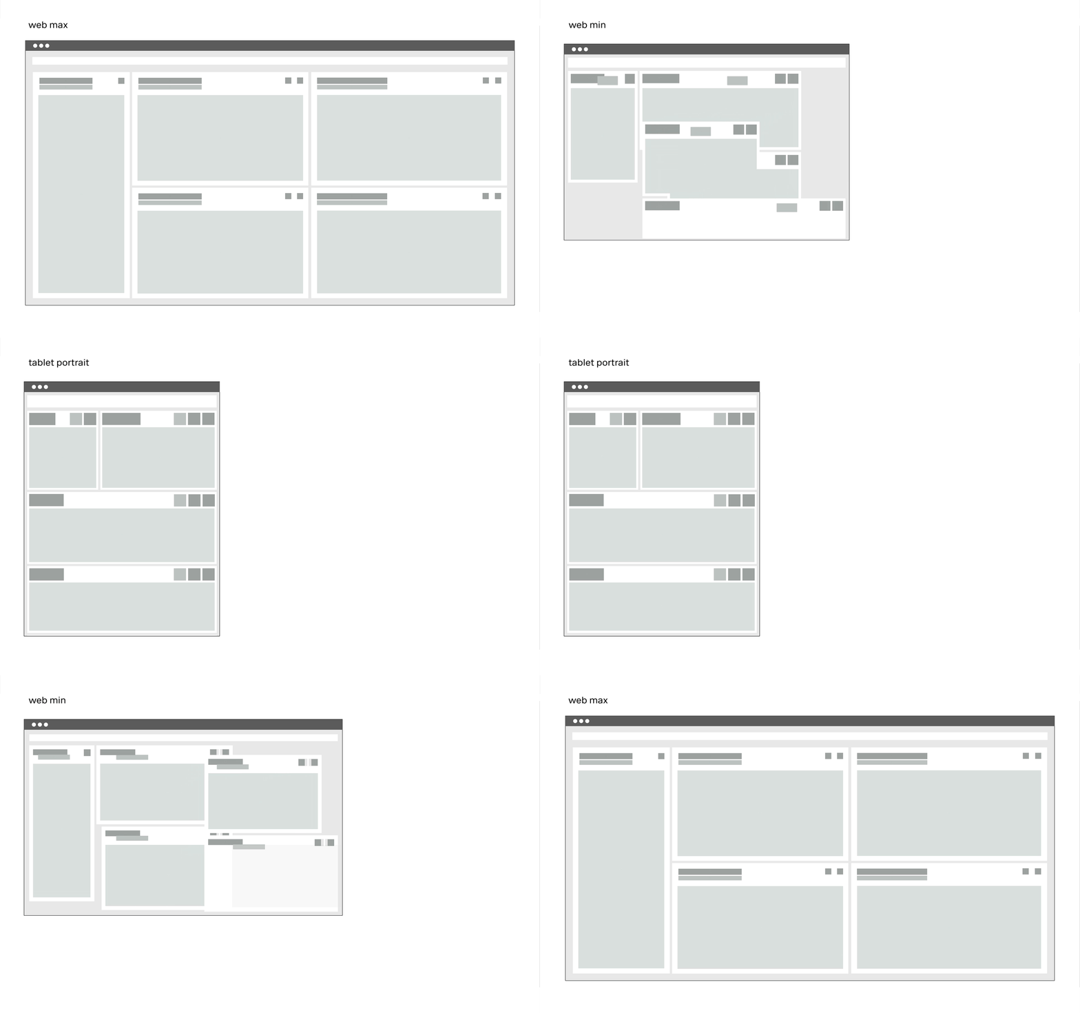
Extra Small <576px | Small ≥576px | Large ≥960px | Extra large ≥1200px | Extra extra large ≥1800px | |
|---|---|---|---|---|---|
| Max container width | |||||
| Class prefix | .col-sm- | .col-md- | .col-lg- | .col-xl- | .col-xxl- |
| # of columns | 24 | 24 | 24 | 24 | 24 |
| Gutter width | n.n | 12 | 12 | 16 | 26 |
| Nestable | Yes | Yes | Yes | Yes | Yes |
| Column ordering | Yes | Yes | Yes | Yes | Yes |
The Guidlines.
This list of breakpoints will grow steadily, as the need arises.
Currently, the following breakpoints are necessary from the point of view of the UI/UX Guild.
- Web max(1920x1080)
- Web min(1280x800)
- Tablet landscape (1024x768)
- Tablet portrait (768x1024)
- Smartphone portrait (375x667)

