Tablet Basics
The dashboard always consists of two organism, a header and the content area. But in the tablet breakpoint there is the possibility to add another molecule: the sandbox molecule. This is advantageous for a quick start and replaces the floting sidebar. The content area can be designed freely, all content must adhere to the 24-column grid. The content may not be positioned freely within the column grid. An overlay must be used for this. All content, in the best case boardlets, start at the top left. They must be placed next to and below each other within the column grid. The header organism always consists of a navigation molecule, logo atom and toolbar molecule.
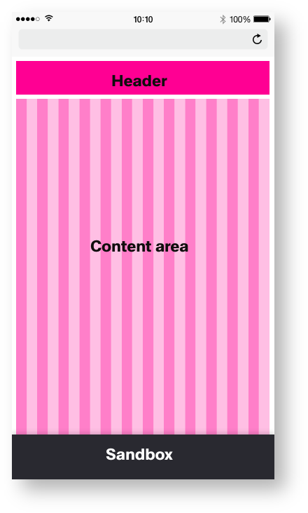
Basic Templates of the Dashboard
Dashboard Spacing
All molecules and the atoms within them have a fixed spacing. This spacing is to place the molecules more precisely within the organism. Within the molecule the atoms also have a fixed spacing to each other. The spacing within the atoms is always the same, it varies only slightly from breakpoint to breakpoint. The spacing of the molecules is flexible. You only have to make sure that it is in the range from Spacing_1 to Whitespacing_7. This gives the design of the software an independent, visually attractive and continuous appearance.
| Base | mobile_portrait (px) | mobile_portrait |
|---|---|---|
| Breakpoint | <576px | - |
| Width | 375* | 23,438* |
| Height | - | - |
| Column Width | 15* | 0,938* |
| Content-Area Margin | 6 | 0,375 |
| Sandbox | ||
| Height | 64 | 4 |
*Iphone 6
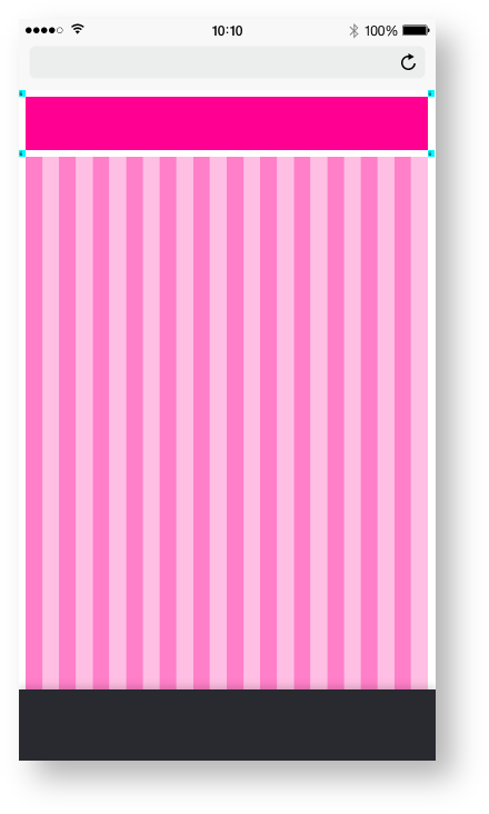
Mobile/Molecules_Spacing
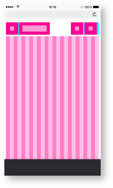
Landscape tablet/Atomic_Spacing
Tablet Dashboard Themes
All templates and pages exist in two themes, the Astronaut(light) and the Tokyo at Night Theme(dark).
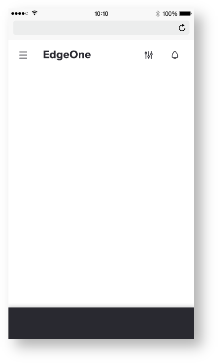
Mobile/Dashboard_Astronaut
here you will find the handover and the Styleguide: |
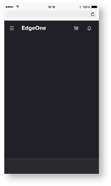
Mobile/Dashboard_Tokyo at night
here you will find the handover and the Styleguide: |