The 24 Colum-Grid
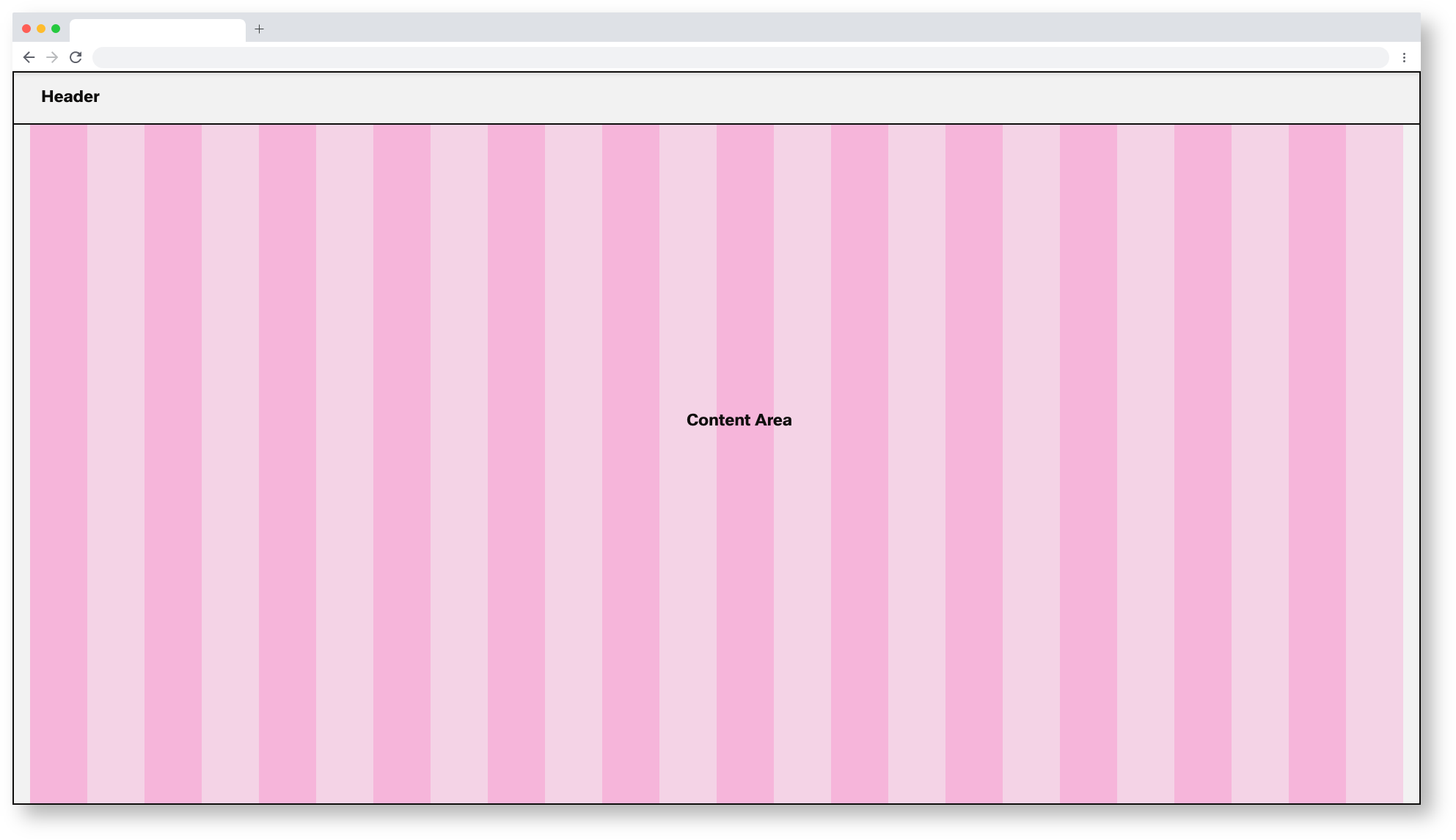
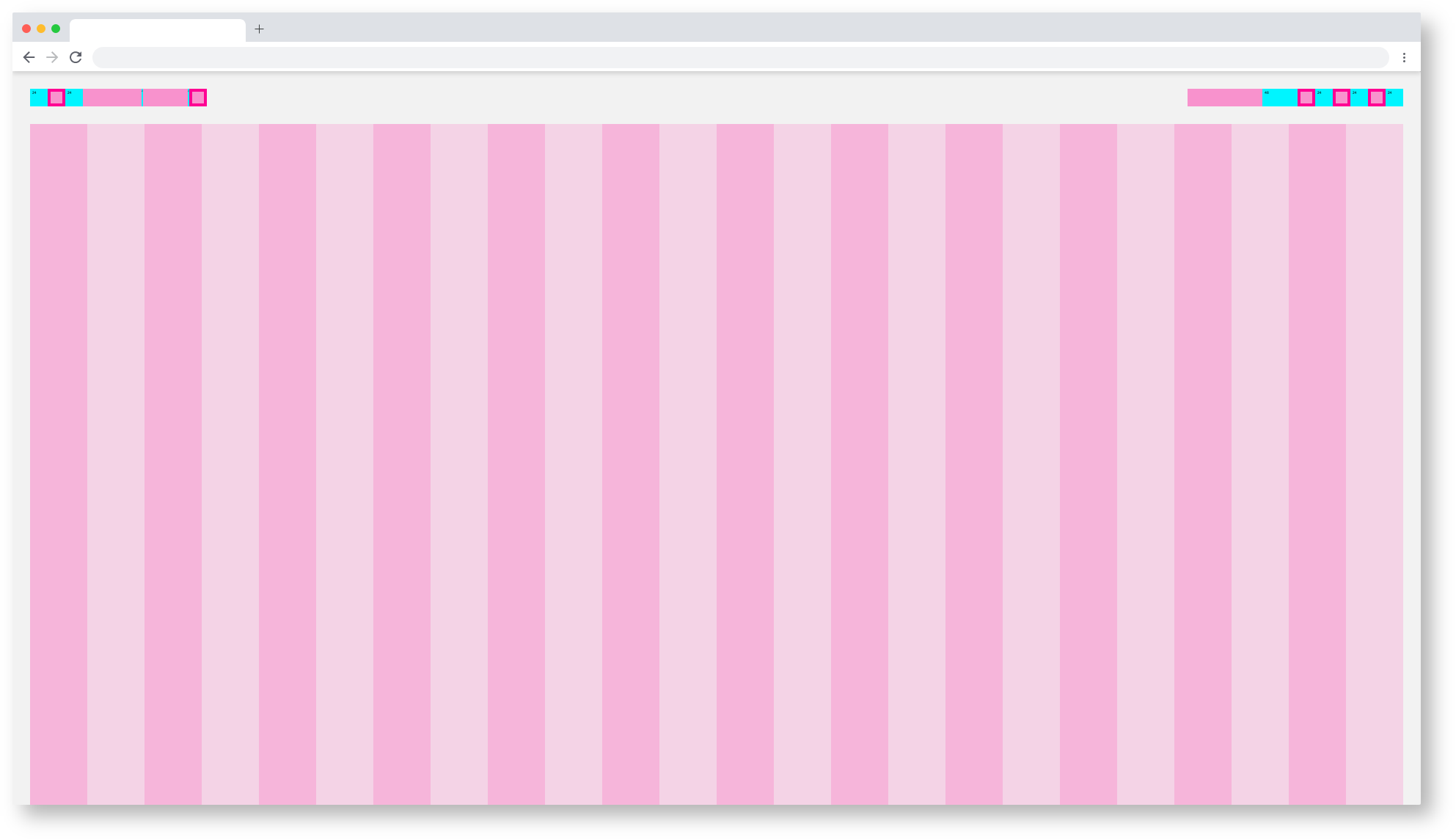
The foundation of the design system is the modified bootstrap frontend grid. this grid has 24 columns within the dashboard and 12 columns within the boardlets. The dashboard is divided into two parts, header and content area. The 24 Columns Grid only applies within the content area. The grid has no column space, all distances are solved via the margin.
Dashboard Spacing
| Base | web_max | web_max (rem) | web_min | web_min (rem) | tablet_landscape | tablet_landscape | tablet_portrait | tablet_portrait | mobile_portrait (px) | mobile_portrait | kiosk (px) | kiosk (rem) |
|---|---|---|---|---|---|---|---|---|---|---|---|---|
| Breakpoint | ≥1800px | - | ≥1200px | - | ≥960px | - | ≥576px | - | <576px | - | WiP | WiP |
| Width | 1920 | 120 | 1280 | 80 | 1024 | 64 | 768 | 48 | 375* | 23,438* | WiP | WiP |
| Height | - | - | - | - | - | - | 1024 | 64 | - | - | WiP | WiP |
| Content Area | ||||||||||||
| Column Width | 78 | 4.875 | 52 | 3.25 | 42 | 2.625 | 31 | 1.938 | 15* | 0,938* | WiP | WiP |
| Gutter | 26 | 1.625 | 16 | 1 | 8 | 0,5 | 8 | 0.5 | - | - | WiP | WiP |
| Content-Area Margin | 24 | 1,5 | 16 | 1 | 8 | 0,5 | 8 | 0.5 | 6 | 0,375 | WiP | WiP |
| Header Area | ||||||||||||
| Header-Area | 24 | 1,5 | 24 | 1,500 | 48 | 3 | 48 | 3 | 48 | 3 | WiP | WiP |
| Icon max | 24 | 1,5 | 24 | 1,500 | 48 | 3 | 48 | 3 | 48 | 3 | WiP | WiP |
| Icon min | 18 | 1,125 | 18 | 1,125 | 48 | 3 | 48 | 3 | 48 | 3 | WiP | WiP |
| Scrollable | yes | yes | yes | yes | yes | WiP | WiP | |||||
| Navi and Toolbar | ||||||||||||
| Height | - | - | - | - | 64 | 4 | 64 | 4 | 64 | 4 | WiP | WiP |
*Iphone 6 / WiP = Work in Progress
Dashboard Breakpoints
All dashboards are divided into different breakpoints. The breakpoints define the visual division and spacing of dashboards and boardlets in all possible digital formats. This UI design kit considers the Web_Max breakpoint as the default, all other breakpoints are located in the category subcategories.


Web_Min/Dashboard
 Tablet_Landscape/Dashboard

Tablet_Portrait/Dashboard

Mobile_Portrait/Dashboard

Kiosk/Dashboard

