Within Inspire Design, the term “content actions” is used to refer to all actions that are located in freely selectable content, e.g. in the content area of a boardlet, dialog or modal organism or free-standing content.
They appear in groups or on their own and are always connected to another organism/component.
The action's scope of influence is confined inside organism/component they are connected to. If the component is disabled, the connected action will be disable too.
We categorize the content actions into 3 groups: regular actions, inline actions and table actions.
Some components inherently have one ore multiple action(s) connected to them, f. ex. opening a dropdown selection on an input field. They are a part of the component and thereby only affect the component itself. The component the action is connected to has a container that clarifies the realm of influence of the action.
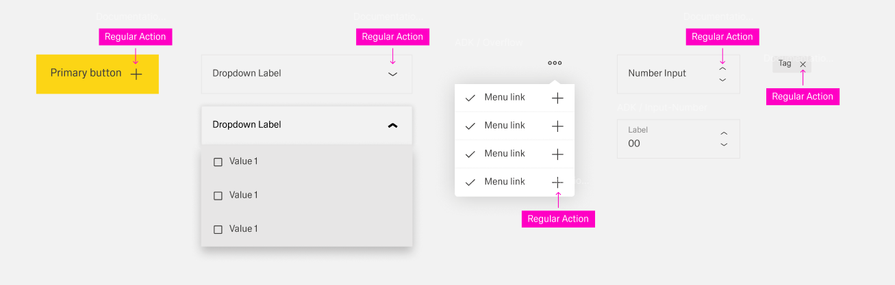
Regular actions are only placed on the right side of the component or organism inside the component they are connected to. They only appear in the form of action icons that are usually predefined by the component.
Inline actions consist of one or more actions connected to an inline component. Thereby, the component and connected to it the action is not enclosed in a container and has no visible border.
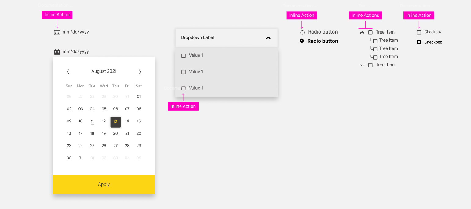
Inline actions are exclusively on the left side of the organism always an action icon. They only appear in the form of action icons that are usually predefined by the component.
Table actions effect a specific row of a table and are placed inside a table row toolbar. The actions are in the form of action icons. The toolbar is a separate column inside the table with the title "Actions" and located at the far-right side.
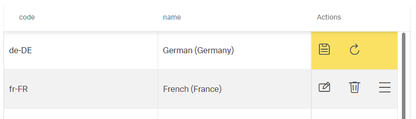
There are two predefined actions: updating and deleting. Additional actions can be placed in the toolbar or a "more" action inside the toolbar. Custom actions inside the toolbar are placed to the right of predefined actions. They have a custom action icon, a label custom visibility and custom activation.
If an action is optional for a component, it should only be added if it is absolutely necessary or has a clear use case. If an action is already present inside the toolbar or footerbar, it should not exist as a content action.
Additionally, regular actions and inline actions are inherently connected to their component. If a component does not have an action, it should never be artificially added.
To enhance clarity, there should never be more than 5 items inside the action column. If more actions are needed, they should be placed inside the overflow menu of the more action.
When choosing an action icon, use an icon that clearly represents the desired action.