[!NOTE] This article is about the Boardlet Pattern. For more information about the boardlet component in the App Composer, please visit this page.
A Boardlet is the core unit of a dashboard. It aggregates and displays matching content, such as tables, diagrams, KPIs, or graphics. It can range from simple to complex depending on the use case. Boardlets are assembled by authorized users to compose a dashboard.
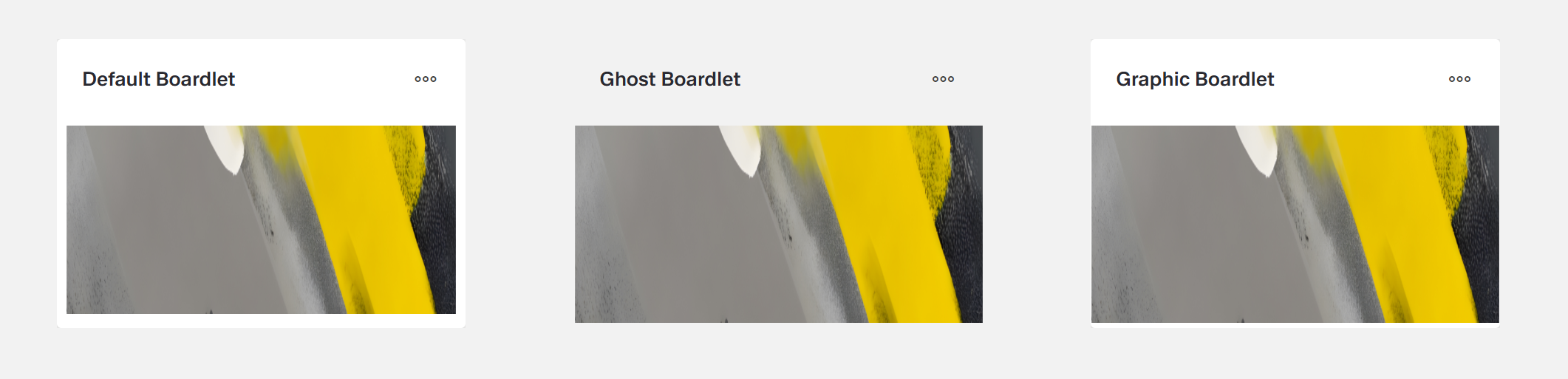
They exist in three variants: default, ghost and graphic. In addition, it has an optional header and footer.
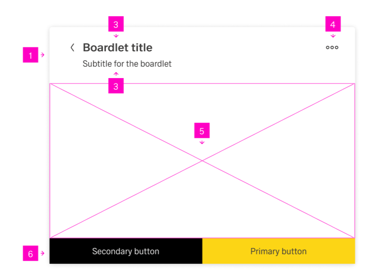
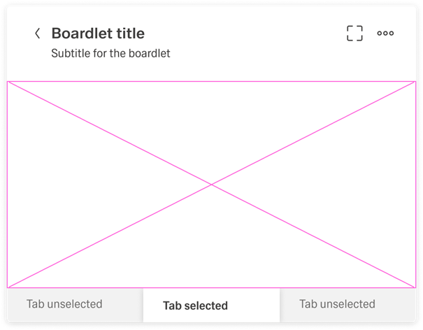
Every boardlet contains a Body where content may be placed. In addition, it can contain a Title, a Subtitle (not currently in the App Composer), an Overflow Menu, and a Footer.
Width and height are flexible but must align to the gid of the dashboard. It has now inner padding, except for the header.
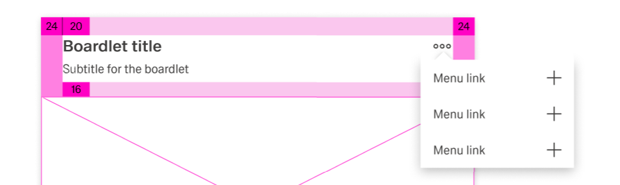
The Boardlet Header is one an optional part of the dashboard. It contains a title, subtitles and overflow menu. The header has mandatory padding at the sides with 24px and a padding of 20 px at the top.
The title is part of the Boardlet Header, which can be activated or deactivated during the boardlet creation. It ensures that the user has an immediate general understanding of the boardlets content when viewing the dashboard. The title is always aligned left. It can include an Icon on its left and right side. It uses a semibold font and should have a slightly larger font-size than following elements.
The Subtitle is an extension of the title, meaning it can't exist without it. The subtitles may expand the information about the header. It uses the same padding as the title while using a slightly smaller font size and regular font weight.
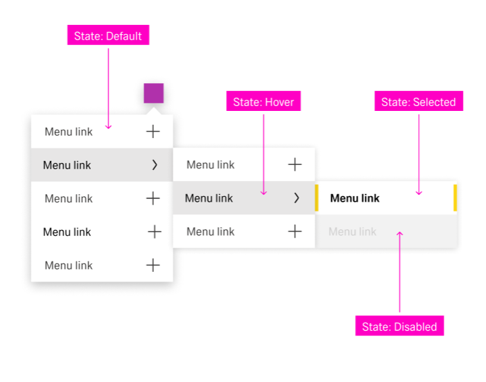
The Overflow Menu is part of the Boardlet Header, which can be activated or deactivated during the boardlet creation. On clicking the icon, it expands to a list of no more than 12 action items. All actions related to the boardlet that are not part of the footer can be stored here. It may also include Inline Navigation.
The action items always contain a title. They may contain an Icon to their left or right side. These actions can be used to control the content and the boardlet view. They should be ordered in a sensible manor.
The Boardlet Body contains the content of the boardlet. A list of content can be placed vertically or horizontally within the body. Additionally, it can be aligned vertically and horizontally. For more information on alignment, see the component page.
The body has neither padding nor grid. A grid may be added through the Grid Component.
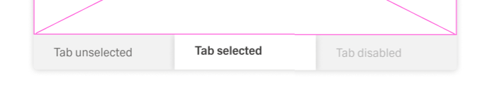
A boardlet can group its content into tabs. By doing so, the boardlet reduces visual clutter and gives the content a well-defined structure. The user can select a tab from a selection of 2 to 12 tabs. The boardlet body will only show the content of the selected tab. Tabs are currently part of the boradlet body.
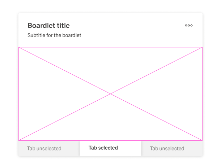
A tab has three different states, selected, unselected and disabled.
There are two types of tabs:
For more information on these variants, visit the linked component pages.
The Boardlet Footer is optional and can be activated or deactivated during the boardlet creation. It can only contain buttons. These buttons can be aligned vertically or horizontally.
A boardlet is a segment of a dashboard that is used to group together matching content and show it to the user. If the content within a boardlet is not connected, it should be separated into multiple boardlets.
A boardlet is somehow comparable with an app in the smartphone world. The functionality can be very simple or complex, depending on the use case. For examples what boardlet content could be:
The dashboard title should be concise and understandable. It should only be deactivated if the content is self-explanatory. When in doubt, show the title.
In the contrary subtitle should only be shown if the information can’t reliably be shown with the header.
In the case the content consists of multiple components, a grid should be used. This ensures related components are visually grouped using white space.
Avoid scrolling inside a Boardlet. If the amount of content is too large, split it into multiple tabs. Exceptions include:
The boardlet has 3 basic styles: Default, Ghost and Graphic.