Notifications in Inspire Design give users clear, visual feedback about their actions and the state of the system. They show whether a process has been completed successfully, whether a problem has occurred, or how an ongoing process is progressing.
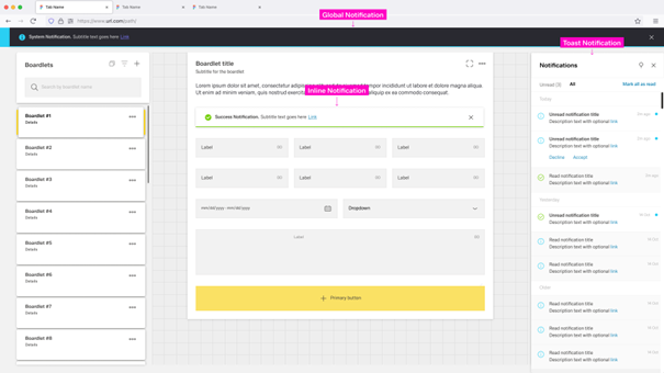
Notifications appear as Local, Global, and Toast Notifications. Together with the Notification Icon in the header and the Notification Panel on the right side of the dashboard, they form a connected notification experience across the application.
Notifications within Inspire Design have five major elements:
The appearance of notification elements may vary between different types of notifications.
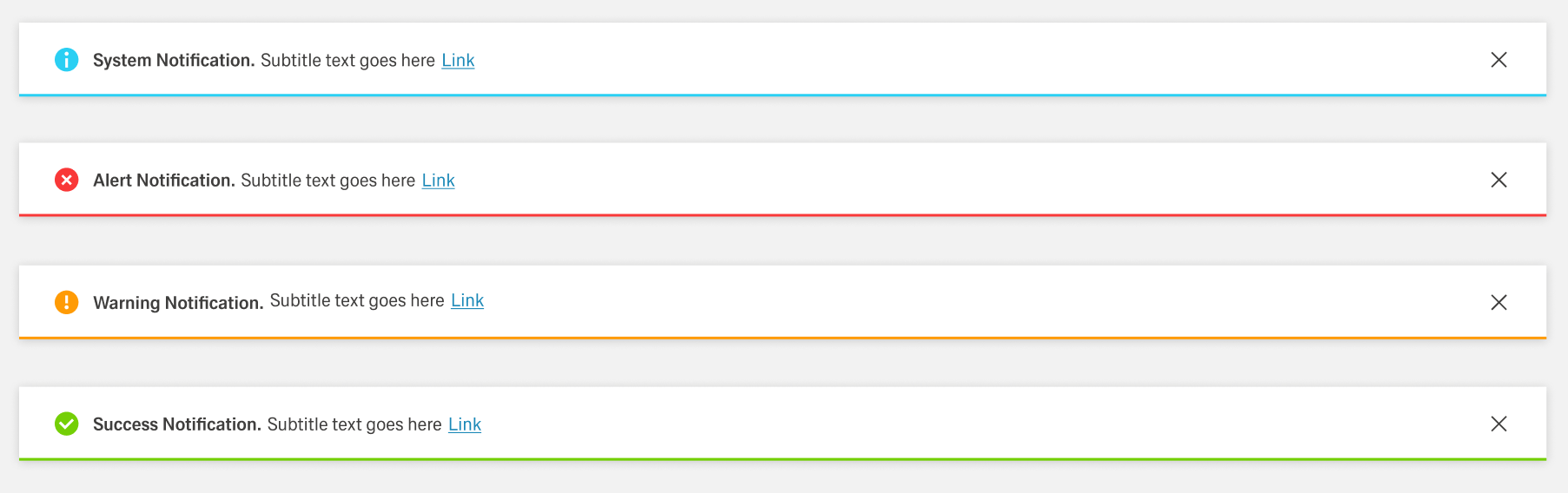
Inspire Design differentiates between the following types of notifications:

The Notification Icon is part of the header toolbar on the right side of the dashboard header.
The icon is located at the far right, immediately to the left of the overflow menu, if one is present.
When a new and unread notification appears, the Notification Icon gains a small blue indicator at the top-right.
The indicator disappears when the user has no unread notifications or opens the Notification Panel.
If the notification is an error, warning, or success notification, a special secondary icon appears to the left of the Notification Icon inside the header.
This icon matches the type of notification in appearance and vanishes when the user interacts with the notification.
A Progress Notification adds a progress indicator to the left of the Notification Icon.
It is circular and actively shows progress instead of being a static icon.

Users can open the Notification Panel by clicking the Notification Icon in the header or on a Toast Notification.
It opens on the right side of the dashboard and has a fixed width.
The Notification Panel can be closed by clicking the close action in the toolbar or by clicking outside the panel.
Users can anchor the panel like the navigation panel.
An anchored panel can only be closed by clicking the close action.
The Notification Panel has two tabs: Unread and All.
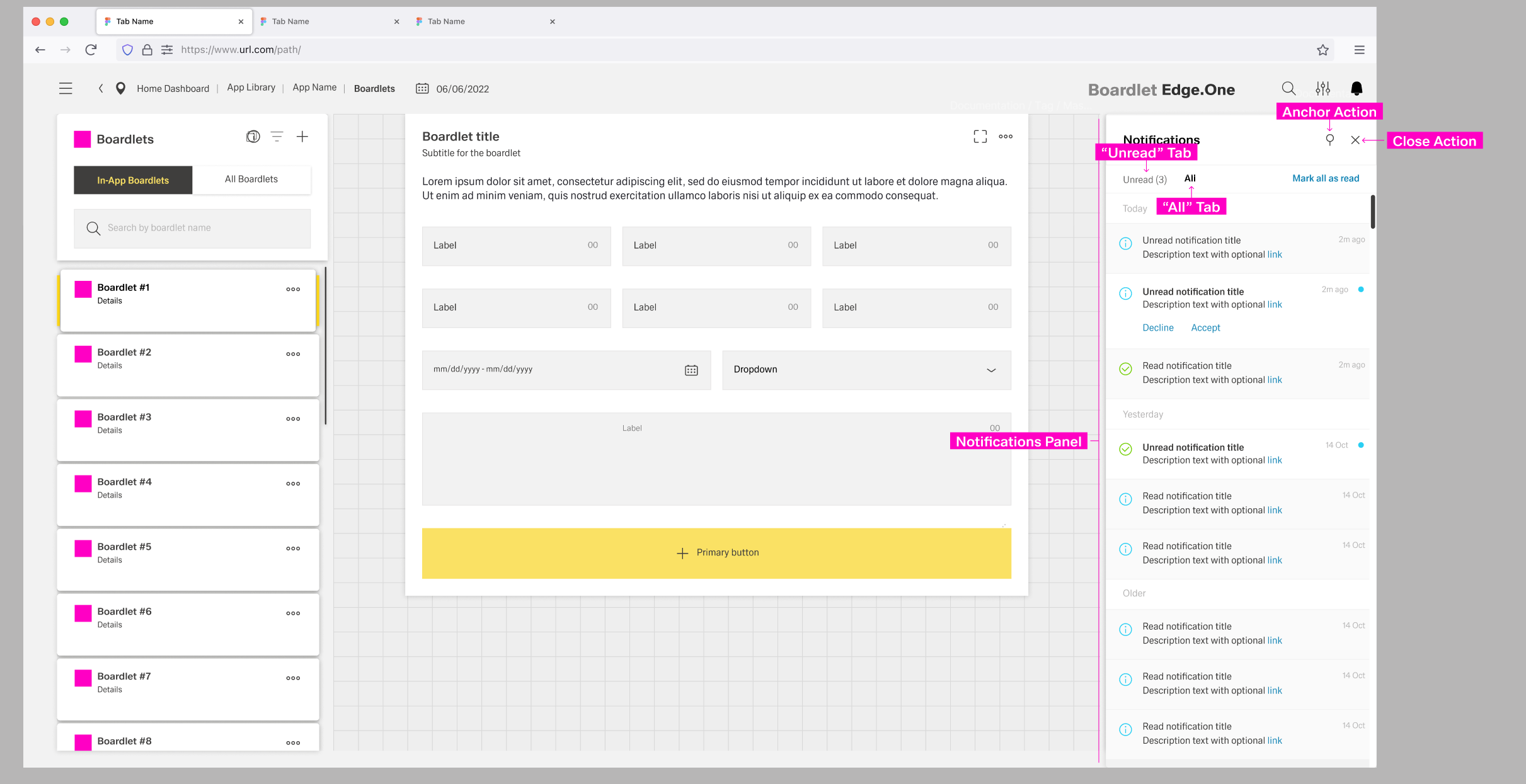
Unread notifications have a small blue status indicator at the top-right and a bold title.
By clicking the status indicator, users can set a notification as read.
Read notifications are grayed out and have a non-bold title.
Both tabs have an action to set all notifications as "read" to the left of the content switch.
Notifications are ordered and grouped by their date of appearance, regardless of the active tab.
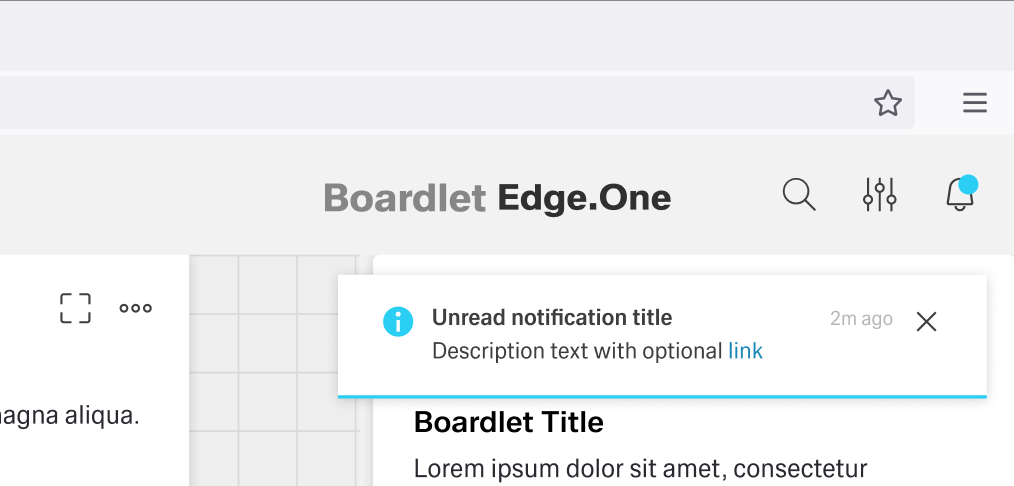
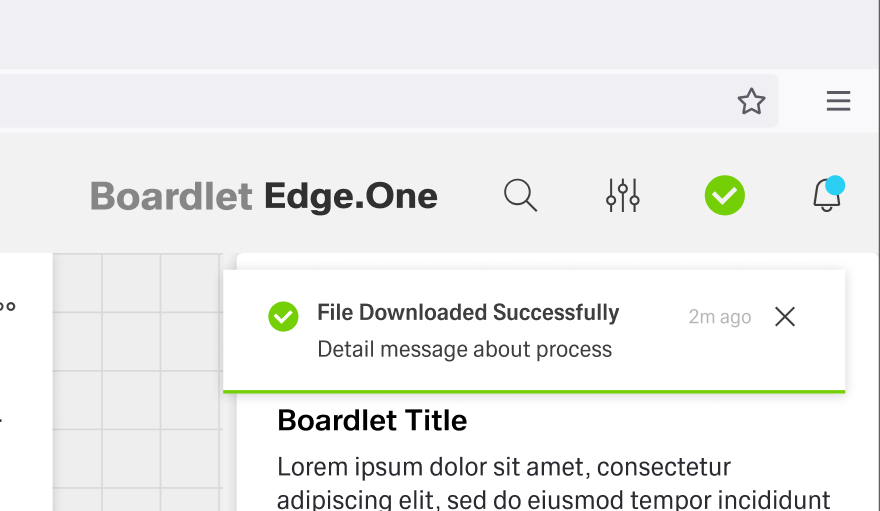
The Toast Notification appears in the top-right corner and visually floats above the dashboard.
Only one Toast Notification can be visible at a time.
They do not disappear automatically.
The color of the Toast Notification depends on the type of notification it contains.
The general layout stays the same between notifications, with the Progress Noti

Global Notifications appear as a bar at the top of the dashboard as a pop-up. Up to two Global Notifications can be visible at any time. They disappear after a set amount of time or if the user clicks the "close" button, if one is present.
Global notifications do not support the progress variant.

For more information on the component of the same name: Inline Notification
Inline Notifications appear inside components or boardlets in general. Their realm of influence is limited to the space they appear in and they are not listed in the Notification Panel. Inline Notifications have four states, determined by the type of notification. The content can vary by use case.
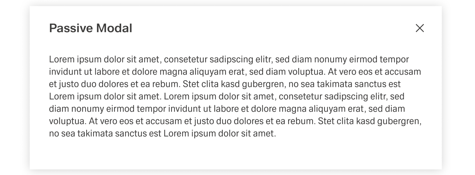
The Modal Notification is a varriation of the Dialog and appears as a centered passive modal above a dimmed background. It contains a critical message and can only be closed with the close action in the header toolba. It blocks interaction with the dashboard until it is closed.
Global Notifications give feedback on major user actions, for example saving a change inside a table. They appear at the end of a process and usually have an impact on the system, like changing data. They are always tied to user interaction or the inability for a user to perform an action.
Global Notification disappear after a set amount of time. This time should tailor to the notification length, so that users of all reading speeds can comprehend the message.
At the same time, it should only be if absolutely required, since the Global Notification is intrusive, blocking the header bar. In addition, the user should be able to close the Global Notification unless its presence is absolutely required.
Inline Notifications deliver a direct response to a user action inside a larger process. One example for an Inline Action would be filling out a text field inside a form. The feedback, i.e. the notification, would be that the input is valid or invalid.
As shown in the example, Inline Notifications are used for immediate feedback on small scale user actions. They usually focus on sub-steps in a series and are tied to actions that on their own do not have a large impact.
Inline Notifications are not permanent, being deleted when the user abandons the process by for example switching dashboard. In addition, they are not displayed inside the notification panel.
These notifications usually change the layout of the boardlet they appear in, making them quite disruptive. Thereby they should only be used sparingly. For example, if a form has multiple text fields with specific requirements, they might only need one Inline Notification. This notification could then cover the message for all text fields, instead of every text field having their own notification.
It is also recommended to include the close button unless the presence of the notification is absolutely required.
In contrast to Global and Inline Notifications, Toast Notifications are not focus of feedback of user actions. They inform the user about the system and background processes, for example downloading a file and the completion message afterwards. They can also include action beyond "closing" to influence the topic of the notification.
In contrast to Inline and Global Notifications, these Notifications are dynamic and live. They can replace each other, for example a success notification replacing a progress notification.
Toast Notifications are the only permanent form of notifications, being stored inside the Notification Panel. To not clutter the Notification Panel, the number of Toast Notifications sent should be no more than necessary.
Modal notification is a consequence of direct user action. The trigger for the Modal Notification should be communicated clearly to the user with the use of the title or text. It is highly disruptive and therefore should only be used for critical information.
The text inside the modal notification can be longer than in other forms of notification. Despite this, it should be concise and to the point, since any type of user interaction is blocked by the overlay.
Texts inside should be concise concrete, using active verbs and simple language whenever possible. They should avoid complicated or foreign words and abbreviation. Inline and Global Notifications should never have a message with multiple rows and Toast Notifications should avoid messages longer than three rows.