Notifications within Inspire Design have four major elements:
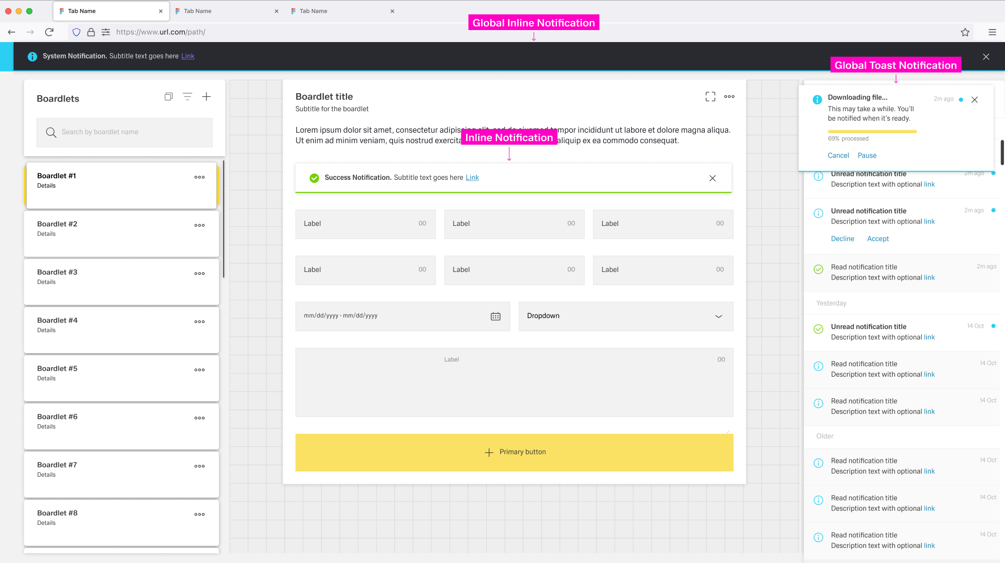
Global Notifications are independent of any dashboard and appear across the entire application.
The Notification Icon, Notification Panel, and Global Notifications build a global notification flow that activates when a user receives a Global Notification.
Local Notifications are tied to the dashboard and, in some cases, to the boardlet where they appear.
They are not connected to the Global Notification flow and vanish when the user leaves the dashboard.
The appearance of notification elements may vary between different types of notifications.
Inspire Design differentiates between the following types of notifications:

The Notification Icon is part of the header toolbar on the right side of the dashboard header.
It is always present, independent of the current dashboard.
The icon is located at the far right, immediately to the left of the overflow menu, if one is present.
When a new and unread notification appears, the Notification Icon gains a small blue indicator at the top-right.
The indicator disappears when the user has no unread notifications or opens the Notification Panel.
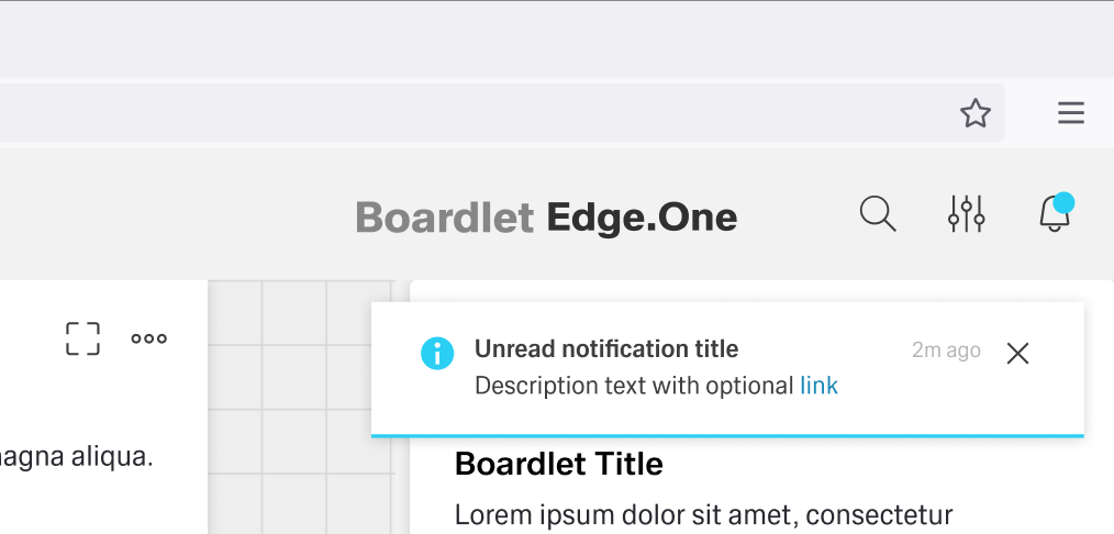
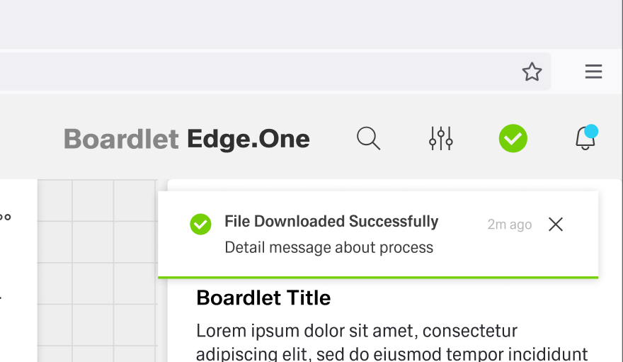
If the notification is an error, warning, or success notification, a special secondary icon appears to the left of the Notification Icon inside the header.
This icon matches the type of notification in appearance and vanishes when the user interacts with the notification.
A Progress Notification adds a progress indicator to the left of the Notification Icon.
It is circular and actively shows progress instead of being a static icon.

Users can open the Notification Panel by clicking the Notification Icon in the header or on a Global Notification.
It opens on the right side of the dashboard and has a fixed width.
The Notification Panel can be closed by clicking the close action in the toolbar or by clicking outside the panel.
Users can anchor the panel like the navigation panel.
An anchored panel can only be closed by clicking the close action.
The Notification Panel has two tabs: Unread and All.
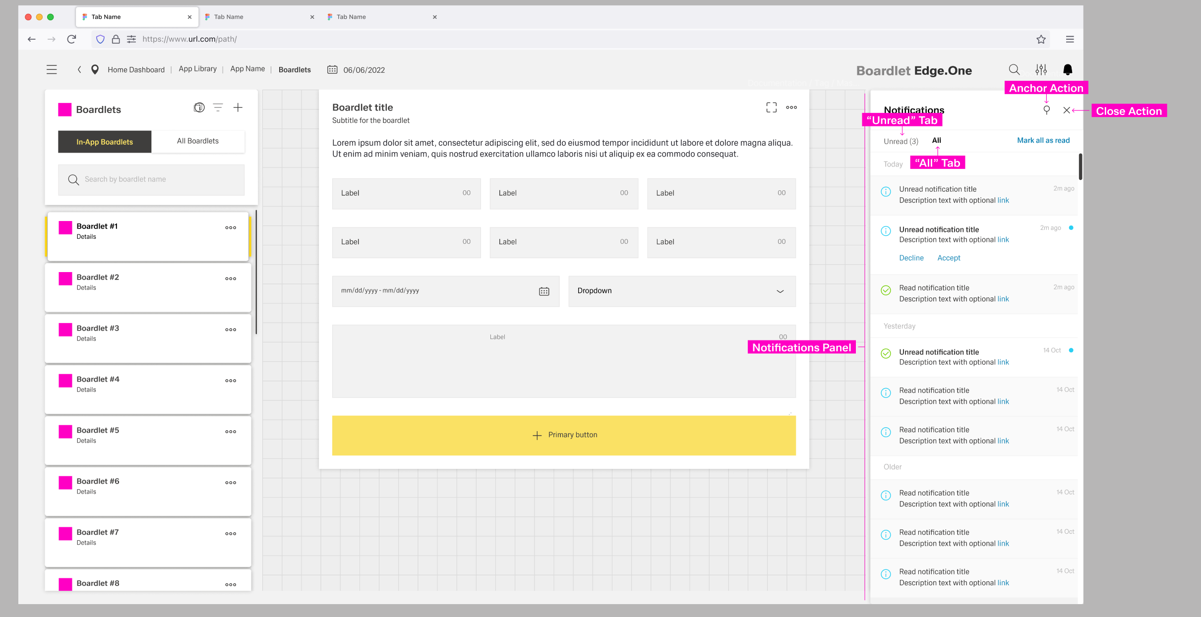
Unread notifications have a small blue status indicator at the top-right and a bold title.
By clicking the status indicator, users can set a notification as read.
Read notifications are grayed out and have a non-bold title.
Both tabs have an action to set all notifications as "read" to the left of the content switch.
Notifications are ordered and grouped by their date of appearance, regardless of the active tab.
The Toast Notification appears in the top-right corner and visually floats above the dashboard.
Only one Toast Notification can be visible at a time.
The color of the Toast Notification depends on the type of notification it contains.
The general layout stays the same between notifications, with the Progress Noti

For more information on the component: Inline Notification
Inline Notifications have four states, determined by importance. The content can vary by use case.
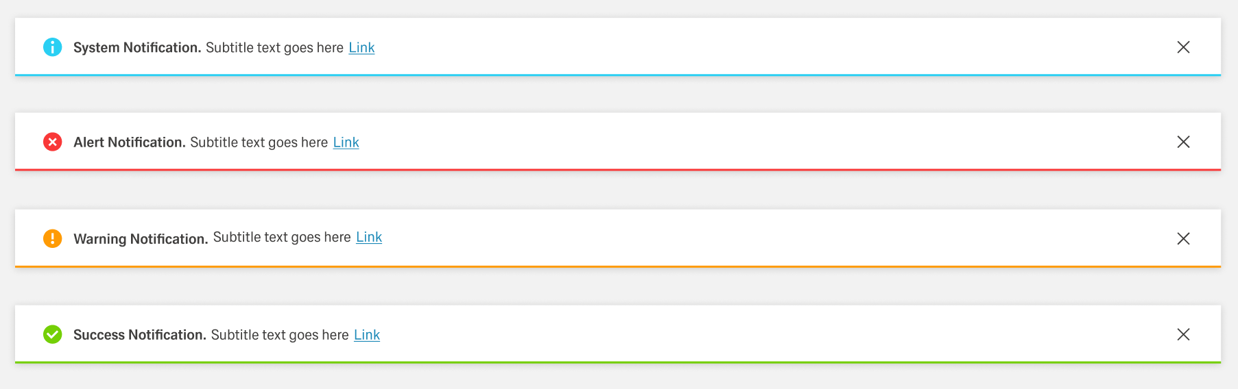
The Inline Notification is part of boath Local and Global Notifications.
Their realm of influence is limited to the dashboard or boardlet they appear in and they are not listed in the Notification Panel. Inline Notifications are not popups and thereby influence the layout of the boardlet they appear in.
Local Notifications are strictly tied to the dashboard they appear in and are static.
[TODO: when to use]
Global Notifications appear regardless of the current dashboard. They are not tied to a specific boardlet and not dependent on user interaction to appear. [TODO: when to use]
This flow starts with a static toast notification. The user can interact with the notification by clicking the close action or the notification itself.
By clicking the close action, the notification closes the pop-up, and the notification will be set as "read".
By clicking the notification itself, users open the Notification Panel.
The notification might have actions or links attached. If the user interacts with them, the action is activated, the notification closes, and it is set to "read".
This flow starts with a progress toast notification. The progress is displayed in the header to the left of the notification icon and in the toast notification. During the process, the user may be able to cancel or stop the process using actions inside the toast notification.
If the notification is successful, it turns into a static success notification on completion. If an error occurs during the process, the notification turns into an error notification.
The user can interact with the success or error notification, for example by clicking it and turning it into a read notification.