(this page was created automatically. In case of formatting issues, please visit the official Wiki Page)
Editor View
This editor layout provides a structured workspace for building and configuring UI components through a three-panel layout.
It supports tasks that involve assembling layouts, editing content, and managing properties to build functional UI elements.
Usage
This editor is applicable when users need to construct, configure, or modify structured UI components with multiple layers of hierarchy and interdependent properties.
When to Use This Page Layout
- Configuration and composition tasks where users build or edit complex, multi-element structures (dialogs, dashboards, forms, layouts) rather than simple single-field entries.
- Detailed editing and refinement where users need simultaneous access to structural organization, visual preview, and granular property controls.
- When the workflow requires previewing changes while editing, helping users understand the impact of adjustments instantly.
- Suitable for handling:
- Master or configuration data (e.g., component properties, form structures)
- Transactional or interactive elements (e.g., actions, inputs, behaviors)
- Granular details of individual components alongside the higher-level structure
- When the page layout needs to support viewing and editing rather than just browsing or analyzing data.
When Not to Use This Page Layout
- When users need to be guided through a series of steps when a new object is created.
- When users need to edit several items at the same time.
- When the target for editing is the content or data, not a struture.
Limitations & Considerations
- Screen space–intensive - Works best on medium to large screens. Shrinking the layout may reduce usability.
- Complexity risk - If too many configuration options appear at once, it may overwhelm novice users.
Anatomy
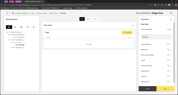
Users can navigate and organize components in the left panel, edit content and properties in the central canvas, and fine-tune specific attributes in the right properties panel, enabling efficient creation and customization of complex interface elements.
Page Frame (Global Structure)
The dashboard is built within the standard App Composer page frame, consisting of:
- Header Area - Displays the page title, optional subtitle, global actions (e.g., refresh, settings), and sometimes date selectors or filters.
- Navigation Panel (Left Sidebar) - Provides access to main sections, modules, or app categories. This remains persistent across the entire workspace.
- Content Area - The main area of the dashboard where widgets, summaries, and visualizations are displayed. This area makes full use of the grid layout.
Dashboard Content Regions
This page layout typically consists of three primary layout regions.
They resemble full-height columns, spanning the entire page.
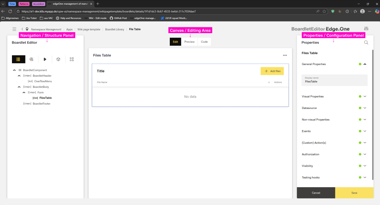
Navigation / Structure Panel
- Width: typically 2-3 columns
- Position: fixed left, full height below header
- Components:
- Panel header: title ("Dialog Editor", "Structure") with optional help icon and overflow menu
- Content Switch: Structure, Library, Actions, Datasource
- Scroll container: vertical scroll when content exceeds viewport
Canvas / Editing Area
- Width: flexible, typically 6-7 columns
- Position: center between the Navigation and Properties, full height below header
Properties / Configuration Panel
- Width: typically 2-3 columns
- Position: fixed right, full height below header
- Components:
- Panel header: "Properties" title with expand/full-screen toggle
- Property groups: Collapsible sections with labels
- Action buttons to save or cancel
- Scroll container: Vertical scroll when properties exceed viewport
Behavior and Interaction
This page layout supports an interactive, real-time editing experience where users can select, modify, and configure components within a structured layout.
Interactions occur across the structure panel, canvas, and properties panel, enabling users to build and refine UI compositions intuitively.
All interactions respect the underlying grid system, snapping components into consistent alignment.
Entry Points
Users can access the editor by clicking the edit icon in the top-right corner of a listing card.
This action opens the editor page directly in Edit Mode, loading the selected item (dialog, boardlet, dashboard, etc.) into the canvas.
Core User Interactions
The editor provides multiple ways for users to interact with components:
Selecting Components - Clicking any element on the Canvas highlights it and activates context-specific editing. The Structure Panel mirrors this selection, scrolling to the corresponding item in the hierarchy. Once a component is selected, the Right Properties Panel displays its:
- Configuration options
- Visual and behavioral attributes
- Validation rules
- Icons, labels, layout, and advanced settings
Mode Switching - The editor may support various modes accessible via the toolbar. Switching modes does not lose data. Changes are preserved across modes.
- Edit Mode: Primary mode for arranging components and editing settings
- Preview Mode: Allows users to simulate the final experience without switching screens
- Code / Expert Mode: Shows underlying configuration or code representation (if the system supports it)
Canvas Interactions - The canvas acts as a live visual representation of the UI being built. Users can:
- Click any component to activate its property panel
- Hover to reveal inline actions (duplicate, delete, reorder)
- Resize or adjust component width (e.g., switching between column layouts)
- Interact with simulated inputs (typing, selecting, toggling) to test behavior in real time