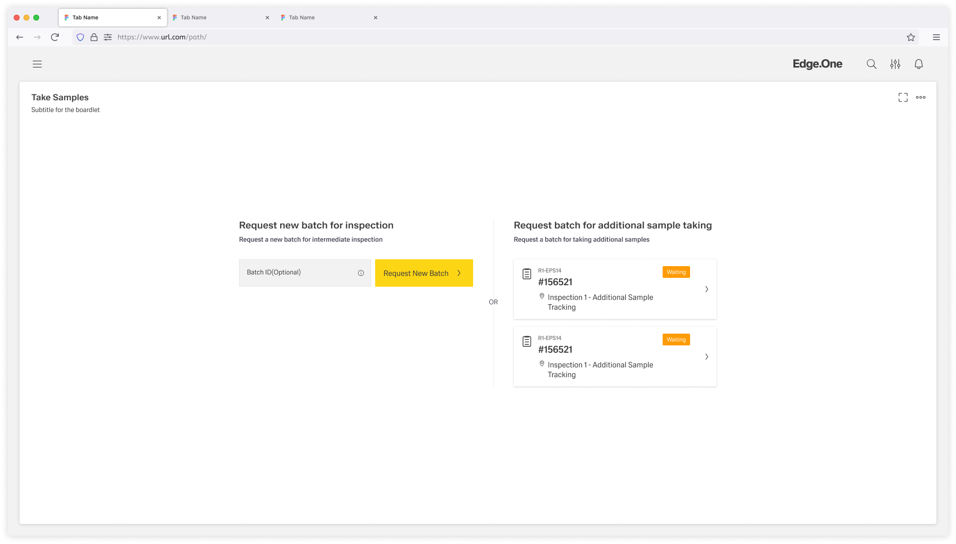
The Process Initiation page layout provides a structured starting point for initiating a new process by choosing one or more objects from a curated list, or by optionally creating a new object.
It guides users through identifying the correct item, reviewing available options, and seamlessly moving into the next step of the workflow.
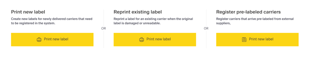
The Process Initiation screen is composed of several key elements that guide the user through selecting or creating a process entry.
It includes multiple sections that may have different functionalities as described below.
Every section is separated from the other sections by a separator line.
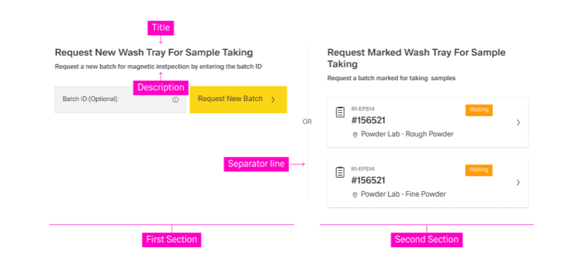
Each section should include:
Avoid more than three sections. Too many sections can overwhelm users and dilute decision clarity.
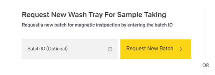
This section allows users to introduce a new object to this process.
Depending on the workflow, the object:
Common features include:
This section displays a curated selection of objects for the user to choose from.
The list usually filters objects by a specific criterion such as:
This criterion must be clearly stated in the section title and reinforced in the description.
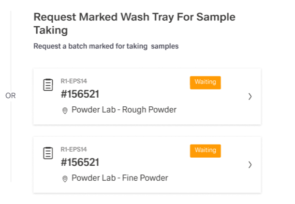
The items inside the list are usually cards with a variety of attributes, for example:
This section can be present multiple times with different listing categories.
Use this section when the list of objects is too long or complex for a compact section. In this case, the section routes users to a separate selection screen (usually table/list-based) where users can more easily choose the right object(s).
Inside Process Initiation, this section includes:
The page layout should keep the number of sections deliberately small, because each additional section increases choice complexity and reduces confidence. In most cases, a maximum of three sections enables fast scanning and keeps the “next step” obvious. More than three sections typically indicates that the selection problem is too complex for this page layout and should be moved to a dedicated selection screen.
Terminology should remain consistent across the entire page layout so that one concept is not labeled as “object” in one place and “card” or “ticket” in another. Exceptions are acceptable when the distinction is meaningful and explicitly explained. A stable vocabulary improves predictability and reduces errors, especially when content and UI are maintained by multiple teams.
Each section should be treated as a small, self-contained decision area. The title should state the purpose or selection rule, while the description should explain what is available in that section and what the outcome of a selection will be. Sections should be clearly separated using spacing and dividers so they read as distinct options rather than one blended block.
Input handling should be tolerant of real-world formats, including common separators and formatting differences such as spaces and dashes. Support for non-text input, such as scanning, should be included when it matches the operational workflow.
When object creation fails, error messages should remain brief, understandable, and focused on recovery. Entered values should be preserved so that retry does not feel like starting over. Where helpful, guidance can point to the next check (for example, validating identifier format or repeating a scan) without exposing internal system details.
Each list of existing objects should make its inclusion rule obvious, ideally by encoding the criterion in the title and reinforcing it in the description. This makes it clear why the items are shown and which list is appropriate for the current task.
Cards should be optimized for scanning and quick comparison, which requires limiting content to the attributes needed for a confident choice. A stable attribute order across lists and consistent truncation rules for long text support faster recognition and reduce rereading.
If multi-selection is supported, it should be supported intentionally and only when the next step can handle multiple objects without ambiguity. Selection feedback should be explicit through selected states, a visible selection count, and a clear “Continue” action. Multi-select rules—such as maximum selection, eligible statuses, and disallowed combinations—should be communicated early and enforced consistently to prevent late-stage surprises.
Task Selection should be used when the initiation view cannot present choices in a compact and understandable way. This typically occurs when there are too many items, or when selection depends on advanced filtering that would overload the initiation layout. In these cases, the initiation view should stay lightweight and provide a short explanation plus a single, clearly labeled entry point to a dedicated selection screen.
The dedicated selection screen should enable efficient decision-making through stronger search and filtering capabilities. Safe return to Process Initiation should be supported whenever feasible, preserving context, entered values, and current selections. This behavior reduces penalty for exploratory navigation and helps recover from mistaken entry paths.
Empty states should explain why nothing is available and indicate a clear next action, such as creating a new object or broadening a query. No-results states should reference the current search term, provide a quick reset path, and optionally suggest alternative search strategies when appropriate.