XS, M, XL), two layout types (Relaxed and Compact), and an optional tooltip overlay to surface overflow data for the 4+ visible-status variant.
| Token | Description |
|---|---|
| displayName | Display name shown in the structure panel |
| size | Controls the height of the bar and label text size. Values: XS, M, XL |
| type | Controls layout style: Relaxed shows labels above segments; Compact hides labels; Relaxed_tooltip / Compact_Tooltip add an overflow tooltip for the last segment |
| visibleStatus | Determines how many status segments are rendered. Values: None, 2, 3, 4, 4+ |
| segmentData | Array of segment objects, each containing a percentage, count, label, and colour token for a status category |
| tooltipContent | Text content displayed inside the overflow tooltip when type is Relaxed_tooltip or Compact_Tooltip (supports i18n) |
| paddingClass | CSS spacing classes applied around the component |
| visibilityPolicySetId | Determines visibility based on policy sets |
| displayConditions | Conditions for displaying the component |
| dataTestId | Testing hook identifier for automated testing |
| enableAsHotspot | Enables the component as a guided tour hotspot |
| guidedTourHotSpotTitle | Title for the guided tour hotspot (i18n) |
| guidedTourHotSpotDescription | Description for the guided tour hotspot (i18n) |
| ON_INIT (Events) | Triggered when the component is initialized |
| ON_DESTROY (Events) | Triggered when the component is removed from the DOM |
| Property | Values | Default |
|---|---|---|
| Height (Relaxed / Relaxed_tooltip) | XS: 24 px · M: 40 px · XL: 56 px | 56 px (XL) |
| Height (Compact / Compact_Tooltip) | XS: 24 px · M: 40 px · XL: 56 px | 56 px (XL) |
| Width (Relaxed / tooltip variants) | 350 px fixed | 350 px |
| Width (Compact variants) | 250 px fixed | 250 px |
| Progress bar track height | XS: 6 px · M: 8 px · XL: 10 px | 10 px (XL) |
| size | XS / M / XL |
XL |
Relaxed_tooltip and Compact_Tooltip types to surface the 4+ breakdown detail.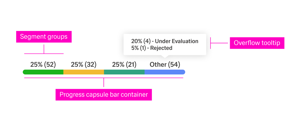
(Configured in General Properties)
"Pipeline Status Bar" makes the component easy to identify when multiple rows share the same template.(Configured in Visual Properties)
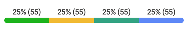
"XS" renders a 24 px row-height bar with 10 px (body-00) labels, suitable for dense data tables. "M" uses 40 px height with 12 px labels, and "XL" (default) uses 56 px with 14 px labels."Relaxed" displays labels above each segment; "Compact" hides all labels for a pure-bar view; "Relaxed_tooltip" and "Compact_Tooltip" additionally render an overflow tooltip on hover for the 4+ status group."None" shows an empty grey track (0 % state); "2" renders two segments (green + blue); "3" adds an amber segment; "4" adds a teal segment; "4+" adds a grey overflow segment for uncategorised items."px-2" gives horizontal breathing room without changing the bar's internal proportions.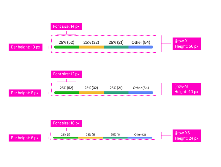
(Configured in Non-Visual Properties)
[{ pct: 50, count: 55, color: "lime-04", label: "Approved" }, ...] drives the proportional width and tooltip text for each capsule.{"en-US": "20% (4) - Under Evaluation\n5% (1) - Rejected"} surfaces the breakdown of the overflow bucket.The component uses a fixed colour palette drawn from GE chart tokens. Segment colours are driven by visibleStatus position:
| Segment position | Colour token | Hex |
|---|---|---|
| 1st (always present) | generic/chart/lime-04 |
#1db31d (green) |
| 2nd | generic/chart/blue-04 (via asset) |
Blue |
| 3rd | generic/chart/yellow-01 |
#f1ba33 (amber) |
| 4th | generic/chart/green-04 |
#32a382 (teal) |
| 4+ overflow | theme-20 grey track (tooltip variant) | #e7e6e6 |
| Empty / None state | generic/theme/theme-20 |
#e7e6e6 (grey) |
(Configured in Visual Properties)
"px-2" gives horizontal breathing room without changing the bar's internal proportions.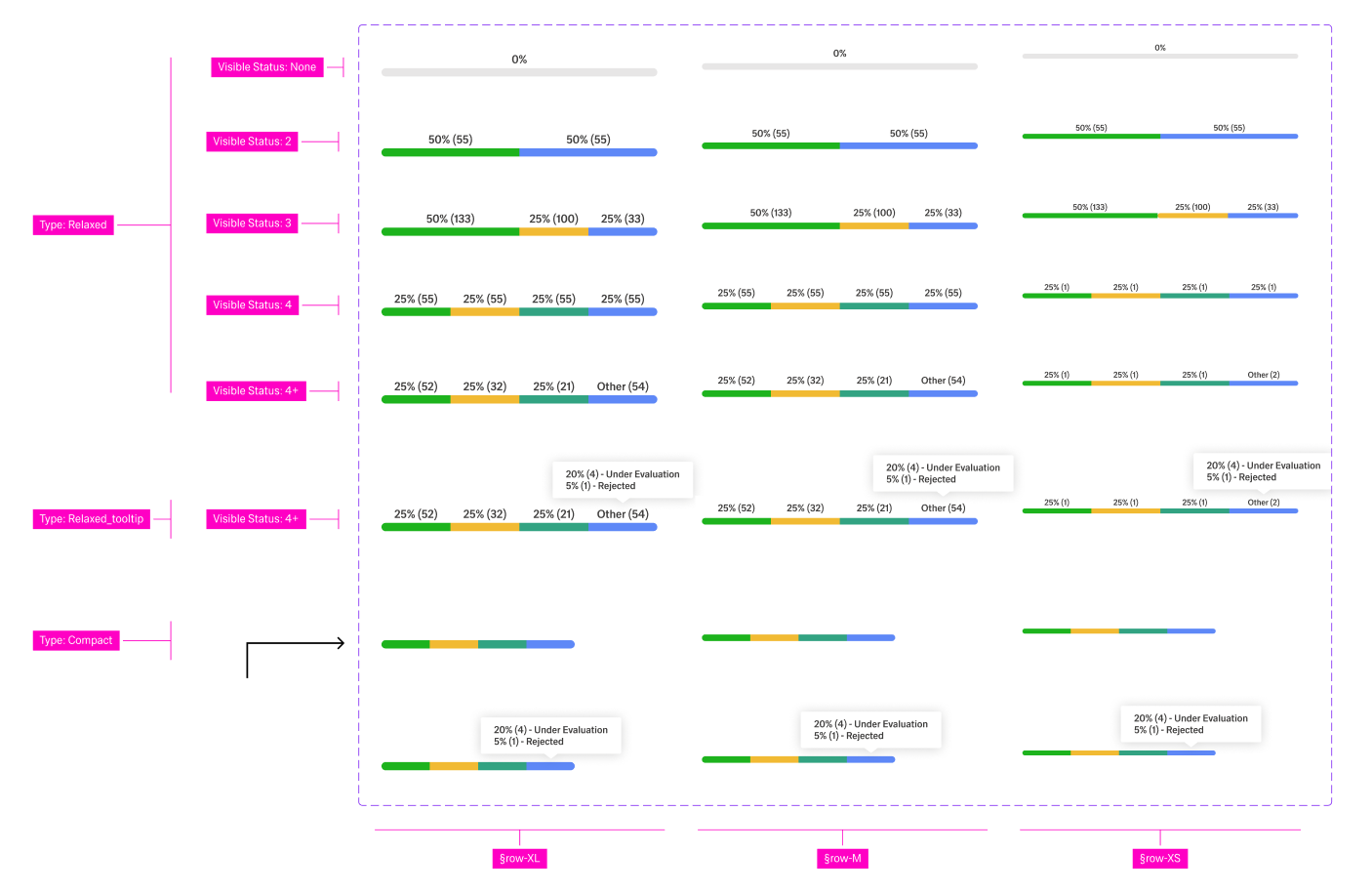
(Configured in Event Actions Properties)
segmentData before the row renders.Tooltip trigger — The overflow tooltip (visible for
Relaxed_tooltip/Compact_Tooltiptypes) is rendered via the ADK Tooltip component. It is positioned absolutely above the last segment and is shown by the host application's hover/focus logic — no additional event wiring is required inside the Status-bar itself.
(Configured in Authorization Properties)
"analyticsViewerPolicy" ensures the progress bar is only visible to users with analytics-view permissions.(Configured in Testing Hooks Properties)
"row-status-bar-test" lets test scripts reliably target the component regardless of surrounding markup changes.{"en-US": "Pipeline Status", "de-DE": "Pipeline-Status"}.visibleStatus to match the number of distinct states your data model produces.type: "Relaxed" when the table has enough row height for labels and users need precise percentage and count values at a glance. Choose "Compact" for dense tables where colour alone is sufficient to communicate relative proportions.type: "Relaxed_tooltip" or "Compact_Tooltip" when visibleStatus is "4+" so that overflow categories remain discoverable without cluttering the row.segmentData from the same data source that drives the parent list or table — never derive segment widths from independent API calls per row.visibleStatus: "None" for rows where the status has not yet been assigned; the grey empty track communicates pending state without showing misleading zeros.size to the row height of the parent table: use "XS" (24 px) for compact data grids, "M" (40 px) for standard tables, and "XL" (56 px) for wide-format or dashboard tables.paddingClass to add horizontal breathing room inside the cell; do not apply external margins directly to the component root.XL Relaxed mode each segment label uses body-02 (14 px SemiBold); in M it uses body-01 (12 px); in XS it uses body-00 (10 px). Do not reduce font sizes below these values.visibleStatus: "None" to represent a row where no status data is available — the grey track communicates an empty state without rendering phantom segments.visibleStatus and segmentData together in a single state change to avoid a visual flash of mismatched segment count and data.Relaxed_tooltip / Compact_Tooltip) with a meaningful tooltipContent value; an empty tooltip renders a blank pop-over on hover.visibilityPolicySetId for tables where status detail is restricted to certain roles (e.g., managers only).displayConditions to hide the bar in row templates where a progress breakdown is not applicable, such as header rows or group-level aggregation rows.segmentData and should be locale-formatted before being passed to the component — the component itself does not apply locale-aware number formatting.tooltipContent) supports i18n objects; always provide at minimum en-US and de-DE keys.| Do | Don't |
|---|---|
Set visibleStatus to match the exact number of distinct states in your data model |
Hard-code visibleStatus: "4+" when your data never produces more than 3 states — unnecessary segments confuse users |
Use type: "Compact" in dense tables where row height is limited and colour coding alone is sufficient |
Use type: "Relaxed" in rows shorter than 40 px — labels will clip or overflow |
Always provide tooltipContent when using Relaxed_tooltip or Compact_Tooltip to explain the overflow bucket |
Leave tooltipContent empty for tooltip variants — a blank tooltip undermines user trust |
Show visibleStatus: "None" for rows awaiting status assignment |
Render a zero-value bar for unassigned rows — a grey empty track communicates pending state more accurately |
Match size consistently across all rows of the same table |
Mix size values within a single table — inconsistent row heights break visual rhythm |
segmentData[n].label so that assistive technologies can announce each status category by name rather than only by colour or percentage.segmentData are always visible (type: "Relaxed") or exposed via a tooltip (Relaxed_tooltip) for users who cannot distinguish chart colours.Compact mode, where labels are hidden, add an ARIA label or title attribute at the container level summarising the overall status distribution for screen-reader users.focus and hover events.dataTestId to expose a stable selector for automated accessibility audits (e.g. axe-core integration in CI pipelines).XS size to ensure sufficient colour contrast surface area — do not reduce the track below this value.