Basics
The header is firmly anchored and fixed in the upper part. The header moves with the scrolling, so that all functions are visible and selectable. The header always consists of 3 main components. 1. the navigation component, 2. the logo component and 3. the toolbar component. The contents of the individual components may differ within the X-Series and EdgeOne.
Header Definition
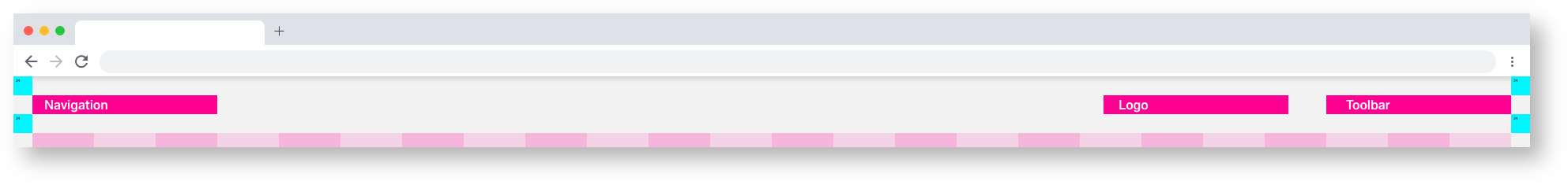
Header MainComponents
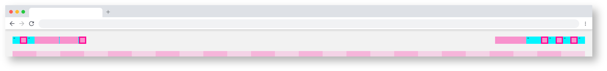
Header Breakpoints
Header Theming
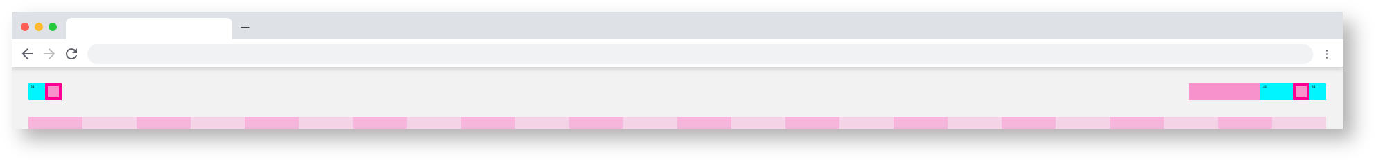
Basic/1920_Header_EdgeOne_Components&Spacing
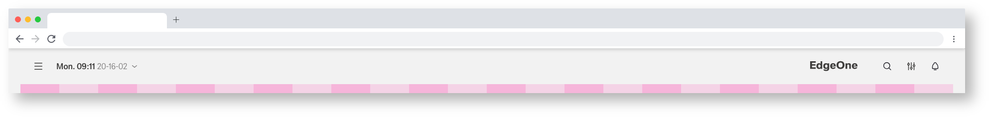
Basic/1920_Header_EdgeOne
Header variation inside EgdeOne and X-Series
Basic/1920_Header_X-Series_Components&Spacing
Basic/1920_X-Series_EdgeOne