Table of contents
- The 24 Columns Grid
- Spacing and Details - The 24 Columns Gutter
- EdgeOne Dashboard example
- Best Practice Dark and Light Theme - X-Series Dashboard example
- Best Practice Dark and Light Theme - Two different Boardlets-Grids

| Base | px | rem |
|---|---|---|
| Breakpoint | ≥1800px | n.n |
| Width | 1920 | 120 |
| Height | 1080 | 67.5 |
| Content Area | ||
| Columns | 24 | - |
| Column Width | 78 | 4.875 |
| Gutter | 26 | 1.625 |
| Header Area | ||
| Header | 24 | 1,5 |
| Icon max | 24 | 1,5 |
| Icon min | 18 | 1.125 |
Zeplin Documentation:
1920_Web_Max_Dashboard-Spacing
Download Inspire Design KIT:
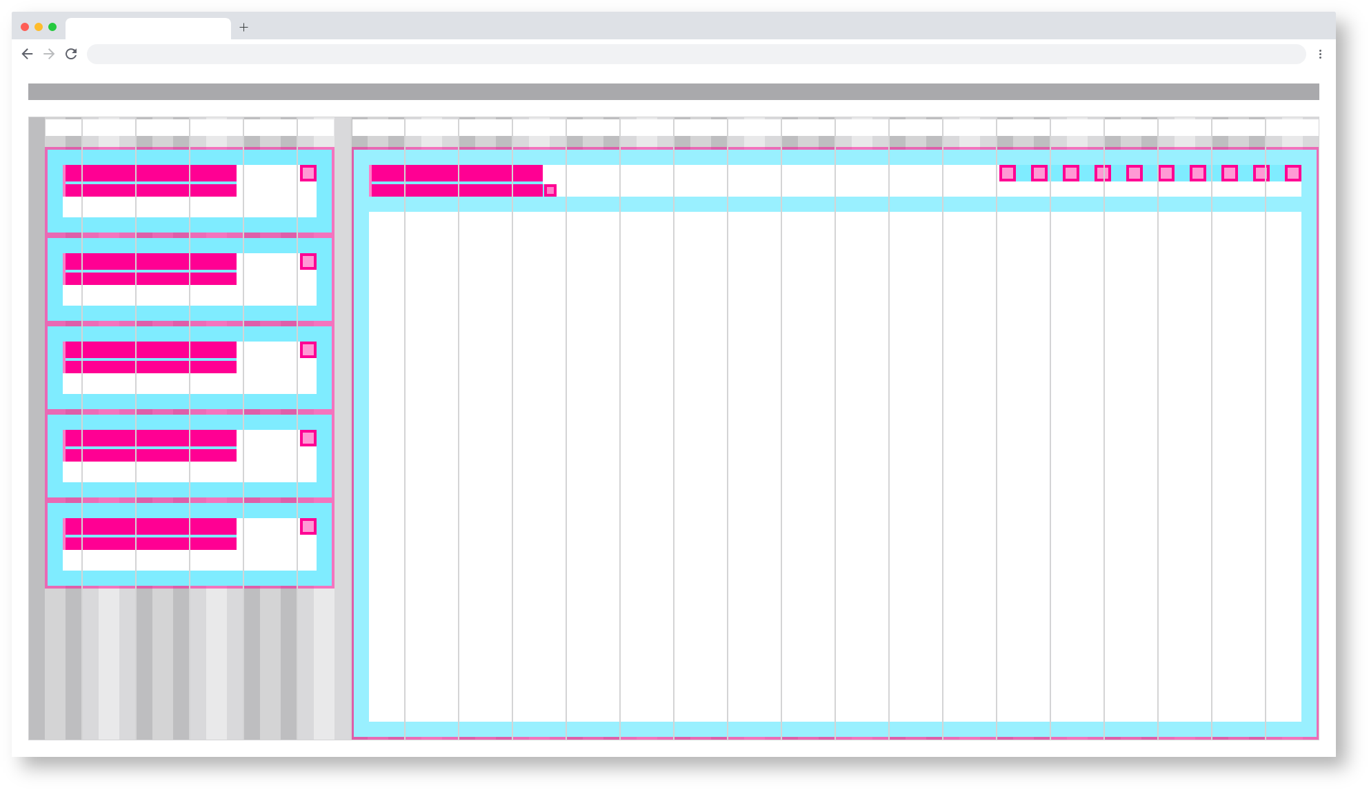
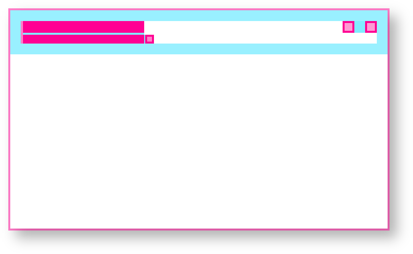
The 24 Columns Gutter.
Gutters may be missing as shown above or present as shown below. For closely related content, you should consider an Gutters free layout. Use the gutter if the content requires more separation.
Example for the use of a gutter.
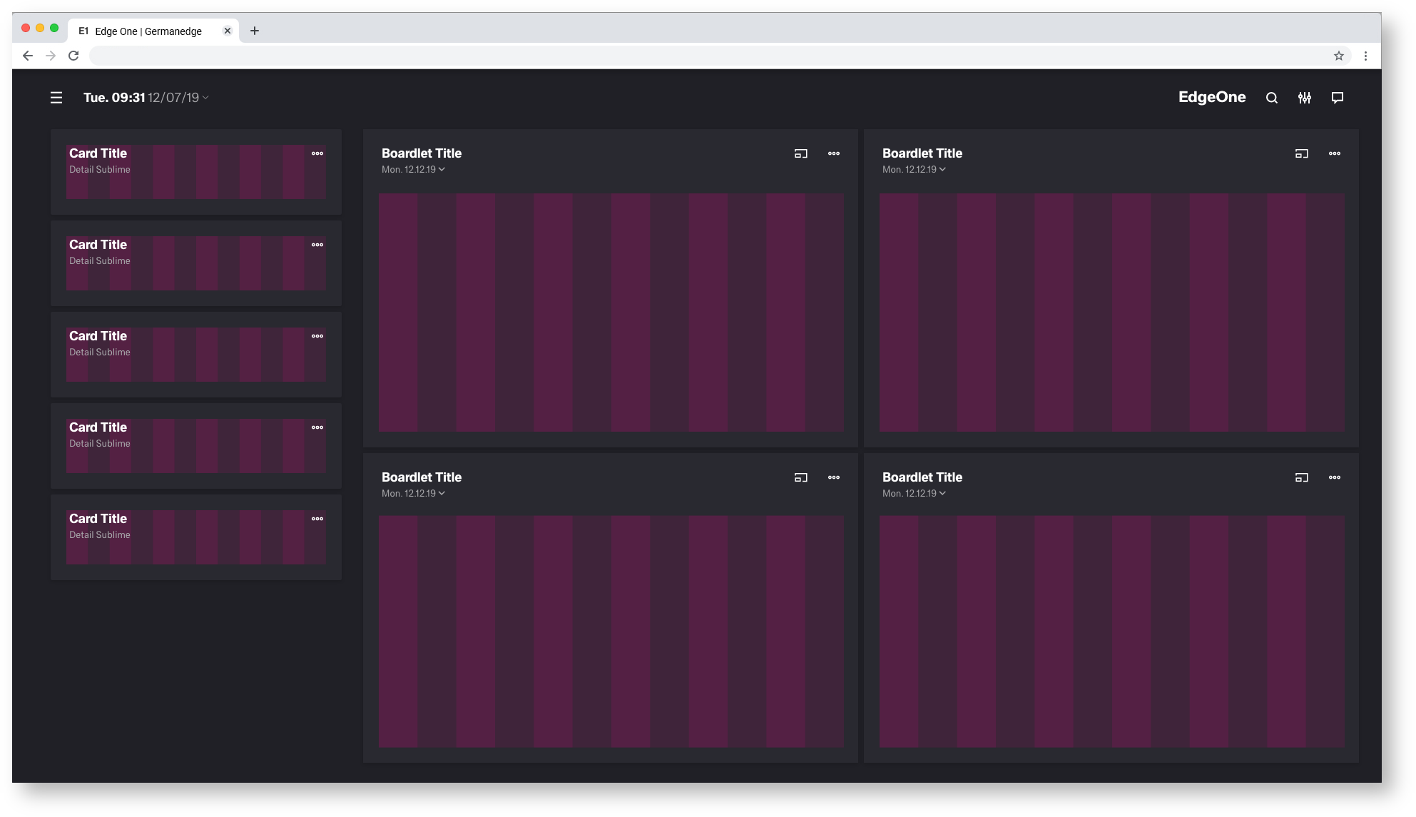

Best Practice
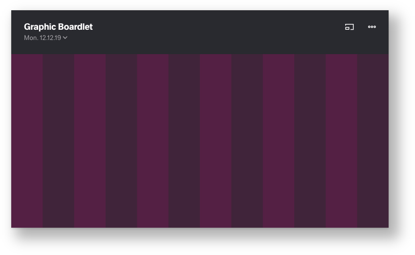
Dark and Light Theme.
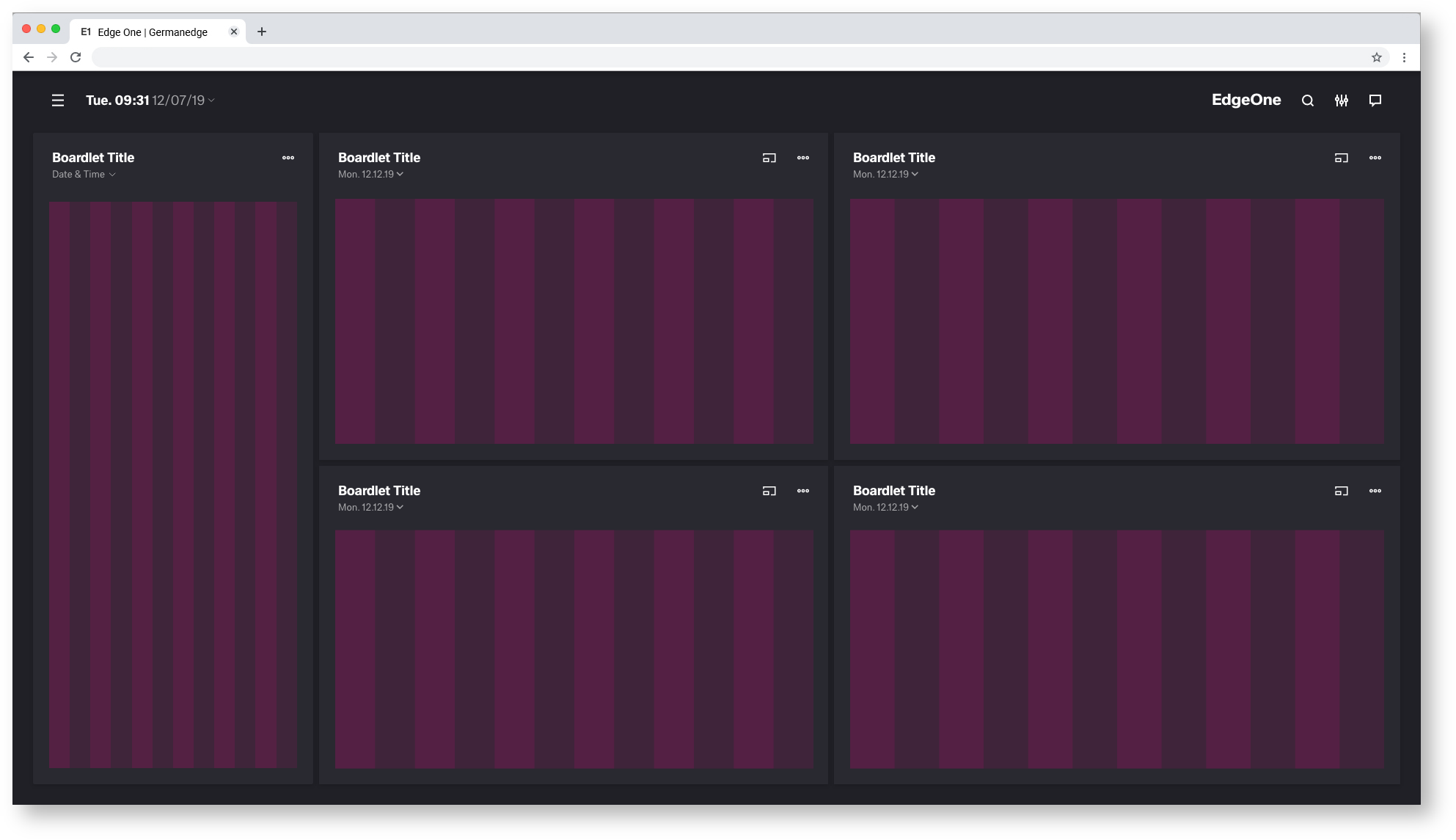

Best Practice
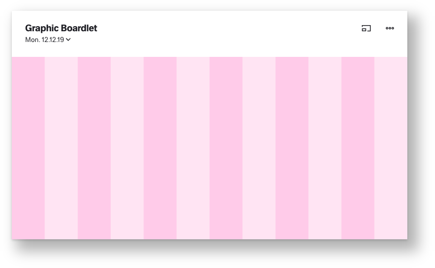
Dark and Light Theme.
This is a work in progress. Not final!!!


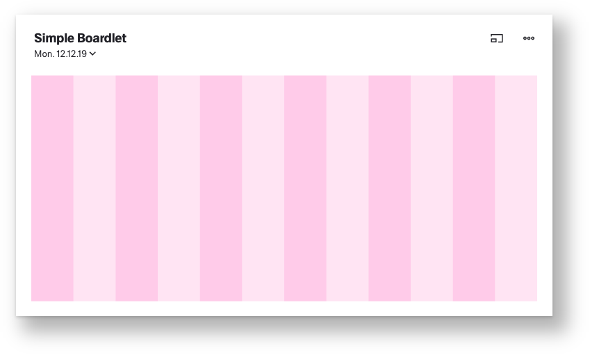
Regular content


Graphic content