
Why UI Style Guides so importent.
This is where individual components are stored to help developers develop a consistent and unified product. Please note: the layouts shown here are not final yet. They will be reworked for optimal readability and usability.

Improve Engagement with These SaaS UX Design Best Practices
SaaS applications are among the most complex pieces of software written today. Implementing UX best practices for any SaaS platform is a useful exercise that can reap valuable rewards:
- Reduce customer churn
- Increase user speed (and therefore satisfaction) by streamlining the experience
- Eliminate user frustration with help and support systems
- Engage users with contextual dashboards and information
Simplify Registration
Registration is normally the first touchpoint a user has with a SaaS platform, and as the saying goes, first impressions are important. When considering the registration process, only ask for the most vital information up front. Many times, an email address is enough to get a potential customer into the application.
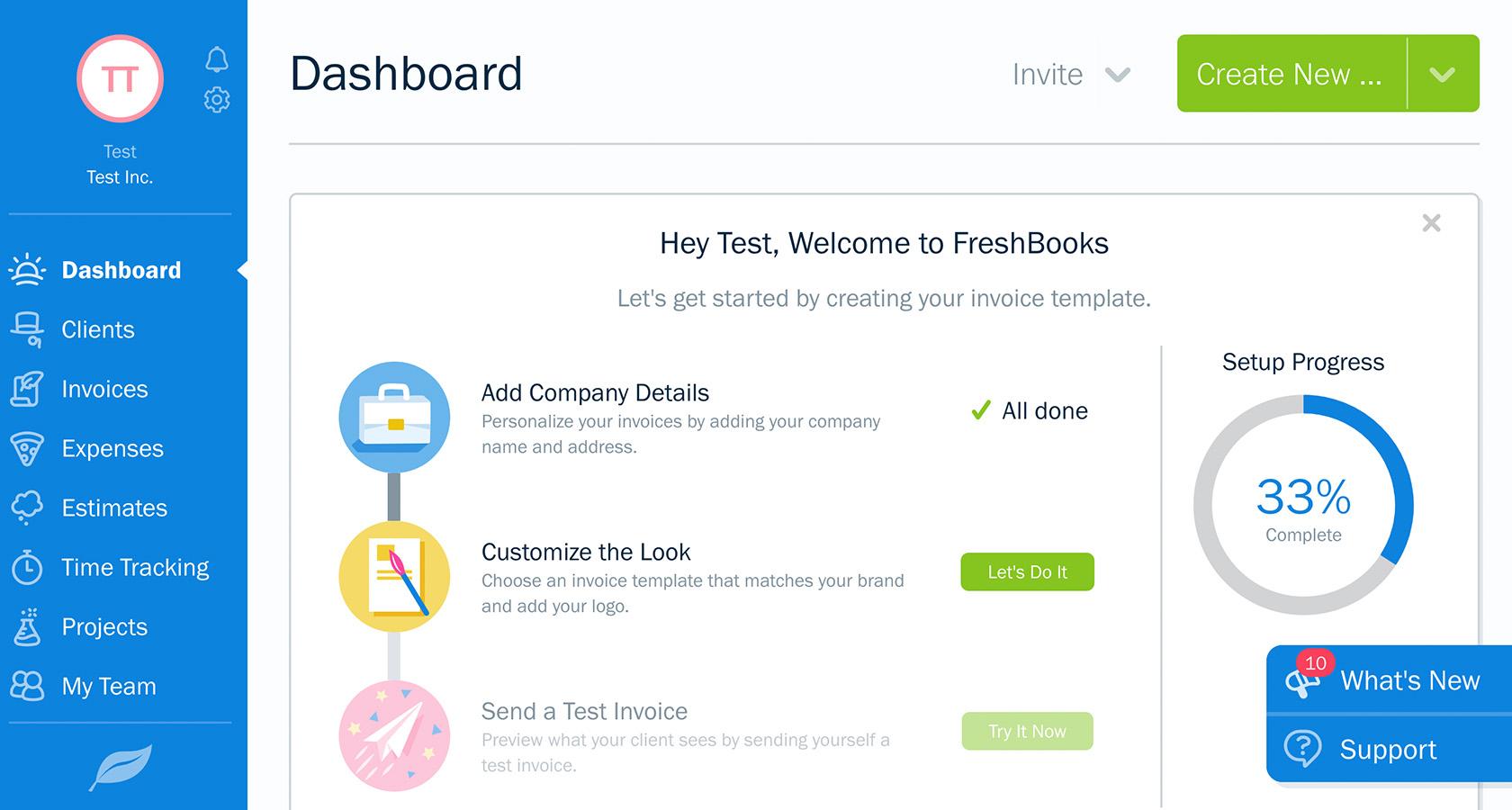
 FreshBooks only requires an email address to get users going.
While their initial registration is minimal, FreshBooks gets more information from users after they’ve begun to use the application. This type of tiered (or stepped) data collection gets users in the door and removes barriers for entry like payment information and lengthy forms.
While refining the registration process, don’t forget to consider calls to action. A clear call to action draws potential users quickly into the system. Not only does FreshBooks have an obvious button (“Get Started”)—they also include a friendly reminder that 97% of users recommend FreshBooks. Tools like this promote trust and can motivate people who may be on the fence to take action.
Clarify with Onboarding
Customer churn is a key performance metric used by SaaS applications. Poor onboarding can lead to user confusion. When users are confused, they cancel memberships. A positive onboarding experience engages, gives a strong first impression, and teaches users how to complete certain tasks they have in mind.
Slack is an example of combining intelligent onboarding methods to create a positive experience for new users.
 Slack's initial onboarding uses a step-by-step wizard for simple team setup.
To begin with, users are given a simple, wizard-driven series of questions to set up their company and team. It’s important to note that users can take advantage of this or skip it for later. Giving choices like this during onboarding is vital because it allows experienced users to dive right into productivity.
In addition, Slack employs an onboarding AI called Slackbot. Slackbot serves as an automated help system. It can field basic questions or direct users through easy processes like making channels or adding more new users.
 Once inside Slack, users are prompted to finish signing up, but they can also begin setting up channels, inviting additional users, or installing apps—all under the direction of Slackbot.
Additional onboarding techniques include demonstration videos and coachmarks (small overlays to point out important features or elements on the page). The goal of onboarding is to introduce users to the primary tasks an application can accomplish and make it as easy as possible to complete them.
Streamline Information Architecture
Information architecture and navigation are the primary ways users find what they need from an application. As such, they should be intuitive and minimal. Hootsuite provides a global side navigation that is out of the way but can be expanded to show labels if the user forgets what an icon means or gets lost in the experience.
 Hootsuite features a minimal, expandable navigation sidebar on the side of the page.
It’s critical that systems like this are first presented in an expanded state. Doing so allows new users to become familiar with available features before minimizing to gain real estate for important tasks.
For SaaS applications that use multiple levels of permissions, role-based access control (RBAC) can help simplify navigation. RBAC only provides users with the navigation and content that they need to complete their individual goals. Consider a medical records (MR) application with three primary roles:
- MR retrieval specialist
- MR coder
- Admin
Each role has a distinct set of goals and a UI to accomplish those goals. Since MR coders don’t need to see retrieval content or tools, hiding retrieval, admin navigation, and content makes sense for those users.
Likewise, retrieval specialists don’t need to delve into coder functionality, so their dashboards and navigation should only include the tools they need. Considering audience roles and manipulating the navigation and content in this way creates a streamlined experience that boosts productivity.
For complex projects, consider implementing mega menus. Mega menus have the advantage of exposing secondary and even tertiary navigation elements with a single interaction, resulting in greater discoverability for new users. Intuitive labeling and navigation organization is still required (mega menus don’t help the experience on mobile devices), but they can be a boon to task speed in the desktop environment.
 Mobilecom Debitel uses mega menus to provide easy access to services in multiple content tiers.
Engage and Inform with Dashboards
A dashboard is often the first thing a user sees when logging into a SaaS application, so spending time on dashboard user experience will almost always lead to a greater ROI. A positive dashboard experience is one that answers the following questions for users:
- How am I doing, or what is my current state?
- What recent activity has been happening?
- What problems should I be aware of?
- What items are on my “To Do” list?
- How can I easily start important tasks?
For users to understand their current state, it’s a good idea to report on any key performance indicators (KPIs) that are critical to the user’s role.
Klipfolio’s dashboards are a great example of showing multiple KPIs (social media followers, load time, response time, etc.) in a tight grouping that is easy to scan. Visual indicators like maps, bars, and charts help to break up the content and make scanning easier.
 Klipfolio's command center (designed for a large HD display) features many KPIs that are readable at a glance.
A visual history of activity helps users determine what’s been happening while they were away. It’s recommended that this list or chart include actionable items so that the user can follow up on anything important. This could be usernames in the case of intranets, timestamps to view reports, headlines for news, etc.
Problem areas should be highlighted as well. Lists of alerts sorted by priority can be a huge help to users of complex applications. Especially critical items can be separated out as alerts that are actionable and dismissable to be sure they are seen.
 A SaaS dashboard design displaying an alert band with actionable buttons. (Darius Dan)
As mentioned earlier, well-designed dashboards serve as a springboard to important functionality. Contextual links like to-do lists are especially useful here as they add capabilities for users that are relevant to their current needs. The Quip redesign makes good use of this with their “Action Items” list.
 Quip's "action Items" offer great contextual links.
Ensure That “Help” Is Useful and Always Available
Successful SaaS applications have intuitive help and support systems in case users get stuck. Modern users expect to be able to get support for their questions without the time commitment of speaking to someone on the phone. There are a few key ways this can be accomplished.
First, the help system should be easily accessible from anywhere in the application. If a user decides they need help, there is a good possibility that they are already frustrated. Forcing them to dig for help content is a recipe for making the experience worse.
 The expandable "Support" button near the bottom of the FreshBooks UI is always available to users.
FAQs help users quickly find answers to popular questions, but these can be improved as well. Agorapulse is an example of an application that has automated their FAQ. Doing so has allowed them to cover more topics and offer users an easy way to search using the “Agorapulse Bot.”
Offering live online support is also important for users who may prefer that channel over traditional support methods (this is especially important for younger audiences). While these user-facing support systems are vitally important, what happens behind the scenes is also critical. Following up on user complaints, categorizing bugs, creating cases, and constantly improving the customer experience are key factors to SaaS longevity.
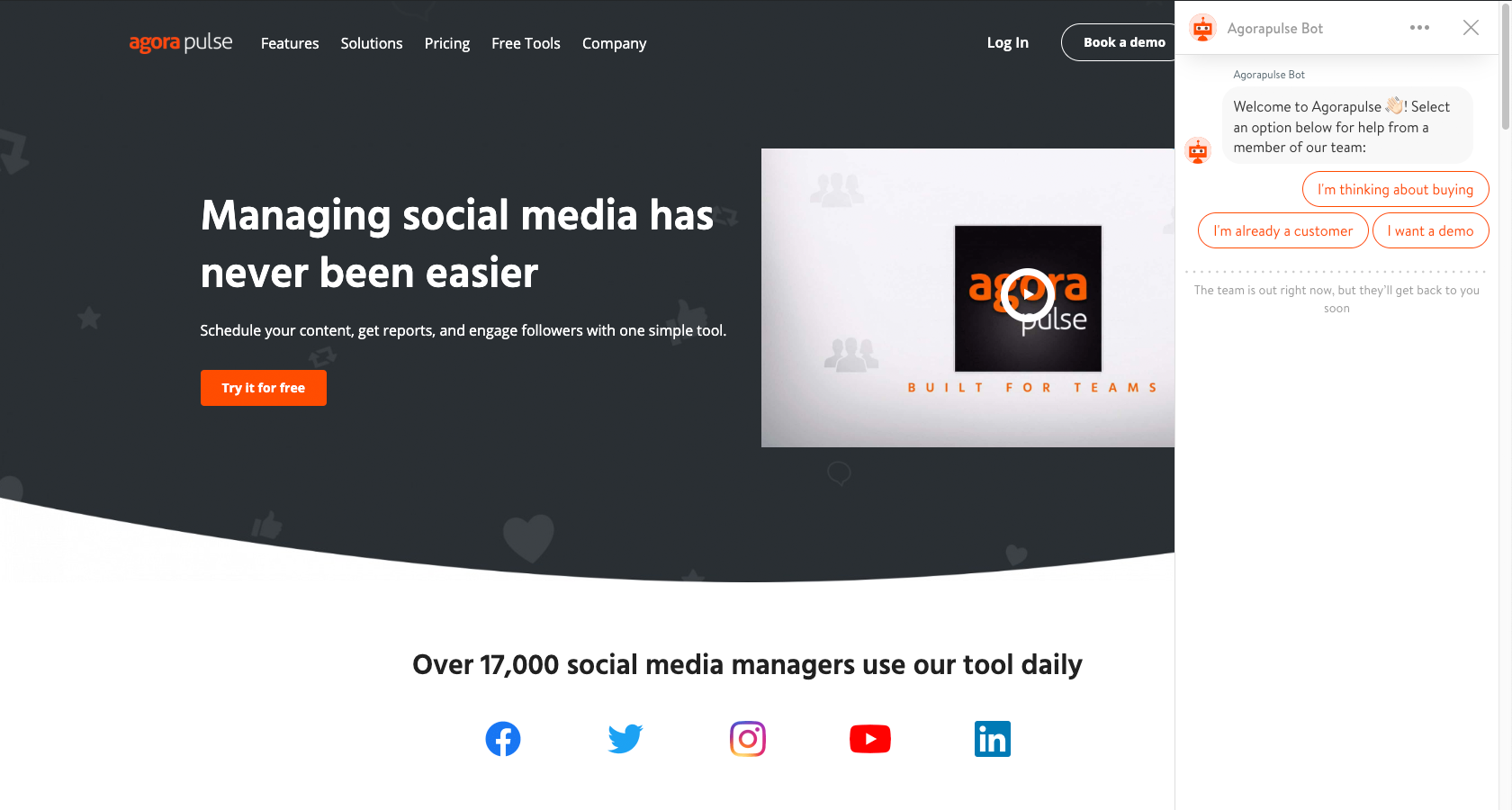 The Agorapulse help system is automated and works like an intelligent FAQ.
Improve SaaS Applications with Review and Iteration
To be worthwhile, UX endeavors must consider primary audiences and be focused on user needs. UX for SaaS is no different, so let’s take a moment to recap our discussion of SaaS UX design best practices.
- Simplify the registration process.
- Use onboarding to clarify functionality for users.
- Streamline information architecture so that it is intuitive and minimal.
- Engage and inform users about KPIs with dashboards.
- Ensure that SaaS product support is useful and always available.
It takes significant effort to maintain a successful SaaS application. Engaging users requires an ongoing commitment to review and iteration, but it’s a battle well worth fighting to retain happy customers.
Responsive Design – Best Practices and Considerations
Responsive websites are websites that adapt to all screen sizes and resolutions, not only on desktop but also on mobile, tablet, and sometimes even TV.
According to Statista, mobile traffic was responsible for 52.64% of all global traffic in 2017, meaning that a website not well optimized for mobile devices is losing out on approximately half of its traffic. By the end of 2018, it’s expected that the global traffic share for mobile devices will grow to 79%, which is an exceptional increase.
Businesses without a mobile website are falling behind at an alarming rate, because 8 in 10 visitors will stop engaging with a website that doesn’t display well on their device. It’s way too easy for users to hit the back button and try a rival business instead, and Google even ranks websites that are not responsive lower in their search.
You can take Google’s mobile-friendly test here.
Does any of this mean that mobile is more important than desktop? No. 83% of mobile users saythat they should be able to continue the experience on desktop if they wish.
Take a look at this mobile-optimized version of eBay vs. what it would look like if it weren’t mobile-optimized. Would you even consider the non-optimized version?
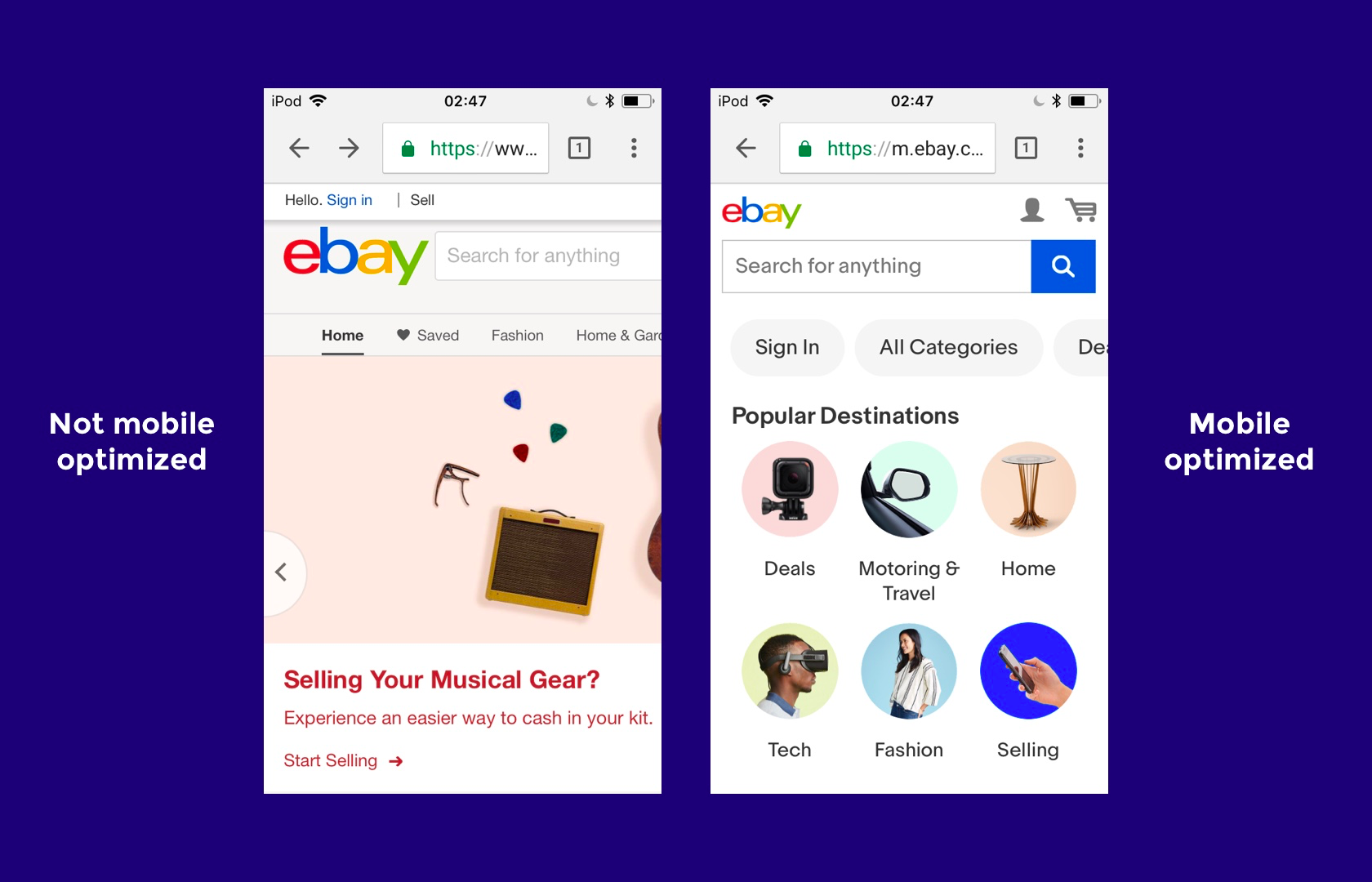
eBay: not mobile-optimized vs. a mobile-optimized responsive website
In order to design websites that can compete on today’s internet, web designers must be experts at responsive web design (RWD). Where should they start?
A Mobile-first Approach to Responsive Web Design
Mobile-first web design means designing the mobile website first and working up to the desktop version. There are a number of reasons why this approach works well.
- Mobile websites have more usability concerns (this is mostly due to the lack of screen real estate), so it’s practical and more efficient for the primary focus to be on mobile design.
- It’s easier to scale up the mobile version than it is to scale down the desktop version (again, because of the lack of space on mobile websites).
- Mobile-first web design helps to reevaluate what’s visually and functionally necessary.
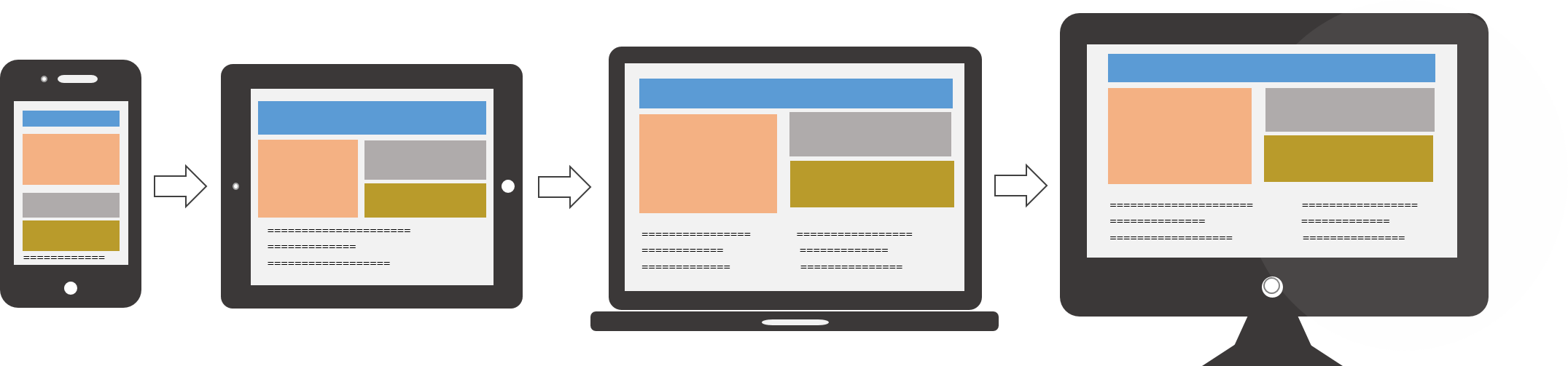
Designers ought to consider taking a mobile-first approach to responsive web design. (source: Usabilla)
Designing a website as a mobile-first responsive site forces designers to ask a number of important questions because there is less screen real estate to work with. Here are the questions that need to be asked:
- Is this feature/function really necessary?
- How can we design something minimalist for mobile first that will later scale up well for desktops?
- Is this visual effect worth the time that it takes to load on mobile?
- What’s the primary objective, and what visual elements help users achieve it?
We’ll take a look at some responsive web design examples in a moment. For now, let’s talk about which devices, screen sizes, and web browsers are relevant today.
What Screen Resolutions Are Relevant for Responsive Web Design?
Here are the most common screen resolutions across mobile, tablet, and desktop users worldwide. As you can see, there is a wide range of resolutions, so neither mobile, tablet nor desktop is dominating the market share right now—what this tells us is that designers should consider all of them when thinking about responsive web design.
- 360x640 (small mobile): 22.64%
- 1366x768 (average laptop): 11.98%
- 1920x1080 (large desktop): 7.35%
- 375x667 (average mobile): 5%
- 1440x900 (average desktop): 3.17%
- 720x1280 (large mobile): 2.74%

Just as with device breakdown, we should segment the data by location to match the user demographics (or anticipated user demographics) of our target audience. It’s also worth catering to resolutions that are gaining popularity, because while some screen sizes are currently not that common, they may be in the future. This will help responsive designers craft futureproof UX that will work even when the market share changes.
For example, 360x640 resolutions (which correspond mostly with Samsung devices using Android) have risen by 5.43% in the last year. Designers can use valuable insights like these to decide on key responsive breakpoints before starting a website design.
What Web Browsers Are Popular Today?
Responsive web design is about offering a seamless experience on any device, and since different web browsers render web pages in different ways, websites must be tested to ensure that they’re compatible with a variety of mobile and desktop web browsers.
Even though making a website scale to the correct responsive breakpoints is primarily the responsibility of a web developer, it’s the web designer that decides exactly how a responsive website will adapt to various screen sizes in order to create an optimal user experience.
Here’s a worldwide breakdown of web browser market share for mobile and desktop.
- Chrome: 55.04%
- Safari: 14.86%
- UC Browser: 8.69%
- Firefox: 5.72%
- Opera: 4.03%
- Internet Explorer: 3.35%

Responsive design isn’t just about “making everything fit”—it’s also about adapting to the capabilities of the device hardware and web browser as well as the device resolution. One example of this could be that, while Google Chrome supports the CSS property overscroll-behavior: (which defines what happens when the user scrolls too hard towards the edge of the viewport), it’s not supported in any other web browser.
Responsive Design Best Practices
Eliminate Friction
As mentioned earlier, a mobile-first approach to responsive web design will help designers evaluate what’s really necessary in order for the user to achieve their main objective.
As we build up to the tablet version (and later the desktop version), we can then begin to think about secondary objectives and the microinteractions, user flows, and CTAs (calls to action) that make those user objectives achievable. What’s more important is that we focus on the primary objectives of the user first and eliminate any unnecessary friction that aids neither the primary nor the secondary objectives.
A primary objective could be the purchasing of a product, whereas the secondary objective could be signing up for a newsletter (which could lead to a purchase later).
Here’s a terrific example of eliminating friction: Since mobile user interfaces are typically harder to navigate, it would be best to switch to a one-page checkout for mobile eCommerce stores and only enable multi-step checkout for desktop eCommerce stores.
Design for Thumbs
Responsive web design is tricky in the sense that users will interact with the desktop website via clicks but the mobile version via taps and swipes. There are physical differences as well. Desktop users typically have their computers on a surface, whereas mobile users hold their devices in their hands. These differences significantly change the way mobile UI designers design tap targets and other important UI elements with which users interact.

Thumbs can reach the center of the device screen better than the corners. (source: A List Apart)
Let’s take a look at some examples:
- People typically expect the main desktop navigation to be at the top; however, on mobile, it should be at the bottom. Thumbs don’t reach the top comfortably.
- Other interactive elements should also be easy to reach. This means keeping them in the center of the screen because it’s more difficult for thumbs to reach the sides and corners of device screens.
- So that they can be tapped with ease, important links and CTAs should have a height of at least 44px (smaller tap targets are bad for usability).
Recommended reading: The Fundamental Guide to Mobile Usability.
Take Advantage of Mobile Devices’ Native Hardware
Mobile hardware (like the device camera, or GPS services) isn’t specifically reserved for native apps, and as mentioned earlier, responsive web design isn’t just about “making everything fit.” It’s also about adapting to the capabilities of the device. In the case of mobile web design, since mobile devices have easy to use cameras, some microinteractions—such as data input—are actually easier on smaller screens as long as websites are taking advantage of the available native hardware.
Let’s take a look at some examples:
- Credit/top-up card scanning (because forms are often tricky on mobile)
- Photo-sharing on social media, because the media is already on your device
- Two-factor authentication (because you’re already on your mobile device)
- Quickly checking stocks/analytics (because mobile apps simplify information)
- Performing a web search with voice (because hands-free is easier than typing)
Make Layouts Fluid/Adaptive by Default
Not every user will have their desktop browser maximized. This means that while designers need to consider the responsive breakpoints of the devices that users are using today, they also need to account for what happens in between those breakpoints.
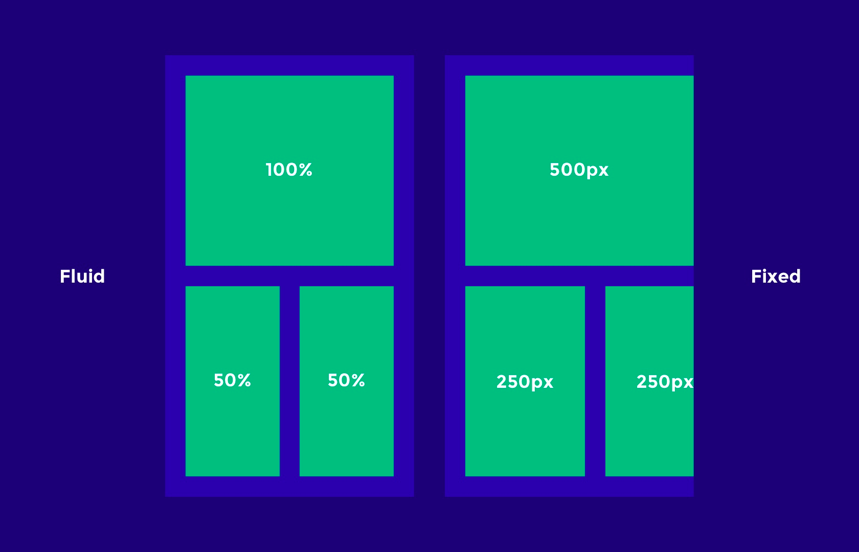
A fluid vs. fixed web layout for responsive web design
Responsive breakpoints should be used to “reflow” the layout and content to a new device, but to account for all the sizes in between (just in case), layouts need to be otherwise fluid (that is, they naturally adapt/stretch as the browser resizes).
Keep these tips in mind when designing fluid/adaptive layouts:
- Percentage units will allow elements to be fluid.
- Setting minimum and maximum widths can enable the “but don’t go smaller/bigger than this” scenario.
- SVG image formats can be scaled up and down without losing quality, and are resolution-independent (as opposed to JPGs and PNGs, which are not).
Don’t Forget about Landscape Orientation
We talked about specific responsive breakpoints earlier, but we also need to consider that those mobile viewports can be displayed in landscape orientation as well. While implementing a fluid layout will technically make the content adaptive, losing a fair chunk of the portrait viewport can be a hindrance to the usability and accessibility.
Navigations are usually safe (sometimes they’re better, actually, since users typically navigate landscape orientation with two thumbs), but scrolling becomes significantly harder, which is less than optimal since the user is required to scroll more on landscape.
Designers may want to consider designing for landscape breakpoints as well; for instance, tiled elements that stack vertically on mobile could be displayed as a slider with left and right navigation buttons, meaning the user doesn’t have to scroll.
Remember, Typography Can Be Responsive Too
Even though UX designers typically use pixel units to design websites, on the actual web, one point doesn’t necessarily equal a pixel anymore, because different devices have different resolutions. The iPhone X, for example, has 458 PPI (Pixels Per Inch), so where pixel sizes are getting smaller, we’re able to achieve crisper graphics in the same physical space (Apple calls this “Retina” technology, and Android calls it “hDPI”).
This means that a 16px font size, for instance, would look bigger or smaller on some devices depending on its resolution. Web developers will typically use em units to define font sizes, which are a type of responsive unit where 1em is equal to 1 point.
Design handoff tools like Zeplin, Sympli, Marvel and InVision can help designers collaborate with developers on matters that are a joint responsibility. While designers execute the design, and developers execute the code, as a whole the product design workflow is a team effort that requires solid communication.
Responsive Design Performance Optimization Tips and Best Practices
Responsive web design isn’t just about how it looks but also about how it acts and feels. Adapting websites so that they load faster on the intended device is equally important.
Lazy Load Non-vital Images and Videos
Images and videos are what make up a large chunk of the total download size of a website, but you don’t need to load them all at once. There are two scenarios where the rendering of media can be delayed: Below-the-fold content can be loaded as the user scrolls below the fold, and render-blocking media should be made to download only after the layout and content has downloaded. This practice is called lazy loading, where the loading of heavy, non-important elements is delayed to improve page performance.
Conditional Loading
Some website elements are not intended for mobile users, or at least aren’t worth the extra cognitive load. We want our mobile websites to be simple, so it makes sense to hide elements in certain scenarios. That being said, we have to make sure that we aren’t wasting browser resources and bandwidth by loading these elements even when they’re hidden; hence, it’s best practice to only include these elements in certain conditions.
Once again, a developer can achieve this with code; however, designers can improve page performance by communicating the conditions of when and where certain elements should and shouldn’t exist.
Responsive Images
As mentioned earlier, some devices display more pixels per inch, which can result in images becoming blurry if they’re not exported at the correct resolution. Depending on the resolution of the device, some will require images at double (@2x), triple (@3x) and even quadruple (@4x) the size. Web browsers now support the <picture> element, which chooses the correct image resolution depending on the device.
Designers crafting responsive websites can tailor images to the correct device by making sure to export at all the resolutions used on today’s devices (if you’re unsure, ask your developer—communication is key when it comes to responsive web design).

Exporting image assets from Sketch @2x for responsive web design
Conclusion
Wireframing can help to iron out the creases early in the design process, and this works well when taking a mobile-first approach to responsive web design. Perhaps there’s a responsive breakpoint that needs some extra attention, or maybe there’s a concept that just isn’t effective in terms of mobile responsiveness. It’s better to find the bumps in the road sooner rather than later (i.e., before adding visual aesthetics).
Modern design tools like Adobe XD, Marvel and InVision enable teams to test prototypes on real devices, discuss feedback in context, and generally collaborate as a team until the layout works in all scenarios.
Employing a lean UX workflow where responsive design is driven by internal testing and feedback will ensure that the user experience works seamlessly across all platforms and screen resolutions before being presented to a real user for the first time.
Basic
https://material.angularjs.org/latest/
https://developer.microsoft.com/en-us/fabric#/controls/web
https://experience.sap.com/fiori-design-web/explore/
https://design.raet.com/ui_library/#/uilibraryintro
https://www.ibm.com/design/language/
HTML5 JavaScript Component Suite
Diagrams
https://www.highcharts.com/demo
Inspiration and good examples
https://airbnb.design/articles/
https://www.toptal.com/designers/responsive/responsive-design-best-practices
Importent to read
https://www.toptal.com/designers/dashboard-design/top-data-visualization-dashboard-examples
https://www.toptal.com/designers/ux/top-5-common-ux-mistakes
https://www.toptal.com/designers/ux/saas-ux-design
https://www.toptal.com/designers/ux/ux-myths-prototypes
https://www.toptal.com/designers/ui/microcopy
https://www.toptal.com/designers/ui/top-wireframe-tools-guide