Table of contents
- The 24 Columns Grid
- Spacing and Details - Dashboard example
The 24 Columns Grid.
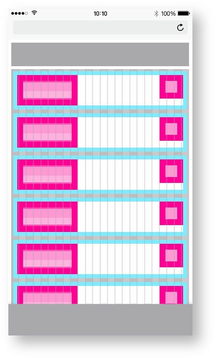
The foundation of the design system is the modified bootstrap frontend grid. this grid has 24 columns within the dashboard and 12 columns within the boardlets. The dashboard is divided into two parts, header and content area. The 24 Columns Grid only applies within the content area. The grid has no column space, all distances are solved via the margin.
Importent for this Breakpoint
no gutter needed. This can be added later optionally, if we recognize in the conception that one is needed after all.
Spacing of the
Smartphone portrait.
Here you can find all important values for building the Smartphone portrait grid. The grid is divided into two main containers. the header area and the content area.
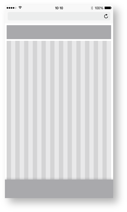
| Base | px | rem |
|---|---|---|
| Breakpoint | <576px | n.n |
| Width (iphone 6) | 375 | 23.438 |
| Height (iphone 6) | 667 | 41.688 |
| Content Area | ||
| Columns | 24 | - |
| Column Width | 15 | 0.938 |
| Gutter | n.n | n.n |
| Header Area | ||
| Header | 48 | 3 |
| Icon max | 48 | 3 |
Zeplin Documentation:
Download Inspire Design KIT:
http://www.ronoemus.com/Brand_x/032020_DESIGN_KIT_INSPIRE_V1.1.zip
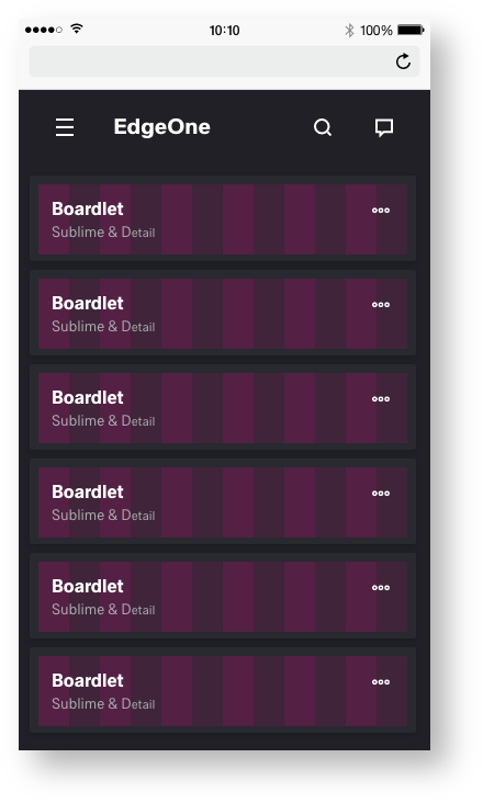
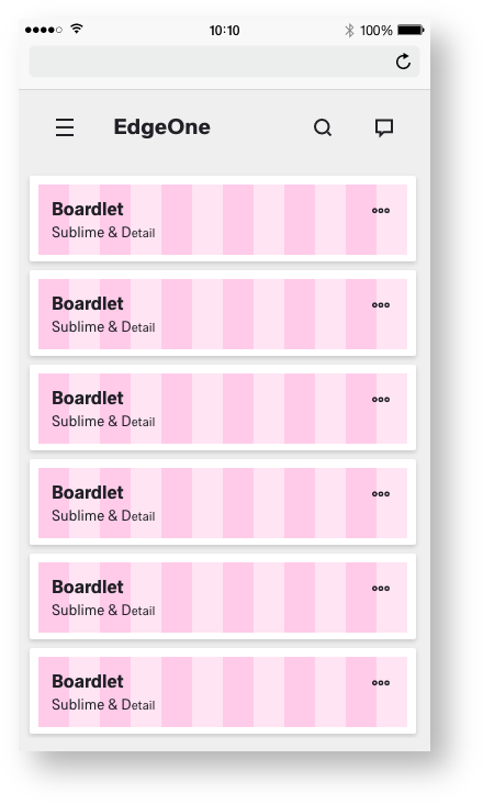
Dashboard example.
The display within Mobile Dashboard behaves differently than the other sizes. Within mobiles, the boardlets transform into cards. The cards serve as a summary or status of the respective boardlet. The cards can be opened by a drill down, or are multilevel content as needed. There is no visual difference between X-Series and EdgeOne in mobile use.
This could be the layout of the cards within this display. The Edge One/X-Series serves as an example.
Importent for this Breakpoint
Within this example, we need more information from the product providers and a basic concept of the UPW and X-Series.