(this page was created automatically. In case of formatting issues, please visit the official Wiki Page)
Accordion
Overview
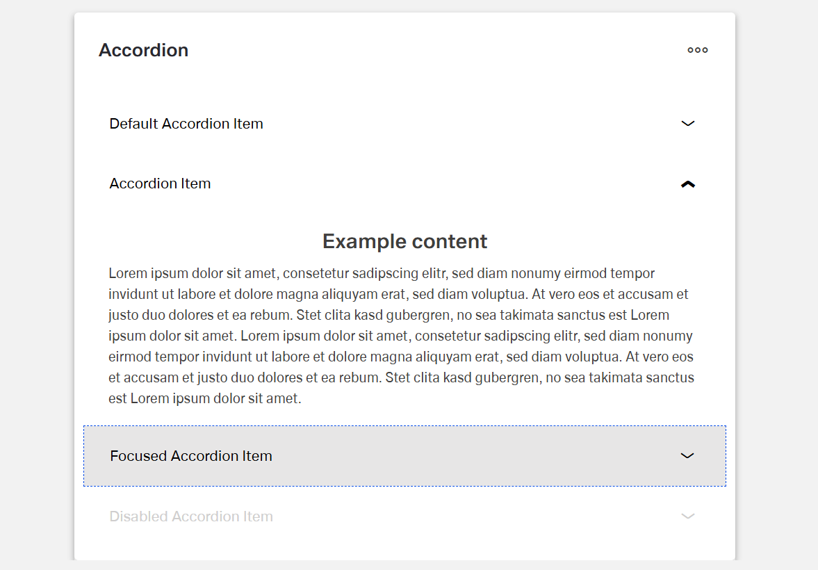
The Dynamic Accordion component is a collapsible content container.
It organizes information into expandable and collapsible sections.
Each accordion item (child component) has a title that remains visible.
The content of each section can be expanded or hidden.
Specs
Structure
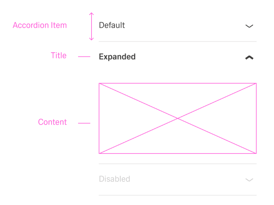
- The accordion is made up of an array of DynamicAccordionItemComponent objects.
- Each item contains a title that is always visible.
- Each item also contains content that can be expanded or collapsed.
General Properties
- displayName — Sets the display name of the component shown in the structure panel. For example, "Product FAQ" allows for easy identification of the accordion's purpose in the component structure.
Visual Properties
- Accordion Items can be added manual through "Add Accordion Item" or a data source through a template (useTemplate).
Accordion Template (Header/Content)
General Properties
- displayName — Sets the display name of the component shown in the structure panel. For example, "Product FAQ" allows for easy identification of the accordion's purpose in the component structure.
Visual Properties
- title – Sets the title text displayed in the accordion, with support for multiple languages. For example, {"en-US": "Contract Details", "de-DE": "Vertragsdetails"} ensures proper localization of the title based on the user's language settings. This title helps users understand what document they're viewing.
- disabled – Controls whether users can interact with the accordion. When set to true, the accordion appears grayed out and cannot be changed by users.
- layout - Determines how child elements are arranged within the accordion template. Options include "vertical" (stacked elements) or "horizontal" (side-by-side elements). For example, "horizontal" places items in a row rather than stacking them.
- alignItemsClass - Controls the vertical alignment of child elements within the accordion template. For example, "align-items-center" centers all child elements vertically within the section.
- gapClass - Configures the spacing between child elements within the accordion template. For example, {"row": "row-gap-4", "column": "column-gap-2"} creates consistent spacing between elements with more vertical than horizontal spacing.
Events
Configures the events that the component can trigger and respond to:
- ON_INIT — Triggered when the accordion component is initialized. Can be used to perform setup operations like loading default data or setting initial states.
- ON_DESTROY — Triggered when the accordion component is removed from the DOM. Useful for cleanup operations and releasing resources.
Testing Hooks
- dataTestId — Sets the testing hook ID for automated testing. For example, setting it to
"faq-accordion"allows test scripts to reliably locate this component. - enableAsHotspot — Enables the component as a guided tour hotspot. When enabled, the accordion can be highlighted during guided tours of your application.
Datasource
- dataSourceId — Specifies the data source for retrieving accordion data. For example, api/featured-products connects the component to the products API endpoint.
- getEntityCollectionHttpRequestParametersMap — Configures HTTP parameters for data fetching, including query parameters, path parameters, and headers. This object maps additional parameters needed for the request.
Events
Configures the events that the component can trigger and respond to:
- ON_INIT — Triggered when the accordion component is initialized. Can be used to perform setup operations like loading default data or setting initial states.
- ON_DESTROY — Triggered when the accordion component is removed from the DOM. Useful for cleanup operations and releasing resources.
Authorization
- visibilityPolicySetId - Determines the visibility of the component based on specified policy sets. For example, setting to "adminOnlyPolicy" restricts the form to users with admin privileges, preventing unauthorized access to sensitive information.
Visibility
- displayConditions – Defines conditions for displaying the component based on context data or expressions. For example, configuring it to display only when "userType === 'advanced'" ensures the grid appears only for advanced users, providing a conditional layout experience.
Testing Hooks
- id - Specifies a unique identifier for the component used for programmatic access. For example, "fqa-accordion" enables targeted manipulation of this specific accordion.
- dataTestId — Sets the testing hook ID for automated testing. For example, setting it to
"faq-accordion"allows test scripts to reliably locate this component. - enableAsHotspot — Enables the component as a guided tour hotspot. When enabled, the accordion can be highlighted during guided tours of your application.
Layout
- paddingClass — Configures spacing around the accordion content using CSS classes. For example,
"p-4"adds medium padding on all sides of the accordion for better visual separation from surrounding elements.
Links
- Figma: https://www.figma.com/design/yck1tcUXgdQ5aYX6iUAwrO/GE---Astronaut-Design-System?node-id=11521-150180&t=iosNC2AkSTGs5lMh-1
- Life style guide: https://e1-dev.k8s.myapp.de/live-style-guide/id5/1-accordion
Guidelines
Usage & Content
An accordion is used as a progressive disclosure pattern when content is related but not always needed on screen.
The items hold secondary content that supports, but does not replace, the main content.
Each item title describes one clear topic so the collapsed list is easy to scan, and the localized title property shows the correct label for each language.
A meaningful displayName is set so the accordion can be recognized quickly in the structure panel.
Layout & Spacing
The layout is chosen to match the content.
The layout property is set to "vertical" for stacked reading and forms, while the "horizontal" layout is reserved for short, side-by-side content. Gap classes are used to keep clear spacing between header parts and content.
Padding is applied with paddingClass so content does not touch the container edges and neighboring components still have enough breathing room.
Visibility & Authorization
Visibility rules ensure that the accordion appears only when it is relevant, and sections that do not apply to a user are not shown. Sensitive accordions are fully hidden for users without permission. Conditional visibility keeps the layout clean by hiding empty or irrelevant accordions.
Content Quality & Clarity
Short, descriptive titles in sentence case are written so the title field clearly states what is inside each item.
Internal displayName values are aligned with the visible titles, and the names in the structure panel roughly match what users see in the UI.
Dos and Don’ts
Usage & Content
Dos
The accordion is used as a progressive disclosure pattern when content is related but not always needed on screen, and the items hold this secondary content.
Each item title describes one clear topic so the collapsed list is easy to scan, using the localized title property for each language.
A meaningful displayName is set so the accordion is easy to recognize in the structure panel, with names such as “Product FAQ” or “Billing sections”.
Don’ts
The accordion is not used for key content that must always be visible, and critical information is not hidden behind expansion.
Unrelated topics are not combined into a single item, and one item does not describe several unrelated subjects.
Generic internal names such as “Accordion 1” are not kept, and machine-like keys or placeholders are not shown to end users.
Layout & Spacing
Dos
The layout is selected to match the content.
The layout property is set to "vertical" for stacked reading and forms, while the "horizontal" layout is used only for short, side-by-side content.
Gap classes are applied to keep clear spacing between header parts and content.
Padding is added with paddingClass so content does not touch the container edges and the accordion has comfortable spacing to nearby components.
Don’ts
Horizontal layout is not forced for long labels or dense forms, so text does not wrap in awkward ways.
Misaligned icons and text are not left in place, and headers do not look uneven because alignItemsClass is missing or inconsistent. Very tight or missing gaps are avoided, and elements do not sit directly against each other when gapClass could provide spacing.
The accordion does not sit directly against neighboring components, and content does not appear cramped because paddingClass is removed or set too small.
Visibility & Authorization
Dos
Visibility rules are used so the accordion appears only when it is relevant, and sections that clearly do not apply to a user are not shown.
Sensitive accordions are fully hidden for users without permission.
Conditional visibility keeps the layout clean by hiding accordions that are empty or irrelevant.
Don’ts
Irrelevant accordions are not left visible just because they exist in the template.
Sensitive content is not shown and then blocked only with text such as “no access.”
Accordions are not left visible but empty, and unused shells do not clutter the page when displayConditions can hide them.
Content Quality & Clarity
Dos
Short, descriptive titles in sentence case are written so the title field clearly states what is inside each item.
Internal displayName values are aligned with the visible titles, and the names shown in the structure panel roughly match what users see in the UI.
Don’ts
Long sentences, technical IDs, or slogans are not used in headers that users must scan quickly.
Completely different internal and external names are not used without a strong reason, so displayName and title do not create confusion for authors or testers.
Accessibility
- Provide meaningful, unique titles for each section so context is clear even when collapsed (
elements.title). Use plain-language; avoid icon-only labels (elements.title). - Expose a stable handle for automated accessibility checks (
dataTestId). - Avoid color-only meaning; place essential cues in text (
elements.title,elements.content). - Keep expansion order predictable by establishing item order during initialization (
ON_INIT,elements).