The basic unit
The basis for the grid of the design system is rem. The smallest unit within the system is 0.125 rem. Variants of 0,125 rem form the dimensions of columns, rows and boxes as well as their edges and fillings. The 0,125 rem adapts to your content while maintaining a constant visual rhythm.

| px | rem | |
|---|---|---|
| Width | 1920 | 120 |
| Height | 1080 | 67.5 |
| Margin | 28 | 1.75 |
| Columns | 24 | - |
| Column Width | 70 | 4,375 |
| Column Space | 8 | 0,500 |
| Gutter | 24 | 1,500 |
| Header | 24 | 1,500 |
| Icon max | 24 | 1,500 |
| Icon min | 16 | 1 |
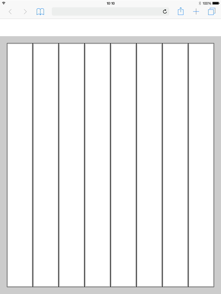
Web 1920
Columns Patting
Web 1920
Gutter Patting


Best Practice
Dark Theme


Breakpoints
Use this set of standard breakpoints to maintain layout integrity across screen sizes. For best results, test designs and code at each of these standard breakpoints.
| Breakpoints | size (px) | columns | size (%) | padding (rem) | margin (unit) | gutter (unit) |
|---|---|---|---|---|---|---|
| Small | 328 | 4 | 25% | 0,25 rem | 1,5 rem | 1,5 rem |
| Tablet upright | 720 | 8 | 12.5% | 0,25 rem | 1,5 rem | 1,5 rem |
| Tablet landscape | 984 | 12 | 8.33% | 0,25 rem | 1,25 rem | 1,5 rem |
| Web 1280 | 1224 | 12 | 8.33% | 0,25 rem | 1,75 rem | 1,5 rem |
| Web 1920 | 1873 | 24 | 4,16% | 0,25 rem | 1,5 rem | 1,5 rem |
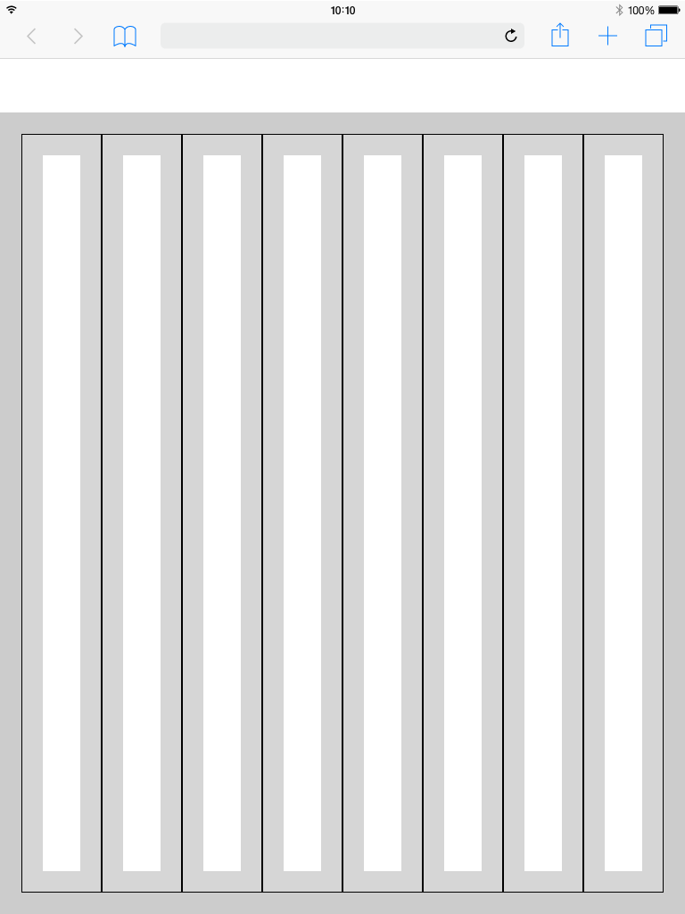
Web 1280
Columns Patting
Web 1280
Gutter Patting


Best Practice
Dark Theme


Grid examples
Tablet_Landscape


Grid examples
Tablet_Upright
Grid examples
Mobile


Header
The header is the heart of the software. All buttons with global functions can be found here.
The appearance and the contents vary within the different devices. This is necessary because for example
mobile less details are necessary or the details have to be displayed in multiple levels. This also applies to the header.
More Details about the Header you will find here