GE2-947 - Getting issue details... STATUS
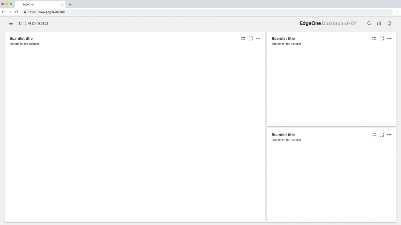
Overview
Validation Concept
Each validation can be associated with a notification. Whether the validation is communicated with an inline or toast notification can be defined by the administrator in the backend. Validations can also be done without notifications, but this is only possible if the validation is limited to one asset. We recommend to use validations without notifications only in simple forms, e.g. login.
Validation Overview
Alert Concept
Each alert must be associated with a notification. Whether the alert is communicated with an inline or toast notification can be defined by the administrator in the backend. We recommend to highlight the area where the alert is localized.
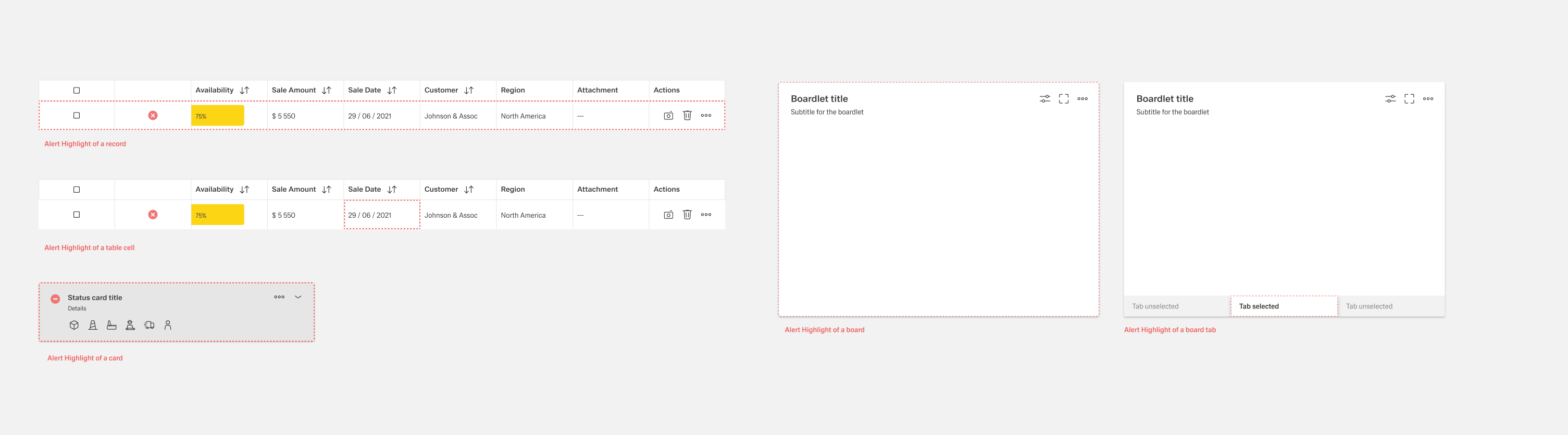
Alert Overview
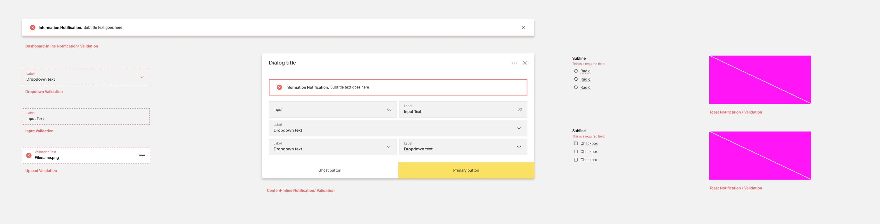
1. Notification
Notifications are messages that convey information to the user. The two main variants of notifications are toast notifications and inline notifications.Notifications inform about successes, system information and warnings and alarms.
1.1 Inline
Inline notifications are divided into two application areas, notifications within the dashboard and within organisms such as dialogs, modals or sidebars. This is necessary to show the user the exact location of the error.
Formatting
 Content Inline Notification
Optionally, the dashed marker can also alert the user to the exact location of the error.
If multiple assets are affected by the error message, all assets are marked independently.
This optional feature is only allowed within the Dashboard inline notification.
Action
Inline notifications have an optional link that is next to the title and the actual content. This button should allow users to perform further actions for the notification.
Size
The width of inline notifications varies depending on placement. Dashboard notifications extend across the entire width. The Content Notification they fill the content area they refer to. Their height depends on the length of the content, which should not exceed two lines of text.
Placement
Inline notifications appear near the associated elements. They can expand to fill the width of the container or content area in which they reside, and should be aligned with the columns of the grid.
Inline notifications are always placed at the top of the asset. If error notifications refer to individual text inputs, they should add the error status of the respective input field.
Dismissal
Inline notifications are not automatically deleted. They remain on the page until the user deletes them or performs an action that cancels the notification.
Inline notifications are optionally canceled with a small "x" in the upper-right corner.
1.2 Toast
Still needs to be designed. Ticket and placement in roadmap needed
2. Forms Validation
Boardlet Form Validation
Effective error messaging can help the user to understand the problem and how to fix it.
First, inform the user what has happened, then provide guidance on next steps or possible resolutions.
Inline Notifications can be used to state the general problem with the users input, such as
“Please input the required fields.” Inline Notifications can occur pre or post submission,
depending on the type of data the user is inputting.
Inline Notification / Multible Boardlet Validation
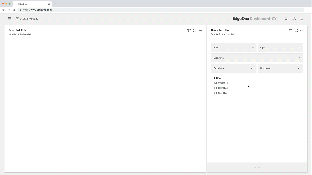
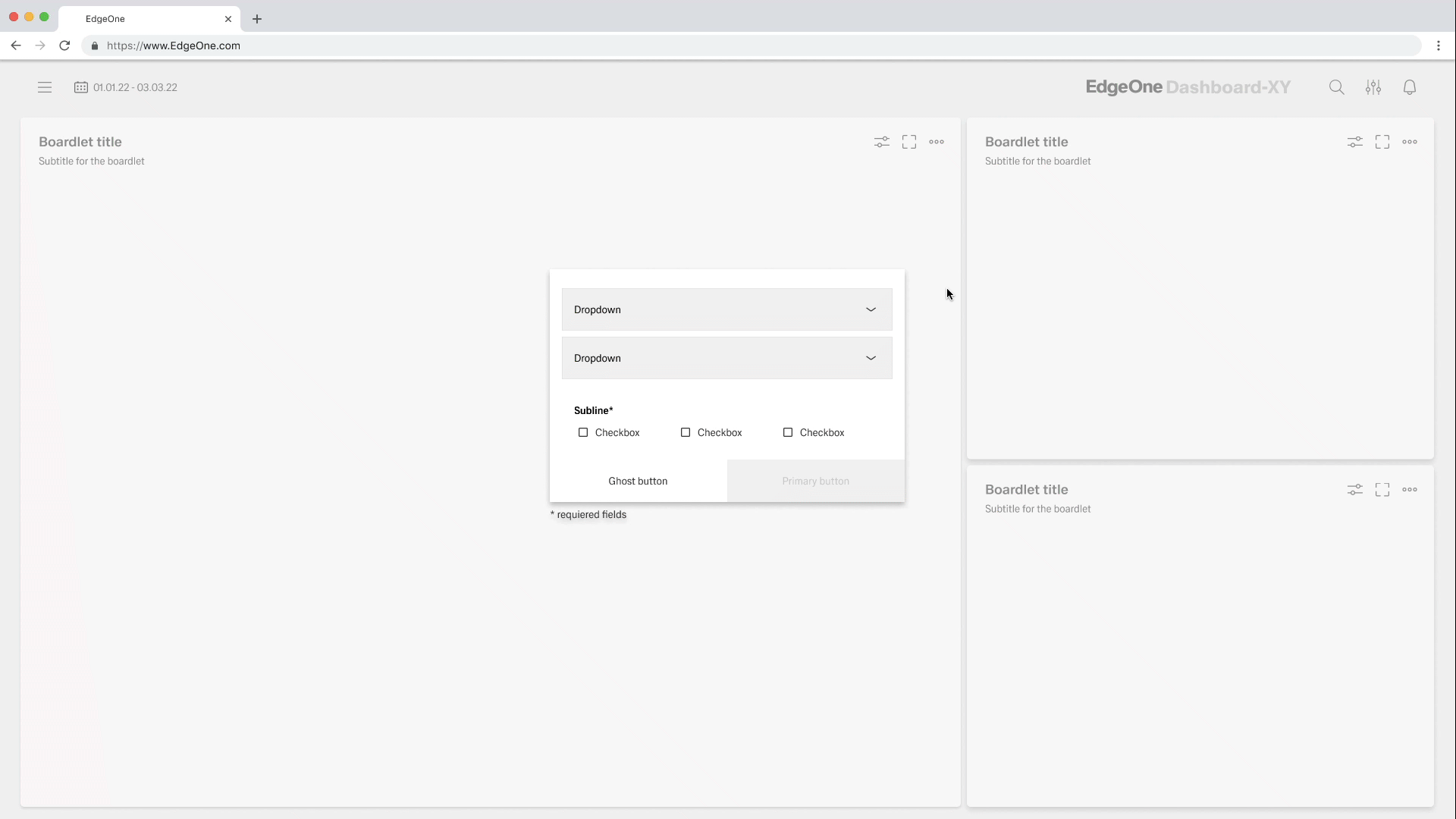
Single Input Validation
Simple forms do not require a notification. However, the administrator always has the option to associate each error message with a notification.
No Notification / Input Validation
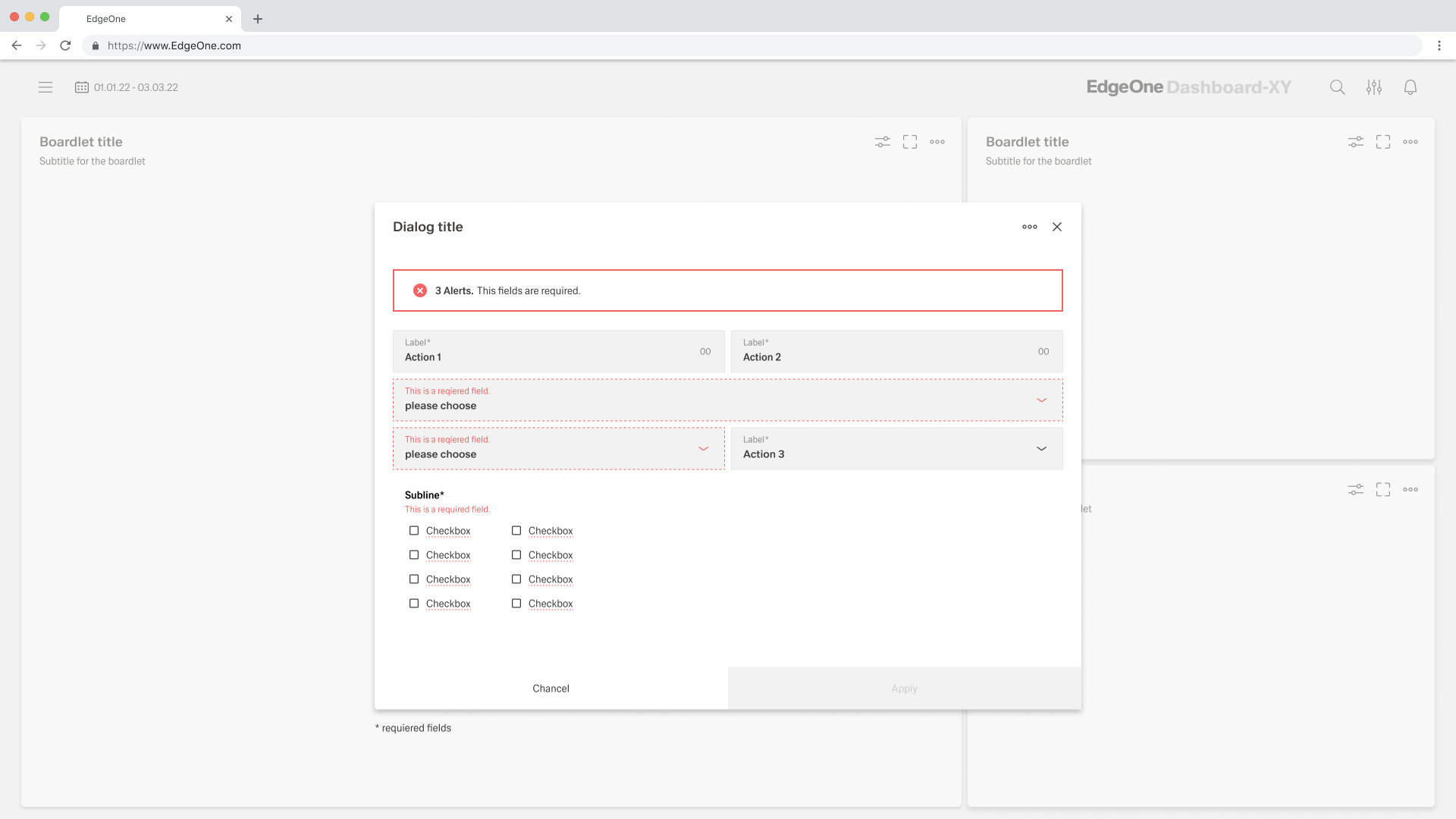
Dialog & Modal Validation
Dialogs and modals appear in a popup. In the case that a popup is used within Inspire, the validation notification will appear within the popup. Use visual cues to guide the user as to where the problem is placed within the Popup. This will help easily identify the elements that needs to be corrected.
The validation should appear when the user has clicked away from the text field. Once the user corrects the errors within the text field, the validation should disappear once the data is rendered as valid.
The validation label below the field should be as informative as possible when describing the issue with the users data.
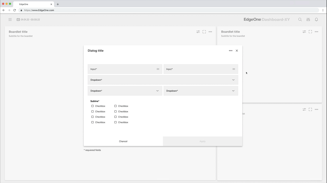
Dialog validation
Modal validation
Group Validation
Additional inputs or input groups or outlines are often used within forms. All groups, outlines or additional inputs must always be separated from the other groups with a subline. If a part of the additional inputs, input groups or the outline consists of a radio, checkbox or icon grouping, the validation text appears below the subline.
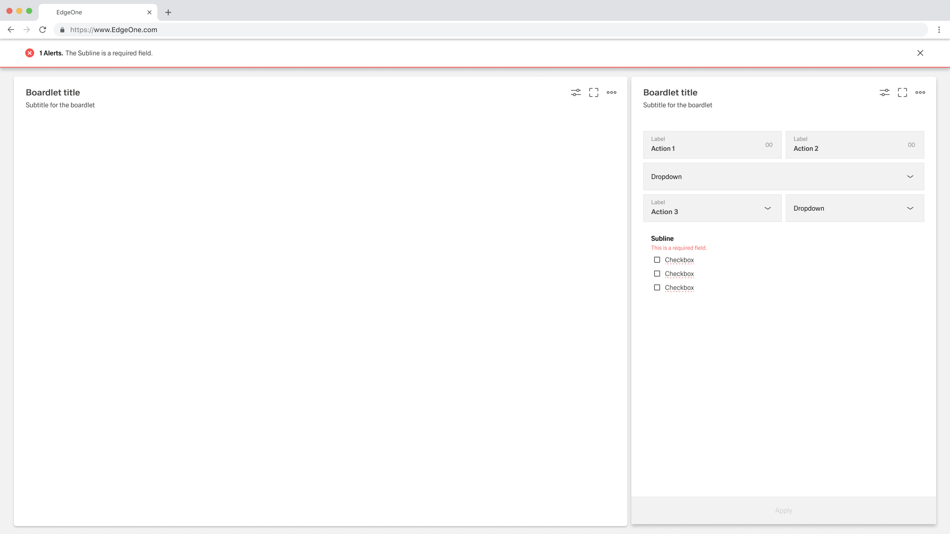
Input groups validation
Input groups validation
3. Individual Validating
In addition to the standard validations, there are individual validations. These validations can include file uploads, process representations, KPI representations, graph representations, accordions. Each of the assets mentioned here will be added to the validation documentation as soon as it is completed.
File Upload Validation
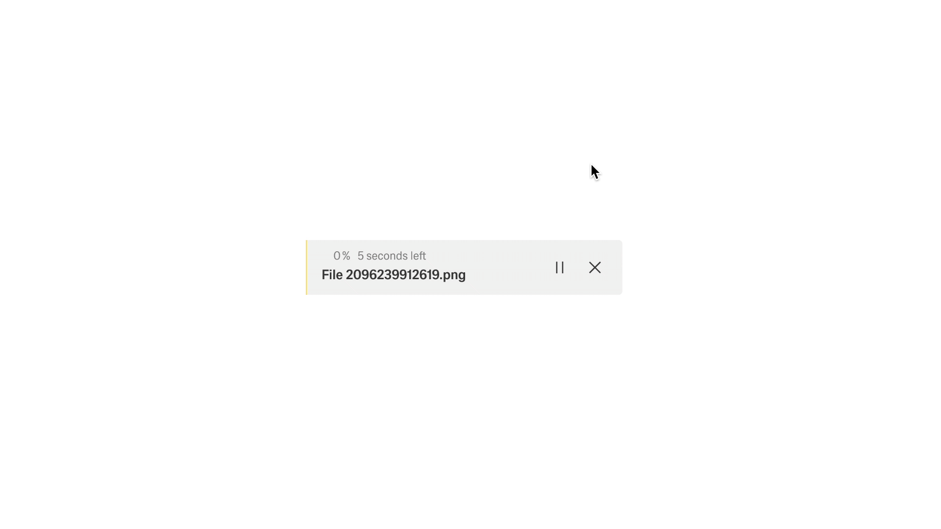
File-Upload validation